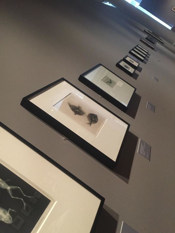
order and Disorder Mindmap
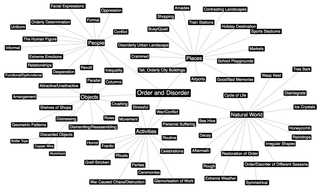
Summer Homework Task 1: Order and Disorder
|
Order
|
Disorder
|
|
|
|
Task 2: Exhibition Visit

Artist Analysis
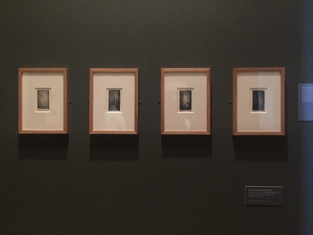
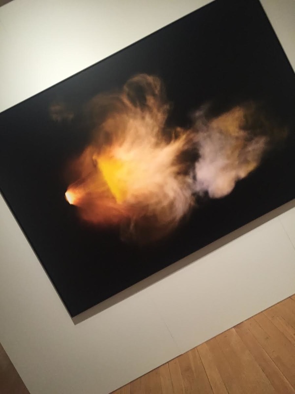
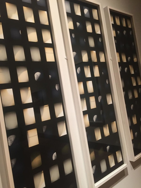
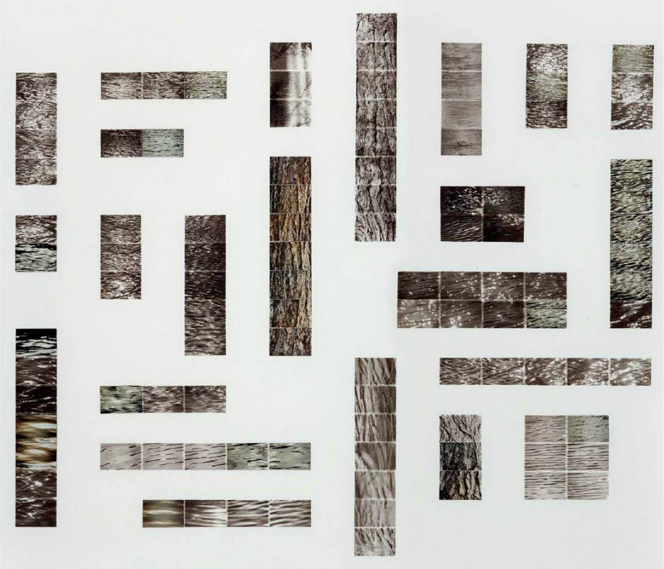
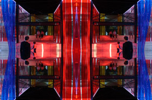
Noel Myles
|
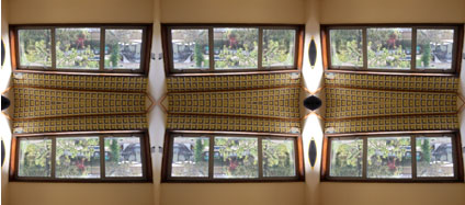
I chose to analyse this photograph because I think it is rather interesting as it shows order in very obvious, neat way. The way that the photographer has chosen to frame the image making it seem as though it several separate images provokes the feeling of structure which contrasts against the idea that nature is quite wild, and doesnt have a particular order. Whereas, in this image, the sky appears to have a specific order set out for it which Myles highlights by framing the photograph in this particular way. Also, the small squares within the picture correspond with the texture and colour of the clouds, which makes the frame seem almost as if its meant to be there. Secondly, I think that this is a very strong picture as the sky is very dramatic and dark, but the clouds are quite a bright, white which creates a heavy contrast throughout the image.
|
I like this image because I think the way that Myles has chosen to lay it out and I think it shows variety against the other two photographs I chose to analyse. I think this photograph shows order in a different way to the first image. Myles has systematically organised the different textures throughout the photograph, I think this is quite a creative, individual way of portraying order and disorder because, in a way, Myles has created his own way of representing order. Secondly, this imaged stood out to me because you can tell what the individual images within the entire photographs are taken of. This almost makes the photograph, as a whole look quite scientific as well as the image has very minimal colours and looks almost black and white.
|
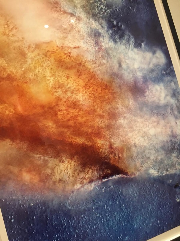
This second photograph intrigued me as it is quite different from the previous, although, still within the same style. This photograph better represents disorder than it does order. However, it is still presented in the same, orderly manner. This photograph also has a much different feel to it as it posses quite vibrant, bright colours. The picture also has no frames and appears rather scattered as opposed to ordered and natural. This is an interesting technique as it invites the viewer to analyse the image more carefully in order to understand what the photograph is taken of. Even though the picture is scattered and dispersed it is still quite clear what the subject of the image is. Secondly, there is a theme throughout the images similar to this one. Myles seems to leave a strip of the main, recurring colour on the right-hand side of the image which shows an element of order.
|
Anna Schuleit
|
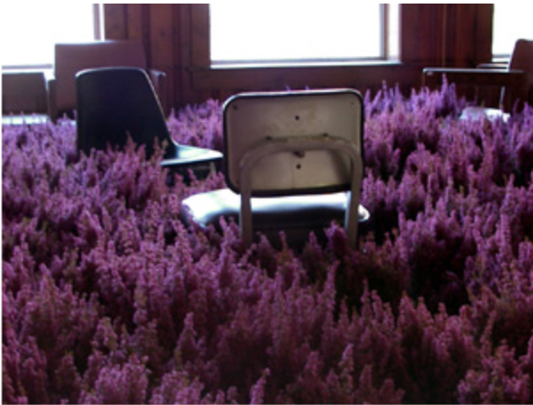
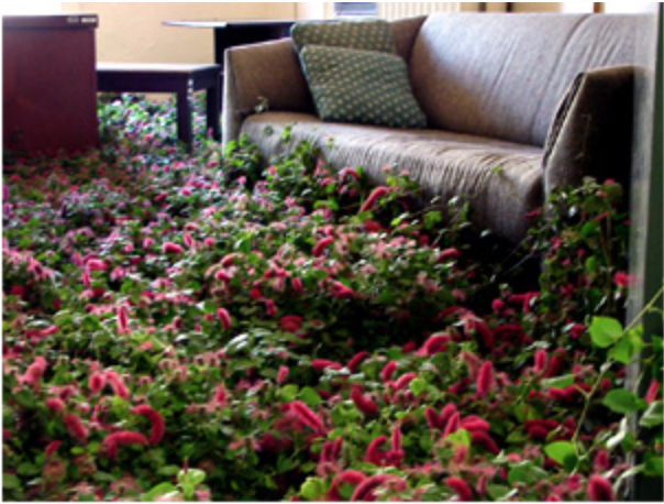
In this series by Schuleit, order and disorder is represented in a very individual way. Schuliet draws attention to the absence of bright, vibrantly coloured flowers in dull psychiatric hospital settings. What I like about this particular photograph is the fact that the flowers look almost as if they're growing as the photographer captured the image because they're quite spiky and prominent. This is also interesting as the photographer chose to take these types of images in a psychiatric hospital as flowers are something that would relate with joy or happiness, whereas psychiatric hospitals would be the opposite. This effect gives a deeper element of contrast than photographers would usually use, making all the images a lot more interesting.
|
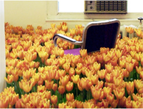
This picture, in particular shows a lot of contrast in a less obvious way, as yellow is the main colour people would connect with joy. This image also shows disorder in many different ways. Firstly, that you wouldn't see a field of brightly coloured flowers in the middle of a psychiatric hospital. Secondly, that the chair in the middle of the field looks almost as if it's floating in the plants because you can't see the legs of the chair or any of the bottom. Another interesting thing that Schuleit has done with this particular photograph is choosing a purple chair. This effect draws the viewer in and makes the chair the, obvious, main focal point of the image as the striking purple of the chair contrasts heavily with the vibrant yellow of the surrounding flowers.
|
This last image stood out to me I think it is slightly different to the previous two. The flowers in this photograph almost look droopy and is if they're about to die. The previous two pictures seemed to have quite a joyful, light feeling to them. However, this photograph gives the infliction of depression and sorrow. Secondly the colours in throughout this image seem to be a lot more dull and dreary and there is little contrast in this photograph, compared to the previous two. The chair, pillow and other furniture around the room is almost the same colour as the flowers surrounding them which causes the whole image to almost blend together. Lastly, the flowers in this image are a lot shorter and closer to the floor giving less of a 'floating' feeling.
|
Ursus Wehrli
|
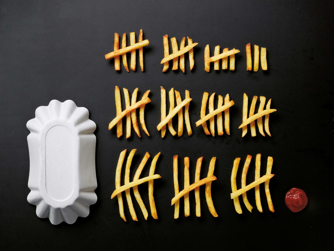
I chose to analyse this first image as I think it shows order in a very obvious way which can be really interesting. I like this image, in particular, as the viewer can very quickly see that the photographer has arranged the items within the image in several different ways. For example the chips are arranged in size order, but are also arranged in a way that makes them easy to count. The fact the photographer has chosen to do this is very interesting to me, because I perennially wouldn't think to do something like that but it makes this (and all other images in the series) extremely pleasing to the eye as they're all ordered so intricately. Secondly, I think the use of very simple and minimal amount of colours throughout the photograph adds to the clean cut, neat effect, further portraying order quite prominently.
|
This image is one of two. In the second photograph, the photographer has ordered all the little pieces of food from the bowl, next to it, on the table as well as the bowl and spoon. All of these images come from a book from Wehrli titled "The Art Of Clean Up: Life Made Neat And Tidy". This book features several images like these, first in their original state, then ordered to an extravagant level of precision. I think that this particular photograph is interesting because in some ways it looks quite orderly as all the shapes in the image are very clear and precise and the bowl and spoon are laid out very specifically. However it is supposed to represent disorder as the food in the bowl hasn't yet been put in specific colour and size order. The bowl in the image is a very bright, white further giving the image that sharp, precise feel.
|
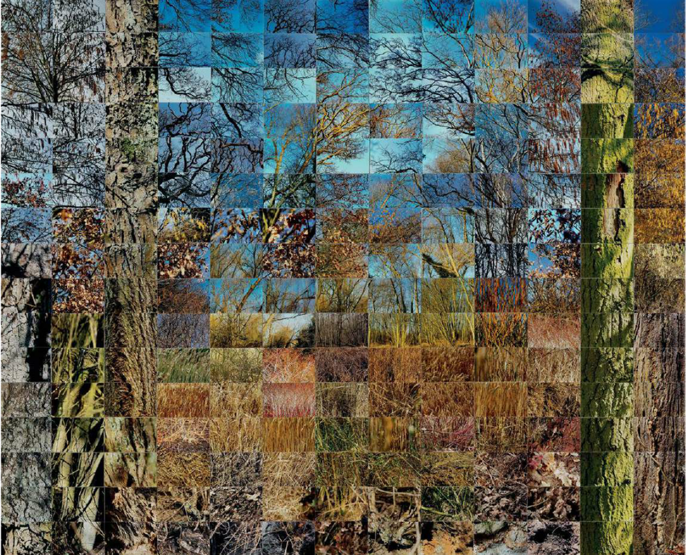
This last image is quite different to the previous two, although it follows the same idea. The first photograph that goes with this image is taken of the flower that all these small, orderly parts came from. This picture is different as it shows a much different degree of order to any of the other photographs i've looked at. However, this image is similar to the first of the series that I analysed as all the smaller parts of the flower have been organised into roughly the same criteria: colour, size etc. Secondly, this photograph stood out to me, in particular, as it inhabits quite summery, light colours which really embodies the nature element of the photograph, continually reminding the viewer what the object originally was. It's obvious that Wehrli was conscious of this as he used a correspondingly bright colour for the background.
|
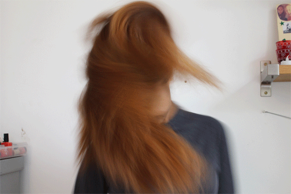
Portrait Disorder
Classwork Response
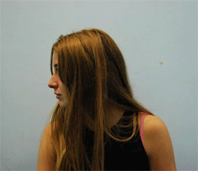
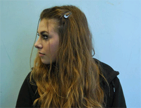
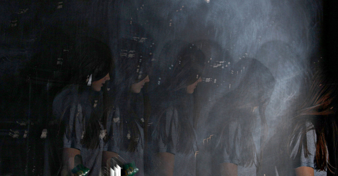
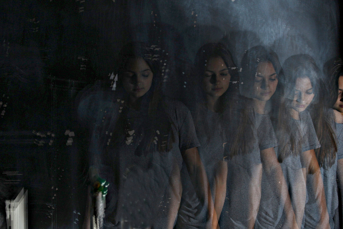
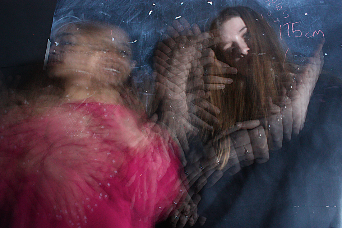
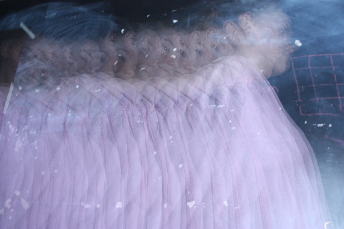
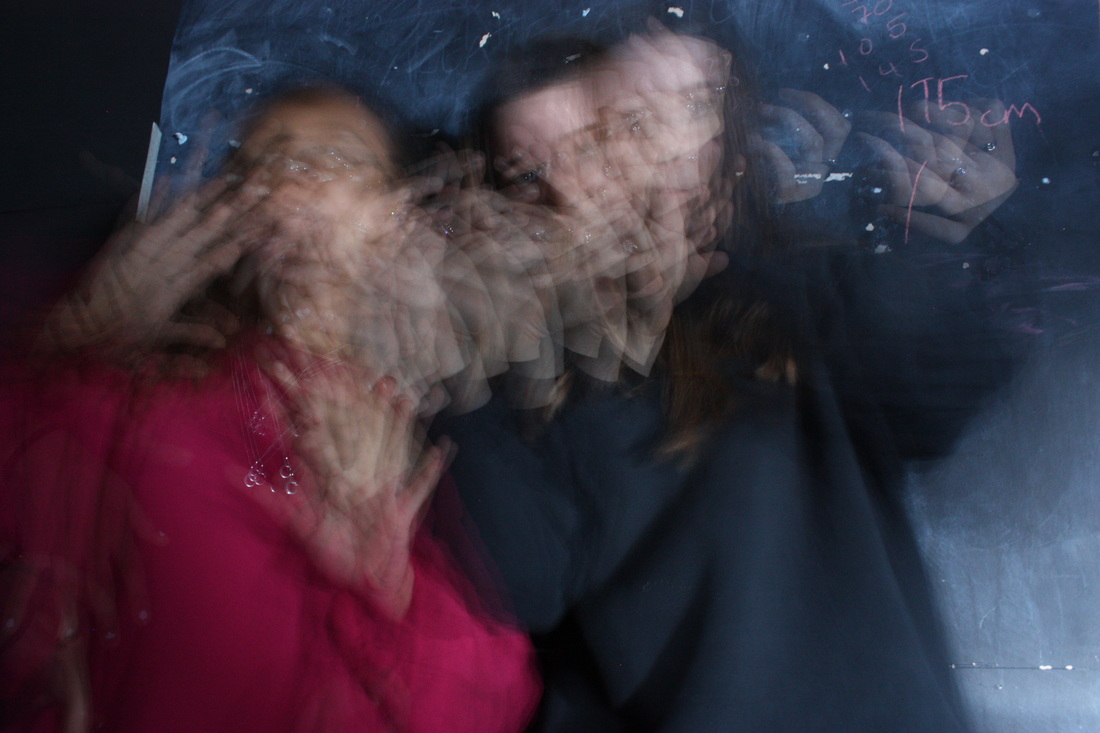
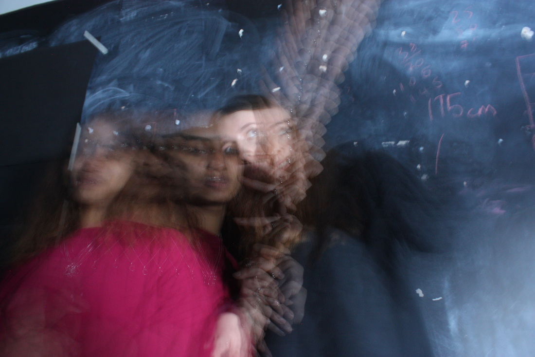
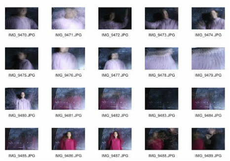
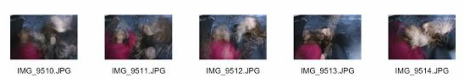
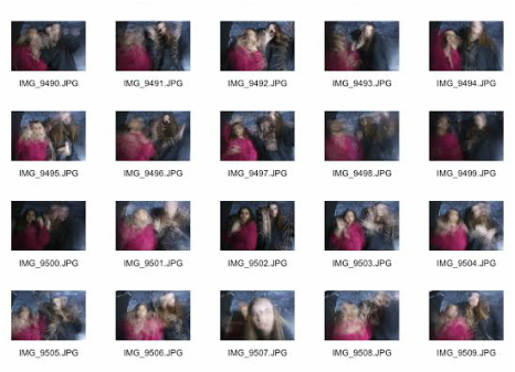
For my class response to this section, I tried to capture two different subjects moving their head from one side to the other. To do this, I took several photographs of the different subjects moving their heads and then put them together in photoshop in order to give off the movement effect. In the first, left-hand image the speed is slower than the photograph on the right. I think this makes the gif seem less stiff and jittery, whereas the image on the right is a lot more jittery. I experimented a lot with the different speeds of the gifs I could use in this lesson, this helped me figure out what would be a good speed to use when I went to do the homework.
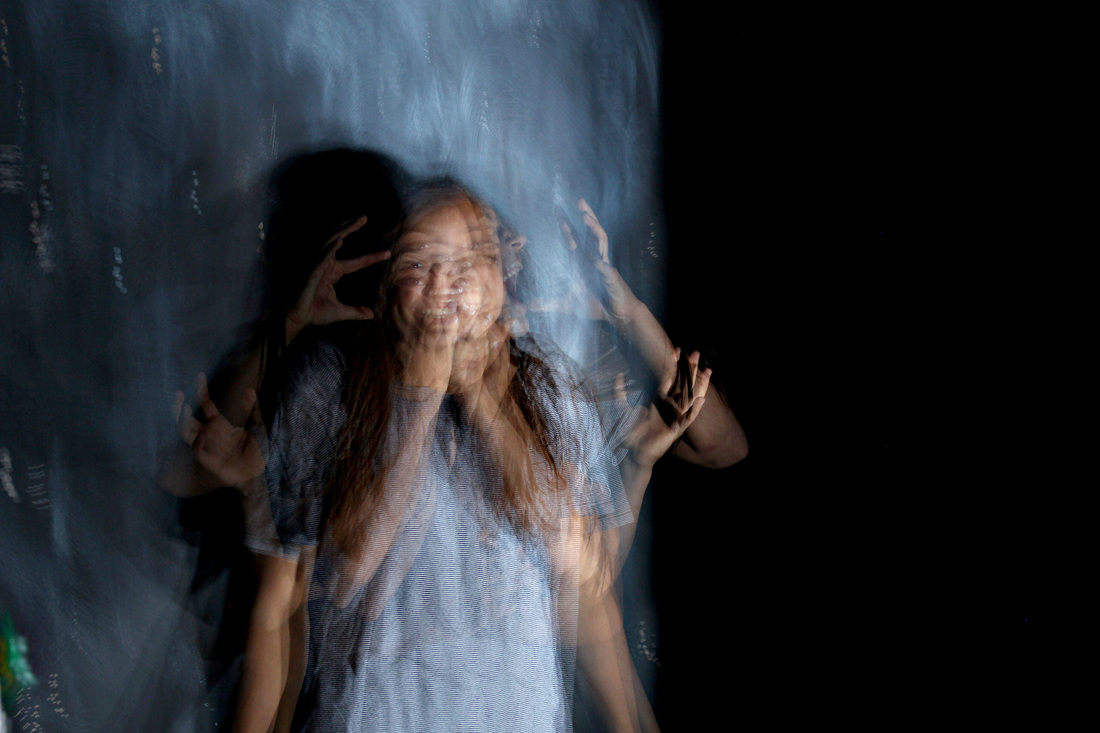
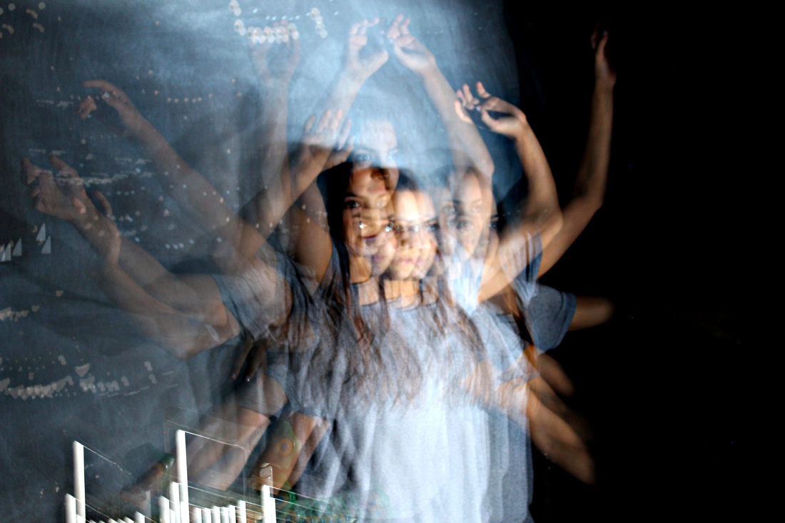
homework Response
|
|
|
Romain Laurent
Romain Laurent is a photographer and director. He is French, born in the Alps, and currently live in New York City. He studied product design at the National School of Applied Arts in Paris and then discovered photography is a much better way to show people his strange ideas. He went on to study that field at Gobelins in Paris. Since then he's been working in advertising and on personal projects.
"To add to the fun I make these ideas move as well. My clients include magazines, agencies and brands like WAD Magazine, Reebok, Hermes, Lacoste, Nissan, VW, Google, Hilton, GQ and more. I'm also a proud member the ADC Young Guns X award" - Romain Laurent
"To add to the fun I make these ideas move as well. My clients include magazines, agencies and brands like WAD Magazine, Reebok, Hermes, Lacoste, Nissan, VW, Google, Hilton, GQ and more. I'm also a proud member the ADC Young Guns X award" - Romain Laurent
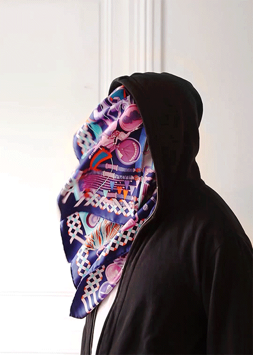
I think this first photograph is interesting as it covers the subjects face. There aren't many of Laurent's photographs in which he does this, which is part of the reason that it stood out to me. I think the fact that he chose to have a different, moving object covering the face of the subject, as opposed to just having the face of the subject move, makes the photograph much more intriguing to the viewer. This is because it's quite a creative idea and method of gif photography that not many other photographers do. Secondly, I think the way Laurent has chosen to use such a bright, crowded print on the scarf draws attention to the scarf. This effect is emphasised by the plain, subtle colours of the background and hoodie of the subject.
|
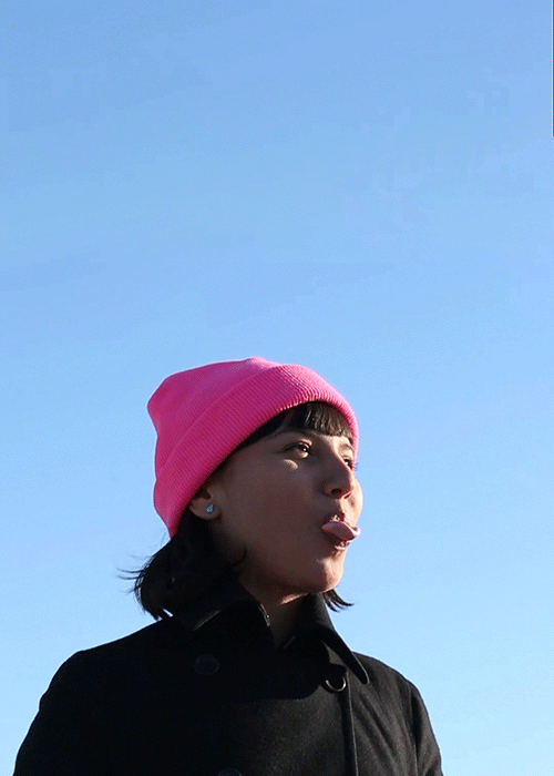
This photograph is different from the previous as it uses bright, block colours throughout the photograph. This gives the image a very light, happy feeling whilst keeping the image quite simplistic. Secondly, this photograph has two, much smaller sections of movement, as opposed to the previous photo where there was one, quite large section of movement. The effect of this makes the image a lot more interesting as there is more than only one main focal point and gives the photograph a lot more depth. I think the small movement in the left hand corner of the image opens the viewers eyes up more to look around the whole image rather than only focusing on the main, middle section of the image.
|
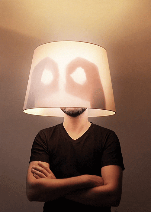
This last picture is different to both the previous two images as it has an apparent representation of the subject blinking his eyes. Laurent has done this by using shadows to represent the opening and closing of the subjects eyes. This is interesting as it shows that he has manipulated the lighting of the image in order to create the desired shadows. Secondly, the colours throughout this photograph are a lot more simplistic and dull than the previous two photographs which allows the viewer to focus on the moving section of the image. Also, the fact that the colours are dull draws attention to the fact that the main focal point of the section is lit up.
|
Symmetrical Order
Sasha Levin
Sasha Levin is a commercial photographer, based in Moscow. The majority of his images are those of symmetrical nature. In my artist section for him I took a series of different images from his Pinterest, which I think most effectively portray the element of symmetry and those that most stood out to me as generally, strong photographs. There is little online information about Levin that I could find as most of it is in Russian.
|
This first picture I chose to analyse from Sasha Levin, I think, displays symmetry very obviously which makes the image much more effective. The way that the foreground of the image is so simple, but the background is quite cluttered and busy gives the photograph an element of contrast. This effect also draws attention to the aspect of symmetry in the picture. Secondly, I think this picture is particularly interesting as it's taken from quite an unusual angle and Levin obviously had to get rather high up to capture the photograph. This angle allows the viewer to see the whole layout of the architecture. It also puts a lot of emphasis on the symmetry throughout the picture.
|
This photograph is a lot more simplistic than the pervious, as there isn't much going on in either the foreground or background. However, it is similar to the previous image in that there is a person in standing in the middle of it. I think this aspect of the photograph really helps draw attention to the symmetry in Levin's photographs. The man standing directly in the middle of the picture almost disrupts the symmetry in the background of the image, but instead puts more of an emphasis on the architectural symmetry. This a technique that comes up quite frequently in Levin's photography. I think this technique is very effective and also quite unique.
|
I think this final image is different to the previous two as it has little element of architecture within it. the symmetry is more spontaneous than in the previous two pictures as it is not taken of something that Levin could really control or manipulate to make it come out the exact way that he wants. The image almost appears as though it was an accident, which I think makes it a lot more effective as the previous two images where kind of already set up for the photographer to capture, he just manipulated the angle to get the exact outcome that he wanted. What's interesting about this particular image is that it seems accidental and out of the photographer's control.
|
Classwork Response
For my classwork response I tried to find symmetry in architecture as there weren't many interesting things around the school that I could photograph. I don't think these images came out particularly well as there is little colour within the photographs or anything particularly interesting about them. For my homework response I set out to find more interesting/colourful things to photograph that would be much more effective when I went to edit them to make them symmetrical.
Before
After
|
|
Homework Response
When taking the images for my homework response to this section, I looked for and found much more interesting architecture and other things to capture for my photographs. I was able to capture, overall, a lot more images than when I did my classwork response. I also think that this se of pictures was a lot stronger than the photographs that I took in class.
Before
|
|
|
After
|
|
|
|
|
Artist & Me
|
Sasha Levin's Work
|
My Work
|
Sasha Levin's Work
|
My Work
|
|

|
|
|
|
Comparing this photograph of mine against Sasha Levin's you can see that the two images have similar elements to them. For example, both of the pictures feature quite abnormal colours that look quite out of place in these normal, everyday settings. Both colour focuses in the pictures are mainly on either side of the images and therefore draw attention to the entire photograph. Secondly, both the images have subjects facing away from the camera, in the middle of the picture. This effect draws attention to the view in the image on the left as it makes the viewer wonder what the subject is looking at. Whereas, in the image on the right the subjects in the middle of the photograph makes it obvious to the viewer that the image was taken at a rather busy, central area. Both photographs also feature architectural structures at the top, centre of the image. I think this gives the image the element of symmetry and makes the photograph look very aesthetically pleasing.
|
For these two images, I think they are similar in different ways to the previous two I have compared. For example, these two photographs have much stronger elements of natural symmetry, whereas the previous photograph of mine I compared to Levin's wasn't really symmetrical until I edited it. Even though these two images do actually look more dissimilar than the previous two that I compared, overall, I think they are actually much more similar. The majority of Levin's photography is taken with automatic, natural symmetry and his photographs are not edited to get the desired look. I think, in some ways, this technique is a lot more interesting than just taking photographs and editing them to make them look symmetrical. I think that in just taking the picture, already symmetrical gives the photographer a lot less control and, therefore, can make for much more surprising outcomes in your photography.
|
Date: 23/09/15
Homework title: Portrait disorder/Architectural symmetry
Teacher comment:
Portrait disorder: Well done a strong second response to improve them further you should use a tripod to avoid the slight jerkiness that is in the frames at present. Also crop out anything from the frame that distracts the viewer
Architectural symmetry:The images you have are good but where is your first response and the contact sheets for your second response
Student comment: I have uploaded my first response and made contact sheets for both.
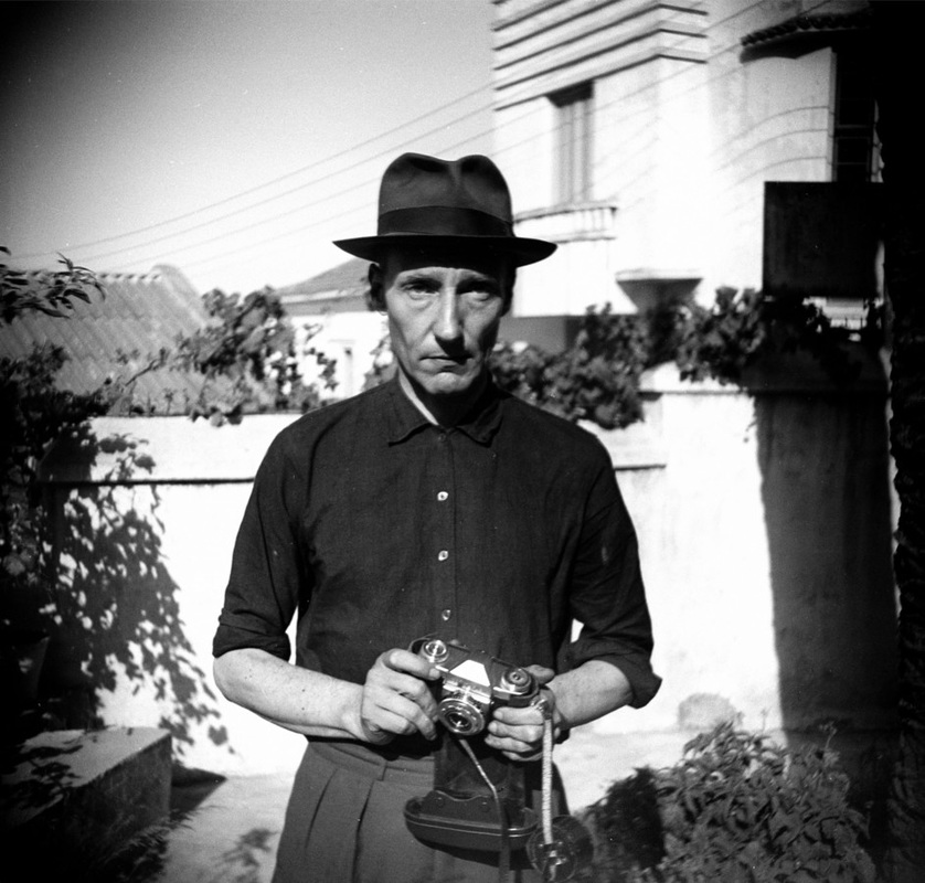
cut Ups
For this section I will take various pictures that relate to a word cut out from a newspaper article. This is technique is inspired by poet/play-write, William S. Burroughs, who features several examples of this particular technique throughout his work.
"Take a newspaper.
Take some scissors.
Choose from this paper an article of the length you want to make your poem.
Cut out the article.
Next carefully cut out each of the words that makes up this article and put them all in a bag.
Shake gently.
Next take out each cutting one after the other.
Copy conscientiously in the order in which they left the bag.
The poem will resemble you.
And there you are – an infinitely original author of charming sensibility, even though unappreciated by the vulgar herd." - William S Burroughs

First Response
|
|
Second Response
For my second response to this section, I tried to improve my final outcome by capturing more pictures so that I had more options. I also tried to portray my photographs in a less obvious way and be more creative with the things that I photographed in order to make my images more interesting and puzzling to the viewer. I don't this response turned out particularly well for me, but I think it's better than my first response to this section.

|

|

|
|
|
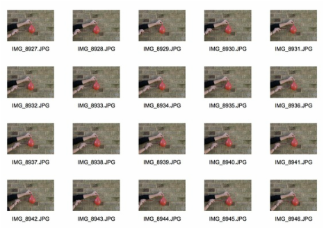
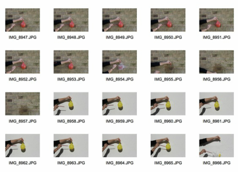
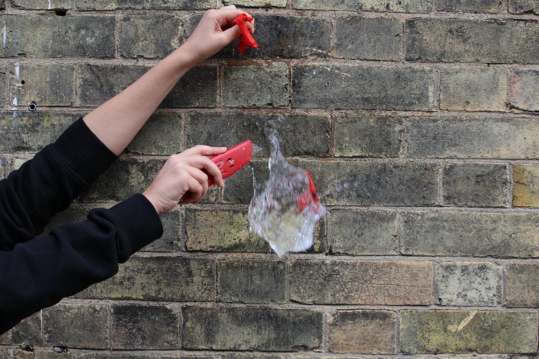
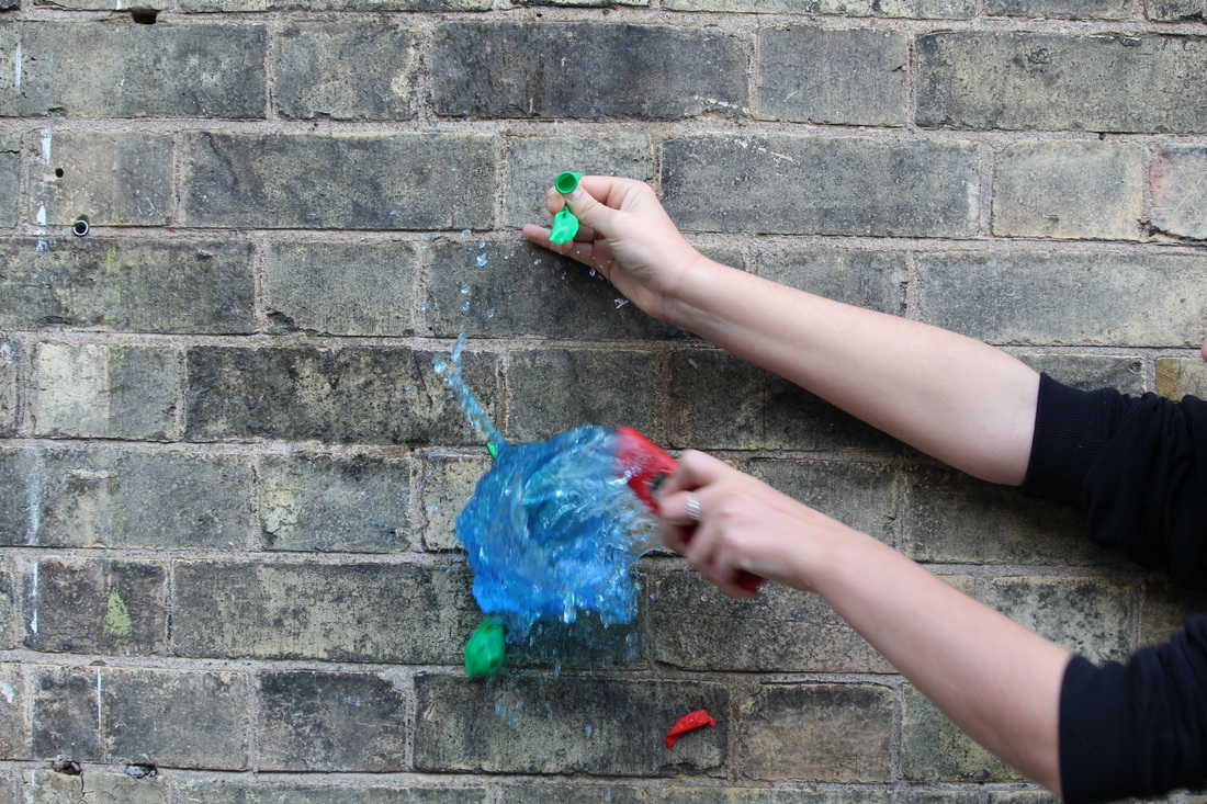
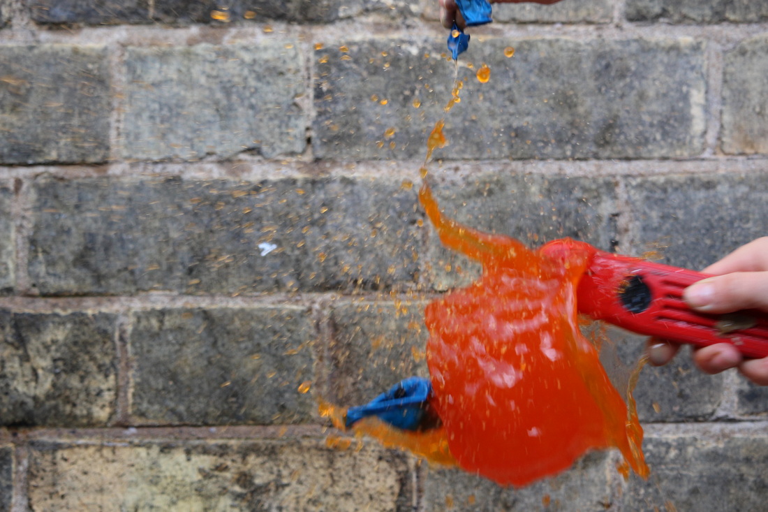
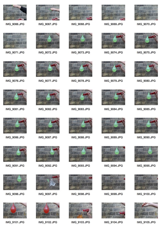
Water Balloons
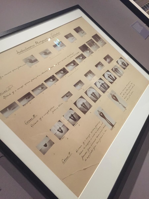
Harold Edgerton
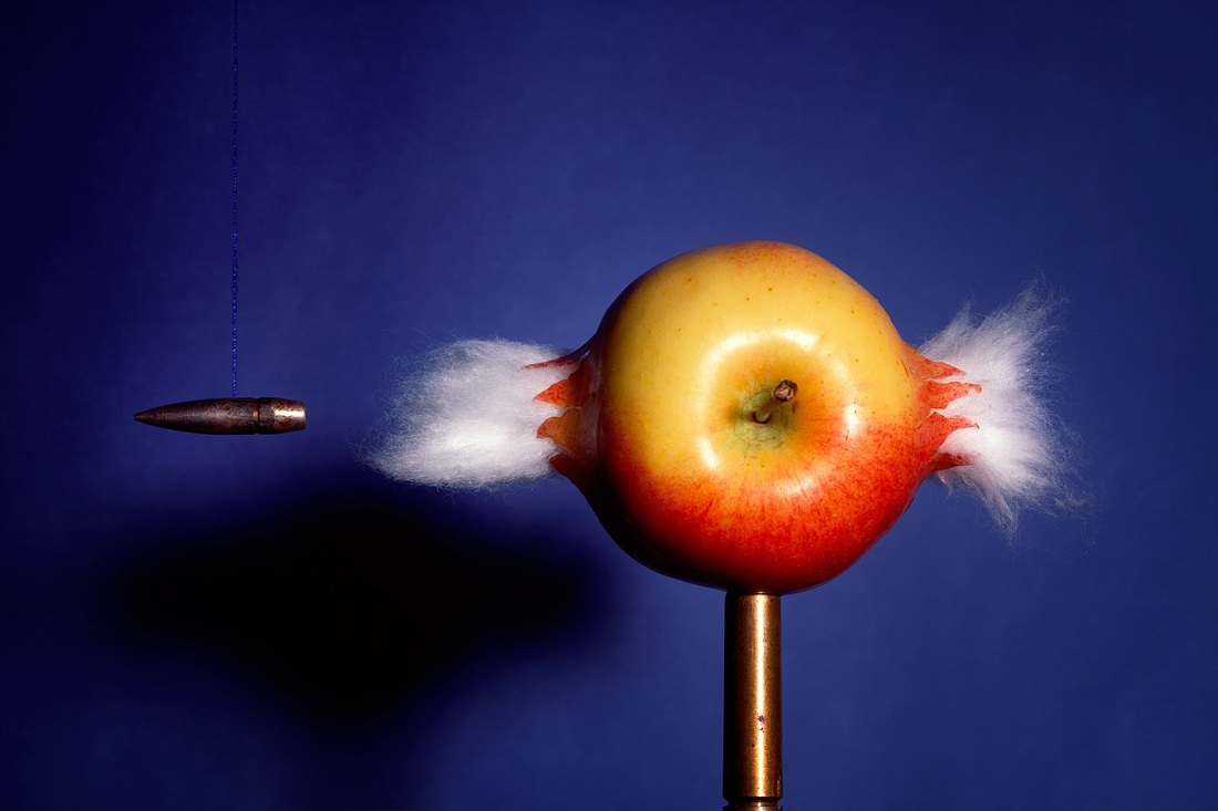
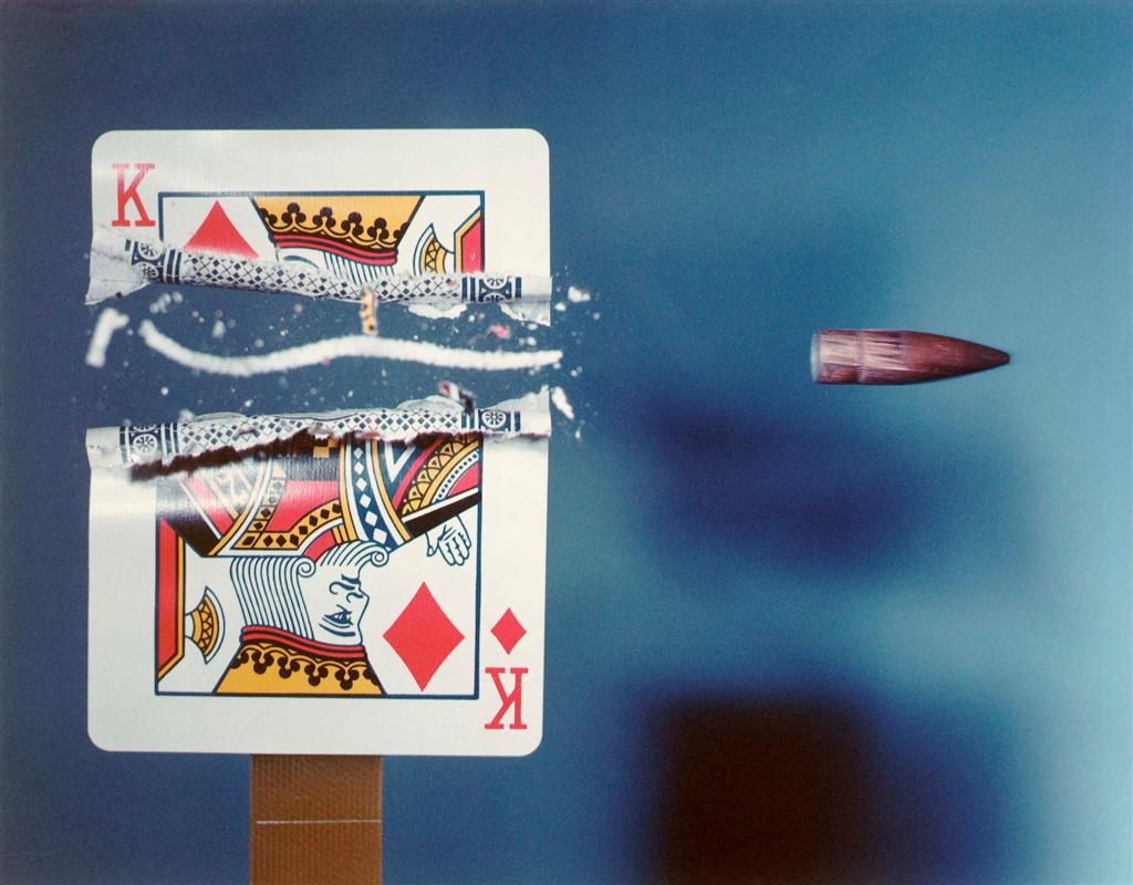
Harold Eugene Edgerton was an electrical engineer. He is mainly credited for bringing the stroboscope from an obscure laboratory instrument into a common device. He is also known for his development of sonar and deep-sea photography. Edgerton is also known for his unique method of photographs. He often uses stroboscopic equipment in his images to help create the effect of multiple images in one. He was a pioneer in using short duration electronic flash in photographing fast event photography, subsequently using the technique to capture images of balloons at their different stages of bursting, a bullet whilst its bursting through an apple, or using multiflash to track the motion of a bird.
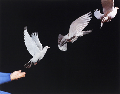
|
This photograph of Edgerton's is quite a famous one in the overall history of photography, as he was the first to use this technique of 'slow motion' photography, capturing a moment down to the millisecond which is a very interesting photographic technique, as it almost allows the photographer to play with time and capture a moment that a human eye would not be able to see. This image, in particular, is very interesting as it is quite quite and spacious. There is nothing within the picture that distracts the viewer from the subject. This quite an effective thing to do for these types of photographs as making the picture busy makes the photograph seem less perfect and still. I think all of Edgerton's photographs have a similar scientific, 'perfect' feeling to them as they are all very precise and sharp.
|
This photograph is very similar to the last. However, I think the way that Edgerton has taken this image slightly more zoomed in is particularly effective as you can really see all the small details of the playing card that have been shot through and are becoming ruined, in the photograph. Also, the way that Edgerton has also used a slightly lighter background than the previous image makes it a lot brighter, and there is less contrast which I think makes this type of photograph more interesting as it makes the image, as a whole, stand out rather than just one aspect of the photograph. Lastly, I think it is interesting how there is accidental symmetry within the rip in the card. This makes the photograph seem as though it has been set up by someone and frozen in time rather, which I think is the most interesting aspect of 'slow motion' photography.
|
This last photographs is different to the previous two as Edgerton has used the strobe light technique to give off this dramatic, sequential effect. This particular image features a lot of quite obvious contrast which makes the strobe technique much more effective. I think this photograph, in particular, is a strong one as the whole image has a very clean, precise feeling to it. An element that adds to this is that the you can't see any blurs or trails in the transition of the bird flying, this makes it look more like it's three different birds, as opposed to one bird flying. However, the hands in the bottom left corner appear very shaky and look almost ghost like because of the strobe effect. This is interesting as it shows a very different kind of contrast that makes the entire photograph a lot more effective.
|
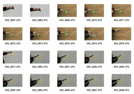
classwork Response
|
|
|
|
|
Homework Response
|
|
Strand Responses
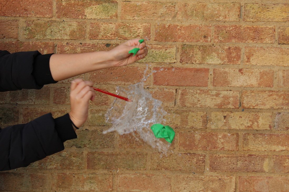
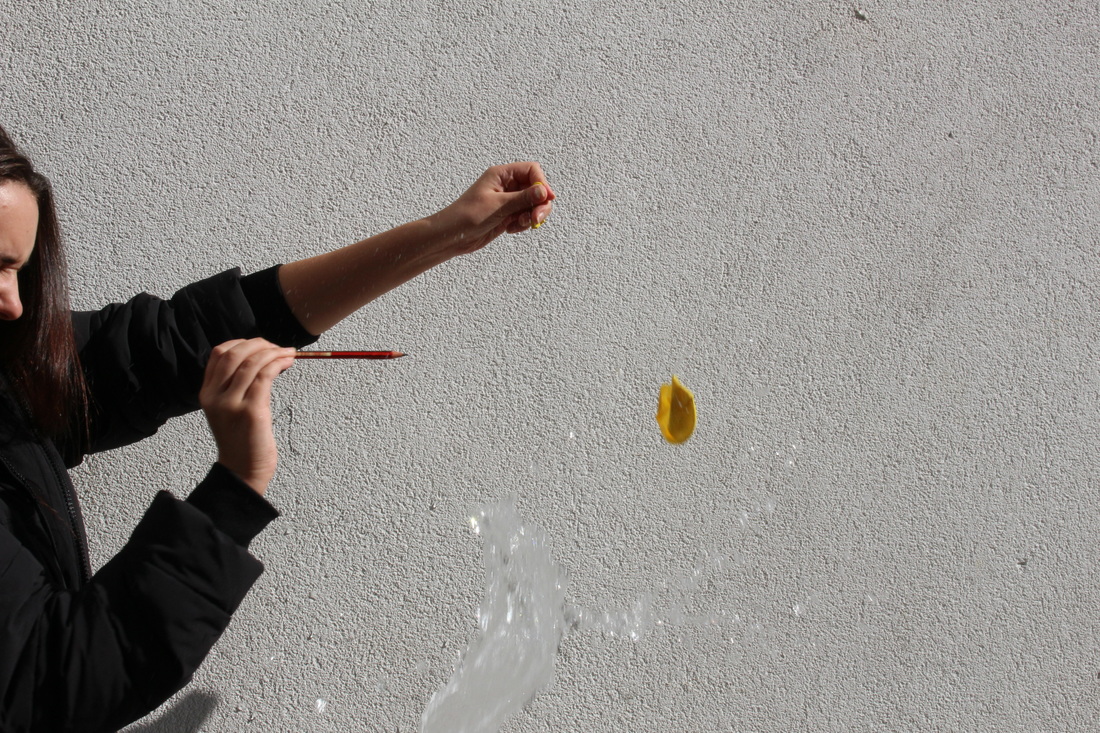
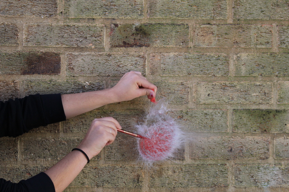
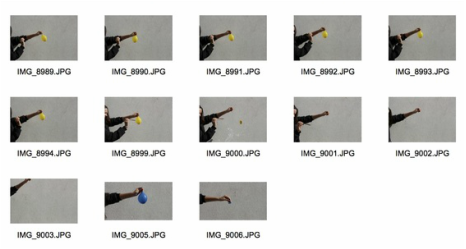
First Response: Strobe Light
For this strand response I took inspiration from artists we have looked at throughout the order and disorder section. For example, Harold Edgerton frequently used this technique in more of a scientific sense. I think this technique is particularly interesting because it looks like some of the images taken by Edgerton, and look like something from a science experiment.
For the following pictures: I used F5.0, iSO 100 and the Bulb setting, I then edited them in Photoshop.
For the following pictures: I used F5.0, iSO 100 and the Bulb setting, I then edited them in Photoshop.
|
|
|
|
|
Second Response
For my second strobe light response I tried to capture more abstract movement and used more than one person as the subject in order to capture more movement within the photograph.
|
|
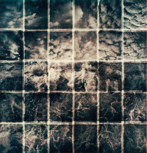
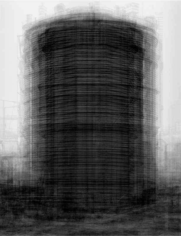
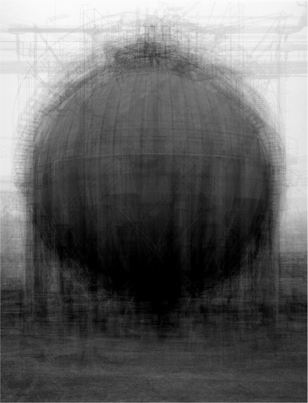
Idris Khan
All of Khan's photography stems from the same ideas / visualisations. For example, every page of the Qur'an, every Beethoven sonata, every William Turner postcard from Tate Britain, or every Bernd and Hilla Becher spherical gasholder. Khan's photography is heavily influenced by Islam and the Qur'an. Khan's father suggested, when he was younger, that he photograph every page of the Qur'an. His work and process have been described as "experiments in compressed memories".
"It is a challenge to not define my work as a photograph but using the medium of photography to create something that exists on the surface of the paper and not to be transported back to an isolated moment in time." - Idris Khan
"It is a challenge to not define my work as a photograph but using the medium of photography to create something that exists on the surface of the paper and not to be transported back to an isolated moment in time." - Idris Khan
|
|
|
|
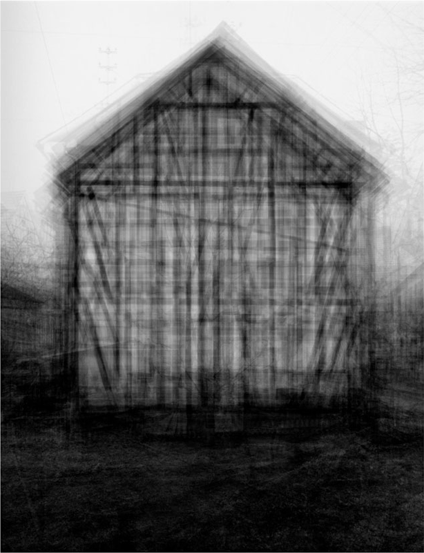
This first photograph from Khan's architectural series is particularly interesting. I think the way that the strobe effect is used here is portrayed in many different ways throughout the image. For example, the tower appears as though it is made of straw because the effect of the picture doesn't convey small details. This element of the photograph, in a way, reflects the effect of the entire image in that the appearance of straw makes the structure seem quite messy and fragile. This is also the effect that using the strobe technique gives to it's photographs. I also think that this picture is interesting as it is taken of an inanimate object. This makes the photograph seem quite reminiscent of when we looked at the zoom blur technique.
|
This second photograph is quite effective as there is an obvious portrayal of contrast throughout the image. For example, the contrast of the bleak, grey/white sky against the strong, dark ground. Also, the colours on the structure that is the subject of the image use strong contrast. Secondly, the sky in this image appears quite ghostly and faded. Whereas, the ground and the structure are quite sharp, contrasting against the background that is the sky. This effect makes the image a lot more interesting as it brings out the subject of the image, making it seem more prominent than it really is. Also, the continual element of contrast throughout the photograph makes the strobe technique a lot more effective as it enhances the outlines of the shapes within the picture.
|
This final image is quite different to the previous two as there is not that much obvious or harsh contrast within the photograph. However, I think this photograph is most interesting out of all three because there is little contrast at the top of the image, but as you look closer at the photograph you can see that there is actually quite a strong contrast at the bottom of the water tower and towards the ground, and then it fades again. I think this makes the picture very interesting as when you first glance at the picture, it appears as though it was taken in quite a thick fog because the top of the image is so faded, whereas towards the bottom it becomes clearer and slightly sharper, enhancing the strobe effect used throughout this series.
|
Response to Idris khan
Second Response: Typology
Marco Ugolini
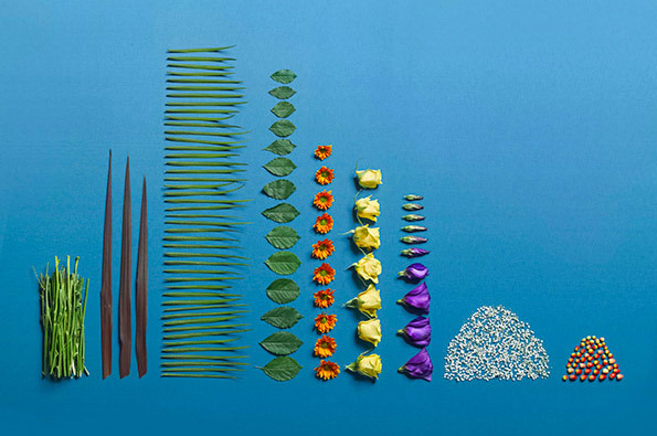
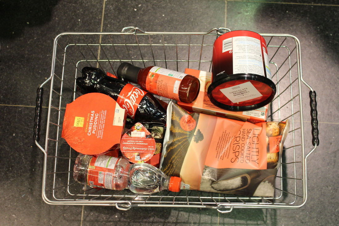
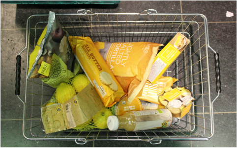
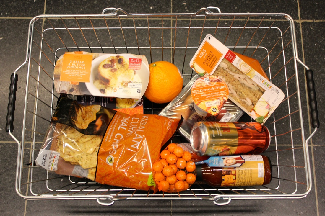
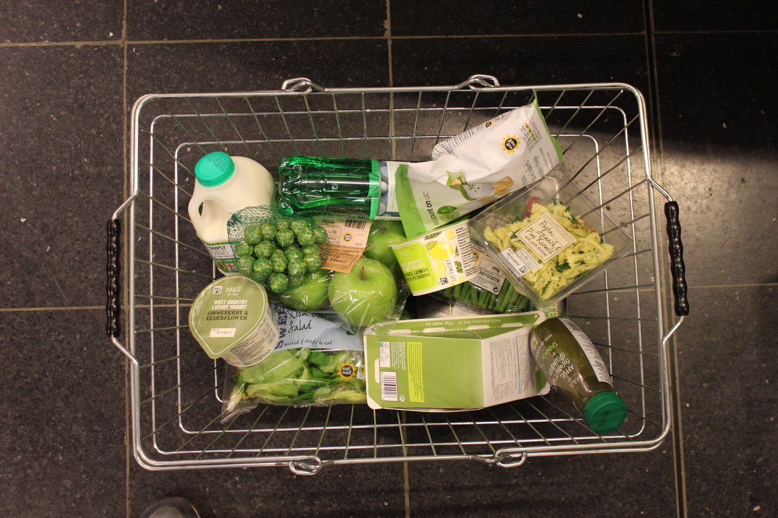
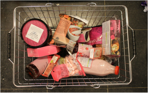
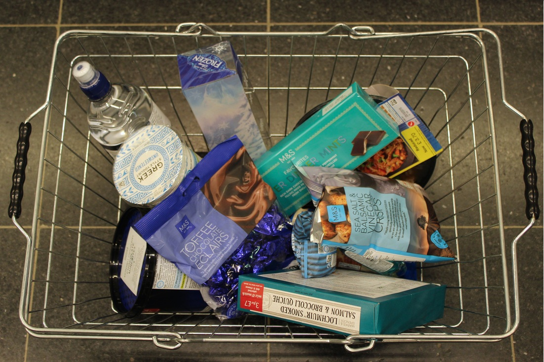
Marco Ugolini is a self employed artist who specialises in digital printing and graphic design, now currently based in San Francisco. This series by Ugolini organises items from a grocery store into colour order. "I see the supermarket space as a space of manipulation. The attempt, in this action, is to subvert this structure of power. The pictures have been taken in collaboration with Photographer Pedro Motta, in a supermarket in the same neighbourhood of the art center. None of the products have been bought after the shooting." - Marco Ugolini
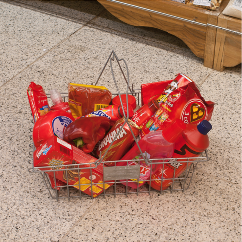

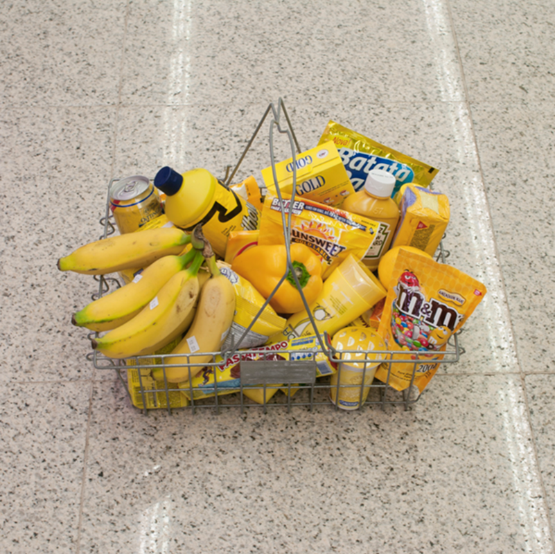
These three images come from Ugolini's series 'per colour'. In this series Ugolini captured several photos of produce in shopping baskets organised through their colours. This represents typology in quite an interesting, more visual way than organising photographs of people. I chose to look at this series and write a response to it because I think it shows variation within this topic. I think this series is interesting as it emphasises the effect that different colours can have on a photograph. For example, the photograph with the blue items in the basket appears a lot bright and cooler than the other two. Whereas, the image with the red items looks a lot warmer and duller than the blue. I will keep this in mind when I go to take my response and look out to see the different effects that each different colour gives, this will also be interesting to see in other images, not only typology, as it can completely change the feeling of the entire photograph.
My Response
|
RED
YELLOW
ORANGE
|
GREEN
PINK
BLUE
|
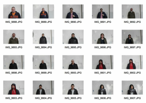
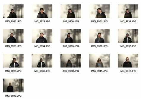
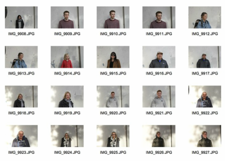
Street Typology
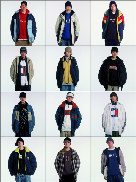
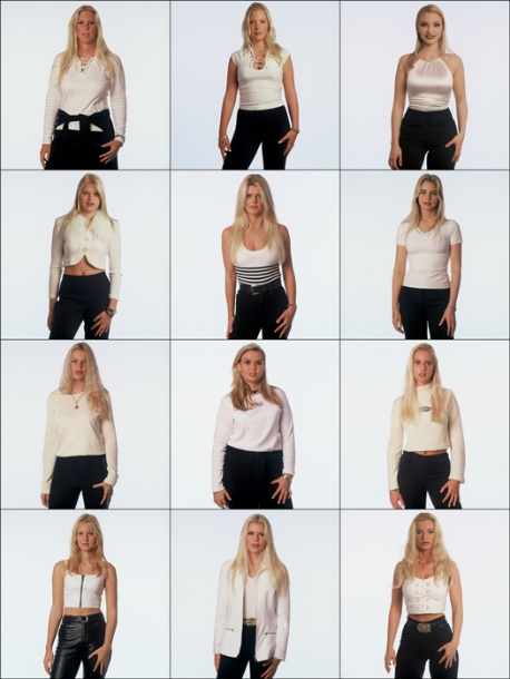
Ari Versluis
The images below of taken by photographer Ari Versluis are all part of a series called 'exactitudes'. "Inspired by a shared interest in striking dress code of various social groups, the artist team of photographer Ari Versluis and profiler Ellie Uyttenbroek have been systematically hamstringing such permutations of received identity for 20 years. By registering their subjects in an identical framework, with similar poses and a strictly observed dress the Exactitudes series provide an almost scientific, anthropological record of people’s attempt to distinguish themselves from others by assuming a group identity." - Ari Versluis
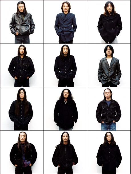
My Response
For this response I took several pictures of different people on the street and then categorised them into the groups shown below. I chose to do this as one of my responses to typology as I thought that it would be interesting to take pictures of people and then categorise them, as opposed to inanimate objects. This response could be improved by taking the images somewhere busier as I don't think I captured enough images to categorise the people into as many groups as I would have liked to.
Facial Hair |
|
|
|
Third Response: City Disorder
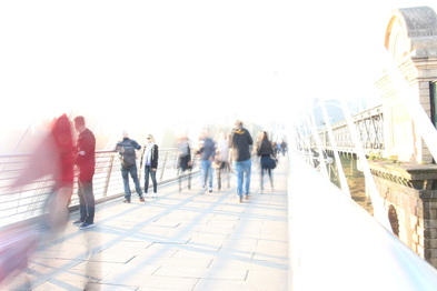
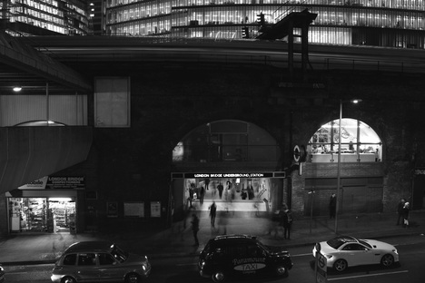
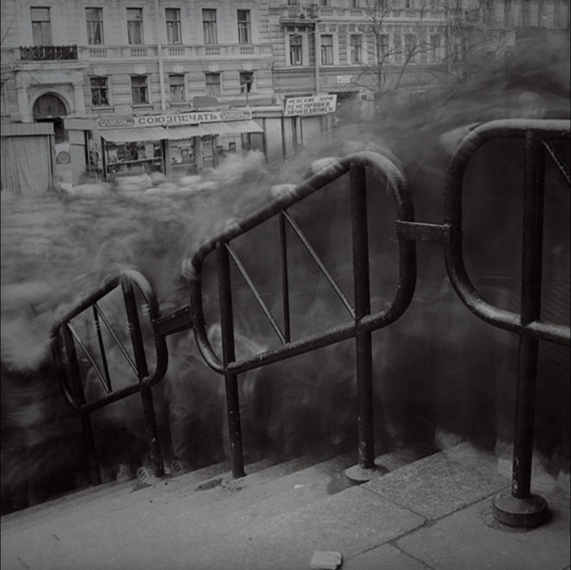
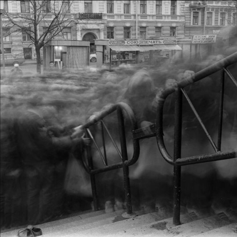
Alexey Titarenko
Alexey Titarenko received his Master of Fine Arts degree from the Department of Cinematic and Photographic Art at Leningrad's Institute of Culture in 1983. He began taking photographs at the beginning of the 1970s, and in 1978 became a member of the well-known Leningrad photographic club Zerkalo, where he had his first solo exhibition (1978). Since this was a creative activity that had no connection with the official Soviet propaganda, the opportunity to declare himself publicly as an artist came only at the peak of Perestroika in 1989 with his "Nomenclature of Signs" exhibition and the creation of Ligovka 99, a photographers' exhibition space that was independent of the Communist ideology. His works are in the collections of major European and American museums, including The State Russian Museum.

|
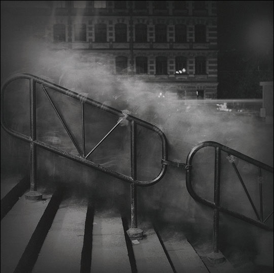
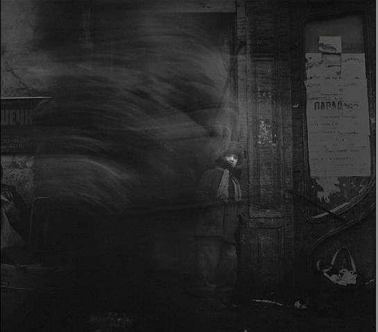
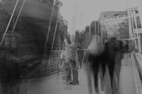
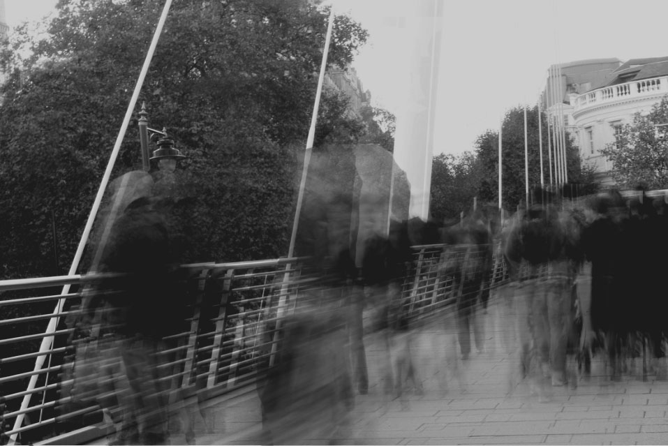
I chose to analyse this particular photograph of Titarenko's as I think it is quite distinct compared to other images of his. The way he has exposed the photograph makes the movement in the image look very ghostly. Also, the way he's done it is very effective as the blurred movement of the people looks almost focused as the image is so clear and the lighting of the photograph is perfect for the image. Usually when taking these photographs it is easy to over expose the image, which is what I found when taking city disorder, but this image seems to have the perfect lighting. Secondly, I think the way that you can see some of the subjects hands gripping the railing gives the photograph quite a dramatic mood adding to the effect of the image being black and white.
|
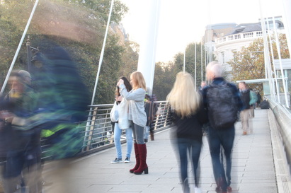
I think this second image is interesting, but different to the previous. This photograph is less blurred so you can tell automatically that less movement took place in this image. However, I think this is also very interesting for this kind of photography as it makes the photograph look quite natural and gives the image much more details as the subjects aren't as blurred. I think this photograph has a lot less of a staged feeling to it than the previous as it seems like Titarenko just went out on the street and took photographs of people without them realising, whereas the previous seems as though it was set up. I also think this image is interesting as there is a section at the back of the photograph where the skyline is particularly bright, this gives the image a lot more depth.
|
This last picture had very different moods to both the previous two photographs. What drew my attention to this particular image is the fact that the little boy is in the background of the photograph, yet Titarenko has portrayed him as the main subject by making him in focus and blurring the people around him. Also, this picture appears to be almost perfectly timed as the man in the foreground blurring the left side of the image seems to have only just walked past the boy in the background. This adds an element of drama and suspense to the image like most of the other of Titarenko's photographs. I think the way he uses the dramatic element of black and white over the intensity of the method of photography he uses makes his images very effective and strong.
|
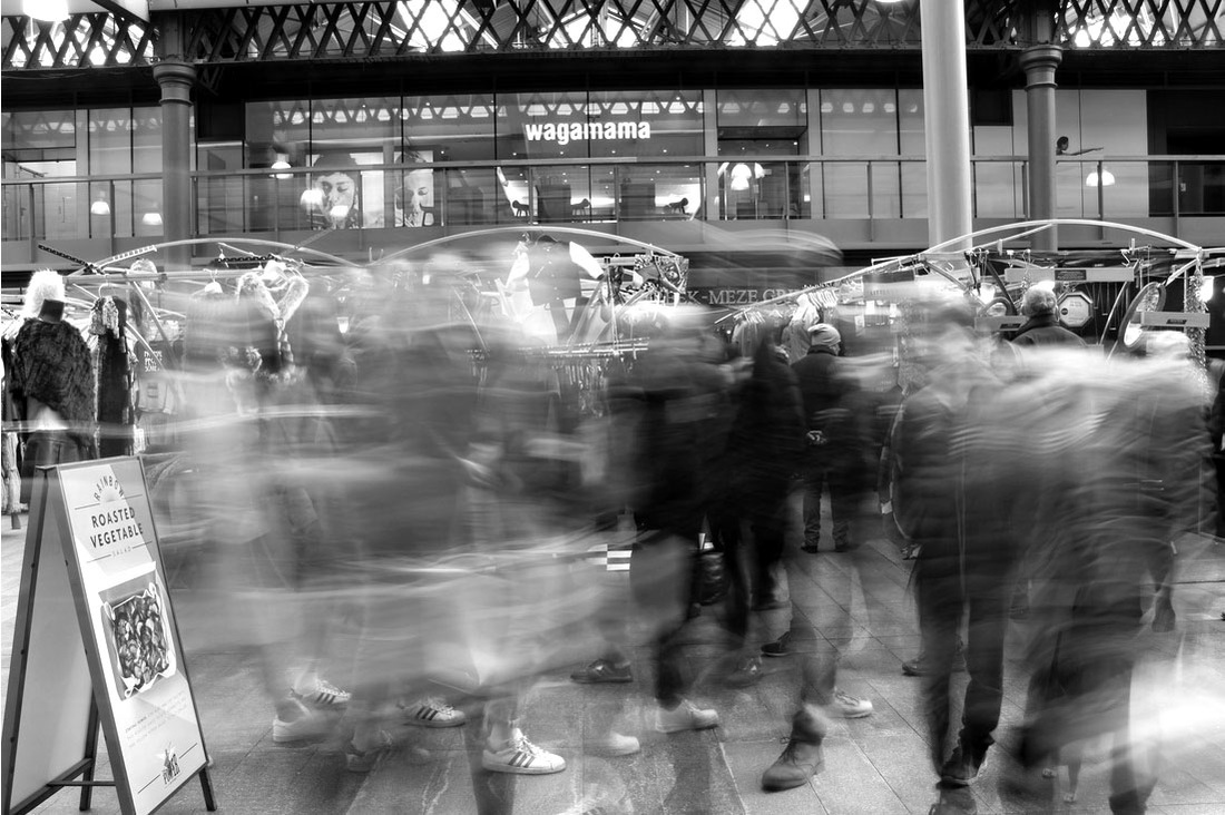
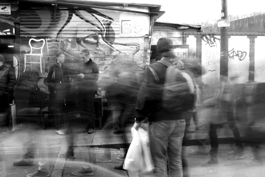
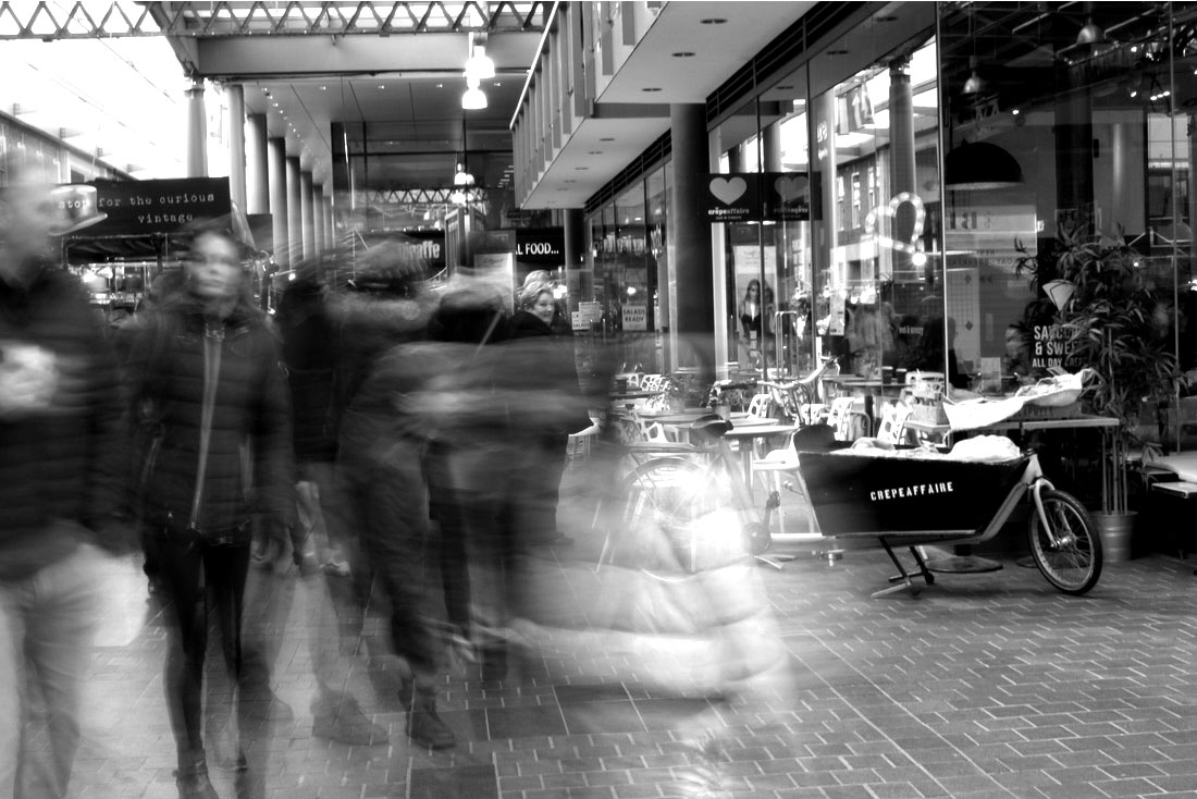
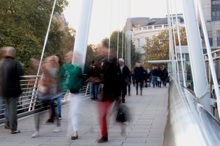
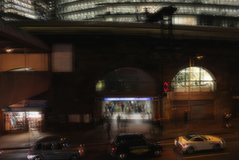
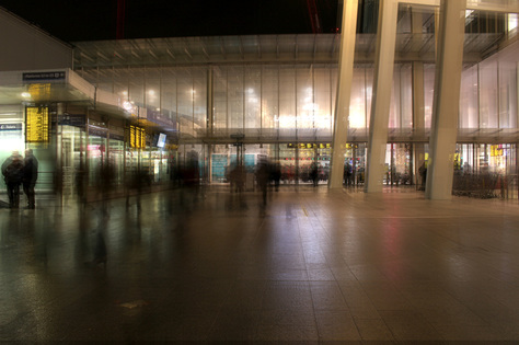
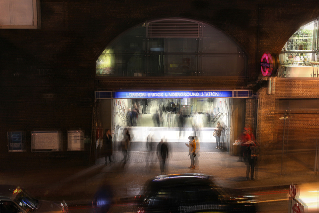
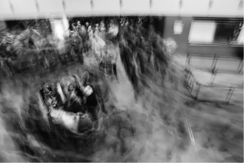
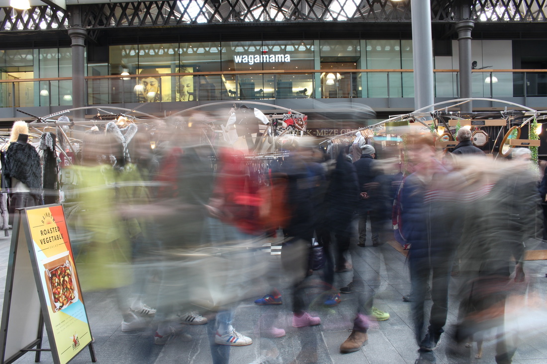
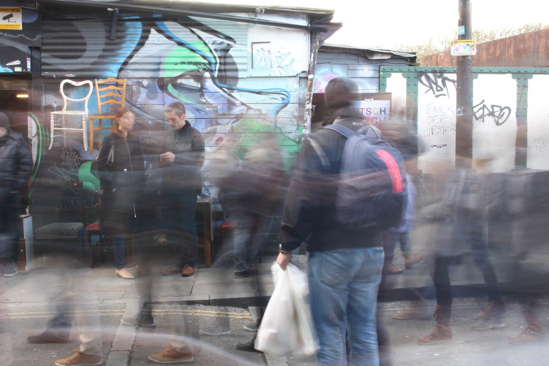
Long Exposure
For this response, I chose to portray 'city disorder' through long exposure images. I chose this because I really like the final effect that these types of photographs give and I also think there are a lot of different things you can capture when doing these pictures, allowing you to be creative and improvise subjects to photograph as you go along. I also like this particular method as it combines many different bigger topics such as movement, disorder, etc. Below are some of the best images I took in my first long exposure response. When I take my second response I will make the outcome photographs better by using a tripod, and shooting when it is less bright to avoid over exposure.
|
|
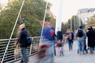
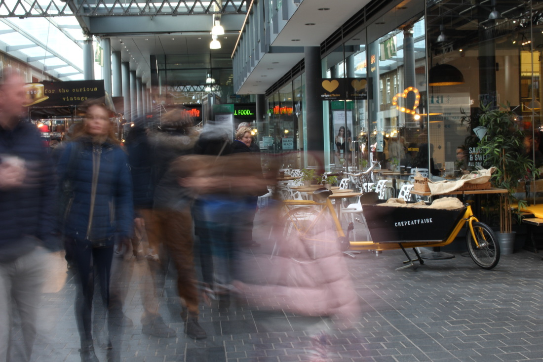
For the images below I tried to portray the movement of the people in the foreground, whilst maintaining the stillness of the background. For the first image, I struggled using a longer shutter speed as the pictures would come out looking over exposed and far too bright because I tried to capture them in midday. When I go back and do my second response I will take the pictures when it's darker to get the desired effect without the images looking so bright. I played around with the settings on my camera until I was happy with the way the images were coming out, but none that I captured were pleasing to me so I edited them to get the desired look.
|

My first attempts at the long exposure style images
|
|


My Alexey Titarenko style edits (first artist response)
|
|
|

|
|
Gifs
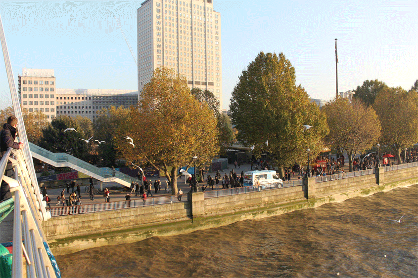
For this section I wanted portray 'city disorder' through gifs. I thought this would be interesting as it's quite similar to long exposure pictures as it shows something happening over a period of few seconds, instead these are taken in a series of different photographs as opposed to one, single image. I also thought this technique would be interesting to use in city disorder as it shows movement, but also shows things that aren't moving. For example, in the gifs below everything in the foreground is moving quite quickly and busily, whereas, in the background all the nature is still.
|
|
|
|
|
Further Development
|
|
Process:
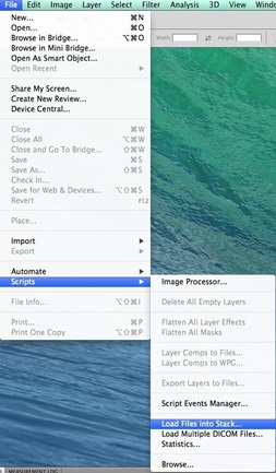
First I opened Photoshop, went to file > scripts > load files into stack...
|
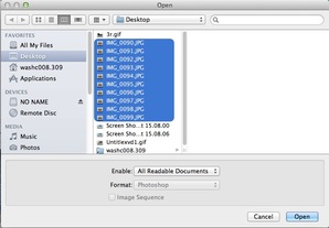
Then selected all the images that I would be using for my gif...
|
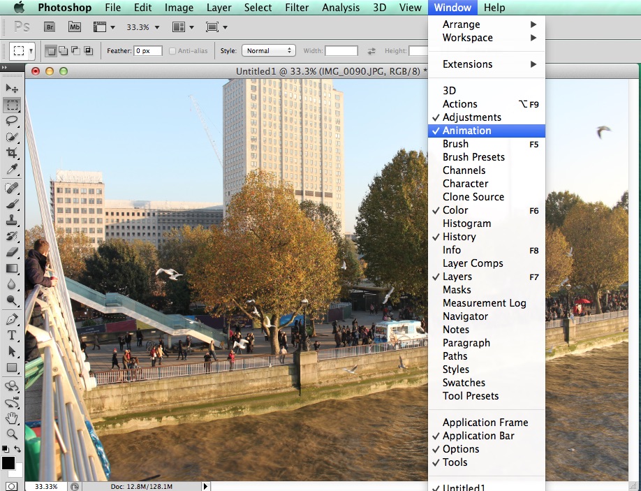
Once all the images I wanted were loaded into Photoshop, I went to window > animation...
|
|
|
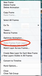
After I made my gif, I had to make it smaller in order for it to work properly on weebly...
|
|
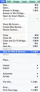
Once I had made my gif small enough, I went to file > save for web & devices...
|
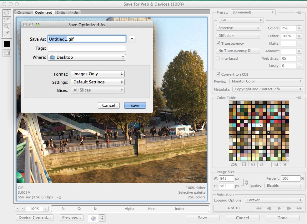
Finally, once it shows me what my gif will look like I pressed save > save...
|
Final Outcome:
Final Development
Stephanie Jung
Stephanie Jung is a freelance photographer based in Berlin, Germany. In 2010 she finished her studies in Visual Communications, where she discovered her passion for experimental photography. Since 2012 she is working as a freelance photographer, focussing on fine art and portrait photography. She loves to travel all over the world, especially to big cities, to capture the vibrant and hectic mood of a place. But her work is not just about citylife, it's about time and caducity, about capturing special moments getting lost in time. Some of her work has been published in different magazines as well as exhibited in art galleries.
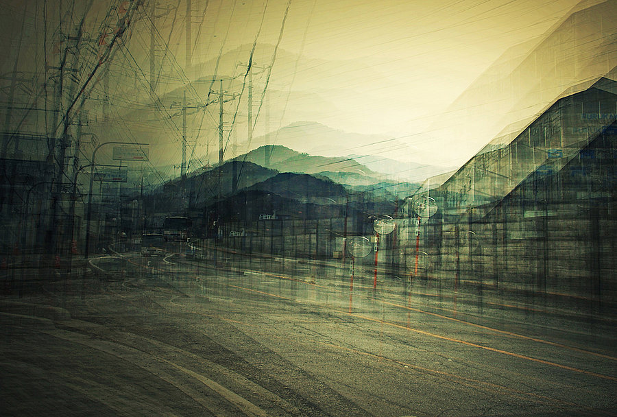
|
This photograph of Jung's is called 'A View Of Paris'. I like this picture because it features two contrasting moods. For example, the lights of the cars in the centre of the image have a very warm feeling, as do the warm yellow tones in the sky. Then the cool blues of the buildings on the sides of the roads thats get a darker shade as they get closer to the edge of the photograph. I think this gives the image a lot of depth and differentiates it from her other photographs. I also think this technique enables the viewer to be able to see what the atmosphere of the day is like even with the shaky effect that Jung uses in her images.
|
I also think this photograph is quite different to those that Jung usually takes as the main focal point of the image is concentrated and the whole photograph is actually the main focal point. I also think that the signature technique that Jung uses looks quite interesting when concentrated on only one subject as it gives the plant quite a misty, cold feeling and makes it seems almost as if there is no effect on the image and that it was taken on a cold day. I also think the way that Jung has made some sections of the image in focus and some not is very effective as it gives the photograph quite a ghostly feeling, but also has sharp details.
|
I think this last photograph has quite a different mood to the previous two as it is rather dark and gloomy. In this image you can really see the type of atmosphere Jung managed to capture which is really effective as the mood of the image can completely change how the viewer perceives it. Secondly, I think the way that the wires in the roads turned out with the effect Jung uses is really interesting as it emphasises her signature layering technique and adds to the overall mood of the image. The several small details in certain parts of the photograph make it very intriguing and allow the viewer to concentrate further into the picture.
|
|
Alexey Titarenko Response
|
Stephanie Jung Response
|
Further Expansion
WWW - My response to Alexey Titarenko had good use of effect, the locations I took the pictures in were useful as they were crowded and helped strengthen the blur effect of images.
EBI - The pictures were taken closer to the subjects so they are more detailed and you can better see the blurred effect Titarenko uses throughout his pictures.
EBI - The pictures were taken closer to the subjects so they are more detailed and you can better see the blurred effect Titarenko uses throughout his pictures.
When I go to expand my Alexey Titarenko response further I will take inspiration from a past student. I like the way she has used a lot of blurring in the photograph to enhance the technique Titarenko uses. I also like the way she focuses quite closely on the subjects of the image, making the photographs more detailed and ghostly.
What I intend my pictures to look like:
What I intend my pictures to look like:
Final Response
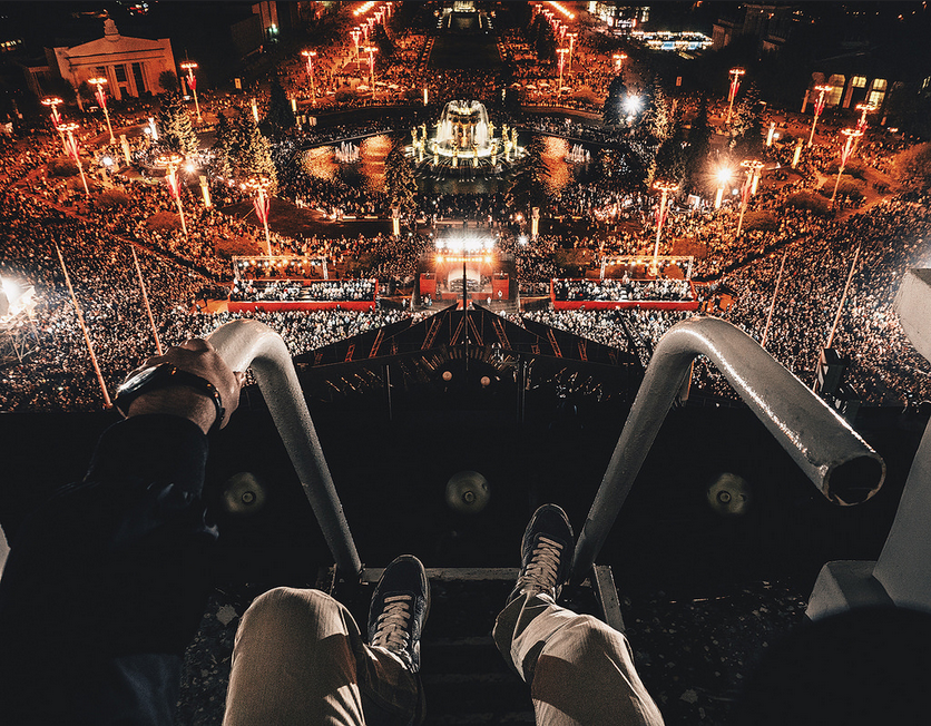
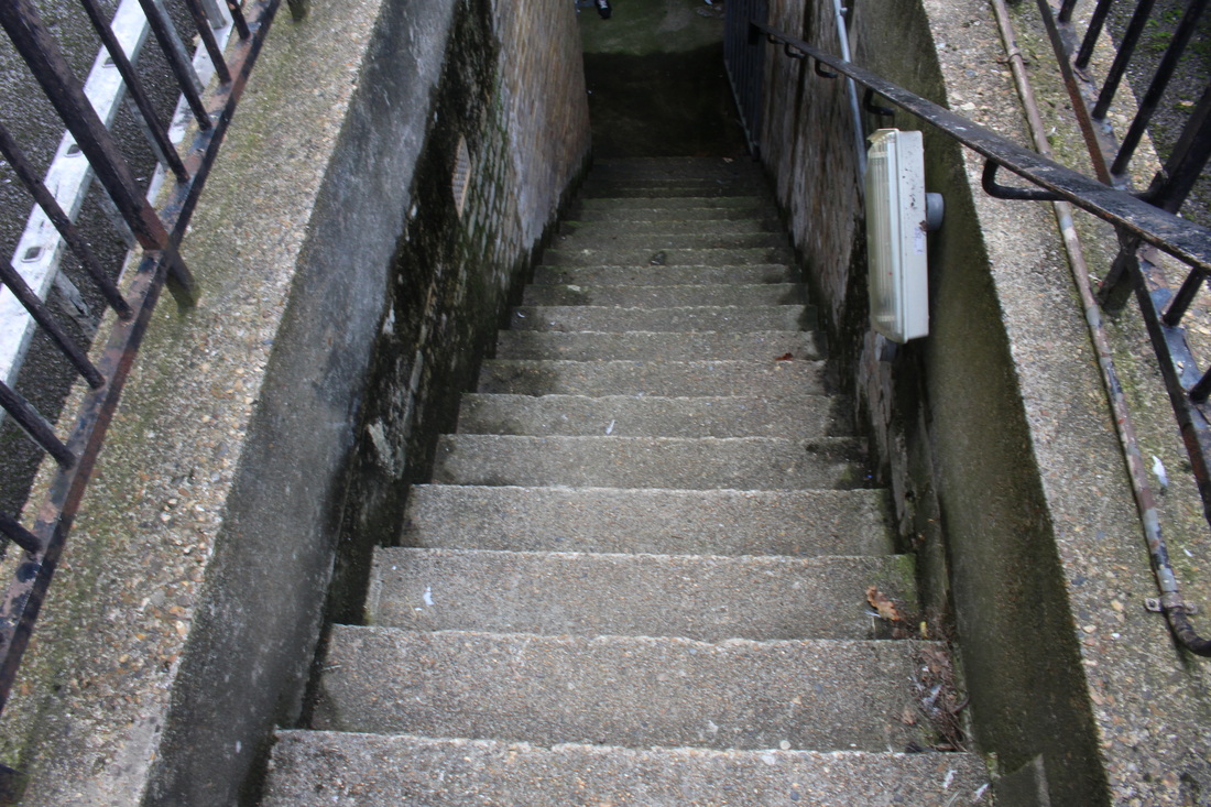
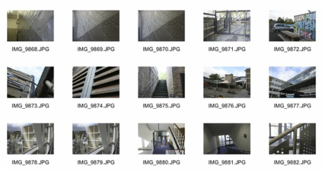
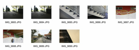
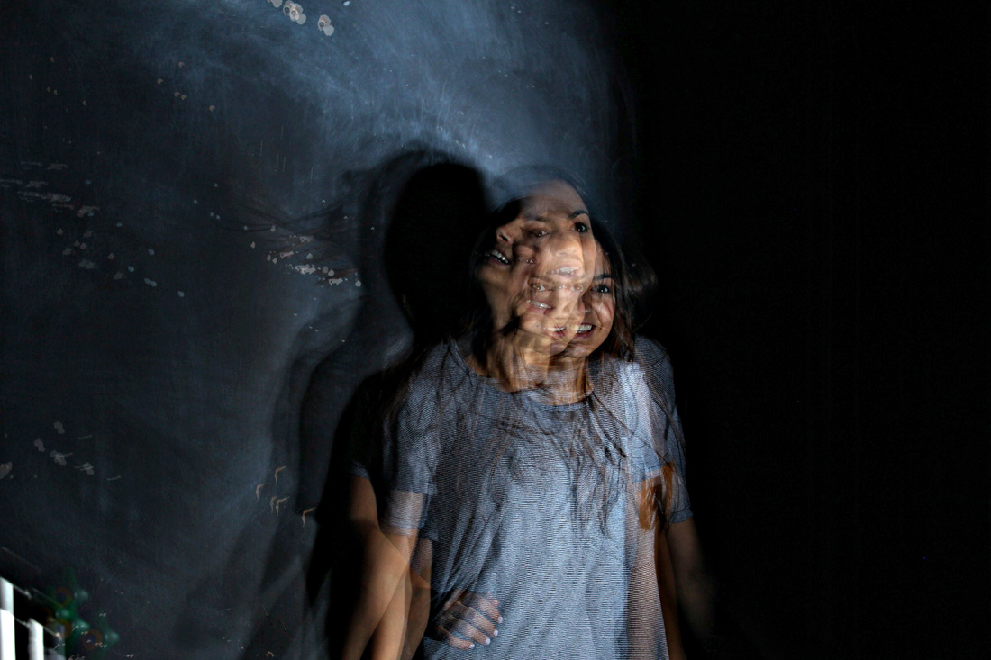
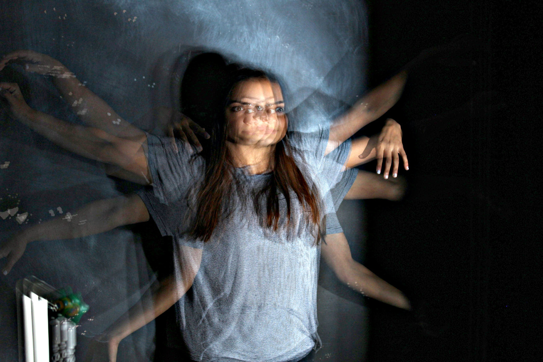
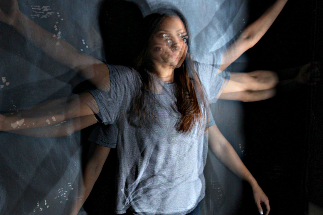
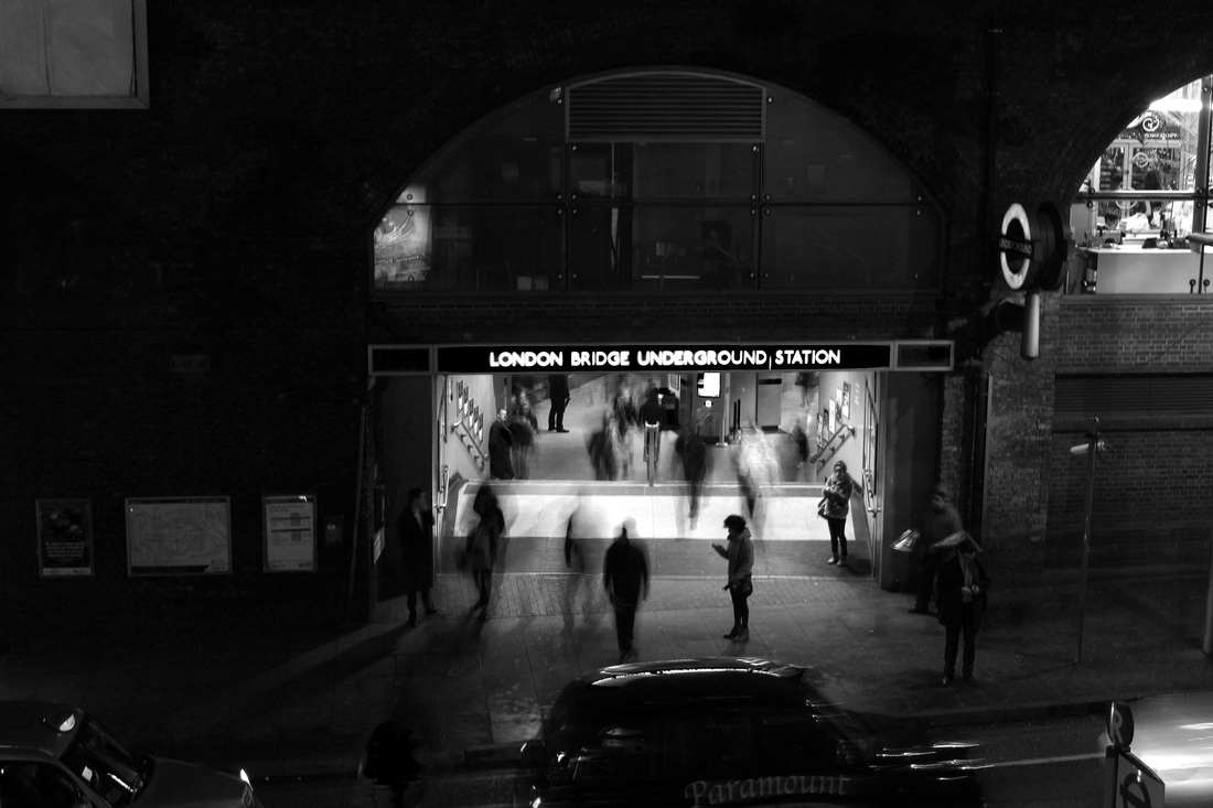
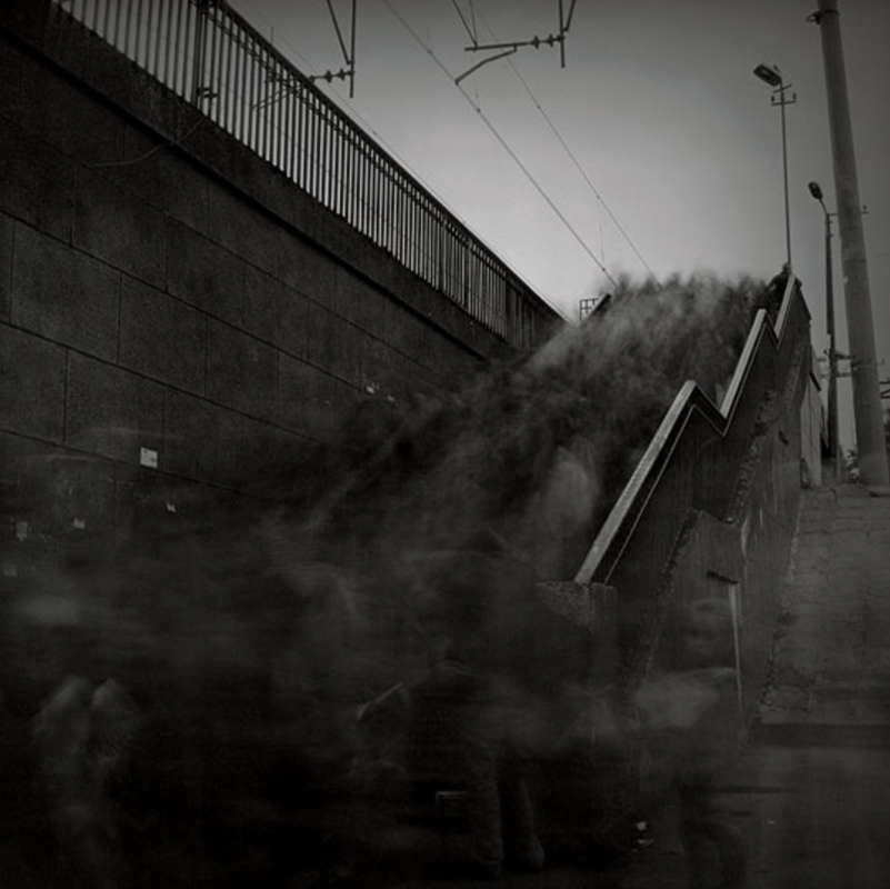
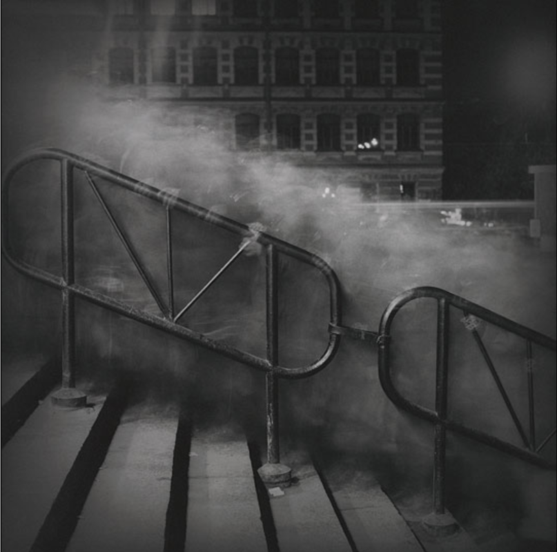
For my final response of long exposure photographs I tried to capture more close up images of people moving, in order to achieve more of a ghostly effect similar to Alexey Titarenko as I found his work very interesting. In the images I took for this final response I tried to incorporate some sort of object that was still in the foreground of the photographs to emphasise the movement within the pictures. I got this idea from a particular series of photographs taken by Titarenko (shown below) in which he uses stair-case handles in the images, which I thought made the pictures much more effective and enhanced the long exposure technique that he uses.
|
|
Final Piece