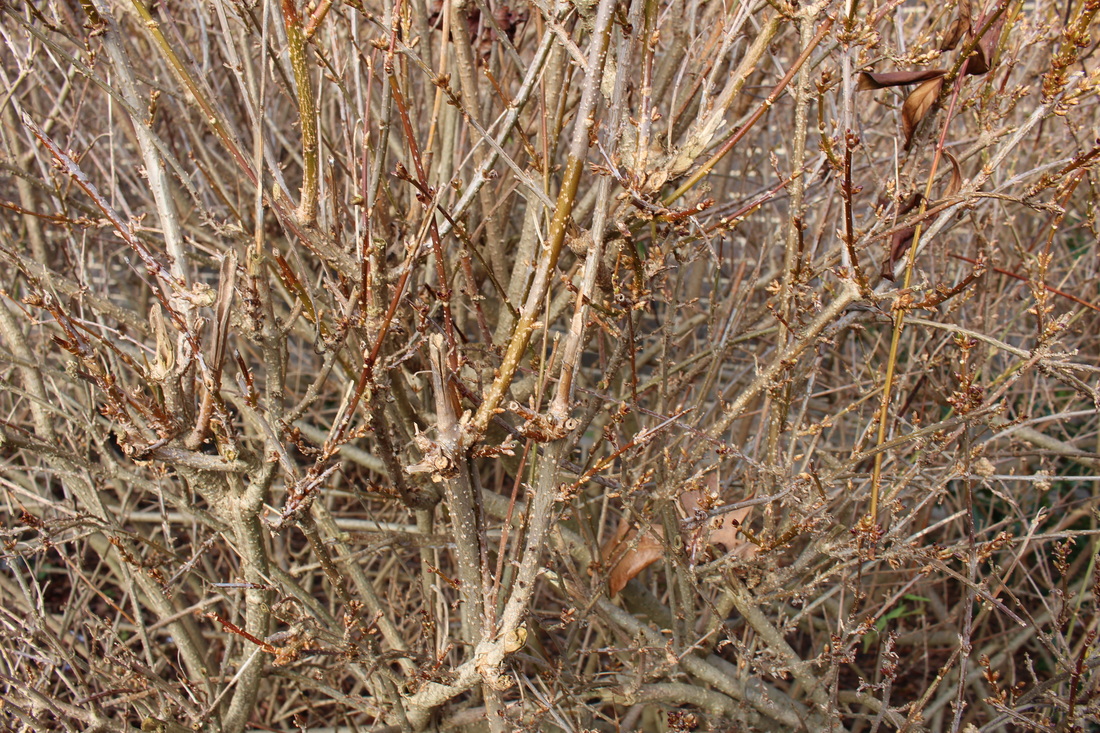
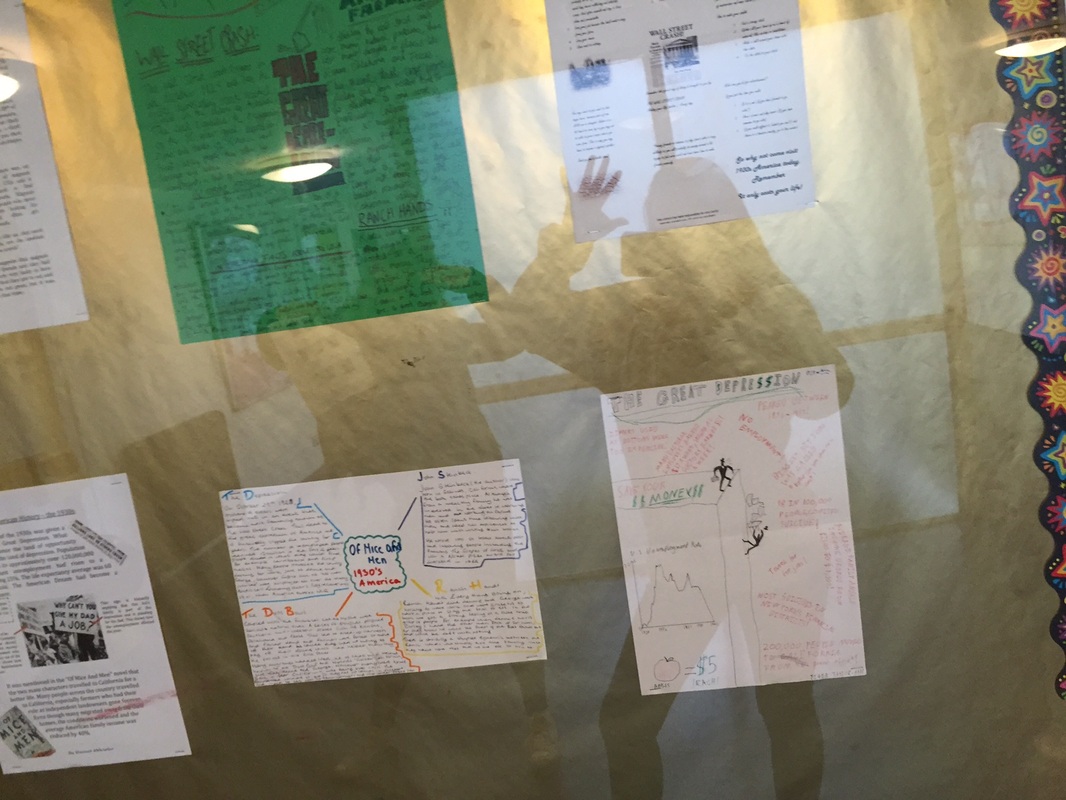
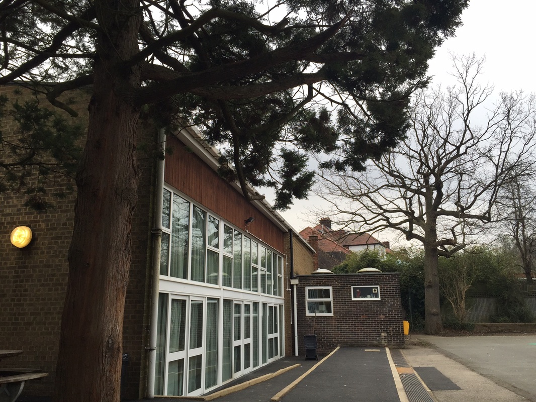
Landscapes - Around The School
Framing The Subject - Around School
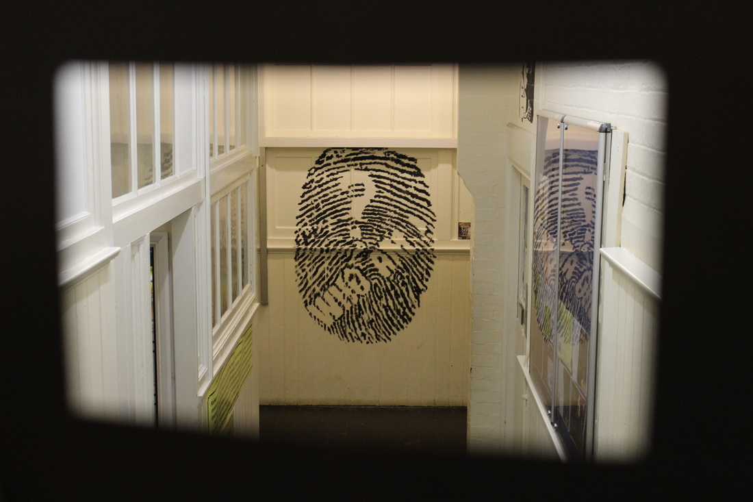
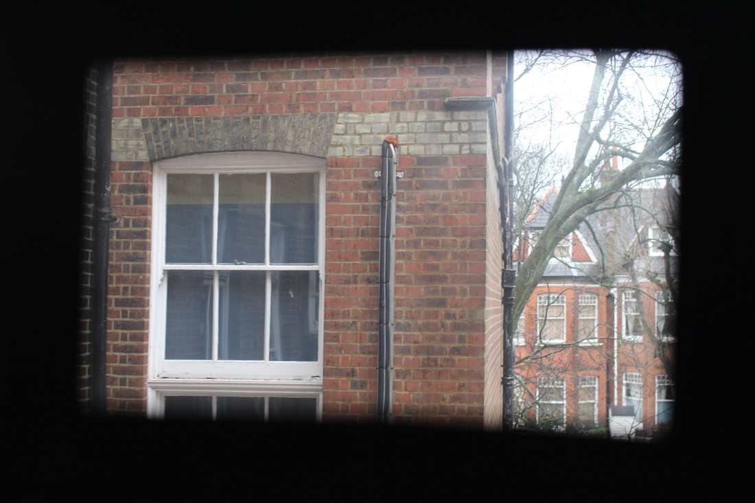
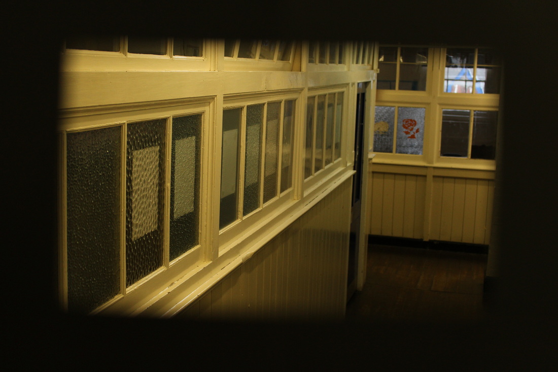
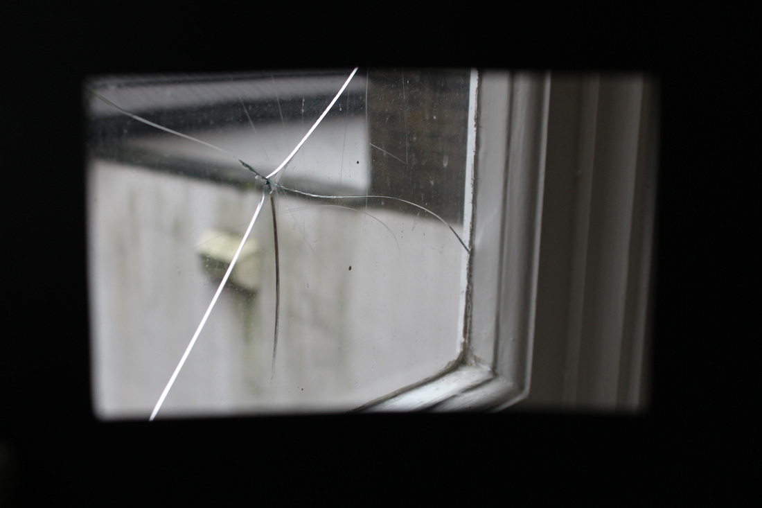
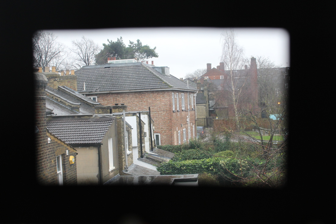
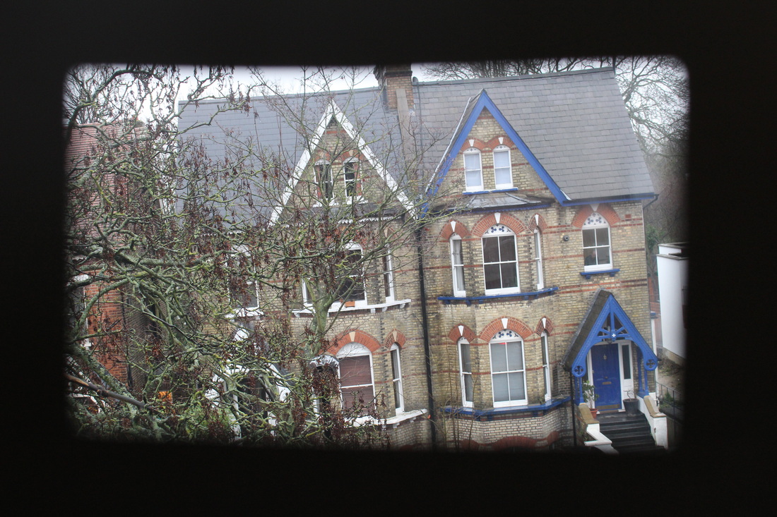
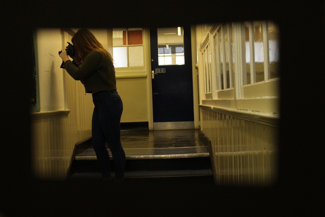
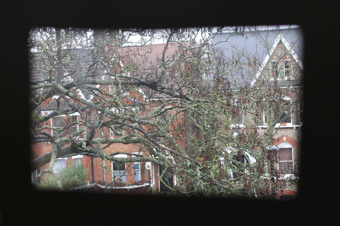
Photographs in this section are taken through a frame to make the subject landscape of the photograph appear more interesting and different to normal landscape photography. These photographs enable photographers to get the outcome photograph closer to the desired image in their mind by framing exactly what they want the eye to automatically focus on.
Homework Response
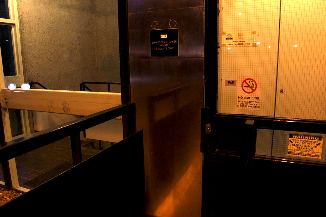
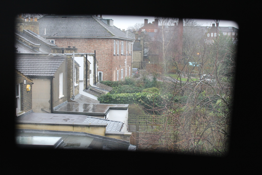
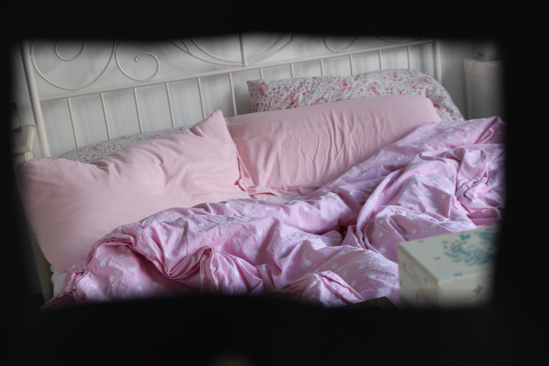
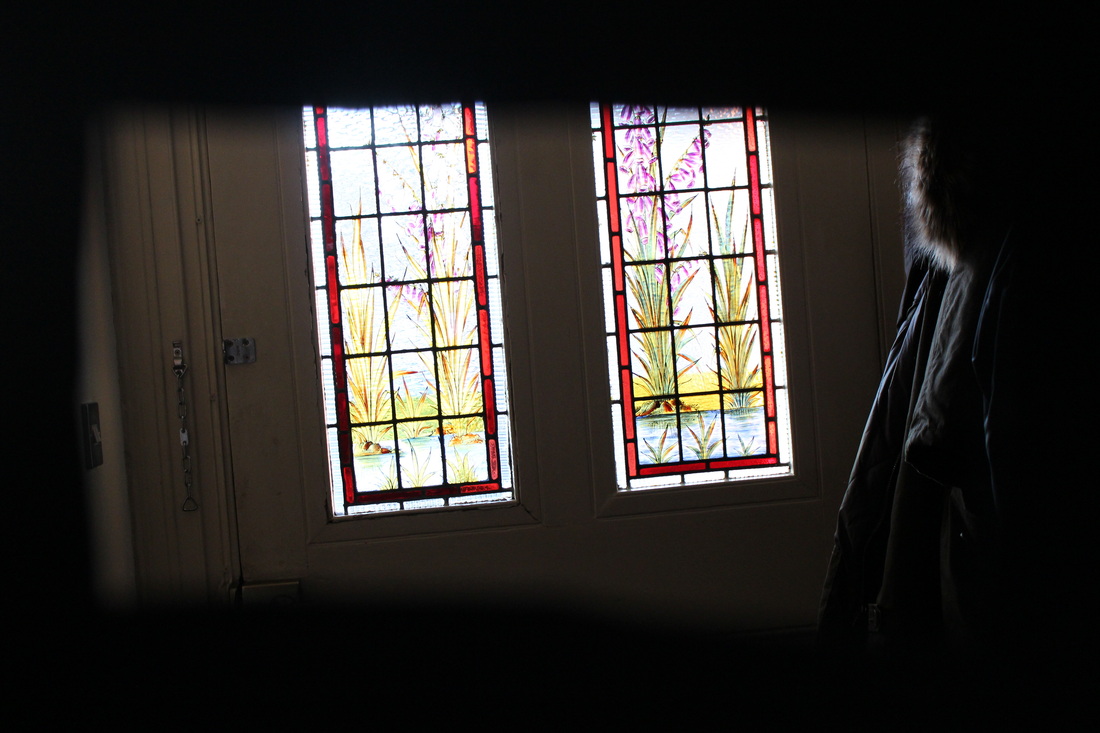
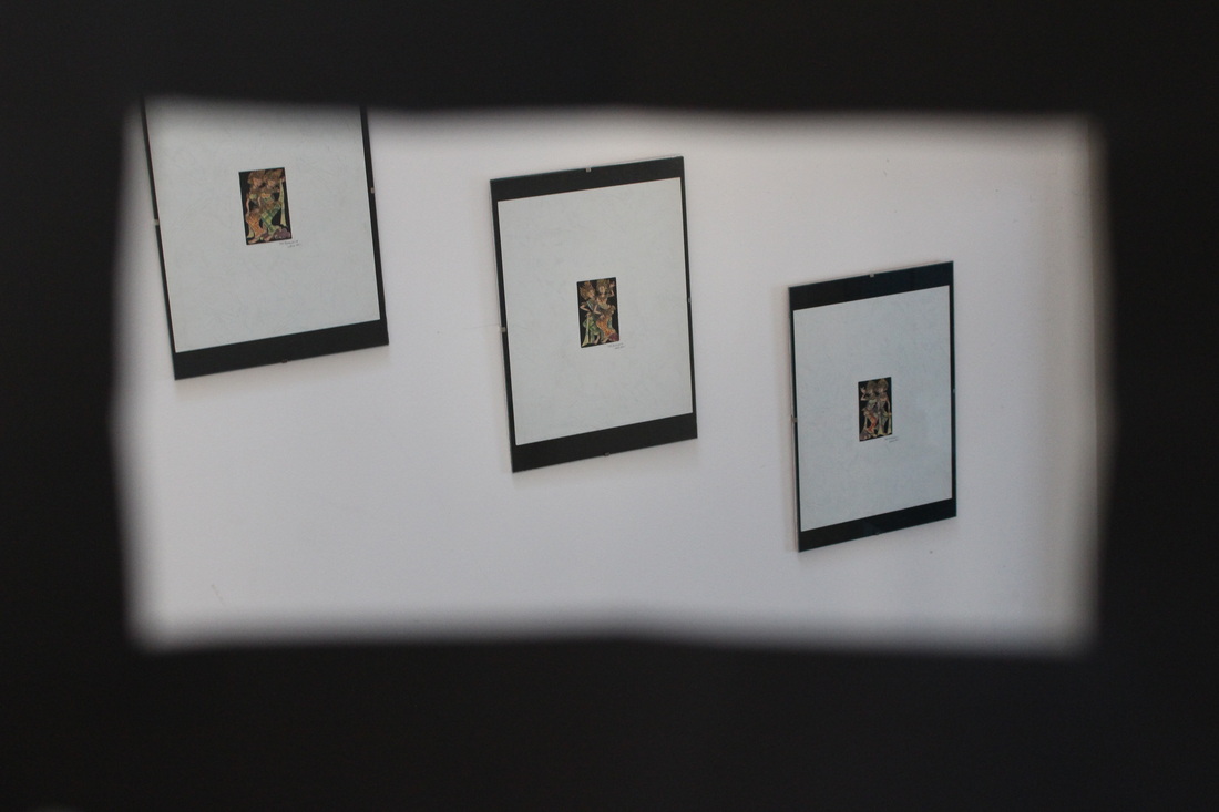
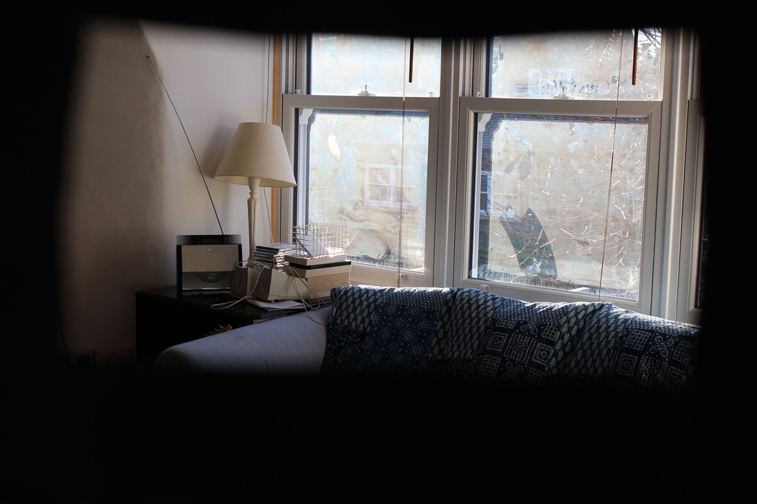
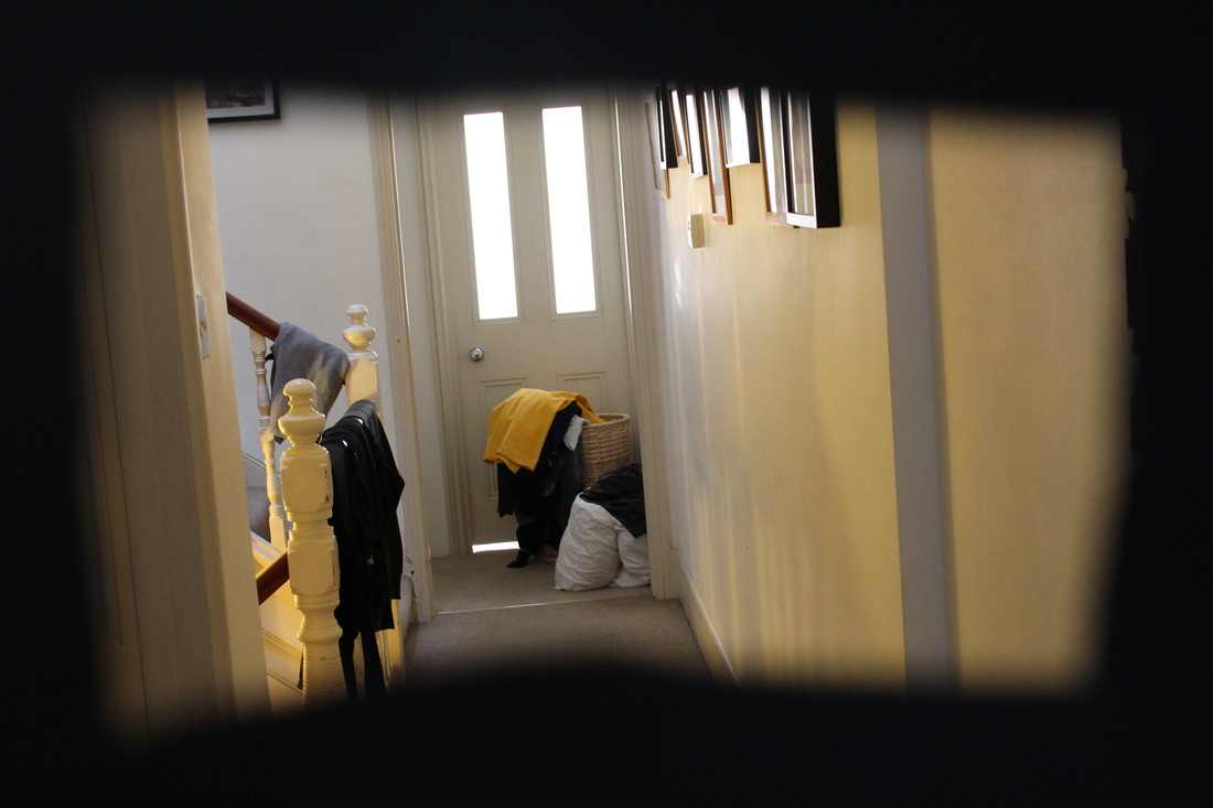
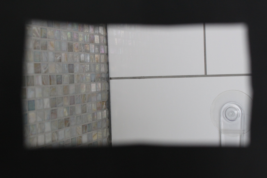
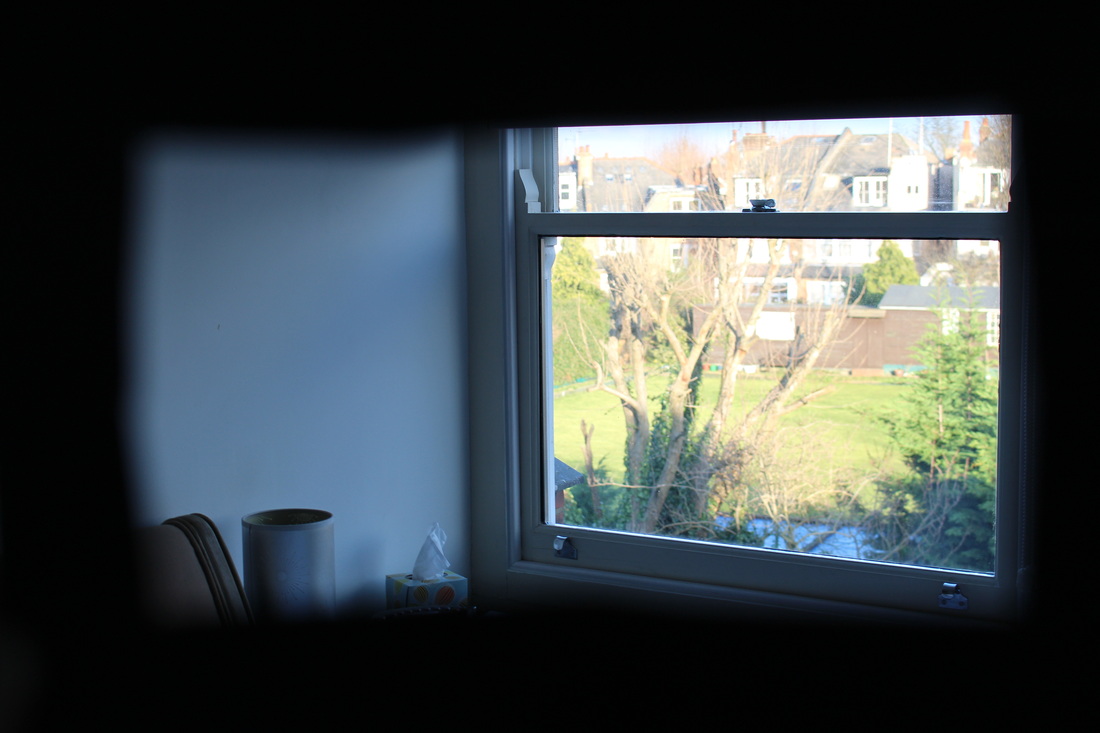
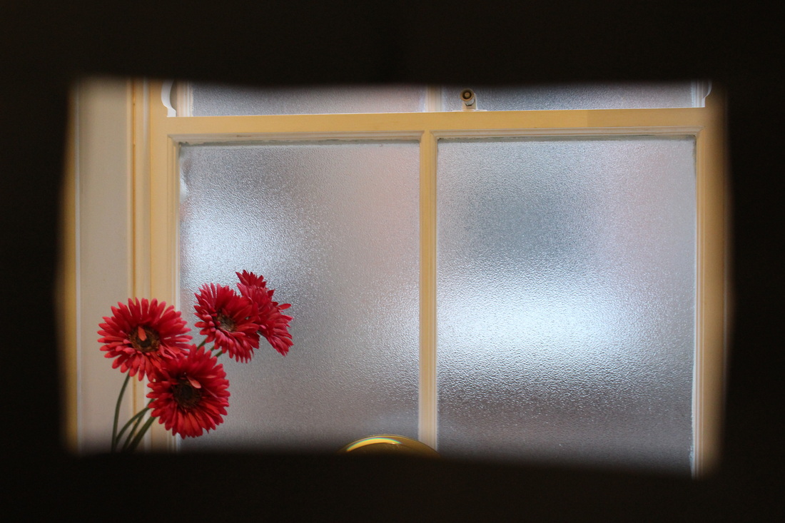
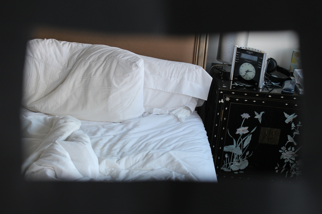
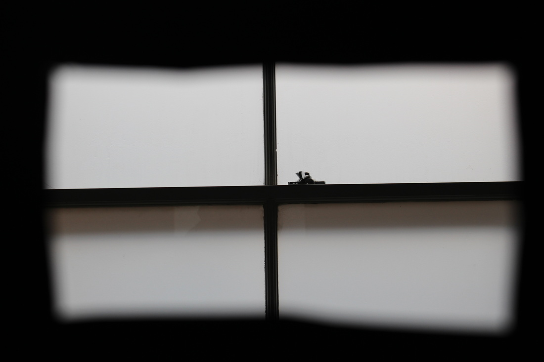
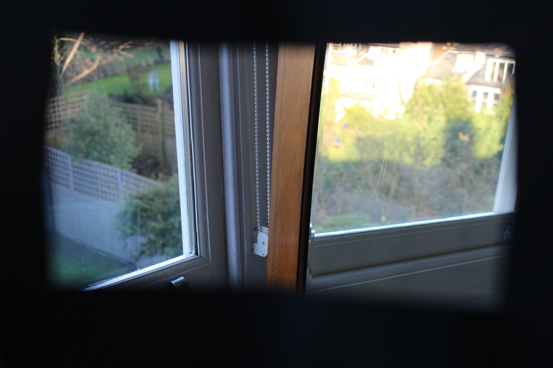
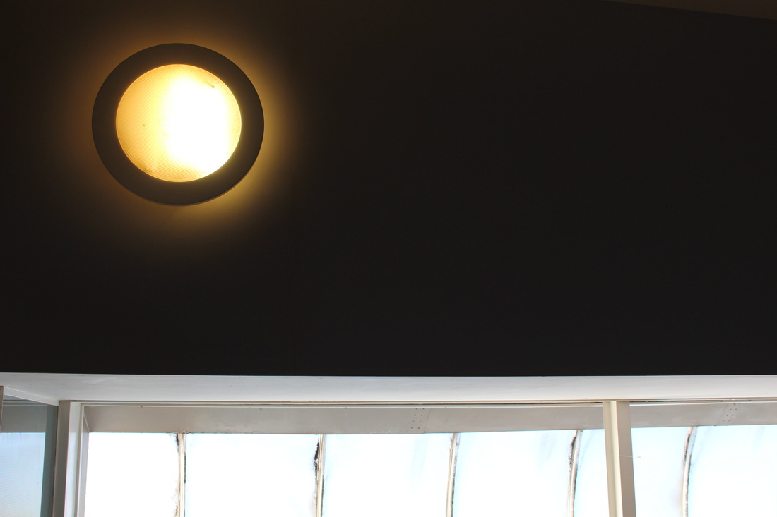
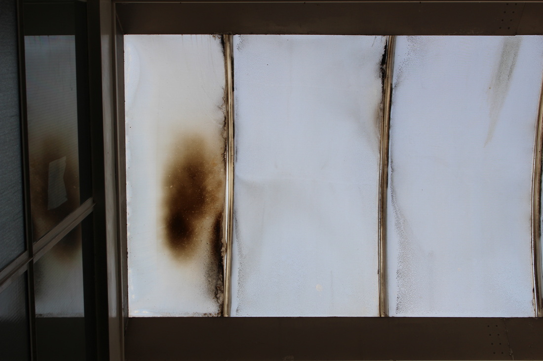
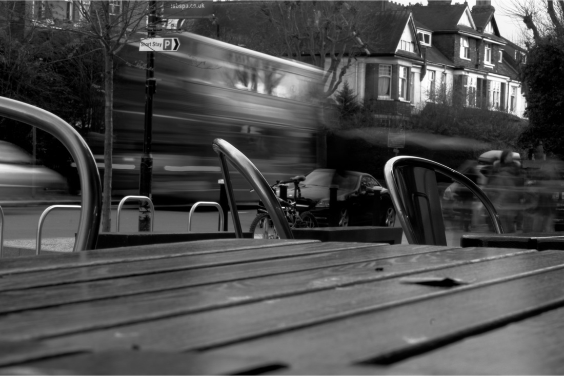
For my homework response, I took several images around my house using the black, cardboard frame we created in class. Through taking these images in intended to portray an interior landscape method. Several of the photographs are taken of windows in which you can see out from the interior into the exterior. This was something I found particularly interesting when I was taking the photographs.

Photographer Analysis
Guy Tal
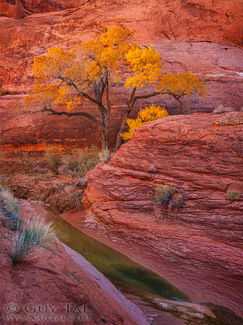
This photograph is appropriately named 'The Glowing Season'. The reason I like this image is because of the inviting, warm yellow/red tones representing Autumn and the changing of seasons in a narrow canyon. Secondly, the river in between the two rocks invites the viewers eyes nicely to see the tree in the background, as the river acts almost as a pathway leading to the tree in the background of the image, which makes the image more interesting and creates more layers within the photograph making the viewer look more intently at the image and analyse it much more naturally.
|
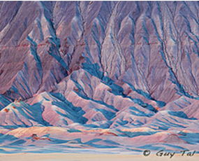
This photograph is called 'Radiant Pastels' and it features in a series of photographs taken by Guy Tal called 'The Good Badlands'. I like this series of pictures because they're all colourful and look almost like drawings or paintings instead of photographs giving off a cartoon/ abstract feel. All the photographs in this series are taken in desert atmospheres, Tal describes the scenery as 'a sun baked wasteland of lifeless grey earth, caked and cracked and carved by rare floods'. I think this photograph is interesting as the photographer is clearly portraying how the landscape is carved by nature and floods, I think this differentiates the photograph from other landscape photography as it is a unique perspective individual to the photographer.
|
Andreas Gursky
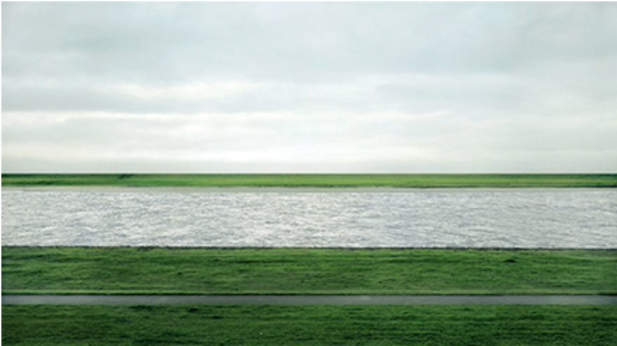
The second photograph of Andreas Gursky's that I chose is titled Rhein II 1999. I think this photograph is interesting as it is quite a different, unique approach to landscape photography. Usually landscapes and environments aren't prefect straight lines whereas this image is very orderly and neat which is very pleasing to the eye of the viewer. Secondly, the colours of the image seem corresponding which makes the viewer wonder wether this is what the photographer intended. Also, the texture of the water between the two strips of grass is rough and bumpy, which coincides with the roughness of the grass. The method Gursky has used sets up the entire aura of the image exactly how he intended it.
|
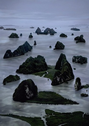
This photograph is called James Bond Island II, it is part of an exhibition of Andreas Gursky's work at Public Delivery also a part of his own series called 'Pyongyang'. I like this photograph because the water surrounding the little islands looks almost like steam and makes it appear unreal. The perspective in many of Gursky's photographs is drawn from an elevated vantage point. This position enables the viewer to encounter scenes, encompassing both the centre and edges of the photograph, which are ordinarily beyond reach.
|
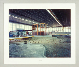
Lynne Cohen
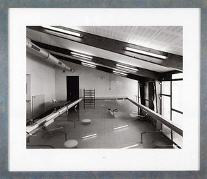
The second photo from Lynne Cohen I also like because of it's unique method of interior space photography and intricate framing. I particularly like Lynne Cohen's frames as I think they intentionally coincide with the landscape in the subject of the photograph. Also, because they make Cohen's photographs look like they're in a scrapbook and gives the image more life and depth which I also think is quite and individual trait. Lastly, Cohen photographs interior spaces that aren't necessarily easy to recognise which makes the image more personal to the viewer as they can very easily create their own interpretation of her work.
|
The reason that i've chosen to look at Lynne Cohen's photos, lastly, is because she uses framing in her photography work which i find very interesting looking and quite an individual method of photography. Something else Lynne Cohen does that i like, is that she is an interior space photographer rather than just a landscape photographer. Also, the interior spaces she photographs are always quite strange and abstract as opposed to a normal interior space like a bedroom or a school, I think this makes her photography a lot more interesting as its unique and creates mystery.
|
John Divola
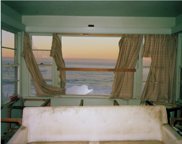
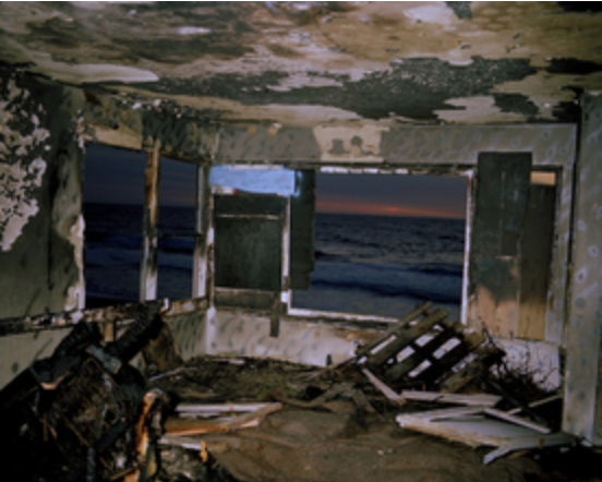
John Divola is a contemporary visual artist currently living in Riverside, California. Divola describes his method of photography as 'exploring the landscape by looking for the edge between the abstract and the specific'. He goes on to say that, he is 'interested in the relation between real artworks and the representations of them, and the issues of the natural and the artificial'. In his famous series of photographs in 1977 he used houses on Zuma Beach and covered their walls in graffiti, then took photos of the ocean landscape through the interior of the derelict buildings. Divola effectively works a schematic desire for escape, movement and transcendence into this series.
Photographs From Zuma Beach
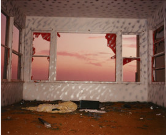
Left -
Lastly, I chose this photograph because the pink
tones and sunrise make the image warmer compared to the previous two. Secondly,
I think that the inside of the frame draws the eyes more toward the landscape
of the pink sky, since there's no furniture and objects inside are quite
sparsely spread out. Lastly, I prefer this image to the other John Divola
pictures i've looked at because the colours are happier and I like the fact
that it's simply a picture of the sky and you cannot see the ground, this fits
the frame of the window very nicely.
Middle -
This second image is similar to the first in
that the frame represents the outside landscape and therefore emphasises the
unique method that Divola employs. I think these images are quite different to
photographs taken in class because the landscapes are more exotic and
intriguing than the landscapes around school. Also, Divola uses window
frames that reciprocate the outside landscape rather than black frames to
simply outline the photograph. I like this image because the it portrays a
clean feel by the colours and textures used within the image.
Right -
Divola's photography all contains an interesting
form of framing a landscape. The thing I like about this photograph, in
particular, is how the interior of the building corresponds with the colour and
intensity of the exterior landscape. This makes the photograph appear much
more neat and pleasing to the viewer's eye. Lastly, this photograph is
different to the previous that i've looked at as it has a more rough, dark
texture. I think that in most of Divola's photographs this technique is used
very tastefully giving all of his images a certain quality that emanates
professionalism.
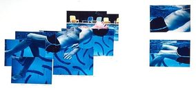
David Hockney
David Hockney is an English painter, draughtsman, print maker, stage designer and photographer. Hockney was born with a condition called synesthesia meaning he sees synthetic colours in response to musical stimuli, however this does not show up in his photography or artwork but more in his set design for ballets or operas. Hockney's method of photography is quite unique as his photographs are made up of sections giving off the effect of a collage, this method is called panography.
Examples Of Hockney's Work
This second photograph is interesting in different ways to the previous. The subject of this image isn't very clear and causes the viewer the need to think and look closely at the image to decide what it is. Hockney's method of photography is quite abstract which is a nice contrast to landscape photography because some landscapes can sometimes appear abstract, whereas some are rather plain. This image is intriguing as the texture of the floor of the landscape is rough and sandy creating a desert feel to the photograph.
|
This photograph is rather interesting to look at because the different sections of the photographs are broken up. Also, some parts of the photograph are left blank, this leaves the viewer to imagine what the rest of the photograph might look like creating more mystery and interest within the image. Lastly, i find this the most interesting of Hockney's photographs that i have chosen to look at because of the different sections of the pictures are split up, whereas Hockney has chosen to keep the colours of the image corresponding which makes the image seem almost as if it hasn't been broken up and is naturally like that.
|
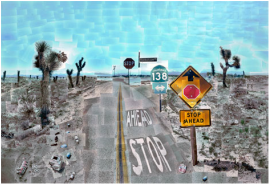
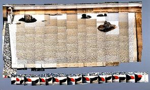
Lastly, the third photograph of Hockney's that I have chosen to analyse, is the above, titled 'Pear Blossom'. I think this image is particularly interesting because you can tell what the landscape subject of the photograph is, which allows the viewer to see the intention of the photographer much more clearly. It's a clear image of a desert motorway somewhere in America, however the image is broken up and distorted in the signature method Hockney continually portrays.
|
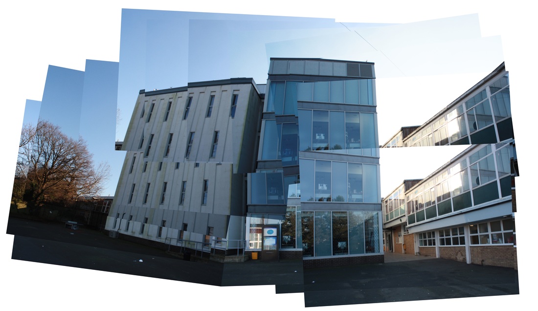
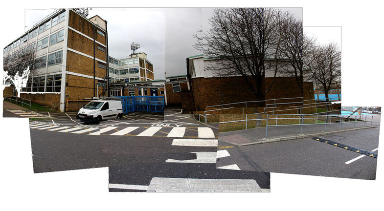
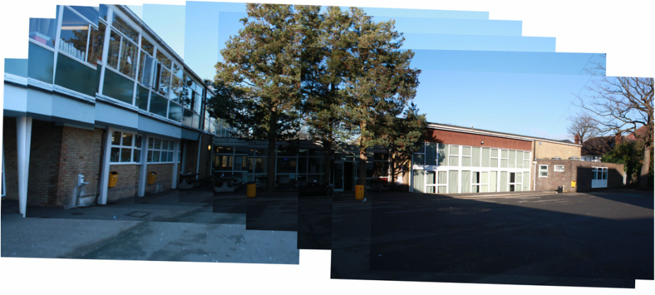
Panography
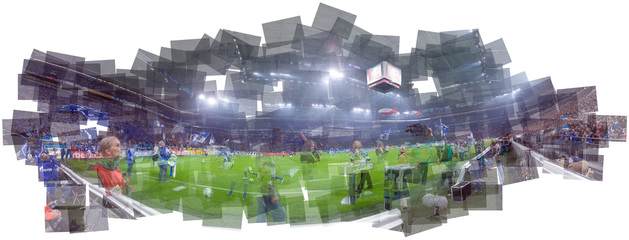
Panography, or a 'joiner', is a photographic technique in which one picture is assembled from several overlapping photographs. Panographs may resemble a wide-angle or panoramic view of a scene. Panographs are taken by shooting several different images from different angles and different view points of the same scenery. You can then either blend the different images together manually, or using a digital image editing software, such as photoshop.
Panography Around School
The Formal Elements
The formal elements are eight basic techniques that make a photograph more aesthetically pleasing and interesting to look at. This section of photographs was taken around school in order to represent the simple formal elements in photography. All elements are crucial to a photographer to give life and intrigue to the images that they create. These formal elements can also be manipulated in unique ways to make an image or images more creative and personal to the photographer and allow their photographs to be perceived in different ways.
Layers
Contrast
Perspective
Negative Space
|
Focus
Texture
Pattern
Scale
|
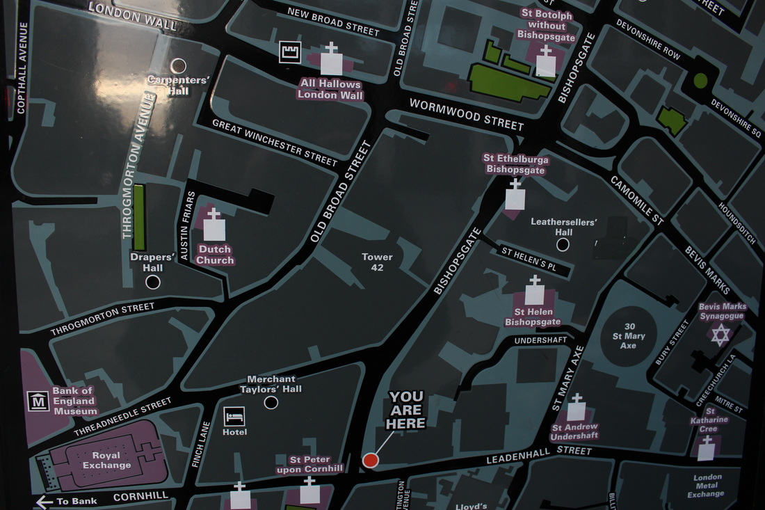
Homework Response
For my homework response I planned a rough, 30 minute walk around an area that I thought would portray the them of 'My London' well and took photographs showing the formal elements. Below is a map showing the area I captured these pictures around:
Photographs From The Walk
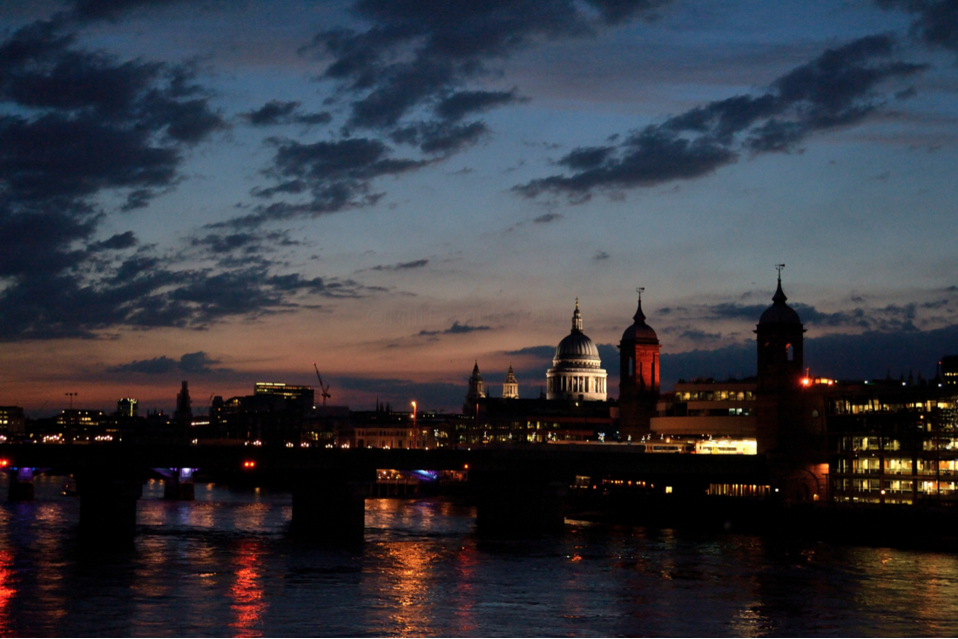
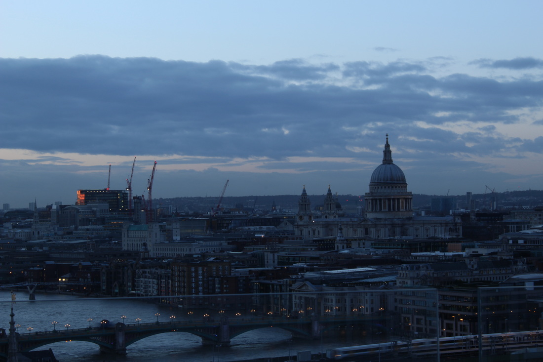
My London
Task 1: Artist Examples
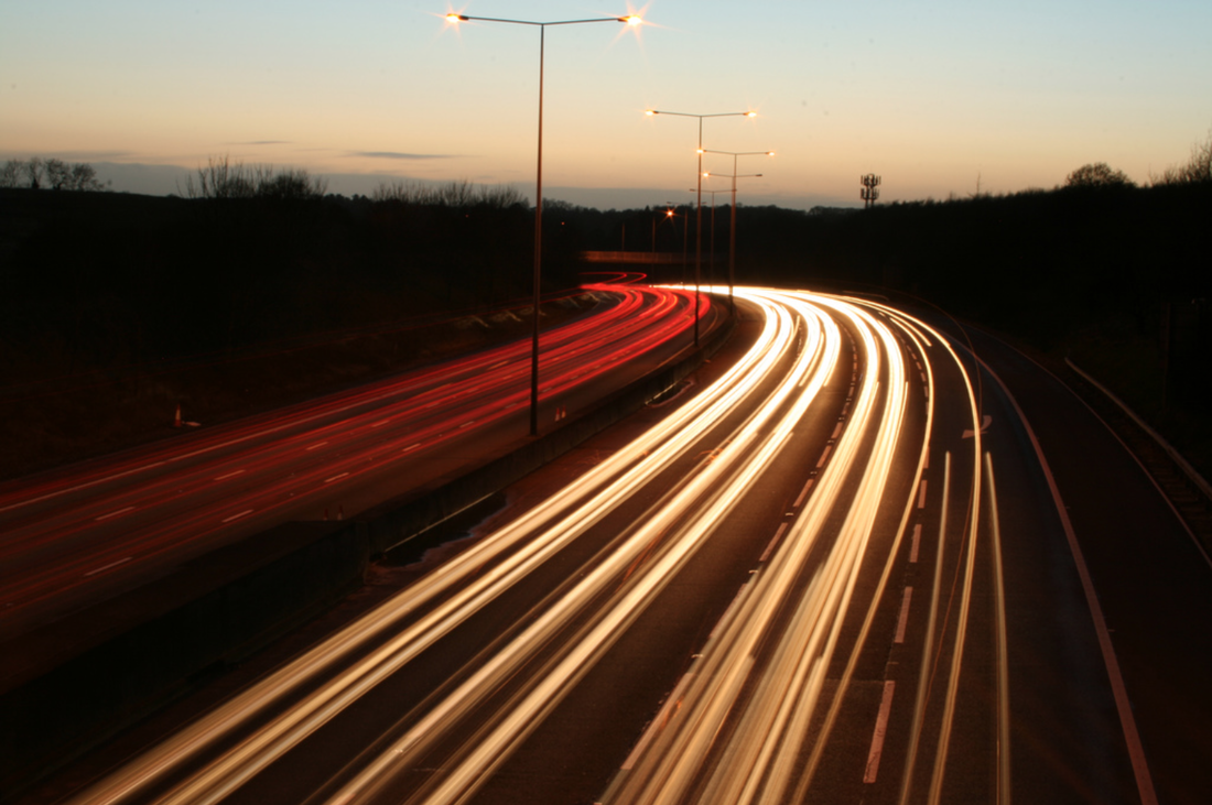
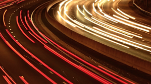
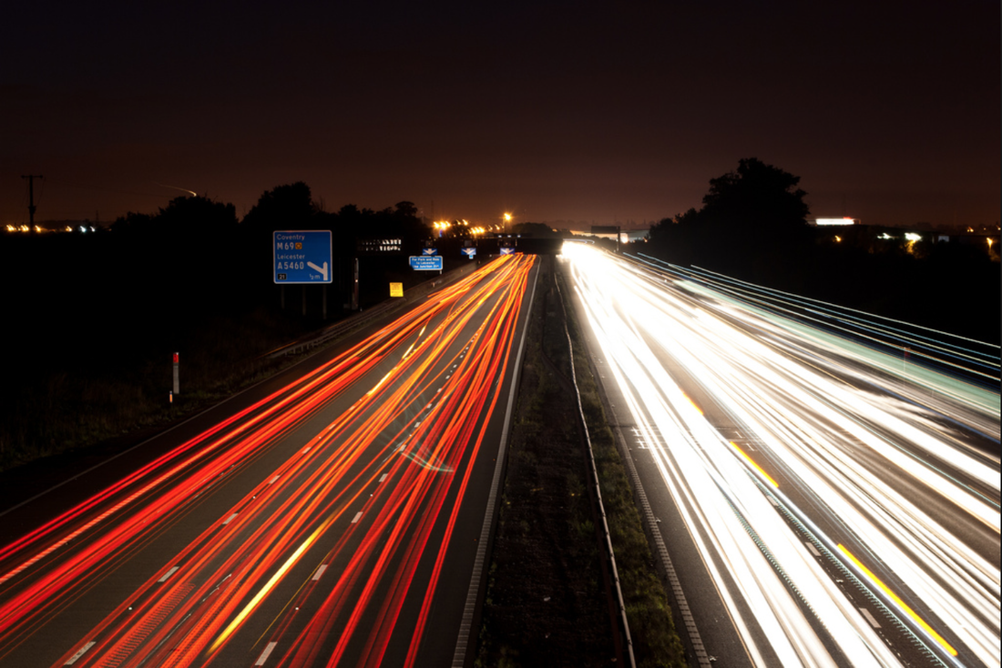
For the second task I chose nine different photographers that will inspire the photographs I choose to take for my final piece. I chose a few different photographers that portrayed all the different aspects of city photography that I wanted to show in my own work, so when I come to take my final images I will be able to draw ideas from other photographers that have done the same thing. The images I have chosen are shown below and all represent some kind of long exposure photography, or night photography of city skylines.
|
Bob Collins

|
Sascha Kohlmann
|
Milt Farquhar

|
Richard Murgatroyd
|
Matt Wain
|
|
Bob McCaffrey
|
John Lamb
|
Carl Spencer
|
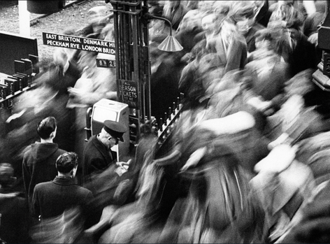
Further Analysis
For this section, I have chosen to further analyse this particular photograph as I feel it is a very strong picture and represents the 'My London' task well. In analysing this picture, I will also try to incorporate aspects of the image into my own photography.
|
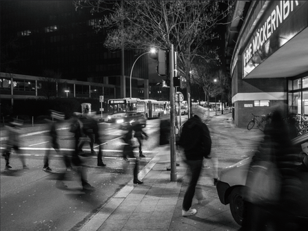
I chose to analyse this photograph further because I think it's a really interesting way of capturing crowds of people. I also think this kind of photography fits in particularly well to the 'My London' section as it very obviously portrays the aspect of how crowded and busy it is. Something I think makes this photograph especially effective is the way that some details are in focus, and everything around is blurred. i think this makes the image much more interesting as it allows the viewer to see the contrast between the focused sections of the image and the blurred sections. In this particular photograph, I like the way that there are a few people still in focus, standing by the phone box. I think this puts the element of movement within the photograph into perspective, as you can see the people standing still compared to those around them moving. It also shows how, in the city, people rarely stop moving. I think this specific image is interesting for that aspect because it was taken in 1960's London, so the viewer can see the difference between now and then. Also I think the way that the image is in black and white emphasises it's antique look and makes the blur sections look more ghostly and abstract. I also think it gives the entire photograph and much more dramatic effect, making it stronger and more effective.
|
Artist & Me
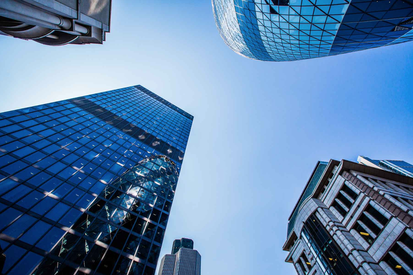
Milt Farquhar's Work
|
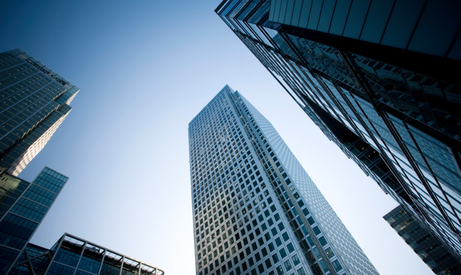
My Work
|
These two images are similar in that they are both taken of the same subject. I think the way Farquhar has set up the angle of his photograph is much more aesthetically pleasing than mine. The scenery in his photograph looks much more aligned and straight, whereas in my image, on the right, the alignment is much more wonky. When I go to improve my images for this response I will try to make them straighter. I think with these types of images, they look much better when everything is aligned and set up neatly. In my photograph, the lighting is a lot more grey and faded, giving the image a more depressing, dull feeling. However, in Farquhar's image, on the right, the lighting is much more dramatic, as some parts of the image are dark, but some parts are lit up quite brightly. I also think the lighting in this image is more effective because there is a lot bigger element of contrast throughout the photograph. For example, in my photograph the clouds are almost the same colour as the sky and you can't really see them as well as you can in the image on the right. I think this adds to the photograph's element of drama and makes it much more effective than the image on the right. Also, in the photograph on the left, the angle is a bit awkward, as the viewer is almost looking down on the buildings, whereas in the image on the right, it is taken at more of a comfortable eye level. I think this makes the image on the left, overall, much more aesthetically pleasing than the image on the right.
Task 2: My London themes
For this task, I took photographs around school following themes, under 'My London', that inspire me and that I may want to embody when I come to capture images for my final piece.
Homework Response
For my homework response to 'My London' themes, I chose to focus more closely at us & nature and negative space because those were the two that stood out most to me and I think look most interesting and have a quite dramatic, strong effect.
Us & Nature
Negative Space
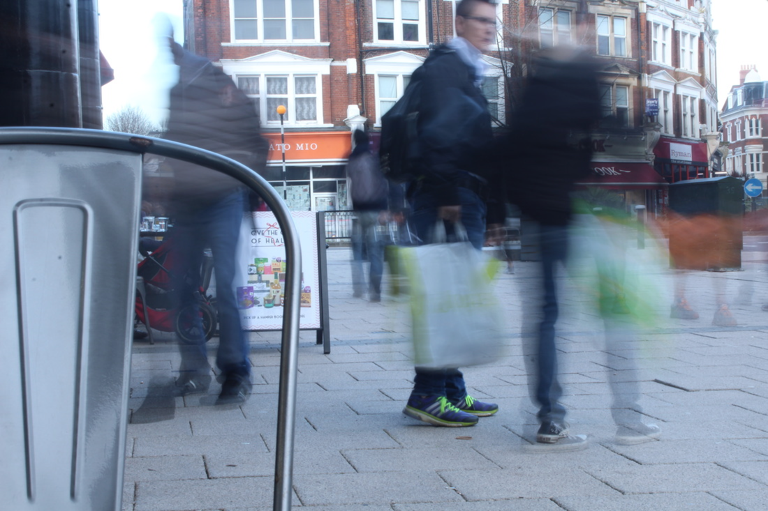
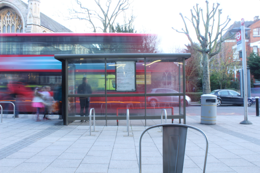
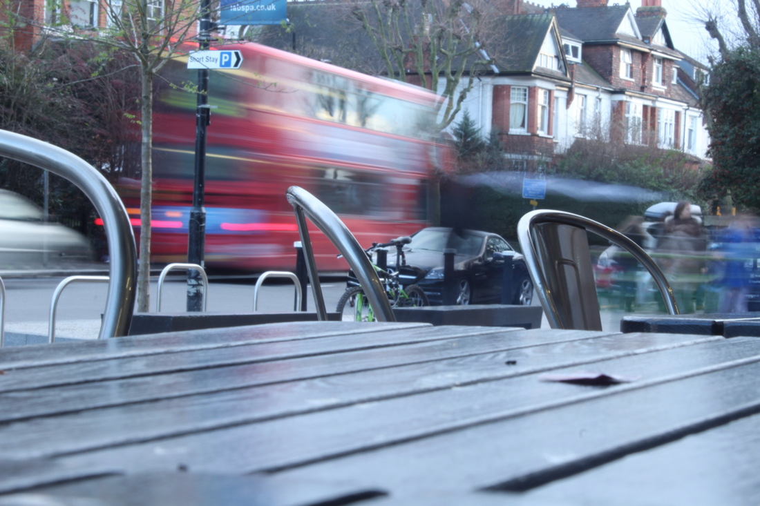
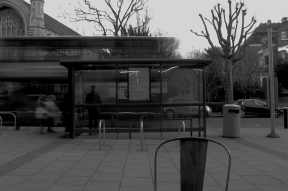
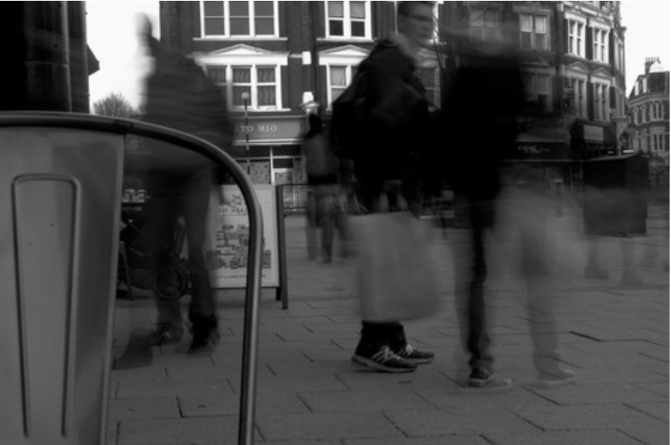
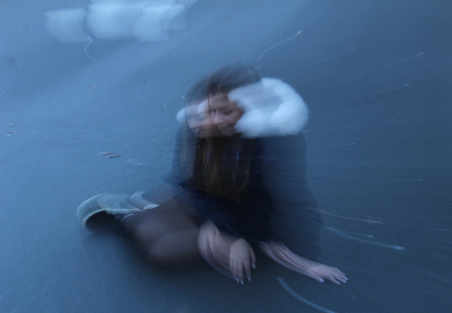
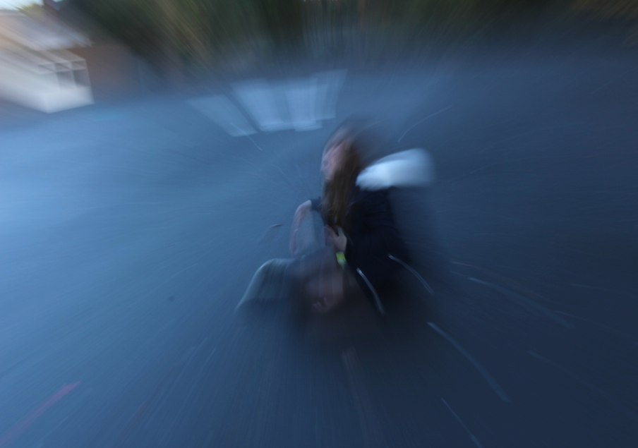
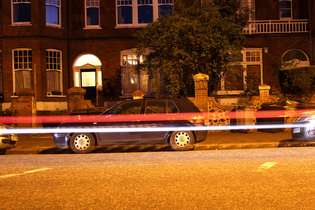
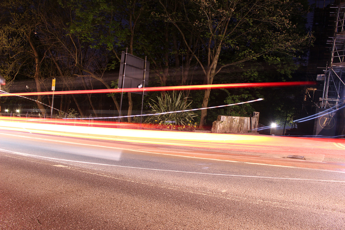
My London First Strand Response - Movement
For my first response to the 'My London' task I am looking to portray movement around London. In the pictures I took I used a slower shutter speed in order to show the movement in the photographs by allowing the subject of the image to be blurred and then background to be still, representing the element of movement in the pictures. I also used a tripod to enable the still parts of the image to remain still. For my first response, shown below, I chose to capture the movement of people. When I further expand this section I will show movement in different ways.
Edits
In response to the artists I looked at for the 'My London' task, I chose to edit these three images, making them black and white. I think they came out looking quite dark and dramatic, which I think is interesting because it gives these types of pictures a completely different effect. Looking at these compared to the photographs in colour, I think black and white puts a lot of dramatic emphasis on the entire photograph, which makes the picture a lot more effective.
|
|
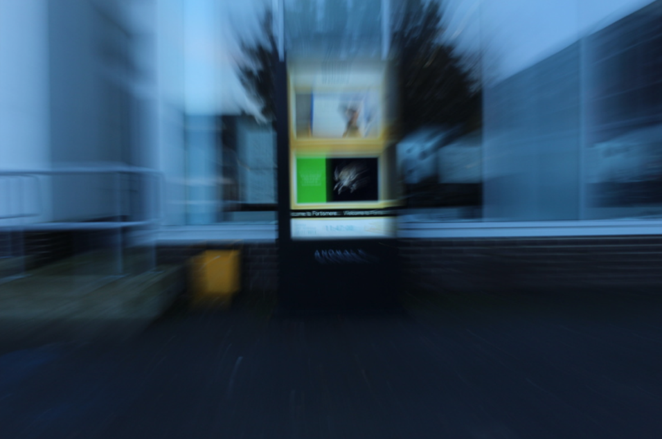
Zoom blur
Zoom blur photos are usually taken using a tripod however, you may not have one, but taking a zoom blur picture without a tripod may add a more dramatic effect to your photograph. Zoom blur photos require a long shutter speed. Once I selected shutter priority mode on my camera I chose a shutter speed of around 1 to 4 seconds. I then focused the camera on the subject of the photo, and zoomed in depending on how blurred I wanted the picture to be; a more zoomed in picture will create more of a blur. As you capture the photo zoom out to give the blur effect to your image. You can also take zoom blur pictures starting with the subject of the picture zoomed, then zoom in as you capture it.
My Response
Zoom Blur in Photoshop
|
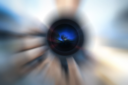
Before:
|
After:
|
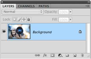
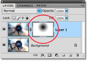
1) Firstly, place the image that you wish to use in a blank photoshop document. Then duplicate the background layer so that you can work on a separate copy of the image, which will allow you to bring back some of the original image later. Looking in the Layers panel, you can see that you currently have one background layer:
|
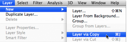
2) To duplicate the background layer, go to the layer menu in the menu bar at the top of the screen. Choose New, and then choose Layer via Copy:
|
|
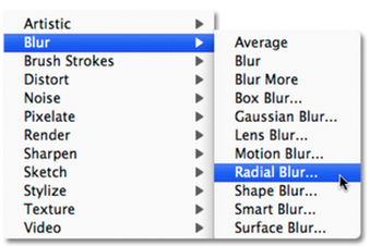
3) After making a copy of the layer, apply the Radial Blur Filter. With "Layer 1" selected, go up to the Filter menu at the top of the screen, choose Blur and then choose Radial Blur:
|
4) Then, use the Blur Centre box on the right side of the radial blur dialog box to set the point where the blur will appear to be 'zooming out' from. Simply click inside the box to set the point. I want my blur effect to be coming from the lens of the camera, so I'm going to click above and the right of centre in the box to set my point:
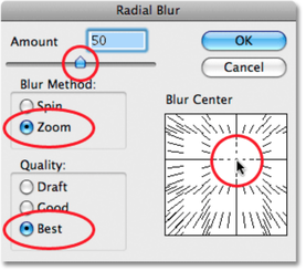
|
5) Next, add a Layer mask. At the moment the blur effect will be covering the entire image, which you don't want as it defeats the 'zoom blur' effect. So, you want to hide the effect in that part of the image and allow the original photo to show through. You can do this by using a layer marker. With 'Layer 1' selected click on the Layers mask icon at the bottom of the layers panel:
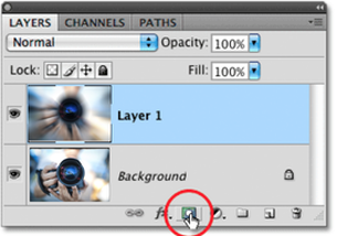
|
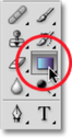
6) Nothing will appear to happen in the document window, but a layer mask thumbnail appears to the right of the preview thumbnail for 'Layer 1'. After this, you will need to select the Gradient Tool in order to hide part of the blur effect and create a smoother transition between the effect on 'Layer 1' and the original image. Select the Gradient Tool from the Tools panel:
|
|
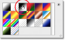
7) Now you will need to select the black to white gradient. With the Gradient Tool selected bring up the Gradient Picker. Then, click on the black to white gradient which is the third gradient from the left, top row:
|
8) Next, select the Radial Gradient and drag it out in order to hide part of the blur effect. As I want the lens of the camera to show through the blur effect I will click the centre of the lens to set the starting point for the gradient. Then simply drag my mouse towards the left until I'm just beyond the edge of the lens. The area in between the start and end points of the gradient will become a smooth transition area between the blurring effect on 'Layer 1' and the original image below it. Because it's a radial gradient, the gradient will extend 360 degrees around the starting point creating a circular shape with black in the middle, gradually changing to white as it extends:

|
9) Though you will not be able to see the gradient on the document, you can see what it will look like at the layer mask thumbnail in the Layers panel. The black area represents that part of the layers that's now hidden from view. As the gradient becomes lighter toward the edges, the more visible it becomes; the white areas are where the layers are completely visible:
|
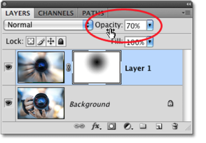
10) Finally, you will need to lower the opacity to fine-tune the results. If you find that the blur effect is too strong, you can reduce its intensity by lowering the opacity of 'Layer 1'. Lowering the layers opacity will make the original image clearer through the blurred one. You'll find the opacity option in the top right of the Layers panel
|
Michael Bosanko
Although, Bosanko is not a London based photographer, I like the overall idea and technique he uses in his photography. I think he represents the aspect of movement in a quite individual, abstract way that looks intriguing in a photograph.
"Light Art (or Light Graffiti) for me had its humble beginnings back in summer 2004 in Greece when by chance, photographing a moonlit landscape went unexpectedly wrong. Unclipping the camera from its tripod, I quickly discovered that by putting the camera into long exposure I could move the camera in my hands and use the moon itself to write out a word. Buzzing with excitement, the next natural stage was to keep the camera on a tripod, and use torchlight to ‘draw’. Ever since then, I have been on a solitary journey of discovery, pushing the limits of my photographic knowledge, my imagination, and always overstepping the boundaries of what is feasibly possible. I find enormous reward in creating a piece of work that only exists in the moment; the only evidence of its existence recorded on camera. The environment; my canvas, is all that’s left behind, exactly as it was before my arrival. Filling an environment with 3 dimensional ‘brush strokes’, vibrancy, energy… turning the ordinary into the extra-ordinary… these are some of the things that drive me; fuels my passion." - Michael Bosanko
"Light Art (or Light Graffiti) for me had its humble beginnings back in summer 2004 in Greece when by chance, photographing a moonlit landscape went unexpectedly wrong. Unclipping the camera from its tripod, I quickly discovered that by putting the camera into long exposure I could move the camera in my hands and use the moon itself to write out a word. Buzzing with excitement, the next natural stage was to keep the camera on a tripod, and use torchlight to ‘draw’. Ever since then, I have been on a solitary journey of discovery, pushing the limits of my photographic knowledge, my imagination, and always overstepping the boundaries of what is feasibly possible. I find enormous reward in creating a piece of work that only exists in the moment; the only evidence of its existence recorded on camera. The environment; my canvas, is all that’s left behind, exactly as it was before my arrival. Filling an environment with 3 dimensional ‘brush strokes’, vibrancy, energy… turning the ordinary into the extra-ordinary… these are some of the things that drive me; fuels my passion." - Michael Bosanko

|
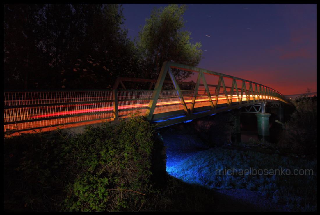
This picture is effective because of the colours within the photograph. For example, the light trail in the middle of the image being red, whilst fading into white in the middle against the purple tones of the sky and the blue light under the bridge type structure in the photograph. This gives the picture quite an abstract feeling as these aren't colours you would find on a natural landscape. The effect of this adds emphasis to the slightly abstract element that the photographer is trying to achieve. I also think it is interesting as all the colours seem to be focused toward the right side of the image, which shows a contrast between the two sides of the picture. On the left side of the image there are trees and other things causing the left side to be a lot darker. Whereas, on the right, you can clearly see the sunset and the lights underneath the trail and the many different abstract, interesting colours.
|
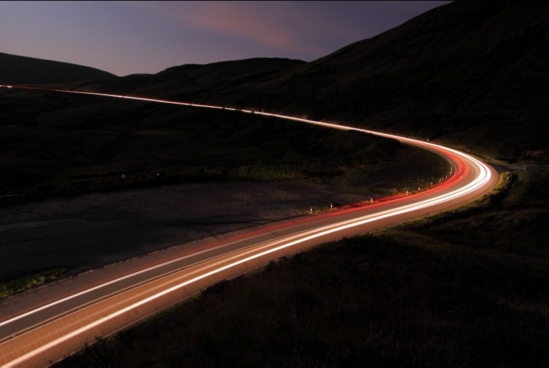
i think this photograph is similar to the previous as it incorporates a similar landscape and darkness. However in this image, the majority of the skyline is quite dark and dreary, there isn't really the same level of vibrant colours. One thing I think is interesting about both this photograph and the previous is that the landscape isn't particularly common. Both these photographs seem to combine a rural landscape with the idea of these industrial light trials invading the darkness of the landscape. This is effective as it shows contrast in quite a visual, obvious way but also in more depth within the idea of the image. This picture is different from the previous, however, as it doesn't embody the same range of colours. There is pretty much only shades of black and grey and then the colours of the car lights on the road path. This is interesting as it shows two different effects of colour side by side.
|
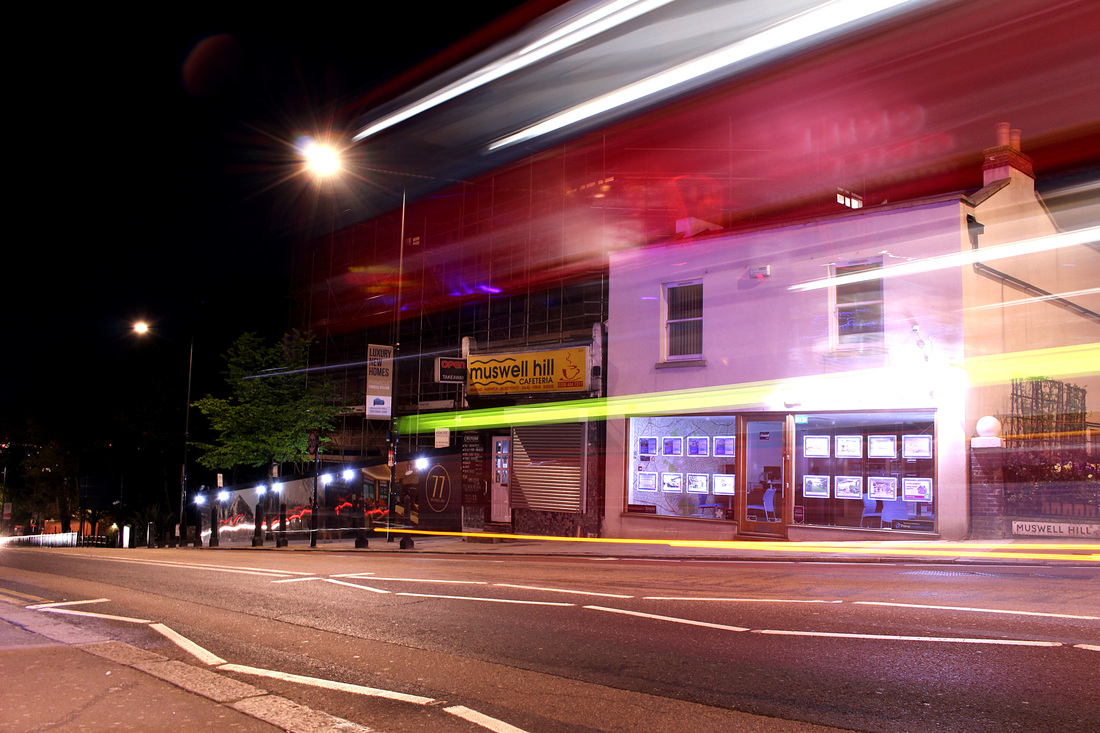
This final photograph is different from the previous two in many aspects. Firstly, the landscape isn't as dark, and there is a much more urban feeling as opposed to a more rural landscape. I think this is interesting, as even though the landscape around the movement within the photograph is quite bright, you can see the sky in the right hand corner and that it is night time. Capturing these kinds of images at night gives a much more obvious effect from the light and also allows a higher contrast between light and dark. Another different aspect between this photograph and the previous two is that the subject is different. For example, in the previous two photographs, the subjects were both trails of light moving through a black landscape. Whereas, here, the entire image is lit up by the light surrounding, and the focus of the image isn't actually the light. The focus of the photograph is the movement of the car rather than just the lights on the car.
|
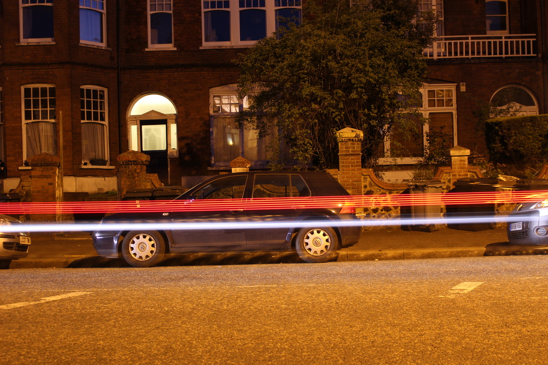
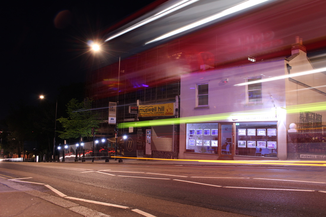
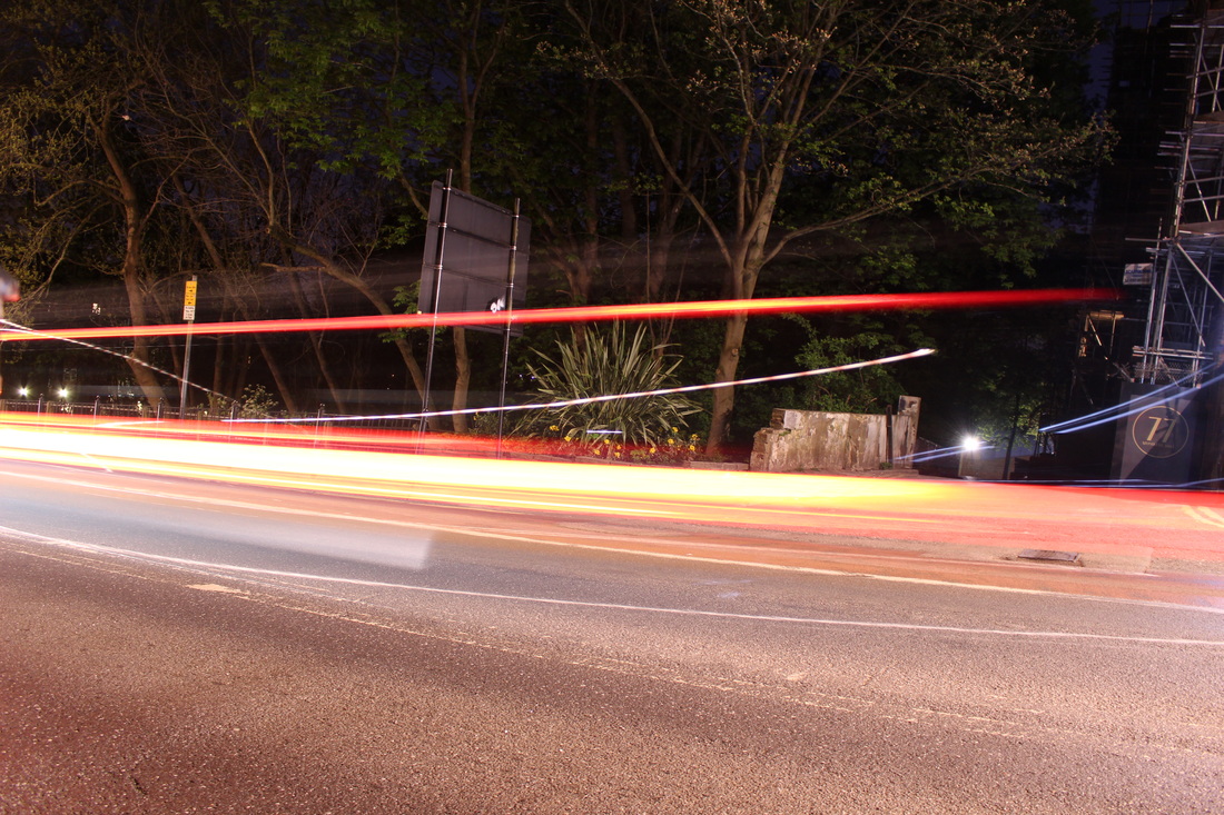
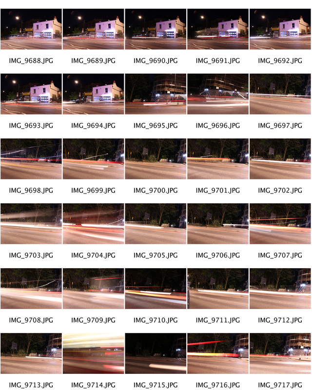
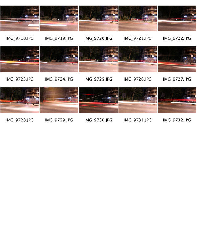
My Response
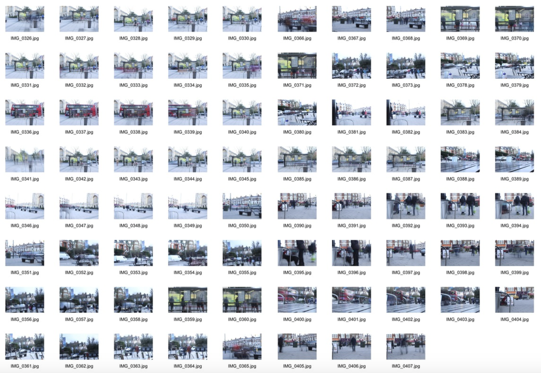
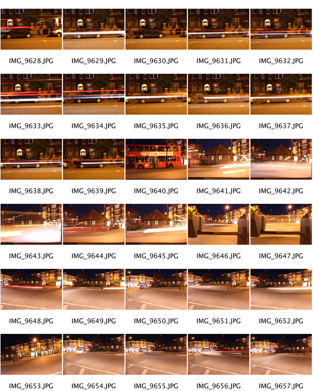
For my response to Michael Bossanko, I took several long exposure photos of light trails from cars. In order to get a better contrast of light, I took the pictures when it was dark, to emphasise the light trails. Also, to better resemble the photographs taken by Bossanko. I think I captured some successful images that are similar to Bossanko's, however I don't think the locations I used were ideal for this task. Below are my three strongest images enlarged, and then a contact sheet of all the photos I took.
|
|
Edits
Second Strand Response - Urban London
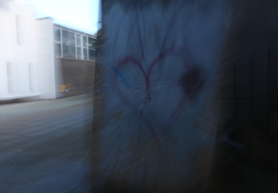
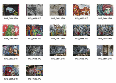
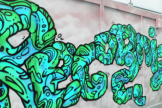
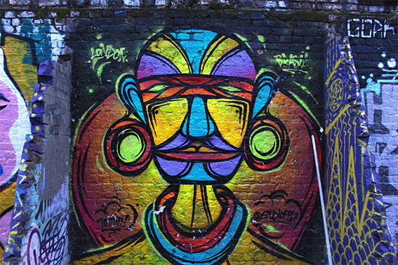
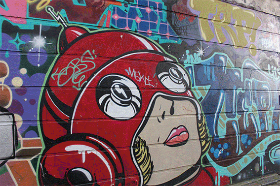
For my final 'My London' response I chose to take quite different pictures than my first. I wanted to show more urban aspects of London, instead of showing a more simple topic like movement, I went and took several pictures of graffiti around Brick Lane. I thought this would be an interesting strand response because it incorporates photography and graffiti art. Below are my first set of pictures that I took in response to my second strand.
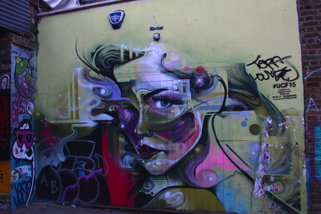
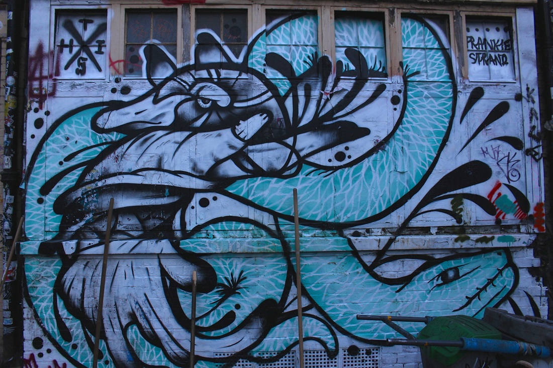
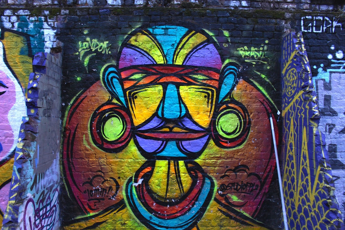
|
|
Further Development
|
|
Edits
|
|
Rut Blees Luxemburg
Rut Blees Luxemburg is a German photographer, based in London. Her technique is to take photographs at night, mostly exploring the urban landscape of London. Luxemburg studied photography at London College of Communication and gained her last formal education at the University of Westminster. She employs long exposures to allows her to use the light emanating from the street only, for instance from office blocks or street lights in her photos. Luxemburg created a series of images for the London Underground in 2007. Many of her photographs and prints deal with nocturnal themes.
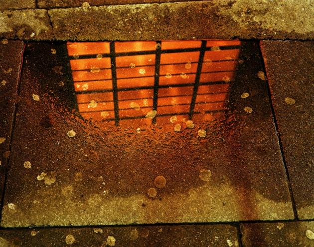
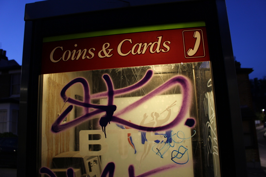
This photograph stood out to me because of the interesting technique that Luxemburg has used here. The way that the reflection in the puddle is a bright, red light makes the image quite strong and is intriguing for the viewer. This image also embodies quite an abstract feeling, that most of Luxemburg's photographs have. I think the way that she photographs these images at night really adds to the effectiveness of the image and gives them a signature street photography look. The way that she uses light in a lot of her pictures is very interesting. For example, here, the colour of the lighting in this photograph makes it feel like the entire image was lit by a street lamp. Also the way she has incorporated an aspect of light into the main subject of the image makes the viewers eye pay attention to the subject straight away. She does a lot of this in her photography, by using bright lights or colours in the main section of the photograph which I think is very effective as it draws the viewer in.
|
|

my response
For my response to Rut Blees Luxemburg I took several pictures around my area, when it was dark out. I tried to capture slightly urban aspects of the area and present it in a similar way to luxemburg. I think the subjects of my photographs worked quite well, however I do think that most of the images I took are slightly too dark, also the location I took the images in wasn't the best and I think a different, more fitting location would've worked much better.
|
|
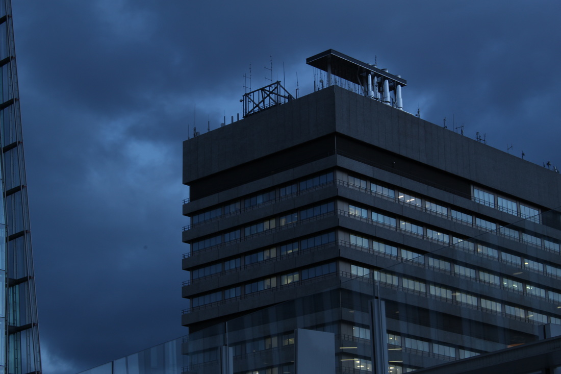
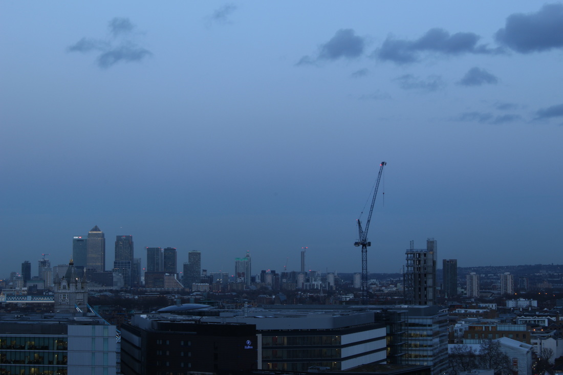
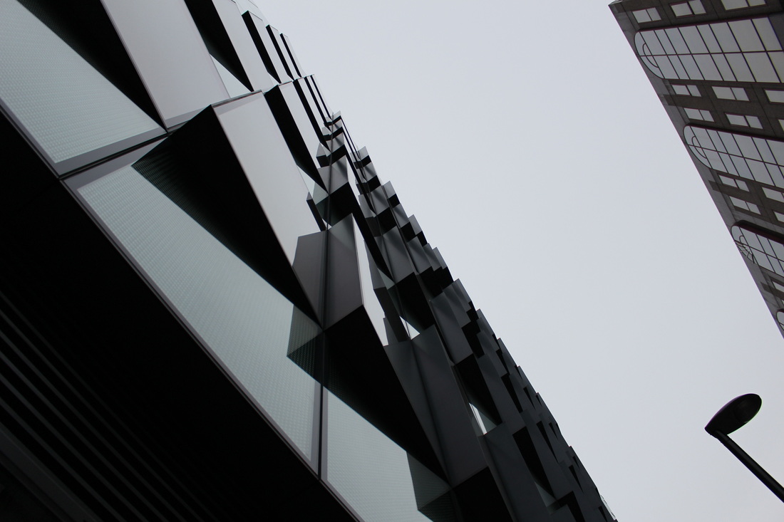
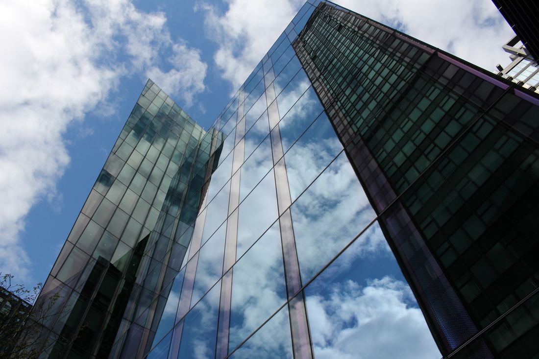
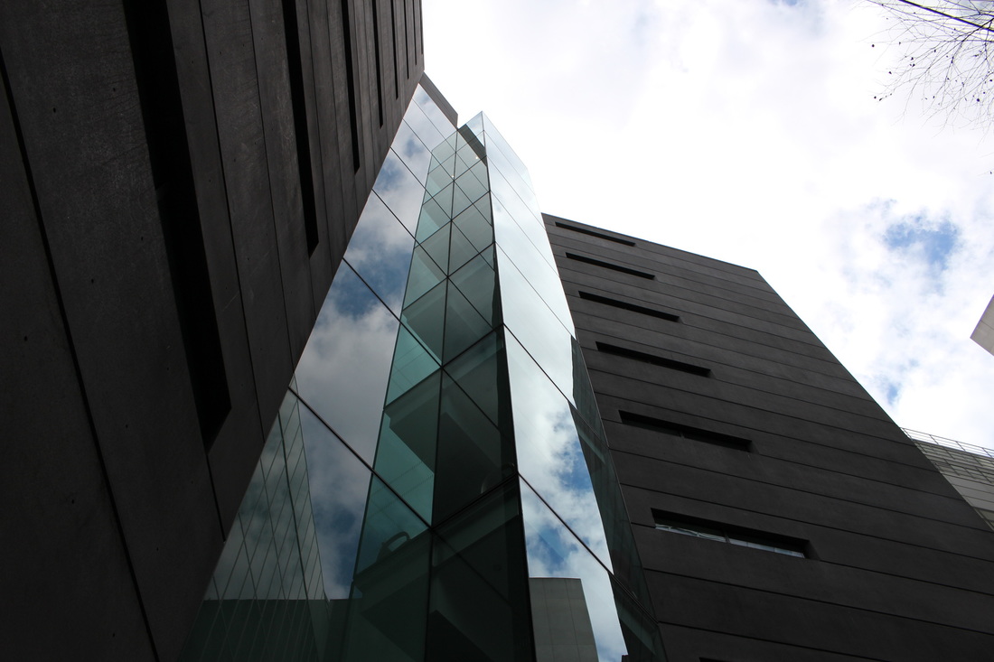
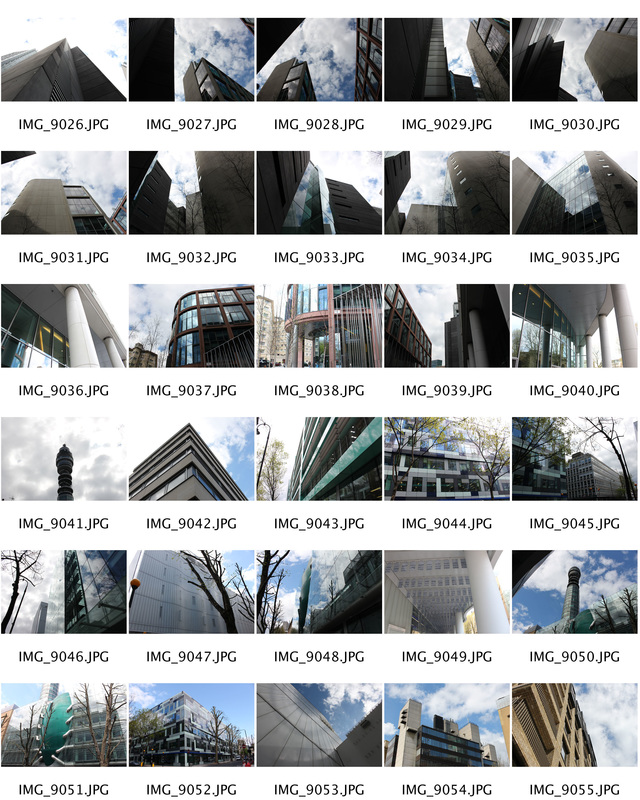
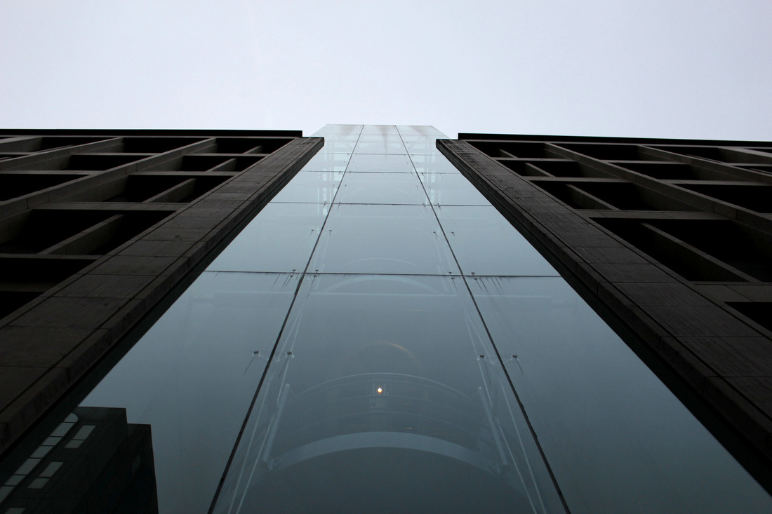
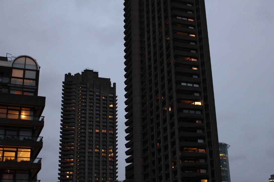
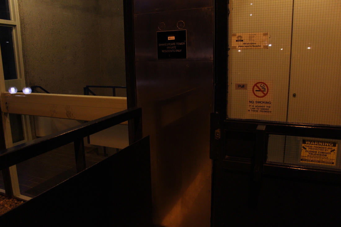
Third Strand Response - Architecture
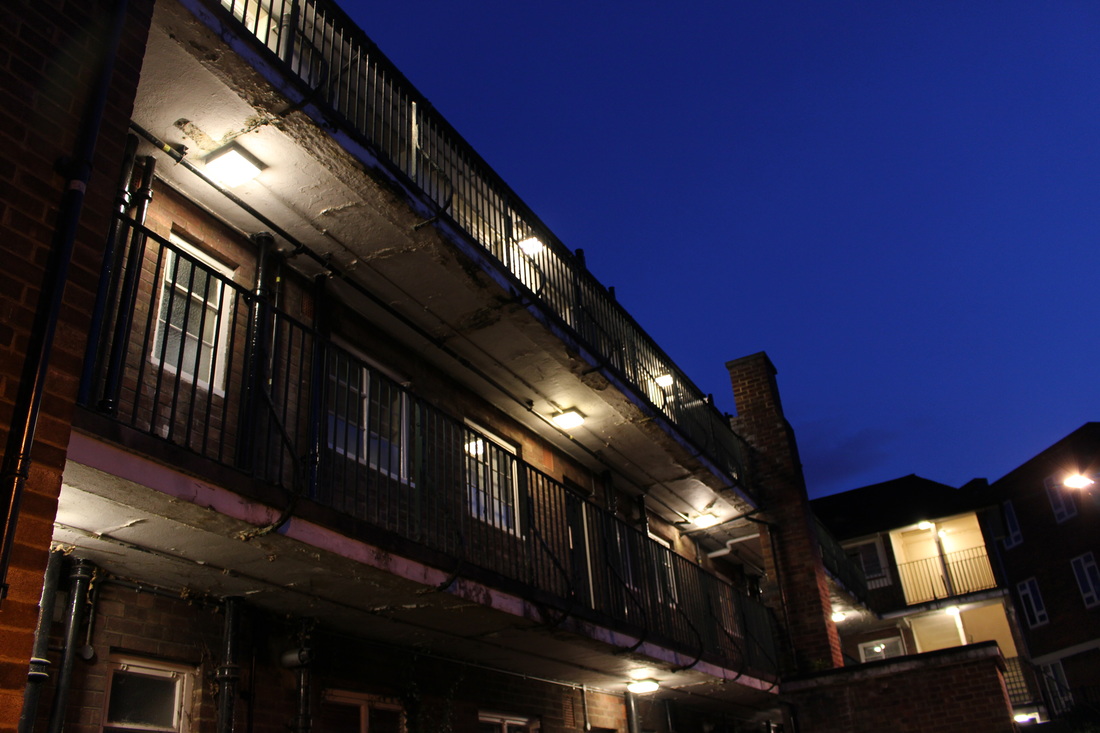
For my third response to the 'My London' task I chose to capture architecture around the city. For my first response I took photographs from a high point to show the buildings at a more interesting angle than you would see them from the ground. I think my pictures could have been mores successful if i had focused more directly at the architecture rather than the whole buildings. When I develop my photographs further I will try to take more detailed, focused pictures of buildings. However, I like the dramatic, quite dark look that the images in my first response embody, I think when I go to take my second response I will try to recreate this.

|
|

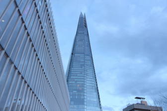
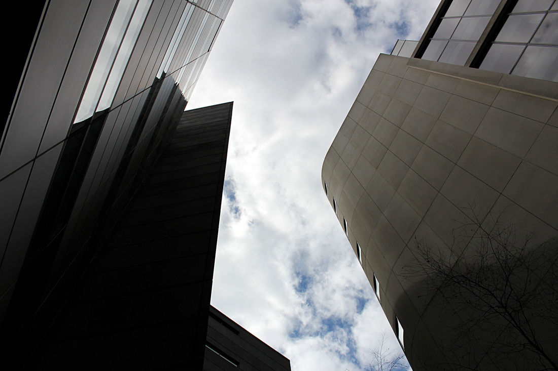
Second Response
For my second response to architecture, I used lower angles, looking up at the buildings rather than on the same level as them. I did this because I think the imposing effect is quite interesting and gives the subject a lot more drama and emphasis. I also used a different location so that I could capture different types of architecture, however, I think a lot of the buildings are quite similar. I will try to re take these images in order to get more variety in architecture, so I can get closer to my desired final outcome.

|
|

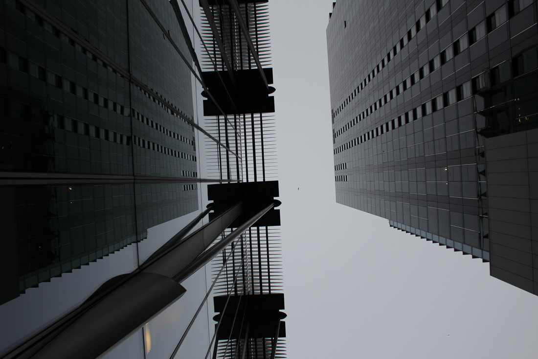
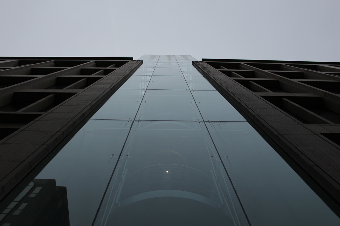
Third Response
For my third response to architecture, I wanted to develop my technique further by taking the images in a location that I thought had more variety in architecture, because I felt that a lot of the images I captured for my second and first response were quite similar. I also focused more on capturing the photographs at a low angle, close to the structure in order to make the structures to look much more imposing. However, I wanted the photographs to look less symmetrical in order to make the final outcome have more depth. I think I achieved this effect quite well in most of my images.

|
|
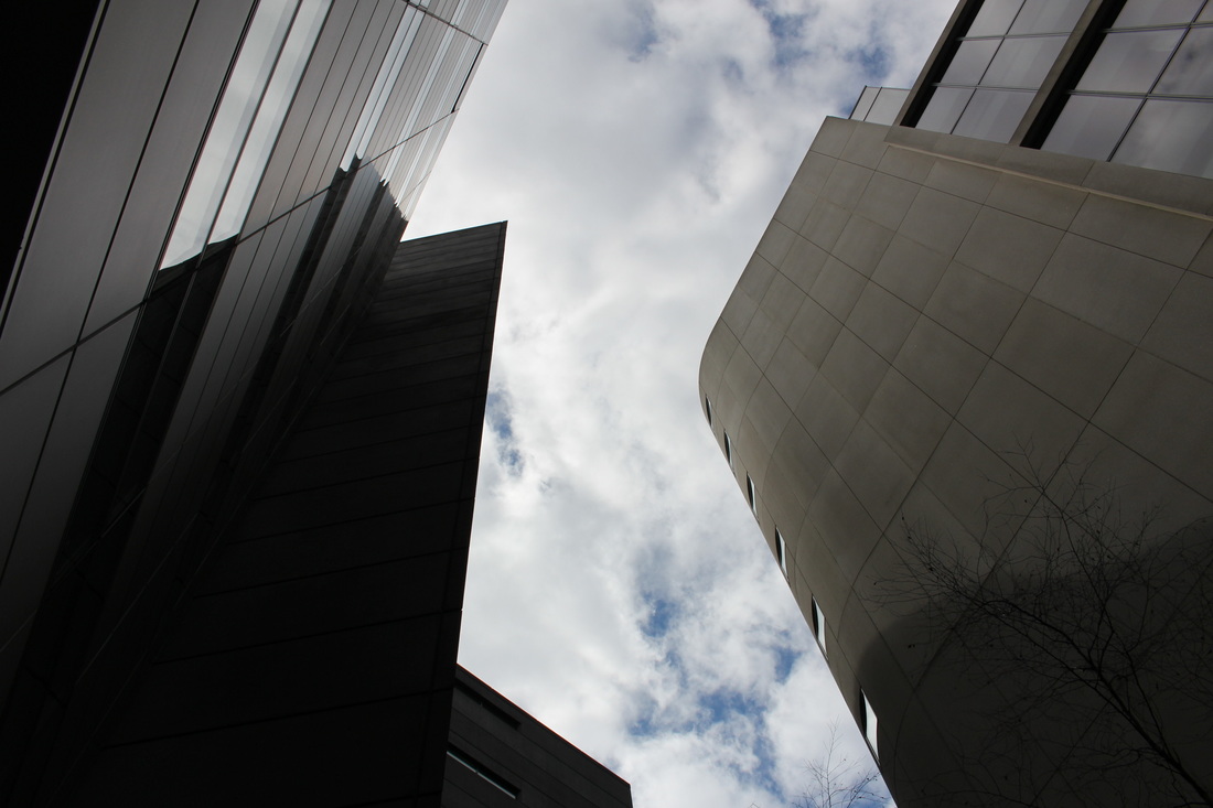
Development
To improve these photographs and make them look more similar to my desired outcome, I took the images from a closer distance in order to make the building look more imposing, I also went to a better location with much more talk buildings and took more photos of the buildings themselves as opposed to the skyline.
|

|
|

|

In my further development I took similar pictures at an angle to create more depth
|
|

|
Final outcome
|
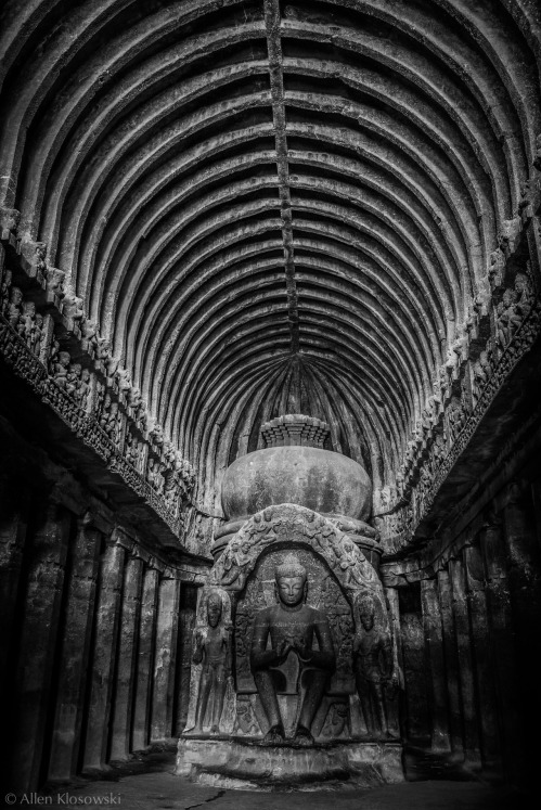
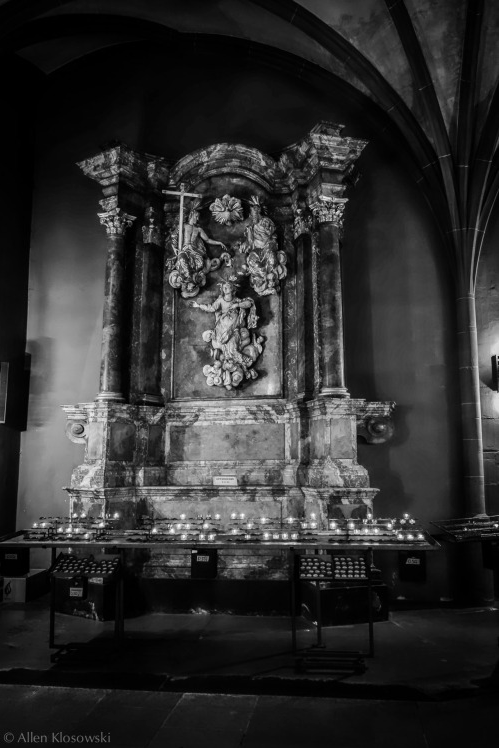
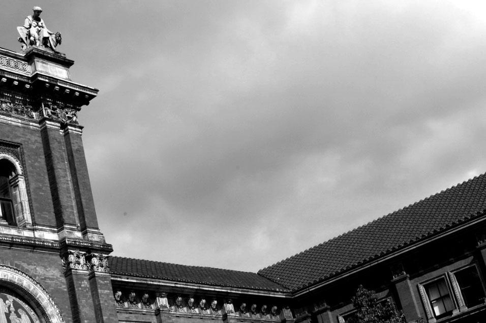
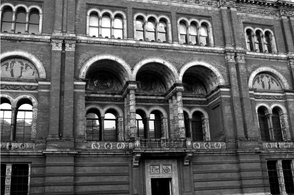
Allen Klosowski
Allen Klosowski is a photographer who is mainly focused on taking pictures of different perspectives of buildings. Klosowski seems to be very interested in angles of different buildings. A lot of his photographs also tend to portray elements of line and structure. His work links to ‘Environment’ as the buildings he captures are an aspect of city landscape. His intentions are to show that buildings are viewed as the viewer wants to see it: in their own way. Some buildings are reflected, some taken from beneath the building, some from above, some straight ahead – which makes us look at the picture in different ways. Klosowksi appears to capture buildings in different ways that are fitting to the particular building. For example, national landmarks are made to look imposing and important.
|
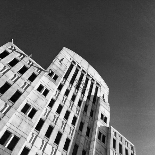
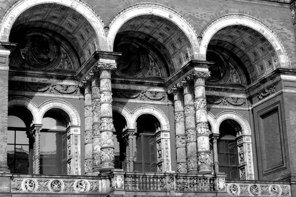
This photograph is interesting as Klosowksi captured the details of the interior architecture in a very obvious way. The small, intricate details of the structure are very blatant in this photograph. They are also emphasised by the way Klosowksi has used black and white for this photograph. I think the element of symmetry here works with the black and white effect to make the entire image seem much more dramatic and interesting. Both these factors together give the photograph an overall dramatic feeling. Also the way that the photograph is taken from a low angle makes the subject of the photograph look larger and more intimidating. Klosowski incorporates the concept of imposing architecture into a lot of his photographs.
|
This photograph is similar to the previous as it is taken of quite intricate, detailed interior architecture. Also, both photographs have strong elements of symmetry. The black and white effect here, also similarly emphasises the tone of the image creating drama and giving the photograph much more depth. It also emphasises the shadows within the image making it have an element of fear and terror. This photograph is different to the previous as it isn't taken at such a low angle. However, I think this image still works very well as the main subject structure of the photograph is already very large and imposing on it's own. This picture also has a much different textures within it, the marble of the statue looks an especially interesting texture in black and white.
|
This last image is quite different to the previous two as it much more imposing in a more blatant way. Klosowksi added emphasis to this particular image by choosing to take it at more of an angle instead of straight underneath the building looking up, using symmetry. I think this is effective as it gives the photograph much more depth being that the subject is at a quite unusual angle that isn't often used. This effect used by Klosowksi also adds an abstract element to the image. The black and white used here makes the photograph similarly dramatic to the previous two. It is much more dramatic, however, as the sky in the image being much darker than the building used as the subject, there is a heavy element of contrast which is not portrayed so obviously in the previous two images.
|
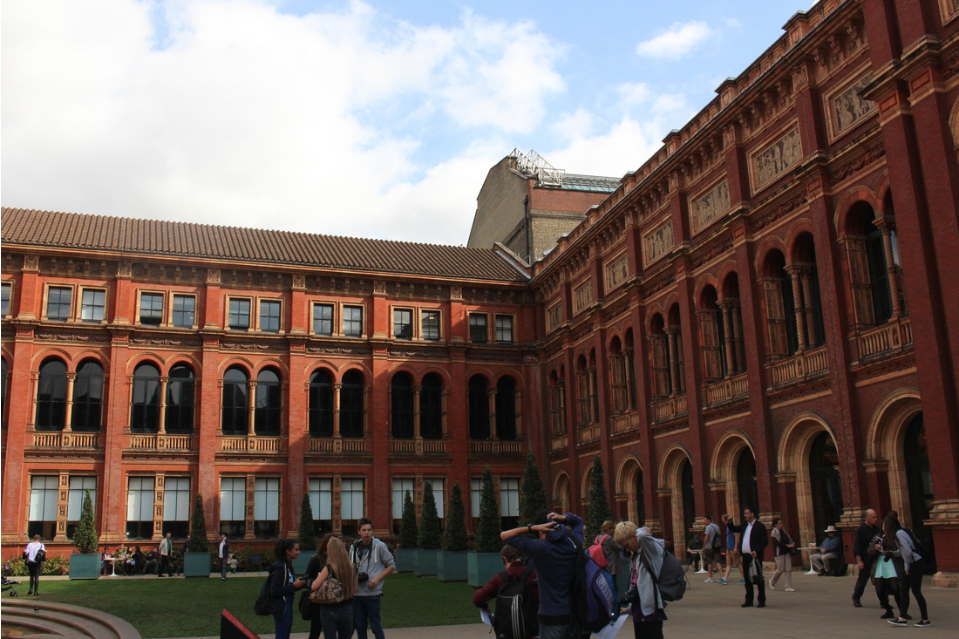
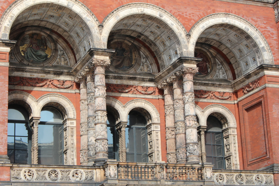
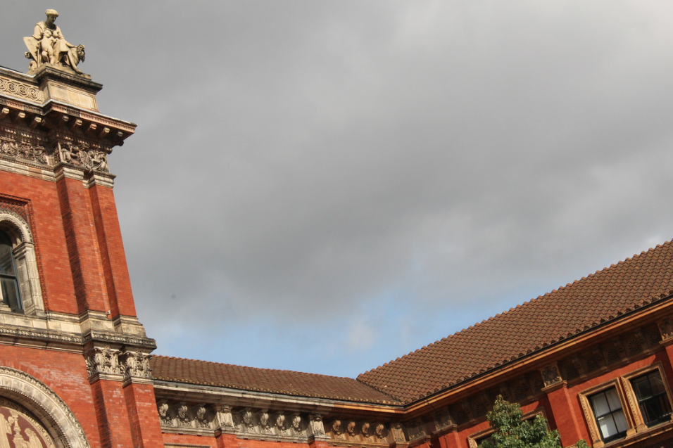
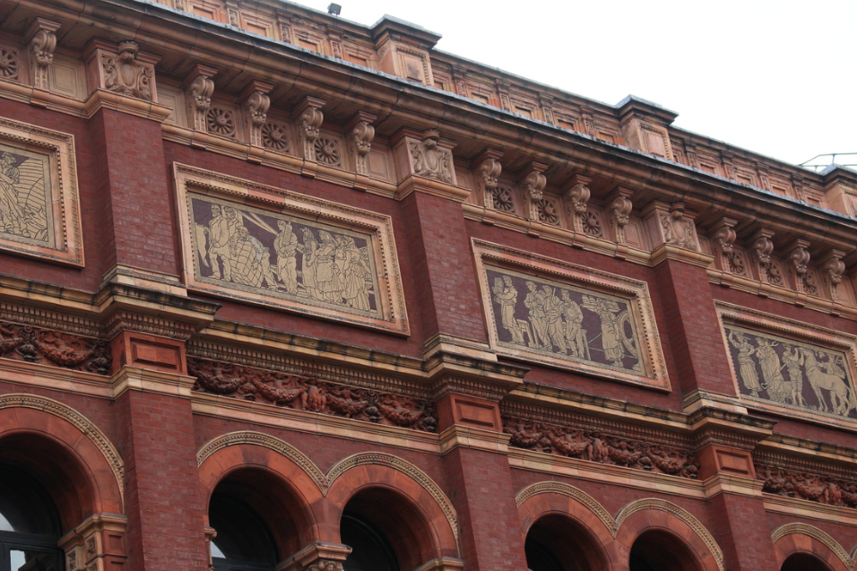
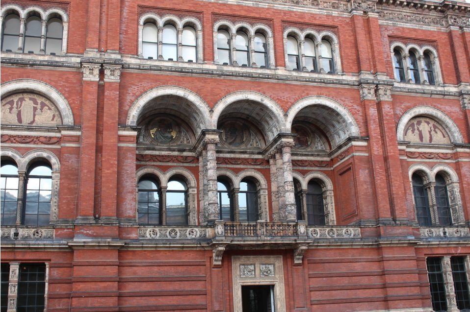
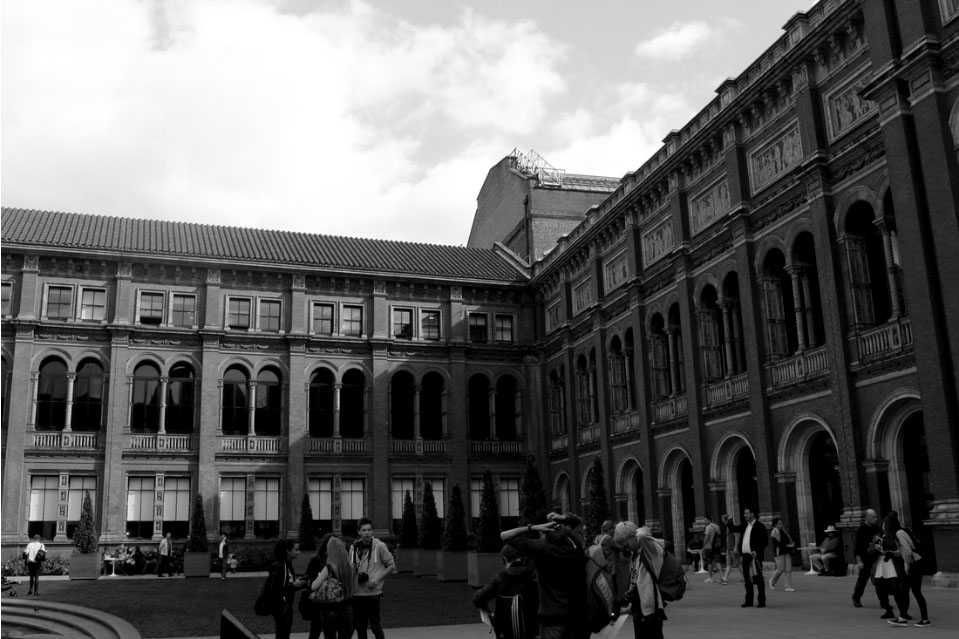
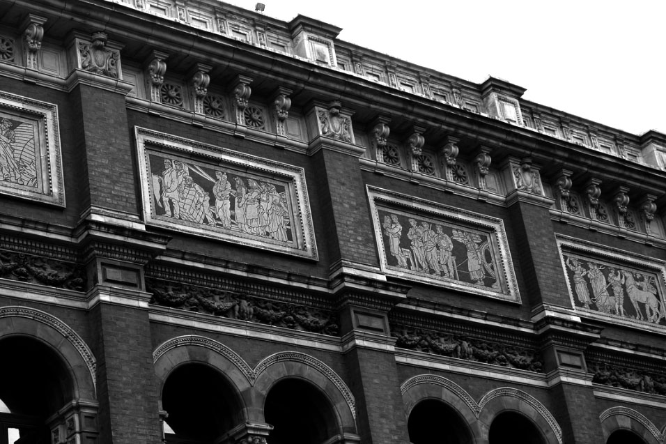
My Response to Klosowski
For my response to Klosowski, I wanted to try and achieve the same effect that he uses in his black and white photography, and focus slightly more on interior details of architecture, in order to make them stand out more. I captured the photographs below of the V&A when I went to an exhibition. I think it is interesting the way that he makes interior photography of architecture imposing by the way he plays with angles and uses black and white to make the photographs look much more dramatic.
Edits
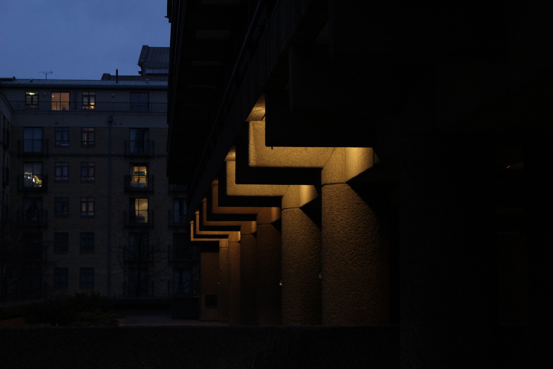
Further Development: Rut Blees Luxemburg
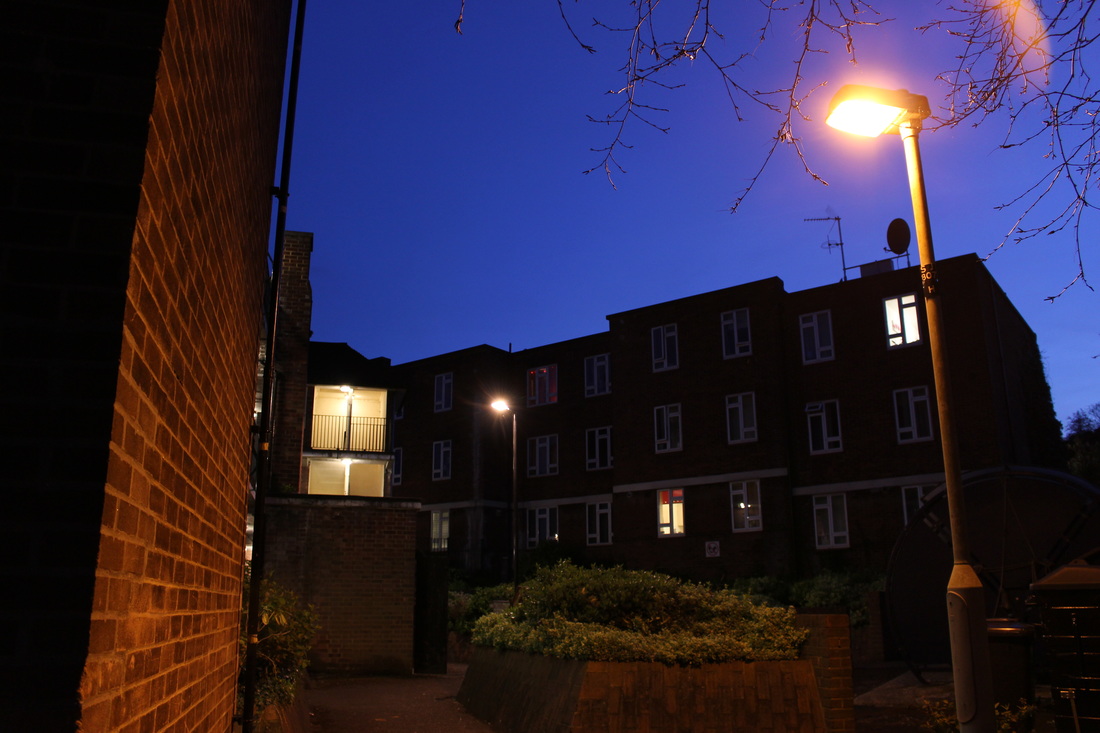
For my second response to Rut Blees Luxemburg I went to a better location and tried to capture the photographs at a different time in order to still have some extent of darkness, but not as much as my first response. I think the location of these photographs worked much better than my first response. Also, in these images I focused more on architecture as I combined the two aspects of architecture and urban, whilst still trying to maintain a similar style to Luxemburg, I think these photographs were successful.
|
|
Final Piece