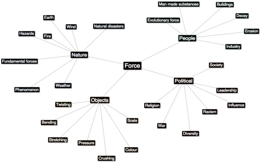
Force Mindmap
Forces Of Nature
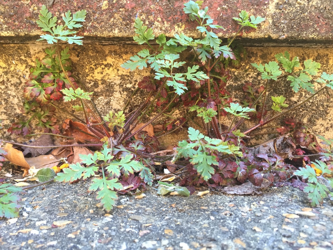
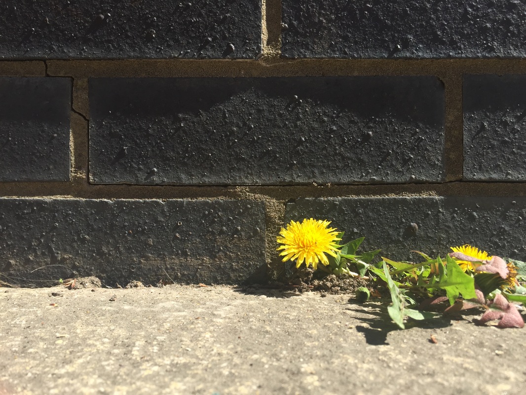
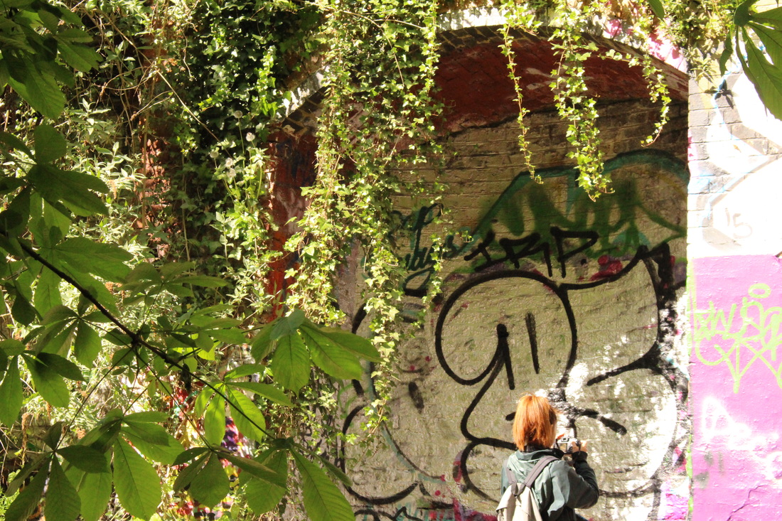
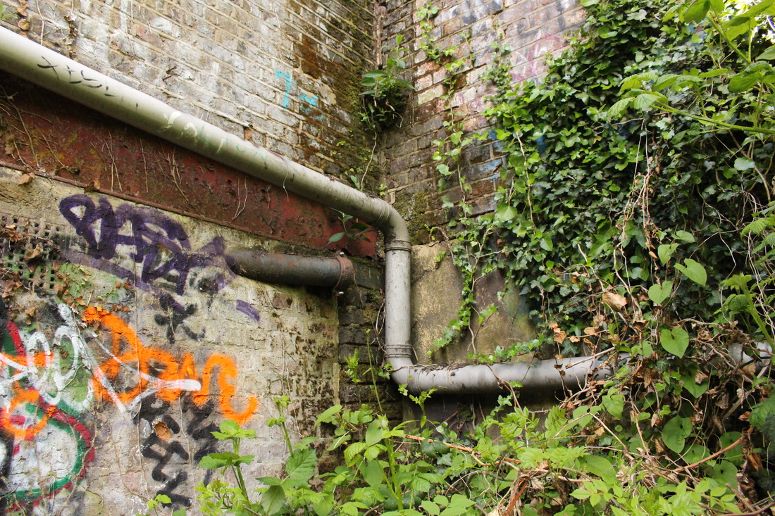
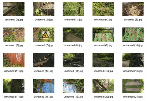
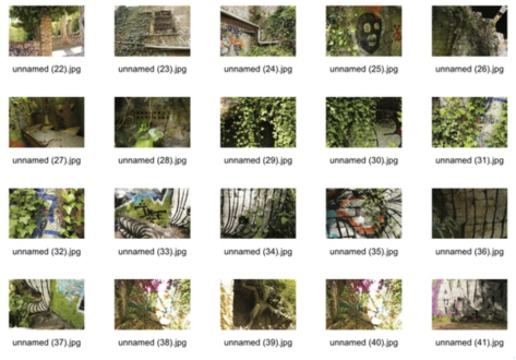
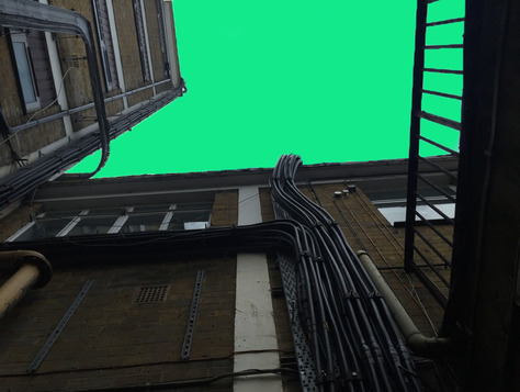
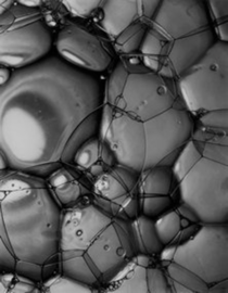
For this task I have taken several different photographs around school which I think portray the force of nature against manmade things. For example, I have taken many shots of different plants growing through cracks of concrete or decaying paint on walls. I found this task interesting as I particularly like these types of images because they represent two contrasting ideas of photography - man and nature. Below are the contact sheets of all the photographs I took around the school, and finally, my three favourite images enlarged.

|
|
Homework Response

|
|
Artist Analysis
Kevin Bauman
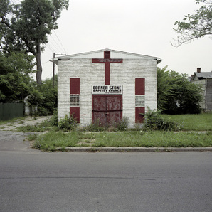
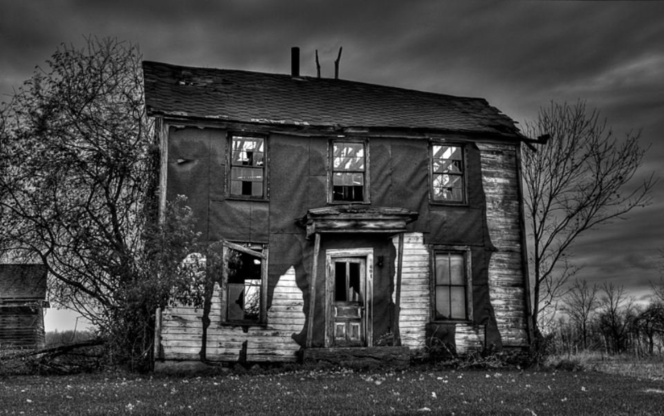
I chose to analyse three photographs from Kevin Bauman's 'motor city' series. Within the series Bauman captures several images of different empty, derelict buildings around Detroit. I think these images are powerful because they show a contrast between a thriving city and a city that is bankrupt. I particularly like this photograph as it shows that not only homes and business buildings are now empty and derelict, but also religious buildings such as churches, for example. Also, I think this image portrays force in a really nice way, as do all the images in the 'motor city' series, because its showing the force that time has on man made things, like buildings.
|
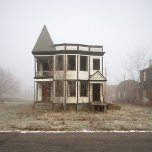
Secondly, I chose to analyse this picture because it shows a very different aspect of the series as this picture seems to stand out to me. I think this is because the subject building in the photograph looks extremely isolated as there is nothing surrounding it but a misty field. I think it gives off a feeling of fear as the house seems empty but not in very bad shape, like something out of a horror film. Finally, this image has quite a smooth, soft texture to it because of the mist in the background, making everything else seem to fade out of the image. Also, because the grassy foreground of the image corresponds with the colours of the detailing on the house.
|
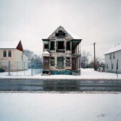
I particularly like this final image because the snow on the ground makes everything seem so clean, but the subject building of the image is so derelict and ruined that it creates a strong contrast with the foreground of the photograph. This makes the subject building in the image a lot more eye catching to the viewer. Secondly, I think this image is particularly effective because it clearly shows a main tone throughout the photograph. For example, the blue details on the house next to the blue of the fence on the left-hand side. Also, the white snow corresponding with the white houses on either side and the almost white sky, above.
|
Amelia Fletcher
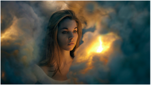
In this series of photographs titled '52 week project' Fletcher shows many pictures of herself that she has set up and also taken herself. Firstly, I chose this photograph to analyse as it really stood out to me. It looks as if Fletcher is standing in the clouds and looking out onto the horizon. This image gives off a rather warm effect as the colours she's used are yellow and golden. I think this image is interesting to look at, as the shapes made by the clouds are somewhat abstract, which sets up the feeling of the entire image and makes the viewer want to analyse it closer. Finally, I think this picture portrays the force that man has on nature and even on the weather.
|

Secondly, I chose to analyse this image because it's different to other images taken by Fletcher and it caught my eye. This photograph has very earthy, natural undertones as the subject has a bug on her mouth and the background of the image is wood. I think the effect this gives off is a very interesting, unique one in that the entire image seems very well strung together and there isn't very much of a contrast in the photograph at all. All the colours in the image correspond very smoothly, making the photograph very easy to look at as the eyes don't get caught up on any specific details in the picture. Lastly, I think this image is showing a representation of the effect man has on nature.
|
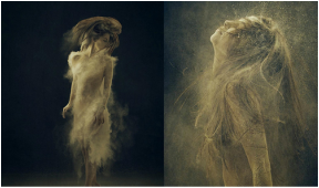
This final image also particularly stood out to me because of the contrast in the colours of the subject, in the foreground and the colour of the background. Fletcher describes this shot as 'her most difficult, but favourite'. For this picture Fletcher was required to spin around whilst jumping with powder all over her body. For this shot she used a fast shutter speed in order to capture herself, appearing as if she is still, in the air. I think this photograph is a more simple, straight forward representation of force than the others, because I think that it simply shows the force used in making this image rather than having a deeper meaning like the other images of the series or the previous two I have analysed.
|
Timm Suess
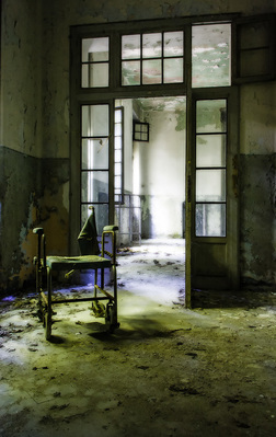
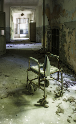
This photograph was taken in an abandoned mental asylum complex in Northern Italy. The image is titled 'Thirty Roses, Seven Candles' as a part of a series by Suess titled 'Orange Agent'. I chose to analyse this particular photograph because I like the element of decay throughout the image. I think that Suess has shown force in a very interesting way here, as it is almost like the force of the patients that stayed at the asylum are still effecting the building itself. The walls and wheelchair occupying the derelict room of the asylum almost look distressed, highlighting the force that the patients that once resided there had a tremendous effect on the building. I also think this picture is effective as it shows the wheelchair at a certain perspective that makes the wheelchair almost seem lonely.
|
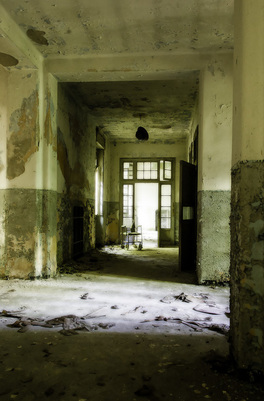
This second image is a part of the same series taken by Suess. The photograph is titled 'Half-Hearted Guess'. In the image the viewer can see that the patients room were extremely tiny and claustrophobic and the radiators were encased to prevent residents from committing suicide. This image is the same as the previous but taken from a different angle. I thought that analysing this photograph would be interesting as you can see the thought process that went into taking the images and what perspective looks better and gives a certain effect. I think this perspective of the hospital shows the rooms as smaller and makes the hallway seem longer compared to the rooms. The way Suess has chosen to capture the hallway portrays everything within it as much smaller than the hallway itself.
|
This final image is also a part of the 'Orange Agent' series by Suess and is titled 'At the Races'. This is also the same photograph as the previous two, of the wheelchair in the abandoned hallway. The main focal point drawing attention, in this image, is the derelict, ruins of a wheelchair once used at the asylum. This shows the photograph in a different way than before as the viewer is now shown the wheelchair as the main focus and the biggest, most important part of the abandoned scene. I think this is an interesting perspective as it is almost the exact opposite view of the subjects from the last image. In the previous photograph, the hallway seems almost as if it's encasing the wheelchair. However, in this image the wheelchair looks as if its much bigger than the hallway and attaches questions to the image more effectively.
|
Nadav Kander - Half Life
In this series, Kander entered the ruined and derelict city of Chernobyl in which he took the photograph series appropriately titled 'Half Life'. I think this shows how the ruins at Chernobyl are halfway between life and death in some aspects, as many people died there and no one can now live there but the remnants of old residents live's live on within the city and to the tourists that come to look at the ruins. Also, I think it shows how Kander perceives photography as a way of keeping things alive; even though the city of Chernobyl is somewhat dead it can live on in images.
"Reactor No.4 at Chernobyl's Nuclear Power Station exploded in 1986 leaving the surrounding area uninhabitable for many hundreds of years. I visited Chernobyl to mark its 20th anniversary, photographing the deserted spaces in what was once a model Soviet City. Home to more than 40,000 people, the apartments, schools and hospitals that were hastily left following the controversial evacuation are stark reminders of past lives, leaving a disturbing sense of quite. An uneasiness that I had never previously experienced." — Nadav Kander
"Reactor No.4 at Chernobyl's Nuclear Power Station exploded in 1986 leaving the surrounding area uninhabitable for many hundreds of years. I visited Chernobyl to mark its 20th anniversary, photographing the deserted spaces in what was once a model Soviet City. Home to more than 40,000 people, the apartments, schools and hospitals that were hastily left following the controversial evacuation are stark reminders of past lives, leaving a disturbing sense of quite. An uneasiness that I had never previously experienced." — Nadav Kander
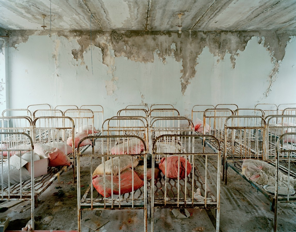
Left - I found this photograph, from Kander's 'half life' series, particularly interesting as the focal point of the image is all the rusted beds. I think this gives the picture a somewhat neat feeling even though all the objects are destroyed and decayed. This is an interesting technique that Kander has used as it creates contrast throughout the photograph and draws attention to the deeper meaning behind the image and the entire series. Secondly, I think that the image portrays a rough, decaying texture that creates depth and intrigue for the viewer. Also, the way that the beds have been arranged in the image make the room look longer and creates the illusion that the room goes on forever. I think that the colours throughout the image emphasise the level of ruin that the entire city experienced; as Kander has captured the colours so that it is obvious that they were once bright, but the explosion and erosion caused the colours to fade and became dull. Finally, the beds in the image remind the viewer that they once served a purpose, but are now useless as people in the city are absent.
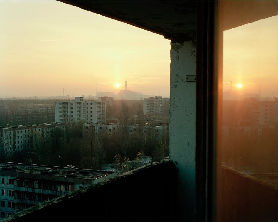
Middle - I chose to analyse this second image as I think it's different from other images in the series. This is quite a powerful photograph as it shows the sun setting behind the two reactors that caused the explosion in 1986. I think the idea behind the photograph is very prominent here as it shows a contrast between the peaceful aura of nature and the destructive nature of man and the things that man can create. Also, the reflection of the landscape against the glass on the right-hand side of the image, I think, makes the image much more effective as it emphasises the view of the buildings that destroyed the city and left it in ruins. It's almost as if Kander has done it on purpose so that the viewer is forced to look at the buildings and think about the destruction that they caused. Lastly, the photograph uses the framing technique that we have looked at previously this year to very good effect. By using the balcony wall, the ceiling above and the reflection to the right, it gives a feeling of enclosure. Without the frame, the focus on the reactors and the creepy feeling to them would not be as strong.
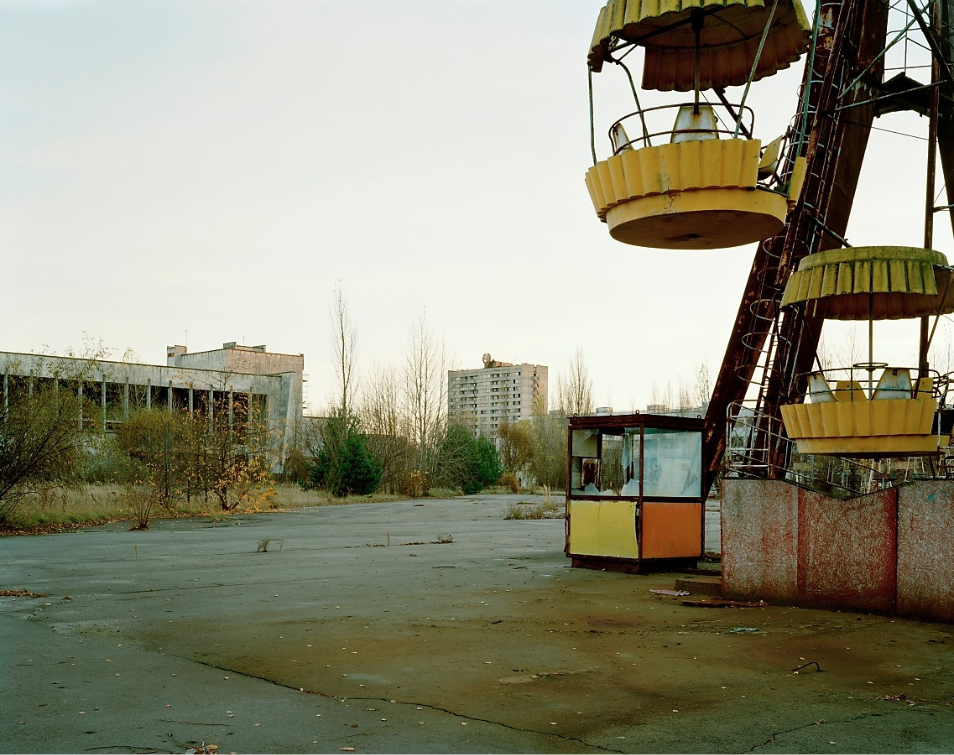
Right - I think this last image is especially interesting because, in the foreground, the viewer can see the ruins of the abandoned fairground and is reminded of the fact that the city used to be heavily populated and was a normal place at one point. Whereas, in the background, the viewer is shown that the city is now in ruins and can no longer inhabit normal living circumstances. The skyline emphasises the extrusive element of loneliness in the photograph and makes the buildings appear sad and desolate. I think the photographs in the series all have an immediate feeling of solidarity and devastation attached to them that stays very prominently in the viewers mind throughout. I think this particular image is interesting because of the way that Kander has chosen angle the image, as it allows the viewer to concentrate on several different points of the photograph easily and doesn't focus on only one main view point. Finally, I think the way that the colours in the image are portrayed is very striking to the viewer. Yellow is normally used to present happiness and joy, but combined here with the orange and red, its gives a sickly feeling drawing attention to the fairground rides that were once seen as an object of childhood and innocence.
Physical Force
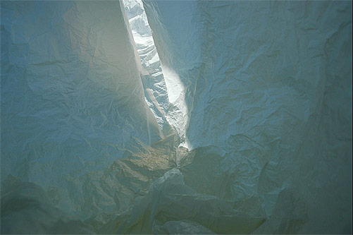
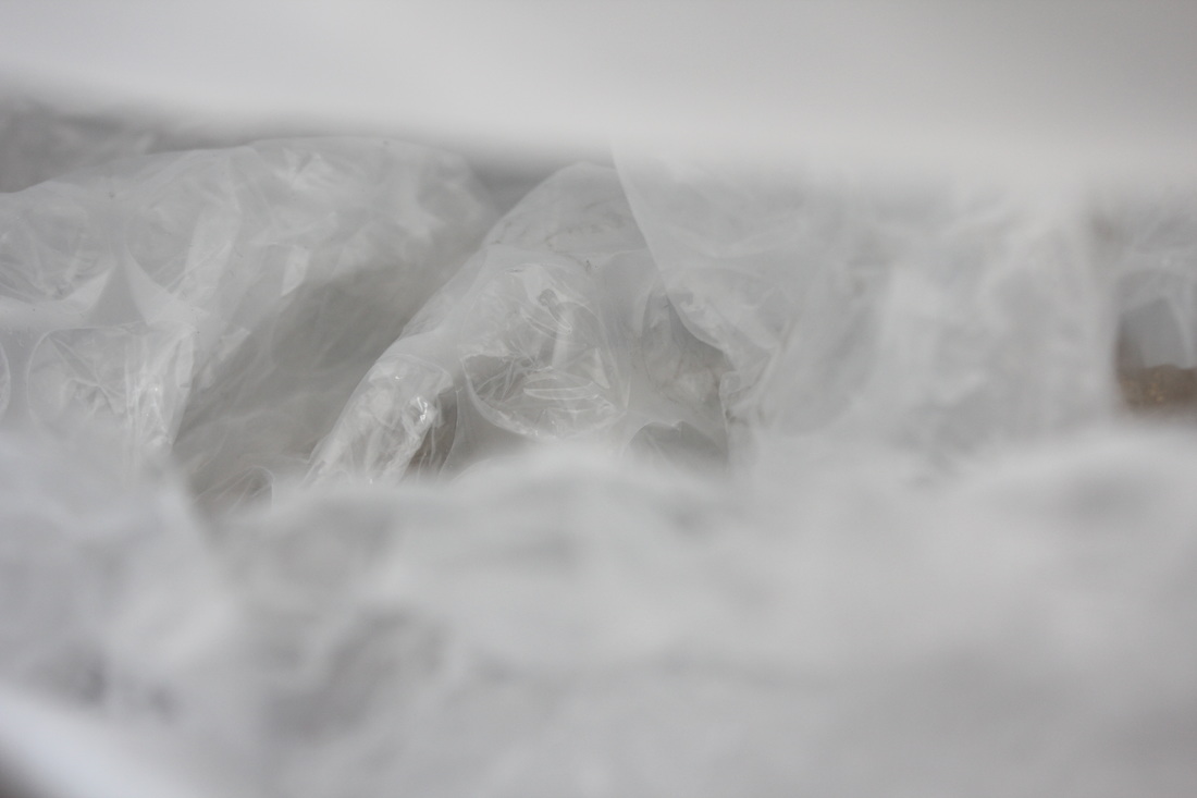
Antarctica In A Bag - Francois Delfosse
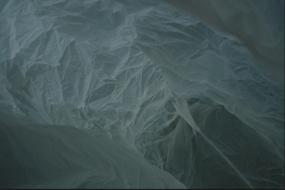
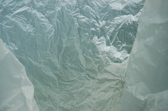
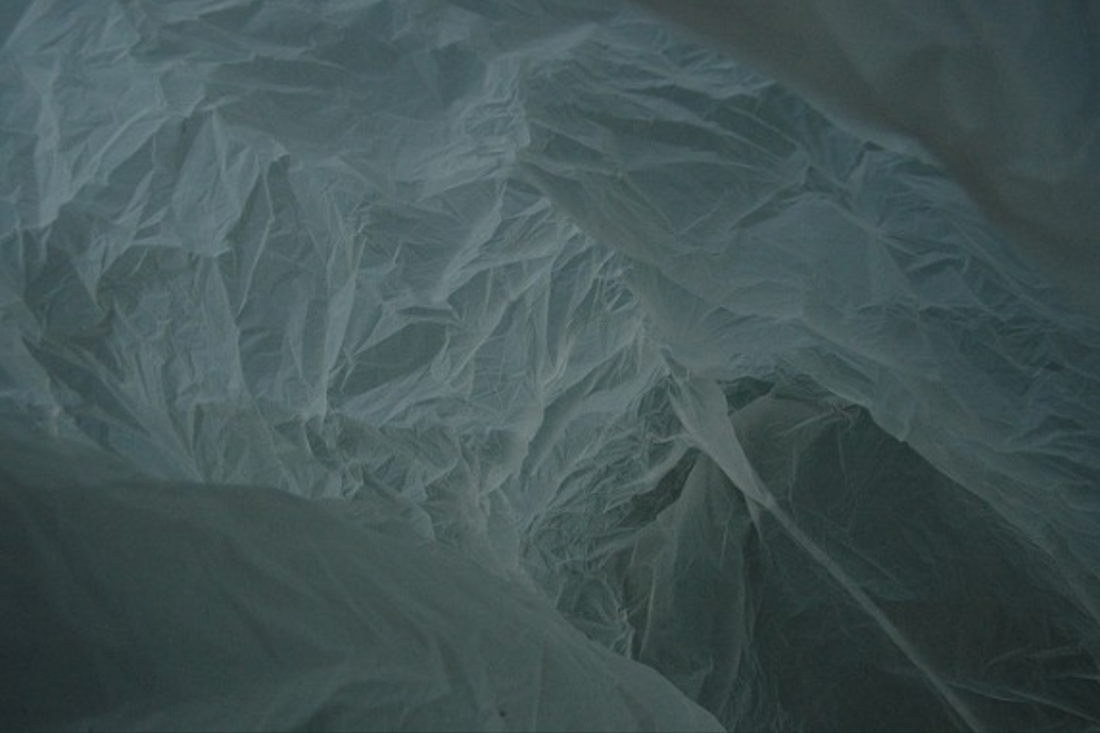
In this series photographer and architect, Francois Delfosse, captures several different images of the view inside a crumpled up, used plastic bag. These images are described as a 'glacier cave just North of the South Pole as viewed from the inside of a plastic bag'. I think this series is interesting as it plays on the fact that nature can create beautiful things and many people would consider glacier caves as stunning or mesmerising. Also, I think it represents how a photographer can manipulate a flimsy, feeble object to appear as though it is one of the strongest forces in nature. This series highlights how abstract photographs open the viewer's mind to interpretation and how a simple choice of title can have such a strong impact on what people think they see. It also conveys the idea that abstract photographs, such as these, can allow different people to see things through the eyes of an architect. I think this is extremely interesting as it can completely change the viewers perception of a normal, everyday object. Underlining that the photographers individual idea has the ability to be expressed through the image and become known to the public.
|
I think all of the images in this series have a very limited colour palette, which adds to the illusion that the photographs are taken in a glacial cave. This photograph, in particular, uses bright light and a warms-eye view to fool the viewer into thinking the image is taken at the bottom of a crevasse, looking up into the daylight from inside of the cave. I think this in an interesting technique the photographer has used as it plays with the scale of the plastic bag, deceiving the viewer into thinking that the bag is much bigger than it is in reality.
|
Exposure plays an important role in this image, as it shows a full range of tones from shadow to highlight in a way that really resembles a landscape and tricks the mind into thinking that the plastic bag is really an ice cave. There is a grey-green cast to the colour that is very ice-like in this photograph that sets up the atmosphere of nature, which I think is very interesting as it must be extremely difficult to make a thin sheet of plastic take the form of such a strong, prominent aspect of nature. I think this is a very fitting technique to use for photographs such as these because it shows the contrast of man vs nature, which makes the image a lot more interesting as it can be categorised in many different ways.
|
Framing is very important in this final image. The two folds of plastic at the right and left of the image look like crevasse walls in the foreground, this helps create the feeling of a recession that leads back. Lighting is used very well to create a crinkly texture and a cold colour that the heighten the illusion of depth and further intrigue the viewer to wonder how a plastic bag can look so much like an icy cave. I particularly like this last image as I think it is one that can most trick the eye into wondering what it is actually taken of.
|
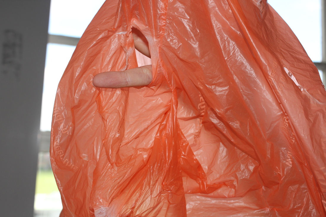
Applied Force - First Response
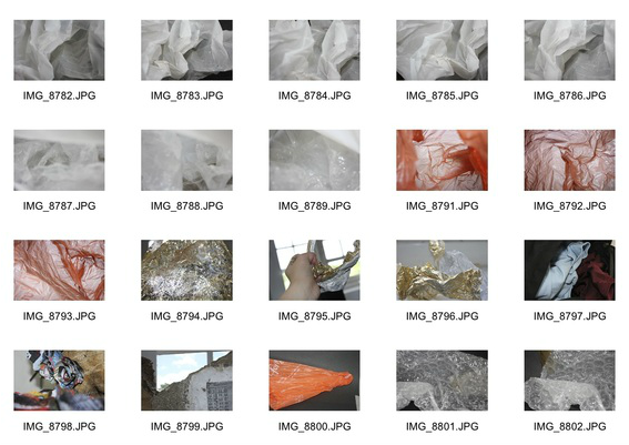
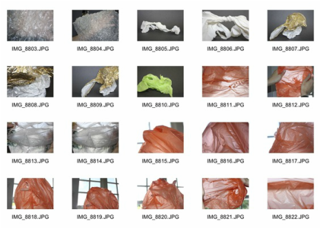
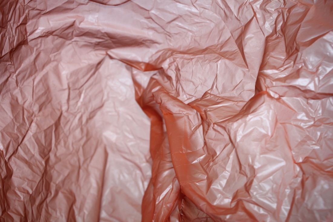
For this task I chose a range of different media and materials and experimented using a field of different forces applied onto them. I took several different photographs, from a variety of angles, of plastic bags, bubble wrap, tissue paper and other objects that I thought would most easily highlight the topic of applied, physical force. I used many different applications of force on each object to portray the different aspects of applied, physical force in different ways. The outcomes of this task are show below in a contact sheet and three of my favourite images enlarged.

|
|
Artist & me
|
My Work
|
Francois Delfosse
|
This photograph is similar to Delfosse's work as I think the contents of the photograph are quite similar. For example in the bottom right-hand corner both the bags are crinkled in quite a similar way. I think it is interesting how this managed to happen by accident as I wasn't looking at the picture by Delfosse when I was trying to take my response. You can also see that a lot of the wrinkles and dents within the bags are quite similar in similar places. However, I think by comparing my work to Delfosse's I can see that to improve my response I should take these images away from the light. In my photograph response to Delfosse you can see the light coming through the bag which almost emphasises that the subject is a plastic bag instead of creating illusion and leaving it up to the viewer to interpret the subject of the photograph, like Delfosse does throughout this series.
Second Response
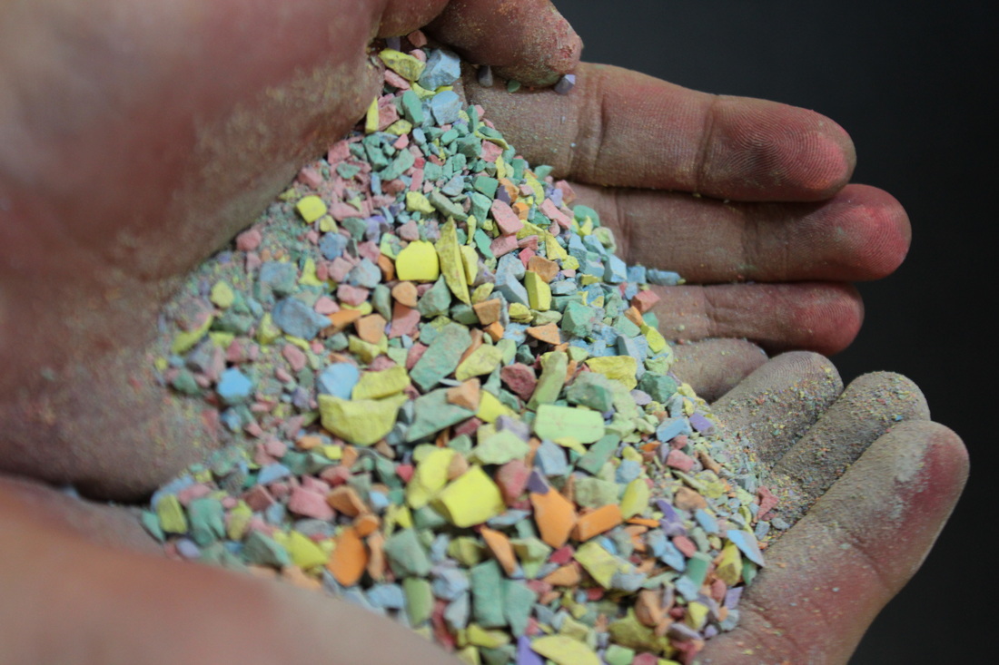
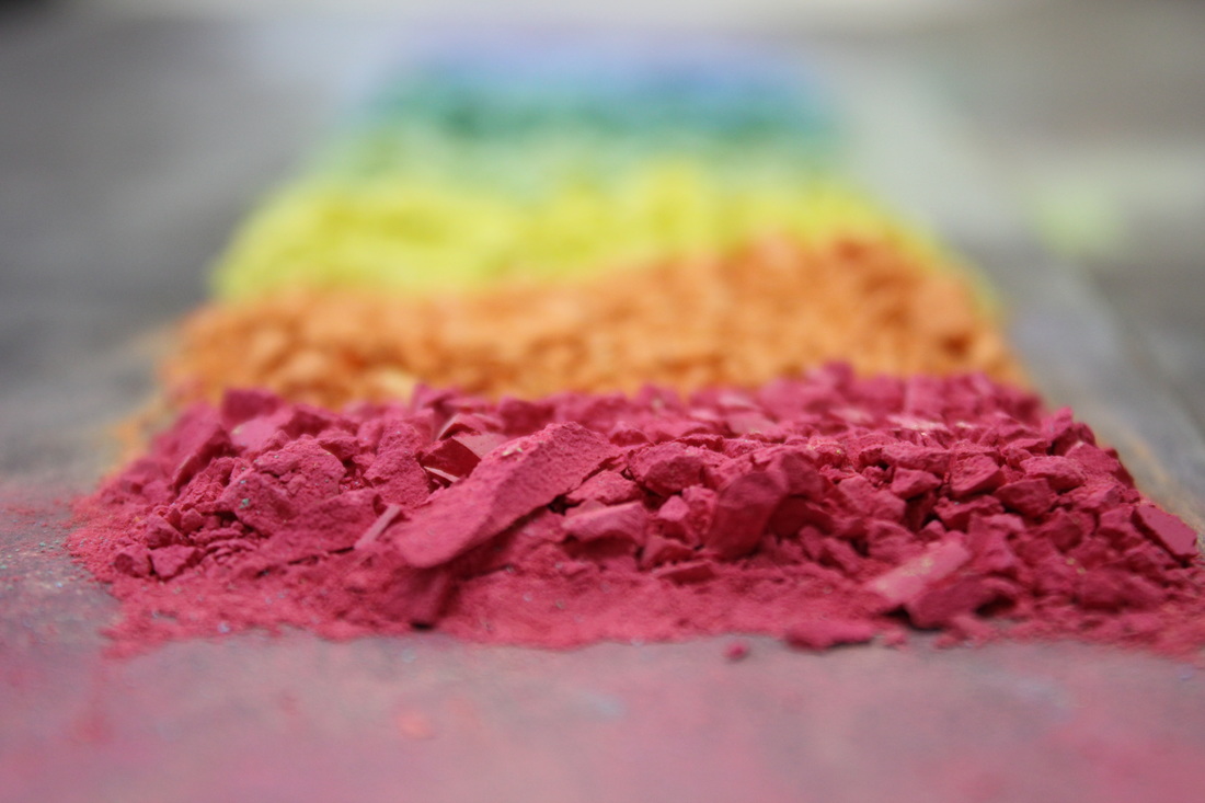
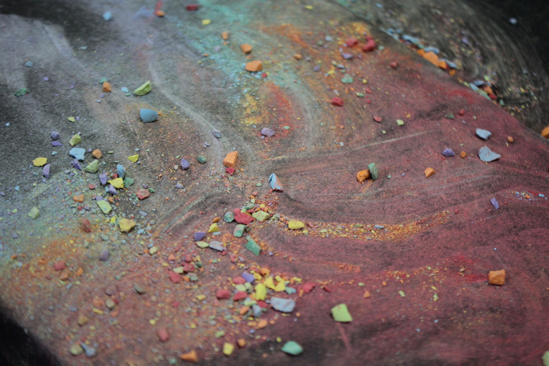
For the second response to the concept of 'applied force' I took several images of crushed, colour chalk in different arrangements that would emphasise the 'force' that had taken place on the chalk for it to be crushed into so many small pieces. I think these photographs were successful as the idea of force here is conveyed in a quite obvious way, as the subject is crushed up by a force acting on it.
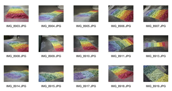
|
|
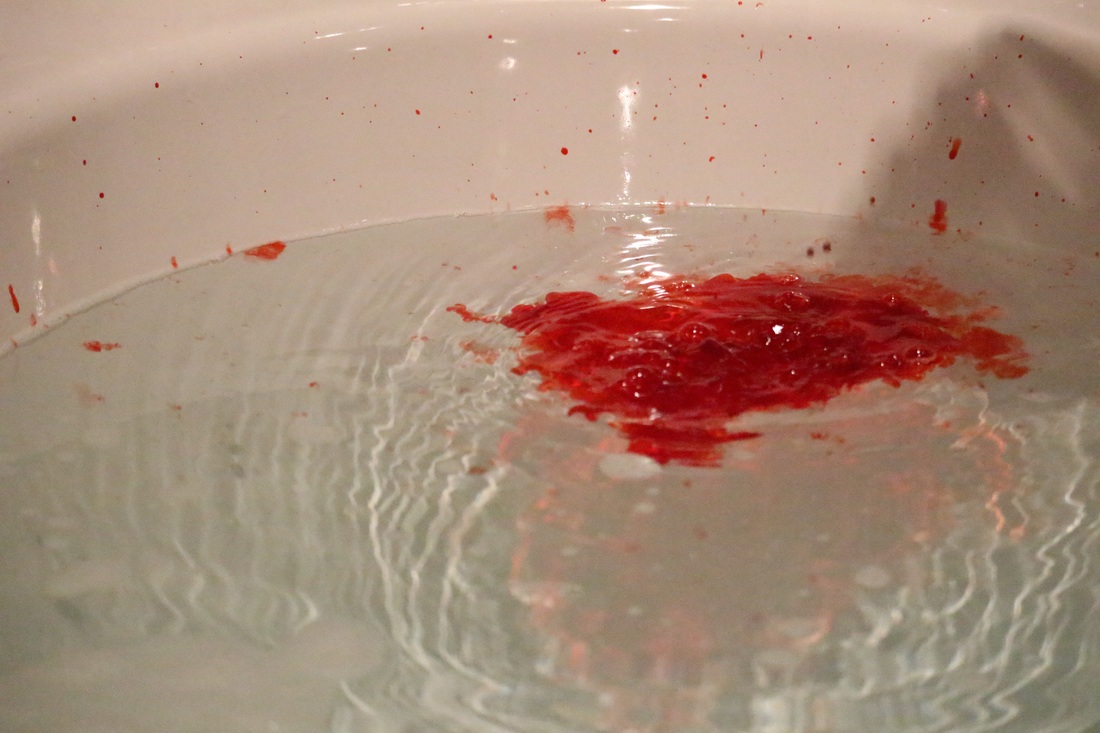
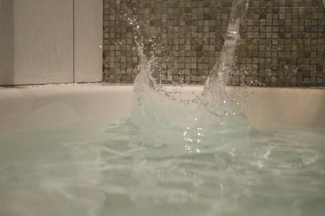
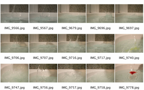
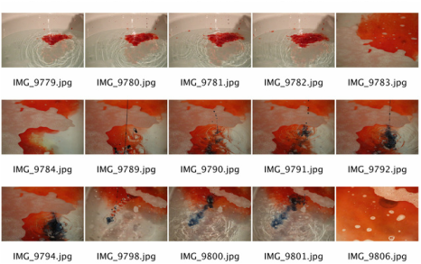
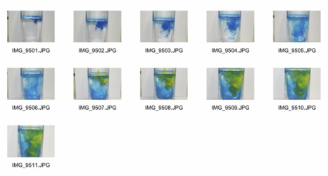
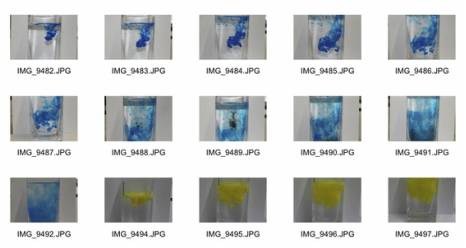
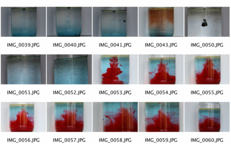
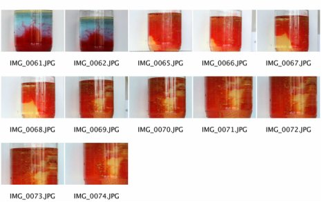
Homework Response
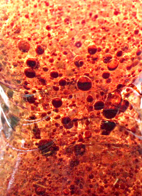
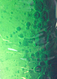
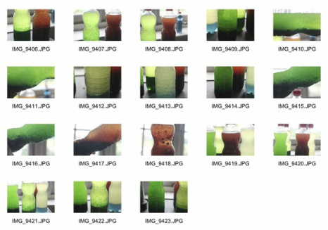
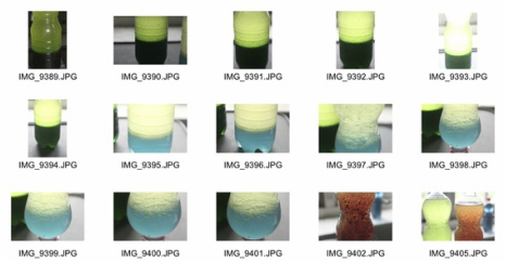
For the homework response to this particular task, I chose to portray 'applied force' using water and other substances. For some of my photographs I used coloured liquids thrown into the water, to convey the force that goes through the water when other liquids are poured into it, in a more visual way. I started out by using just water splashed into itself, then decided that using colours would be much more interesting in a visual sense. Below are the contact sheets of all the images I took and above them, my three favourite photographs from the sequence.


|
|
Imposing Architecture
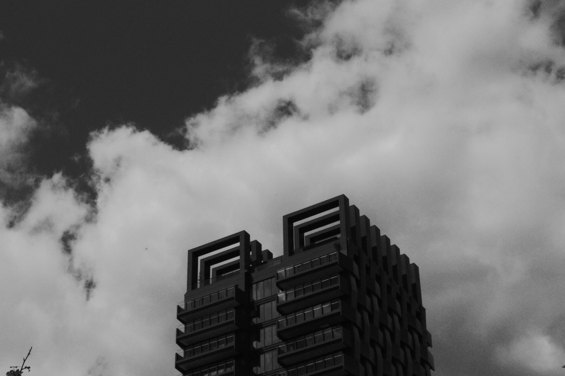
Hannah J Taylor
Hannah J Taylor graduated with a first class degree in photography from Falmouth College of Arts in 2003. For the past six years Taylor has specialised in architecture and urban landscape undertaking both commissions and personal projects. She has collaborated in numerous exhibitions and has been featured in the Royal Photographic Society Journal under the title ‘Coming Up Fast’. Her passion for the modern city continues to drive her personal work.
|
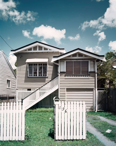
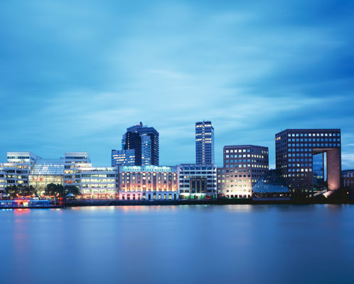
I think this photograph is interesting as it conveys 'imposing architecture' in a different way to most of Taylor's photographs. It has an element of symmetry throughout the image as the two separate parts of the house are the same shape, also, Taylor has made it so that the house is directly in the middle of the photograph. In doing so, the viewers attention will be directly drawn to the house. I think the way that Taylor has chose to angle this picture is also very effective. The picture seems as if it were taken a slightly upward angle, making the house appear larger than it really is. The sky in this image adds to the dramatic effect of the photograph as the black rain gutters on the roof have a strong contrast against the quite pale, blue sky. I think contrast plays an important role in this picture as most of the colours contrast against to the ones next to them. For example, The bright, green of the grass contrasts against the reflective, white of the fence. This also gives the image a very summery, warm feeling.
|
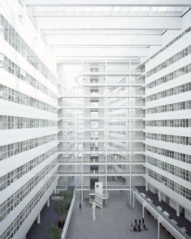
This picture is very effective as it intrigues the viewer. The several glass, windows aligned next to each other perfectly, appear as though they stretch on forever and never end. This creates a great amount of depth to the image which enables the viewer to analyse the photograph with a lot more discernment. Also, I think the angle that Taylor has chosen to capture this image at is very effective to this particular subject. She could of chosen to take the image from a low angle, looking up at the architecture, which wouldn't have been as successful as taking the picture straight on. I think this photograph is engaging because it doesn't really have a main focus point or even a background. The whole image is really the focus point, I think this is an effective technique to use when taking architectural photographs such as this one. Finally, I think that this method makes the image appear quite simple and shallow, whereas the illusion of continuity created by the windows and the angle contrast against this creating, again, a prominent feeling of importance in contrast.
|
I think this picture is effective because the sky over the buildings is smooth and gives a silky, soft texture which corresponds with the water underneath the city skyline. This makes the skyline seem as though it's against a blue background and the buildings appear as though they're fading into the blue, as if the sky were part of the water. I also think Taylor has used contrast well in this picture as the way that the buildings are lit up makes them stand out against the dramatic blue of the water and sky combined. It gives the entire image a modern, sleek feel because of the way the architecture is displayed and how the colours have been put together throughout the photograph. The sky in this picture also makes the architecture stand out in an obvious way because the clouds are quite dramatic on either corners of the image, whereas in the middle they resemble the water as they're very smooth and subtle. I think this makes the photograph very interesting because it's something many people would take a picture of but it's been done in quite an individual, original way.
|
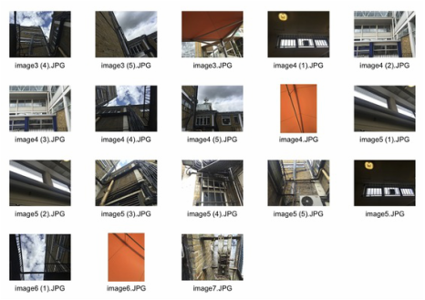
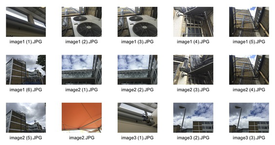
Classwork Response
For my first response to imposing architecture, I took several photographs around the school of tall buildings that I thought would make an interesting subject for this kind of photograph. I think I could improve on these photographs by taking them at much lower angle and of more relevant, fitting subjects.
|
|
Homework Response
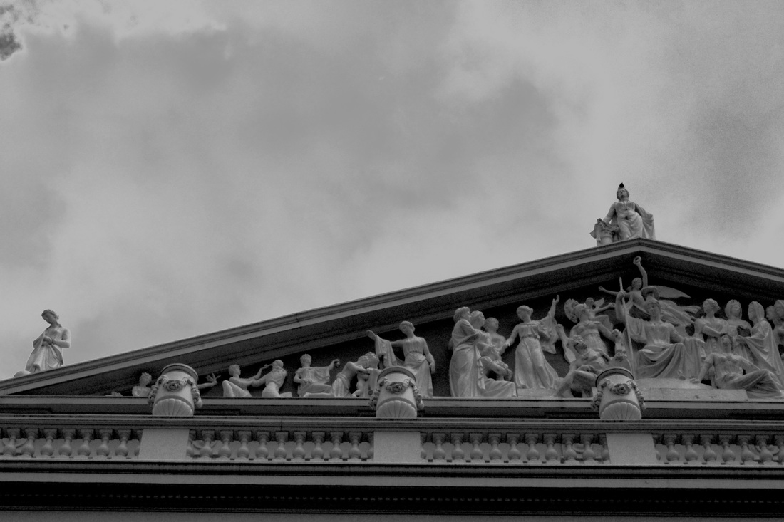
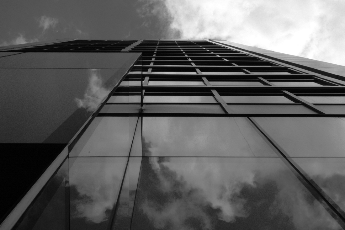
Below are the contact sheets showing all the photographs I took around London that I feel respond appropriately to the task of 'Imposing Architecture'. Also, my three favourite images that I have edited in photoshop. Editing architectural pictures in black and white, as shown below, makes them a lot more dramatic and imposing because it can gives these types of pictures more texture and depth.
|
|
Edits
|
|
Deconstructing Objects
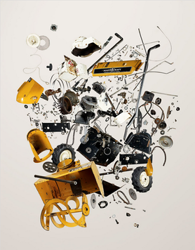
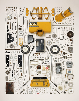
Artist Analysis - Todd McLellan
Things Come Apart is an expansion of the original Disassembly Series. This new set of images explores retro to modern daily items that have, are, or will be in our everyday lives. The book "Things Come Apart" published by Thames & Hudson and is now available at all major bookstores. This series portrays sets of images taken of several different everyday objects dissembled. There are photographs that feature the object dissembling in the air, almost as if it's been blown up. Then, there are pictures of the object placed in a neat order against a white background.
|
|
In this series, titled 'Things Come Apart', McLellan captures several different everyday objects that he has dissembled in a very powerful way. There are several different objects used in the series, and for each, there is a photograph taken against a bleak, off-white background of the different pieces of the certain object floating in the air as if it's exploded it causing to break into it's original pieces. There is also a picture for each different object of all the original parts of the object laid out neatly on a the same off-white background. I think this is an effective technique that McLellan has displayed here. By using a harsh, off-white background there are no other distractions around the image and cuts the focus directly to the selected object in the photograph. Another interesting aspect of the photographs is the symmetry throughout the second image on the left. The objects are arranged in such a way that the photograph is almost symmetrical, this makes the image a lot more aesthetically pleasing to the viewer and portrays an undertone of flawlessness of perfection. Finally, the photograph has very little range of colour throughout which makes the image appear simple and much more easy to understand and take in. I think these pictures are particularly effective side-by-side as they show two completely different ways any photographer could choose to capture that specific object, conveying the element of dissembling.
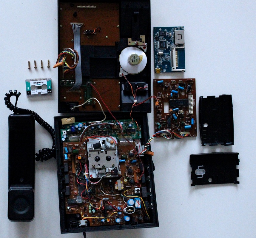
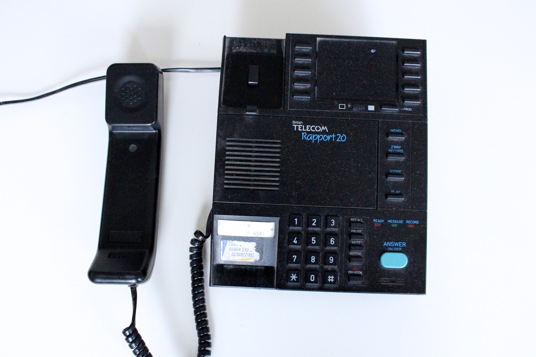
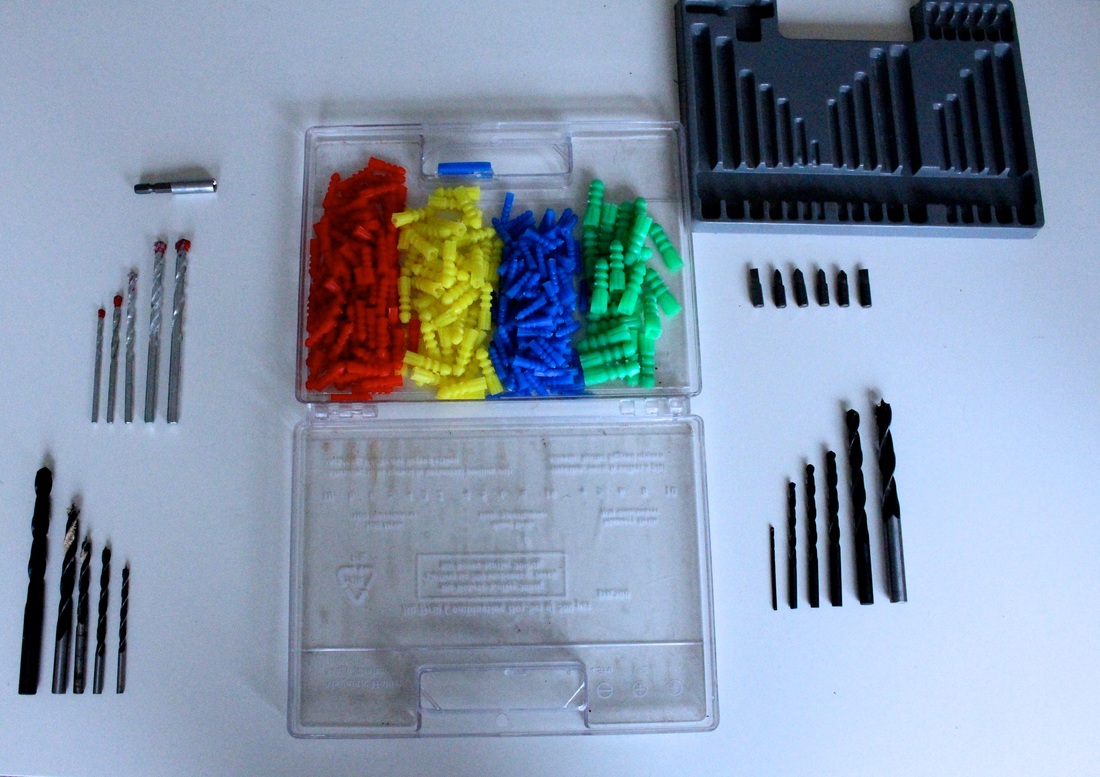
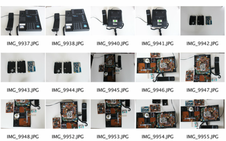
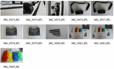
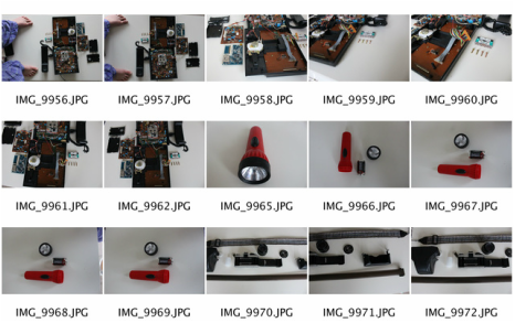
My Response
For this task I took apart several different objects from home (an old telephone, a torch and a drill combination box set) and lay them out against a white background in attempt of mimicking the work of Todd McLellan. Below are the contact sheets of all the photographs I took and then my three best images enlarged and edited.
|
|
Strand Response
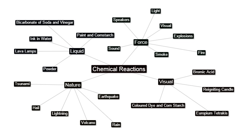
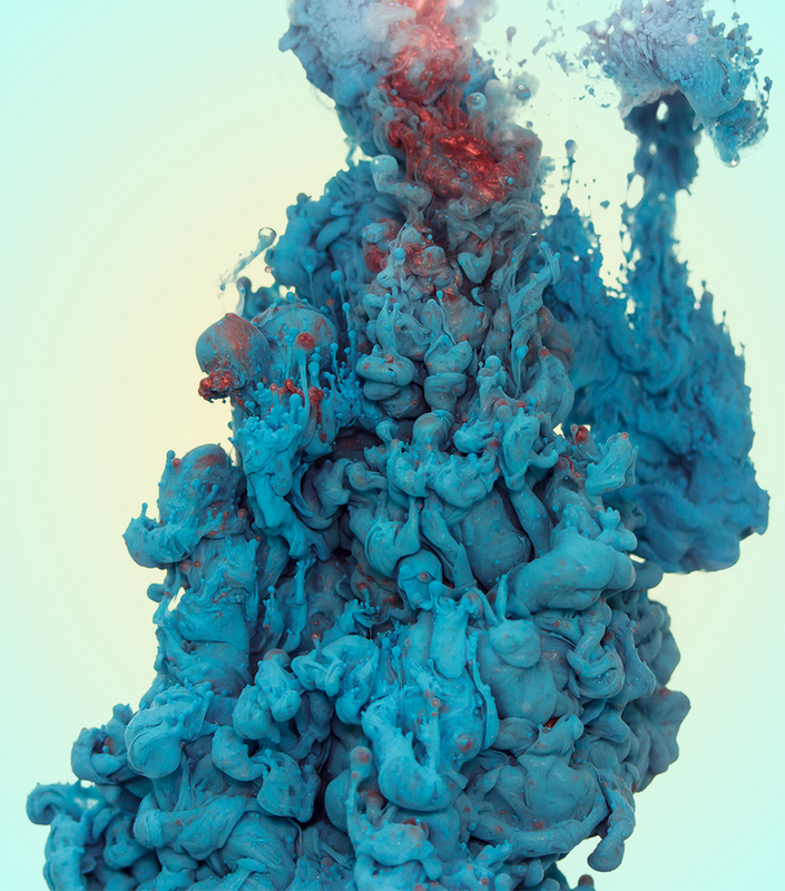
For my first strand response I have chosen to look at chemical reactions as a representation of force. I chose to do this because I think it is a strong, visual representation of force, which is a more powerful way to show force through photographs since you can see the forces taking place. Also, there are many different aspects of the subject which I can explore, such as reactions within nature or liquid chemical reactions done from home or in class. The outcome photographs that are taken within the topic of chemical reactions are very different to everything else that we've done so far in class this year. This allows me explore many different forms of photography as these types of images can be perceived as rather abstract as opposed to the more simple topics that have been set through school this year.
Lava Lamp
For this section of my strand response I took inspiration from photographer Berenice Abott. She has some images of scientific nature, one of which inspired the way I took the following photographs as she used a zoomed in, very defined and focused technique. I thought this was an affective and individual way of photographing this particular subject, as it showed only the focus point of the image in the entire photograph so there are no other distractions from the main focal point.
|
Examples of Berenice Abott's work:
|
|
My Response

|
|
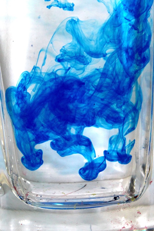
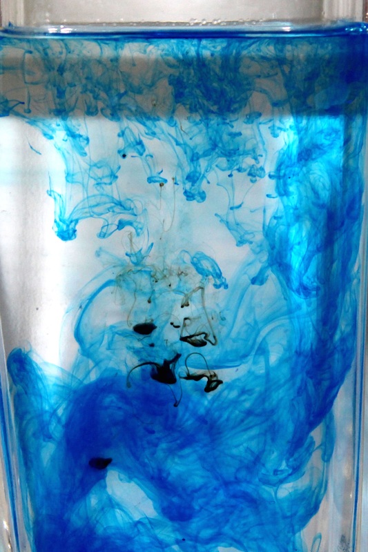
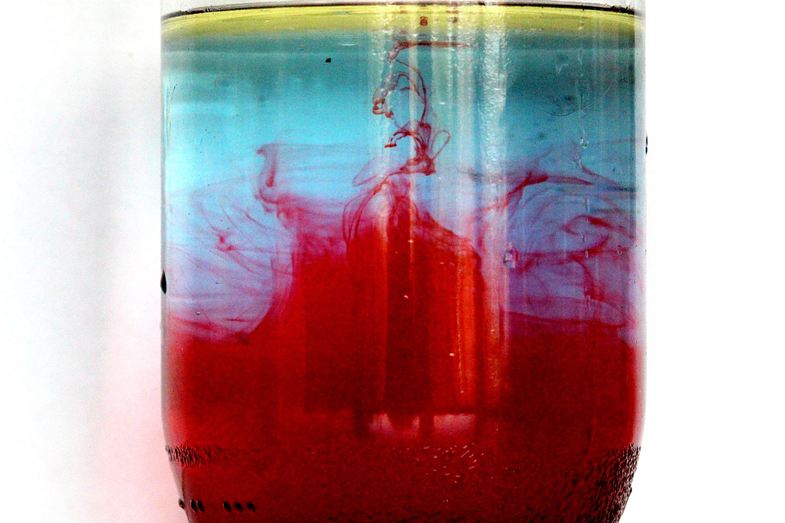
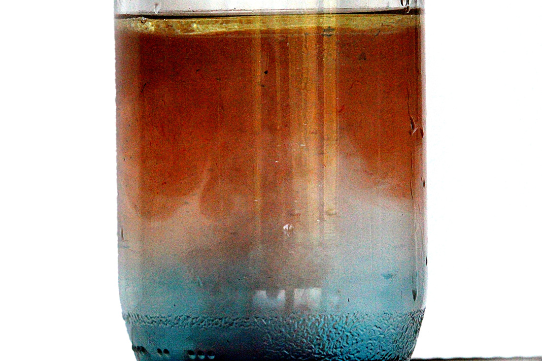
Ink & Water
For this section I have chosen to photograph several different colours of ink in a glass container with water in it, against a white background. I have taken inspiration from other photographers by capturing close shots of the ink appearing to float throughout the liquid and making interesting shapes within the water. I think this reaction makes for interesting photographs as the camera can capture the liquid ink gradually expanding through the entire glass container. Below is a video that I found that I think shows the many different interesting, potential things that you can do with ink and water in photographs.
Ink and Water from Brian Andrews on Vimeo.
Alberto Seveso
Italian illustrator & Digital Photographer Alberto Seveso was born in Milan, he grow up in Sardinia but is now working and living in Bristol (UK) as a freelancer. His passion for graphic art started when he was in a young age and he was really fascinated by the graphic of skate decks and the cover of music CD of metal bands in the early ‘90s. From this passion he started to create his artworks. Bristol-based illustrator and photographer Alberto Seveso shared a new collection of underwater ink photographs titled Heavy Metals. Seveso achieves the ethereal forms in his photographs by mixing ink with metallic powders which are then suspended in different fluids. This series by Seveso features several images of different coloured inks, some completely metallic, whereas others have only a slight metallic tinge to them. I think this series is particularly intriguing as the photographs make the ink look as if it's something else and have a very alien, abstract feel to them. This series also seems to correspond alongside Seveso's longtime interest in metal bands, which makes these photographs feel quite personal and down to earth.

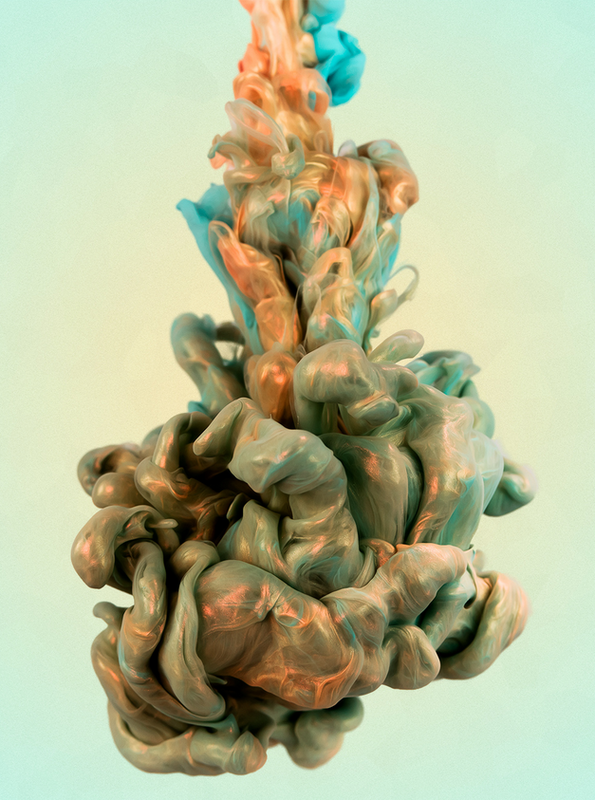
Left - I chose this image as one of three to represent Seveso's series 'Heavy Metals' as I think it is a powerful photograph. The colours of the ink cloud seem to very subtly correspond with the faded colours of the background in the image, which makes the picture much more effective, as the colour in the centre of the image is lighter and becomes gradually darker as the eye moves towards the edge of the photograph. I also think that the shape of the ink cloud makes the picture a lot more effective, as it starts off rather thin and copper coloured, then gradually becomes blue and gets thicker right at the bottom of the image which is much more interesting to look at, as opposed to just a big or small blob of ink.
Middle - I chose to analyse this photograph as I think the colours and the shape of the cloud of ink that is the main focal point, drew to my attention. This image particularly stood out to me as there is so much detail within the photograph even though it is just a picture of some ink in water, the image is incredibly intricate, detailed and focused. There are two colours of ink in this image that have seemed to mix together and form a third colour covering the detail of the two more prominent colours. This makes the image look very abstract and interesting and almost makes the ink cloud look like a cocoon holing more ink inside. Finally, I think this image is effective as the bottom of the ink is in complete focus, whereas the top of the ink cloud is slightly blurred giving the entire photograph more depth and intrigue.
Right - This photograph is quite different to the previous two as it has only one main colour and some slight parts of it are a different colour. I think this is less effective than the other technique of using more colours as it gives the photograph much less depth and makes it seem a lot bleaker. However, I chose to analyse this photograph as I think it is slightly different to the other images throughout Seveso's series 'Heavy Metals'. This image features one main colour with very little metallic feel to it and seems much bigger and bulkier than the other photographs of the series. I think this exploration of colour and shape is interesting as it shows how different a photograph can look just by changing one small aspect.
Classwork Response
For this response I captured several photographs of different coloured inks and dropped them into a glass container filled with water. I achieved the white background by placing the glass container in front of white cardboard. Below, are the contact sheets of all the images I took in class and then three chosen, edited images that I felt were the strongest of all of them and show the most variety.
|
|
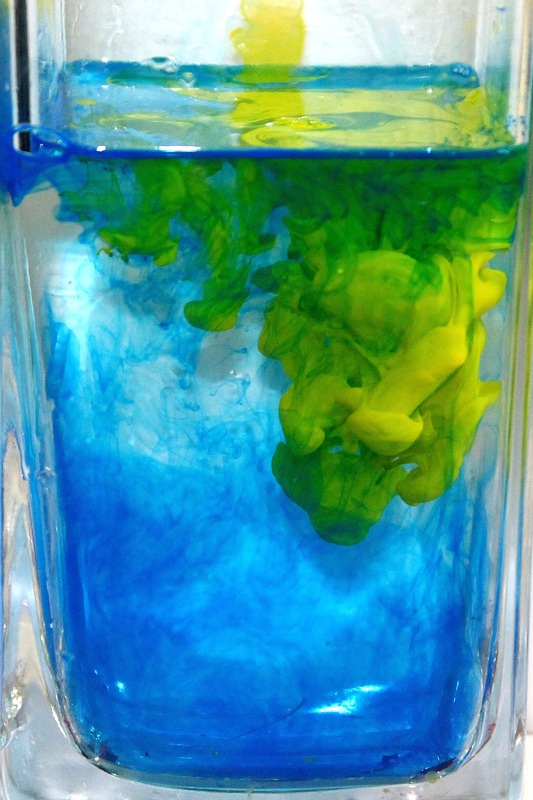
Homework Response
For my homework response to this particular section, I experimented with many different substances to produce different coloured liquids with different viscosities and appearances. Some worked better than others, my three personal best photographs are shown below in big and have been edited using Photoshop below them are all the pictures that I took displayed in contact sheets.

|
|
Second Strand Response
For my second strand response I have chosen to look at the force of decay, I chose this because I particularly like the images you can create within this topic. Also, I think it can also represent other forces such as the force of nature and the force of time, which gives the photographer a lot of control as there are many different ways you can capture and represent this force through your images. This relates to the force of nature which we looked at in class earlier this year and I thought especially captured my interest and made me want to expand on it.
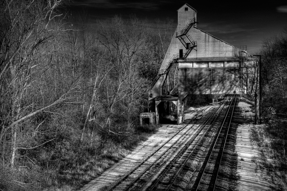
Derelict Buildings
For this section of my second strand response I took inspiration from photographer Sean M Leahy. His photographs struck me as I think that the black and white effect that he uses gives the images a lot more impact on the viewer as opposed to coloured photographs and makes them particularly dramatic and interesting to look at. Leahy has a series of photographs based around abandoned, derelict buildings. I think that the way he captures the buildings and the angles he uses makes the force of decay very obvious. I also think that he portrays the force of nature against man made things, such as buildings, very clearly.
Abandoned Buildings - Sean M Leahy

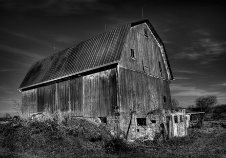
Left - This picture stood out to me as I think the force portrayed throughout the image is very clear in a visual way. Firstly, the cracked pain of the walls of the house emphasise the force that nature and time has had on the building, making to foundation of the walls show though the paint. The image almost makes the subject look like something out of a horror movie, which is also why I like the black and white effect that Leahy uses throughout the series. Secondly, I think the way the building contrasts with the sky behind makes it stand out so it's the first thing that the viewer sees when looking at the photograph. Also, I think that the effect of the black and white on the sky makes the building look a lot more imposing and the whole image much more dramatic. Lastly, I think the element of symmetry that Leahy has captured with the trees either side of the house makes the image stand out against others and is very aesthetically pleasing to the viewer.
Middle - I particularly like this picture as I think that the train tracks leading up to the ruined arch above makes the image very interesting to look at. I think that the angle that Leahy used really emphasises the abandoned, derelict atmosphere throughout the photograph. I also think that the use of the black and white effect emphasises this and makes the picture more dramatic than if it to were be in colour. Secondly, I think that the trees next to the train tracks adds significance to the element of force in the photograph as it reminds the viewer that nature is almost taking over the area as it has been abandoned and is no longer looked after.
Right - I chose to analyse this final image from Leahy's abandoned buildings series as I think the contrast of the imposing, abandoned structure against the bleak, dramatic sky accentuates the decay on the building. I think this photograph is quite similar to the first that I analysed from this series, except Leahy has taken it from a lower and less centred angle which exaggerates the size of the building and overall gives the photograph more of a dramatic effect, as well as the use of black and white. Secondly, I think this picture is also different to the other two in some ways, for example, It feels a lot more empty and minimalistic as there aren't many surrounding distractions within the image. I think this is interesting as it directly draws the viewers attention to the main focal point of the photograph and allows the viewer to clearly understand the force that the photographer intended.
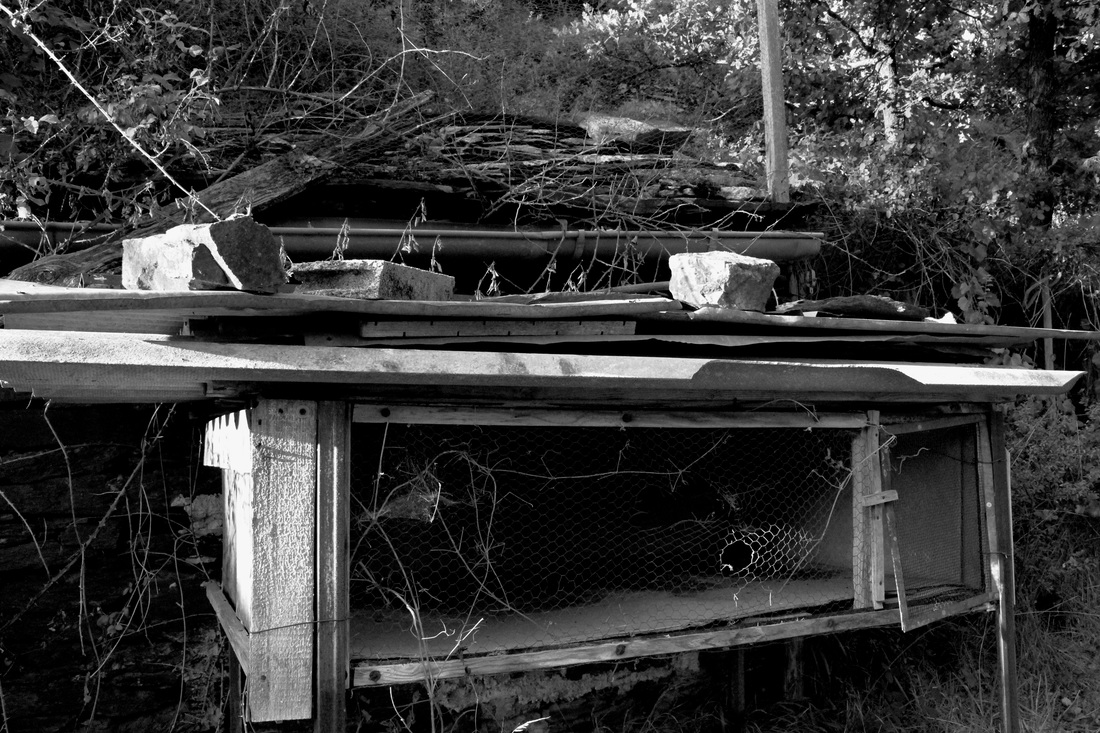
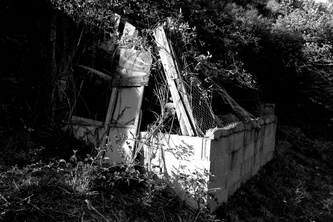
My Response
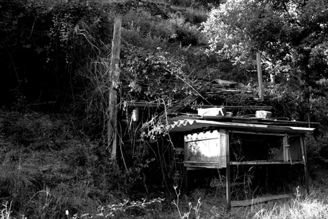
For my response to Leahy's abandoned buildings series, I took several images of a derelict, run down shed in a field. I thought this replicated Leahy's work rather well as most of the pictures in this series are surrounded by grassy areas and have nature-filled backgrounds. In the photographs that I took there was a lot more nature and plants growing around and on the abandoned establishment. I think this shows the force of decay in different ways which is very interesting to me. For example, the building is abandoned and eroding which shows the force of decay inflicted on the building. However, the plants and nature growing on the building show the force that nature can have on man made things. Below are my three favourite edited images and then a contact sheet of all the photographs I took.

|
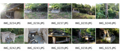
|
Artist & Me
Sean Leahy's Work
|
My Work
|
There is some similarity and some difference between my photography and Leahy's. In my image, on the right, I have tried to incorporate nature around the subject to make the effect of decay look a lot more prominent and stand out. I think that showing how plants and grass around the main structure in the image have grown around the subject shows how the structure has decayed. This highlights to the viewer that element of neglect making the main subject seem more abandoned, whereas if the surroundings were clean cut and looked kept, it would have a completely look. I think Leahy also incorporates this in his own work, especially in the photograph on the right. However, in these two examples they are used in different ways. Leahy's work has more of an imposing element than my own, which I think makes the image look much more dramatic especially as it has the black and white effect. I also think that the sky in Leahy's photograph adds to the drama of the entire photo by enhancing the size of the structure and making it seem more imposing, whereas in my photograph it looks more as if the structure is being drowned by the nature around it because you can't see the sky and there is a lot more decay around the structure as opposed to on it.
Second Response
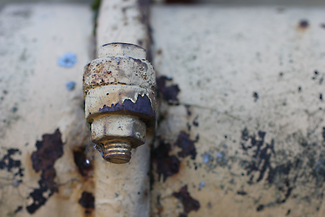
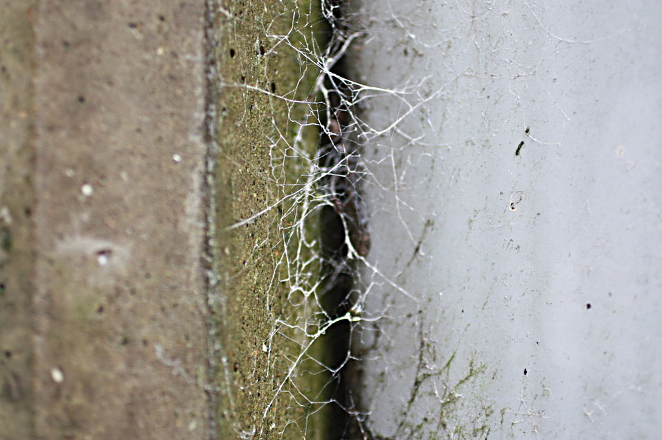
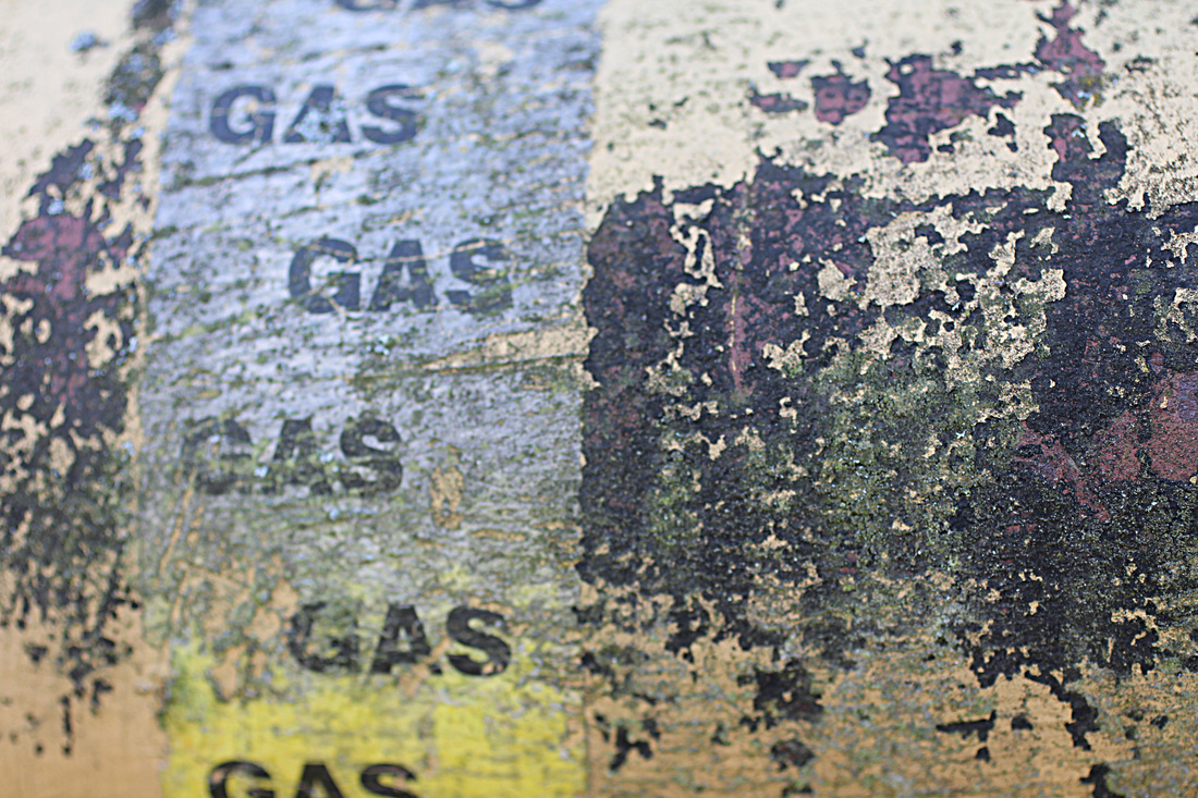
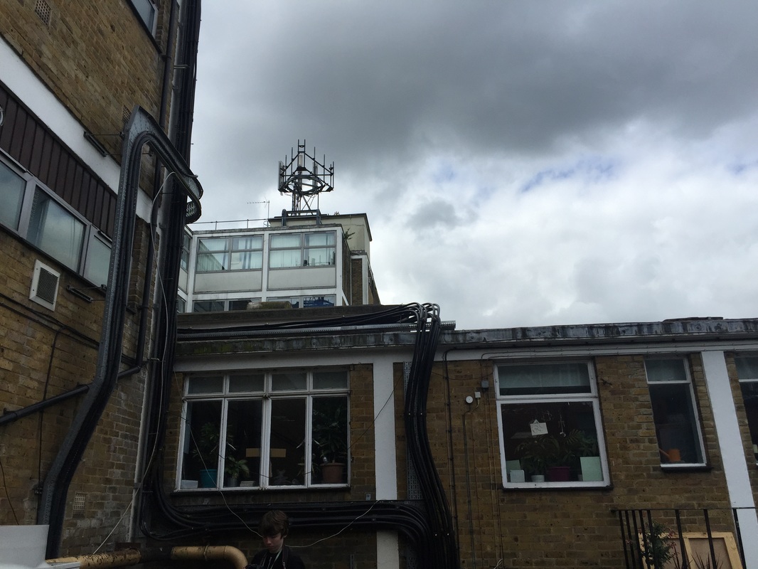
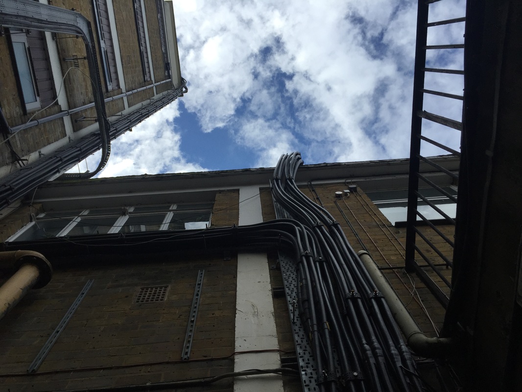
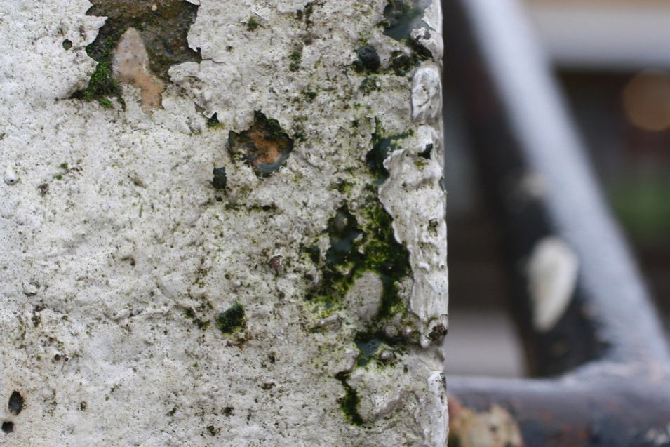
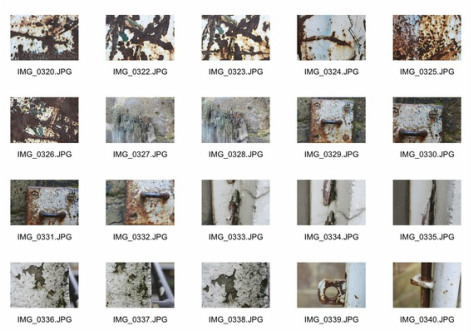
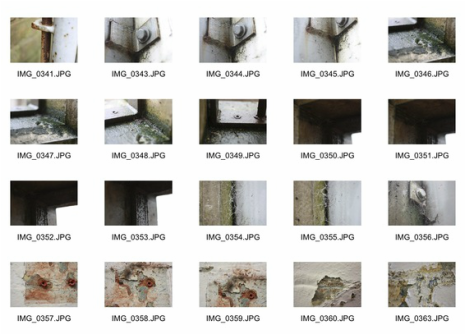
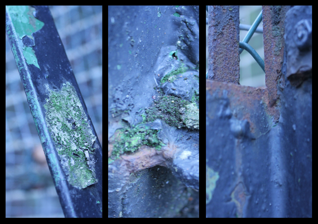
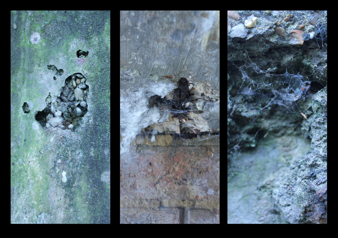
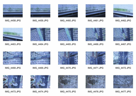
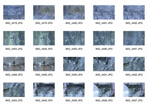
For my second response I tired to something different than capturing a main subject that I think portrays decay. I walked around school and photographed smaller, more intricate details of objects that looked like they were rusting or decaying using a macro lens to allow me to focus on the small, close up details of the object. I think this method of capturing decay is also interesting as it focuses solely on the aspect of decay, rather than showing the viewer that a house, or other object, is decaying and falling apart. This forces the viewer to imagine what the subject of the photograph might be.
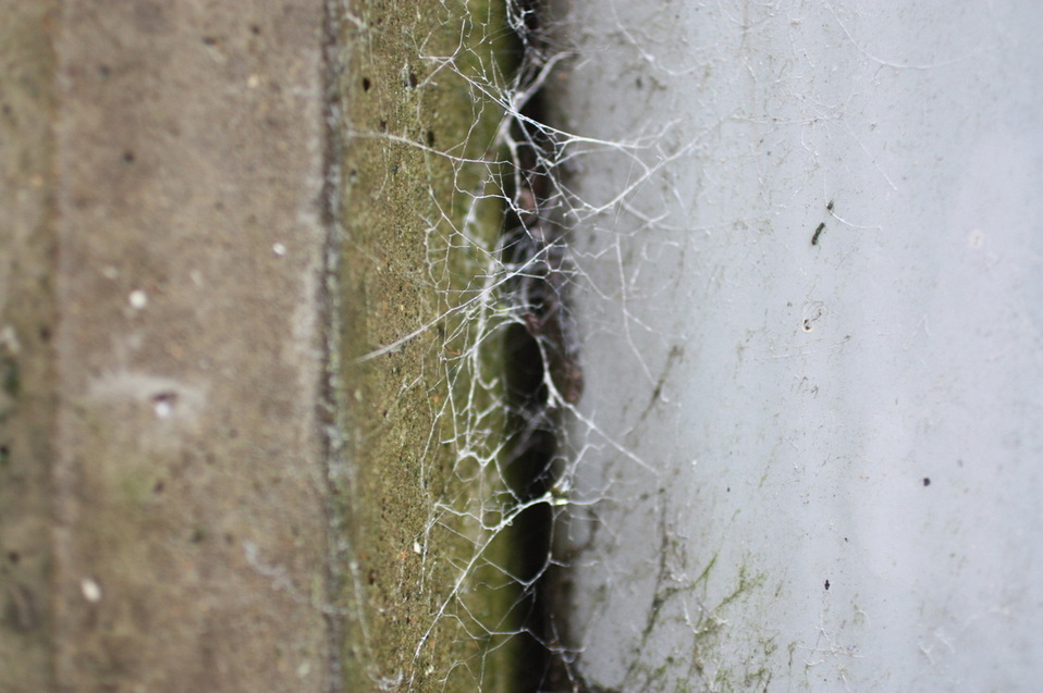
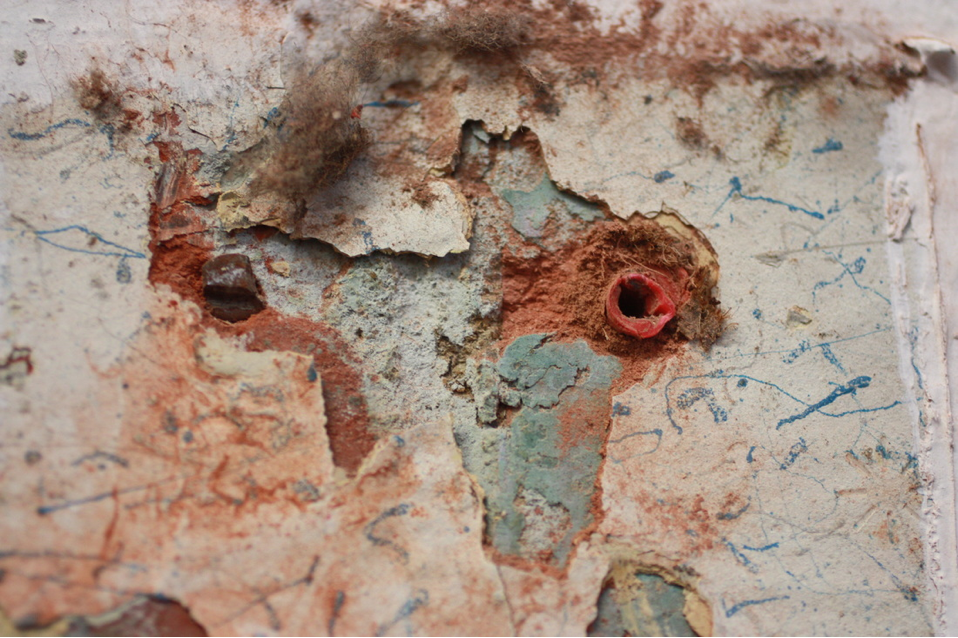
|
|
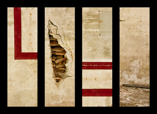
Tim Suess
"Most of my work revolves around and the slow battle between human structures and nature’s decay processes. I’m fascinated by the effects of time, which is why I like time-lapse movies and created the open source interavalometer Intervaluino. My pictures show internal spaces, external structures, crumbling walls, industrial details and abstract compositions. They are memento mori of forgotten places, through which I try to demonstrate that the absence of human life changes a location fundamentally."- Tim Suess
|
|
|
Tim Suess is an interesting photographer as he uses quite an individual style to portray the decay of an object. In the above series, Suess uses several images aligned next to each other, like a collage. I think this is quite effective in emphasising the details of the decay on an object. For example, I the first photograph on the above left, you can see all the small details of decay on the subject without even knowing what the object is. I find this type of technique is very effective because it allows the viewer to imagine what the object that Suess photographed might have been, rather than it just being obvious what the photograph is of. This makes it a more abstract method of photography, which is different to others photographers that I have previously looked at during the topic of force. I think this method is particularly interesting because it takes quite a simple aspect, such as decay, and makes it more complex and gives his images a lot more depth. I also think that the way Suess uses this distinct method of framing to show the small details of things that aren't necessarily decaying is quite thought provoking as it allows the viewer to imagine more things that the subject could possibly be.
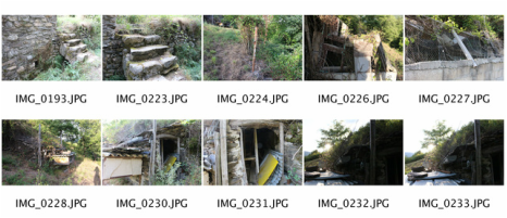
My Response
|
|
Final Piece