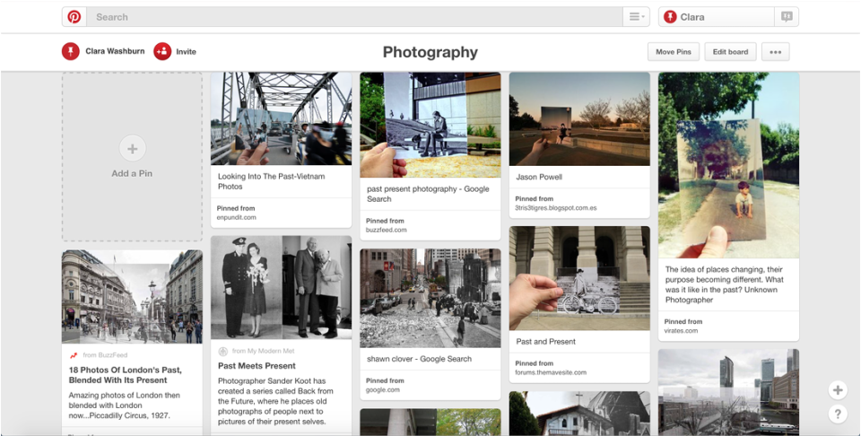
Past, Present & Future
Pinterest Board

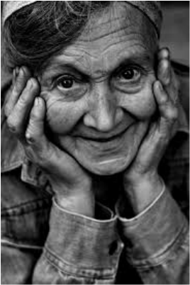
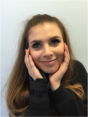
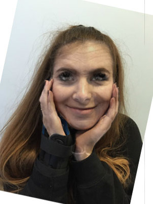
Aged Portrait
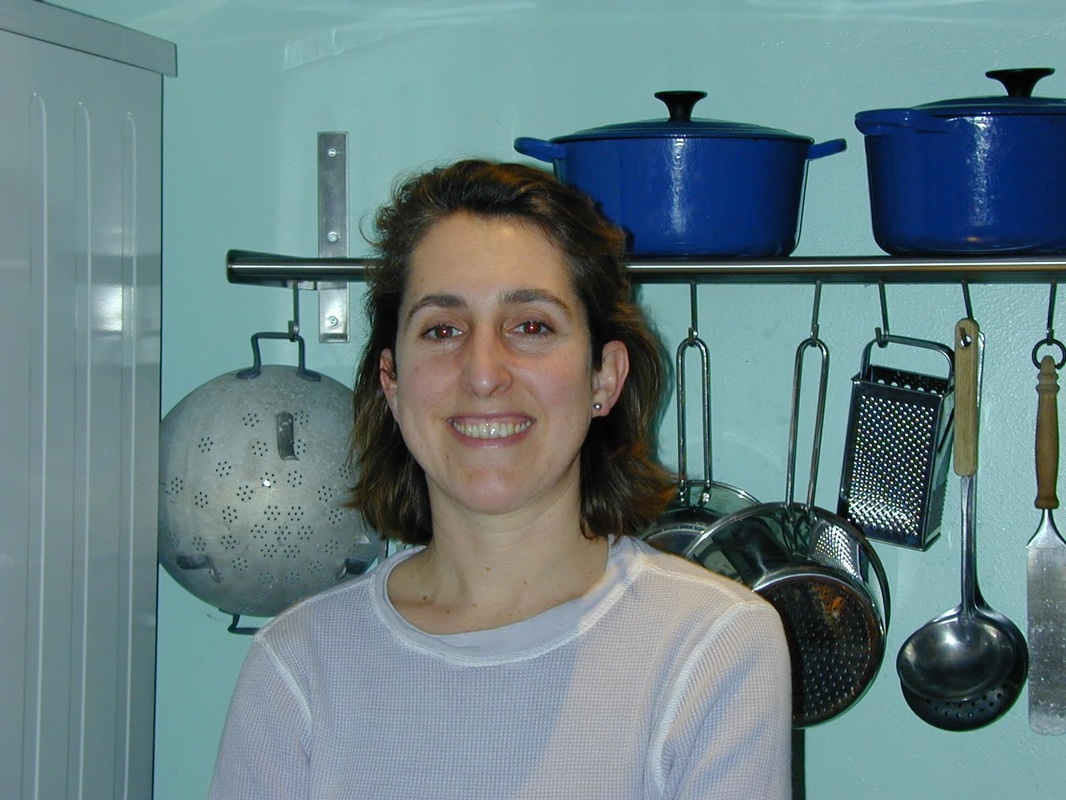
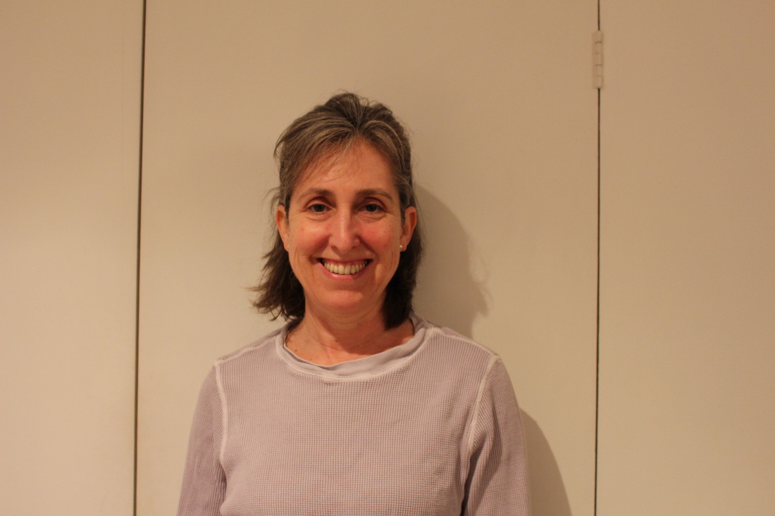
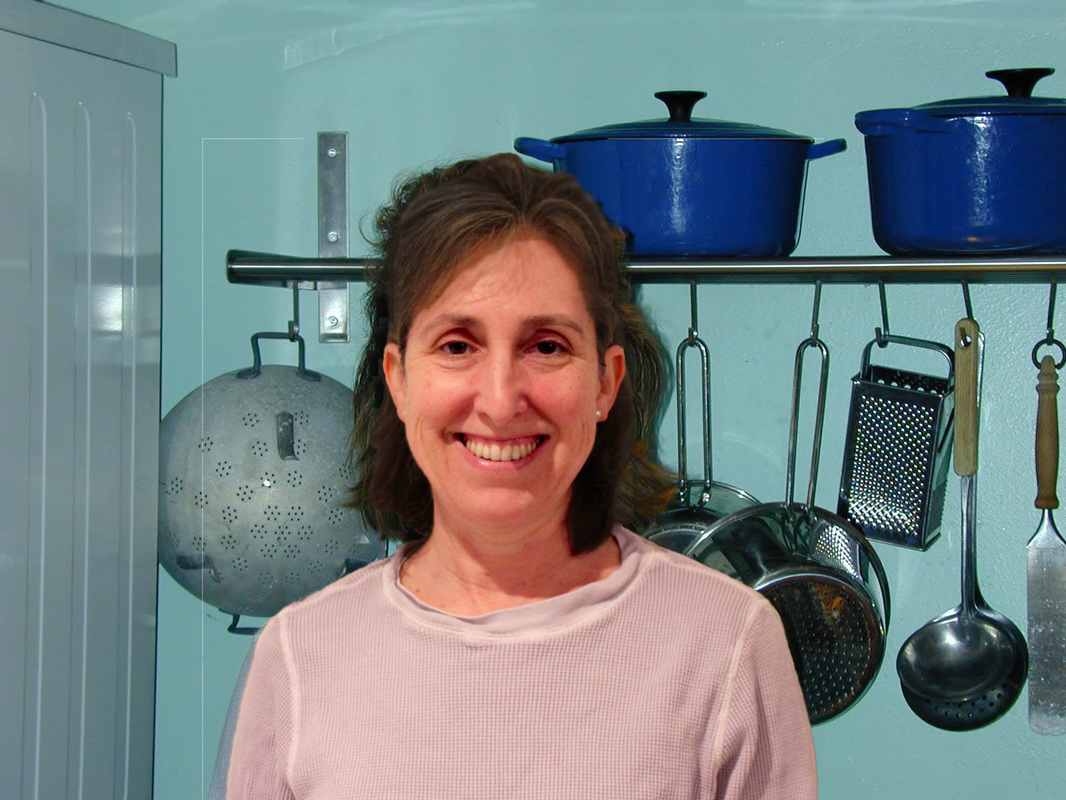
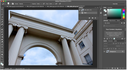
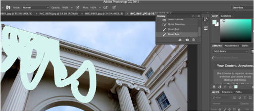
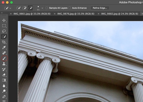
For this task I found an aged image online and tried to get the model to recreate the pose of the woman so I could get a more accurate outcome. I then followed the video below for instructions on how to merge the images and make the model look aged, below are all the pictures I used, then the final outcome photograph.
|
|
|
bobby Neel Adams
Bobby Neel Adams was born in Black Mountain, North Carolina and presently resides in Arizona on the Mexico Border. He has exhibited worldwide and his photographs are in the collections of: International Center for Photography, NY, Houston Museum of Fine Arts, Station Museum, diRosa Foundation, and the Norton Family Foundation to name a few. Adams has received grants and awards from the Aaron Siskind Foundation, LEF Foundation, MacDowell Art Colony and the Hermitage. His book Broken Wings was published by the Greenville Museum in 1997. Adams is currently working on a series of Memento Mori photographs of insects, birds, and mammals.
|
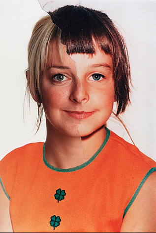
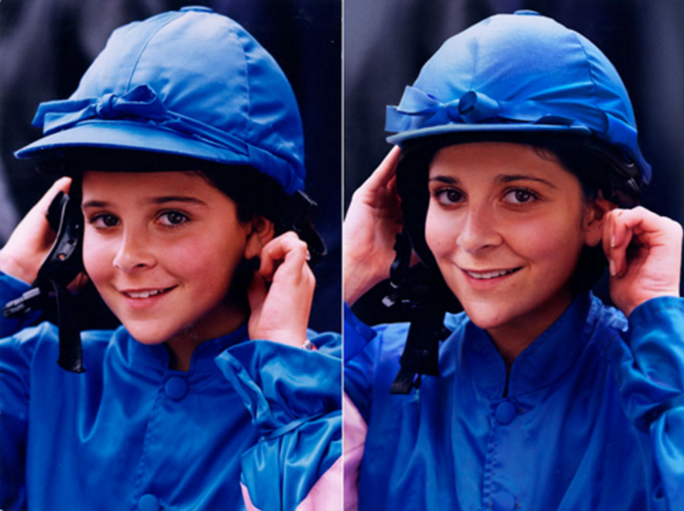
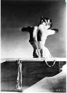
I chose to look further into this image of Adams' because I think the colours within the photograph draw in the viewers eye to further analyse the image. The other images in the series of Adams' look quite serious and have much bleaker, simple colours whereas this one stood out to me because it's the opposite. I also think this photograph looks quite flawless in the way that he's lined the two images up perfectly and re-in-acted the woman's pose so well. It makes the image very aesthetically pleasing to the viewer as it flows very nicely and has quite a smooth quality to it. It also allows the viewer to directly see the changes that time has had on this woman, relating to the topic of 'Past, Present and Future' nicely. I think these kinds of photographs are interesting because they all have an obvious meaning or purpose, and you can obviously see what the photographer was trying to achieve.
|
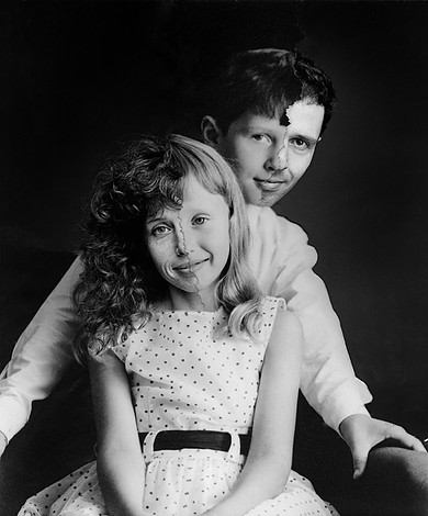
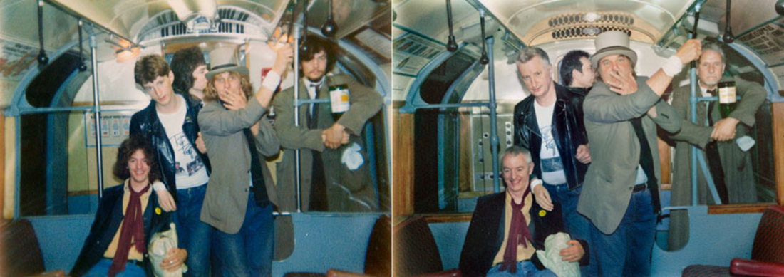
In this second photograph that I chose to analyse, Adams' has managed to create the half young, half old effect on two people at once. I thought this image was interesting compared to the previous as they contrast quite a lot. For example, the colours in the first are vibrant and bright, whereas here there are none and the image appears quite serious. Secondly, the image has much more complexity to it. In the first photograph, the subject is in a simple position, whereas here the positioning of the two subjects would be a lot harder to work with, making the photograph have more depth, further intriguing the viewer. Furthermore, this photograph looks most complex out of the three as the angle is slightly lowered, looking up at the subjects, this would also make it harder for Adams to edit the image with the older photographs over them because he would have to use the same angle as the original.
|
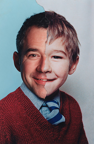
This photograph is similar to the first as both subjects are in similar positions and both looking into the camera. However, I think the colours within this image are much softer and warmer. In the first photograph the colours are quite vibrant and harsh and there is quite a strong level of contrast. In this photograph, however, the colours are a lot smoother and flow throughout the image much more easily and there is less contrast. For example, in the first image the bleak, white background has a high level of contrast against the bright orange, whereas here, the deep red and the blue have some element of contrast, but look much more aesthetically pleasing next to each other. I also think this photograph is interesting to look at on its own as you see, in the older image, the way that the technology of the camera has changed by the quality of the image. For example, the older image appears much more grainy.
|
Location
Taylor Jones
Last May, Taylor Jones was sitting with his family in Ontario when his mother pulled out an old photo album. Among the hundreds of shots was one of Jones's younger brother at his third birthday party. "He was sitting in front of his Winnie-the-Pooh birthday cake," Jones recalls. Jones grabbed his camera and took a shot of the old photograph lined up to match its original location. He posted it and six others on a blog. Within days, the blog, which he later named Dear Photograph, had gone viral. Today, eight months on, Dear Photograph has had 10m hits, and been named one of Time magazine's 10 best sites. It now gets 20,000 hits a day."It was weird – because my brother was there, in the exact spot he was sitting in in the photograph."
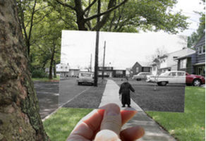
This photograph from Taylor Jones' 'Dear Photograph' series was interesting to me, because of the obvious change in scenery, but also obvious elements of similarity. For example, on the right side of the both photographs there is a car, Jones has lined the car up perfectly with the car thats actually in front of him. This makes the photograph very effective as you can see the change in technology, not only scenery. I think this particular image stood out to me because of the way Jones has perfectly lined up the image with the real view in front of him, this shows that although the things inside the picture have changed with time, the overall structure of the road has stayed very similar, as even the houses and street lights are perfectly lined up. It's also interesting how Jones has chosen to use a black and white photograph against the colour image, further emphasising the idea that technology has developed and changed with time.
|
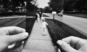
This picture is also interesting as Jones has chosen to use a black and white effect over both the two images. This makes the image look much more emotionally significant and dramatic. This effect may have been used because the older photograph is sentimental to the photographer. The use of this effect also makes the image that's being held up appear older and perhaps sadder. A recurring aspect of the images in this series is that the scenery never really changes so much as what's actually in the photograph. However, I think this makes the idea that Jones is trying to convey much more obvious and effective, as you can see both elements of similarities and differences. Also, it makes the photograph, as a whole, appear more as if the viewer is travelling back in time or looking into the past. This is because the photograph being lined up so perfectly makes the image more imaginable. The way that the photographer has used both hands to hold up the image makes it seem much more personal as if he captured the photograph with his own eyes.
|
I think this final photograph that I chose to analyse is interesting compared to the first two. In this image, a lot of the scenery within the older photograph is different to the current state of the scenery. This is effective as, in the last two the scenery seemed to not have changed at all, which emphasised the element of change regarding the objects in the photographs and allowed the viewer to focus more on the sentimental aspect of the images and the memories connected to them. However, in this image it's a more obvious state of change as the things within the image have changed as well as the scenery. I think this makes this final photograph a lot more thought provoking and gives the meaning of the image more depth. Elements of the image are the same, however, which allows the viewer to relate the picture to the background and still be able to see that they're the same place, but that time has had more drastic effect here.
|
My Response
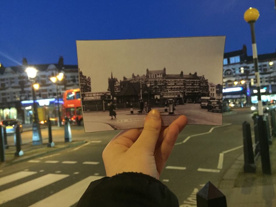
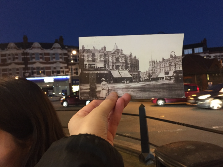
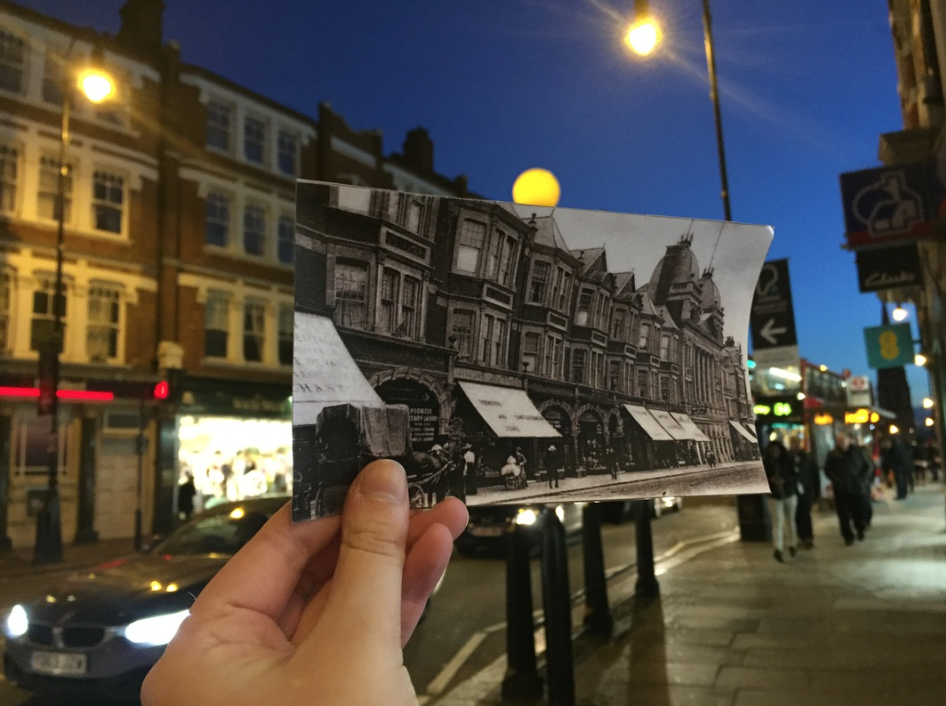
For my response to Taylor Jones, I printed several old photographs of Muswell Hill and held them in front of the modern scenes. I think the way I managed to captured both the photograph and the background in focus worked well. However, when I go to improve my Taylor Jones response I will use more personal locations and try and align the image better.

Irina Werning
Werning was born in Buenos Aires and has a BA in Economics from Universidad de San Andres, Buenos Aires in 1997. She has an MA in History from Universidad Di Tella, Buenos Aires in 1999. And an MA in Photographic Journalism from Westminster University, London in 2006. She also has several other accomplishments and awards for her works, such as:
• Winner Ian Parry Scholarship 2006 (The Sunday Times Magazine, Getty Images)
• Gordon Foundation Grant 2006
• Selected for the Joop Swart Masterclass (World Press Photo Organization), 2007
• Flash Forward, The Magenta Foundation, Canada 2011
• Winner BURN 2011 Emerging Photographer Grant (Magnum Foundation)
• Winner Fine Art Portraits, SONY World Photography Awards 2012
"I love old photos. I admit being a nosey photographer. As soon as I step into someone else’s house, I start sniffing for them. Most of us are fascinated by their retro look but to me, it’s imagining how people would feel and look like if they were to reenact them today… Two years ago, I decided to actually do this. So, with my camera, I started inviting people to go back to their future.." - Irina Werning
Riff Raff 1976 & 2011 London
Lea T 1995 & 2011 Paris
|
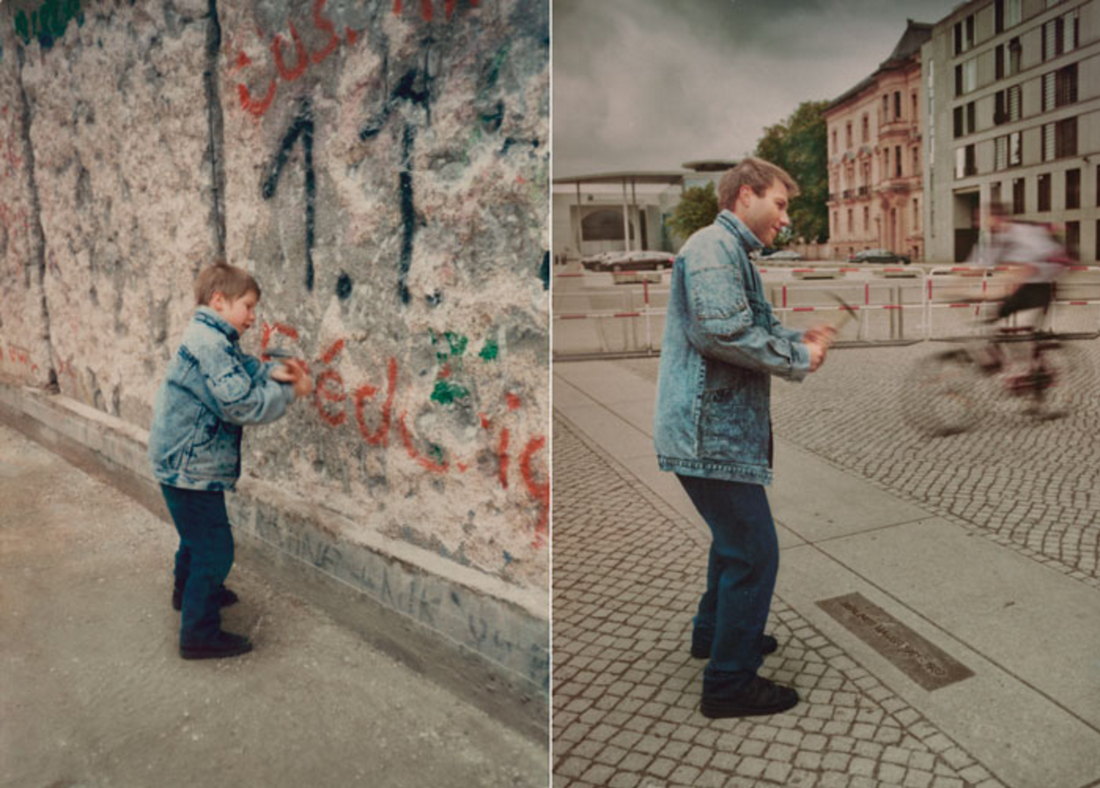
Christoph 1990 & 2011 Berlin Wall
Marina 1988 & 2010 Buenos Aires
|
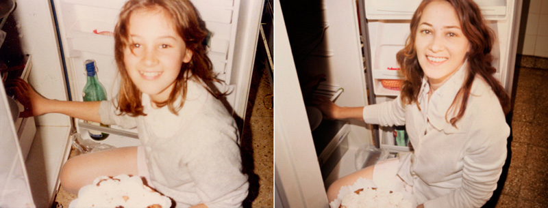
I think the way Werning manages to recreate all of the above images is really interesting because they're so accurate. It's interesting to see, in her images of people how you can see the size difference of the subjects. Particularly in the bottom left image, you can see that the woman's hat looks much bigger for her in the image of her as a child. I think this is interesting at it somehow captures the element of time in the photograph because it makes the viewer think about the concept of time and how the subject has changed with time, relating to the topic of 'past'. Another thing I liked about this series is how in some images, for example the top right, you can see how the scenery has changed quite dramatically, and even though Werning has still managed to re create the image well with the subject, it almost makes it look like a completely different photograph. This image is particularly effective as it emphasises the idea of the past and also the future because it's almost as if the person looking at the past photograph, then gets a glimpse into the future and can see several different qualities within the image that have changed such as the subject, and the architecture/scenery etc. In the bottom right image, I think the level that Werning has re created the image is very obviously detailed as you can see that she has even managed to get the shadow in the photograph in the exact right place. This makes the image much more effective and stronger as everything in the photograph is virtually the exact same, except the subject is more aged.
My Response
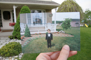
For my response to Adams, I recreated a picture of my mum from an older house. For these particular images I wasn't able to recreate the background of the photograph well enough to make the image look as accurate as I wanted. In order to achieve a more accurate recreation of the picture, whilst still showing the effects of time I decided to take the present photograph against a white background and use photoshop over the old picture to create the effect of having the exact same background to both pictures.
Southbank Walk
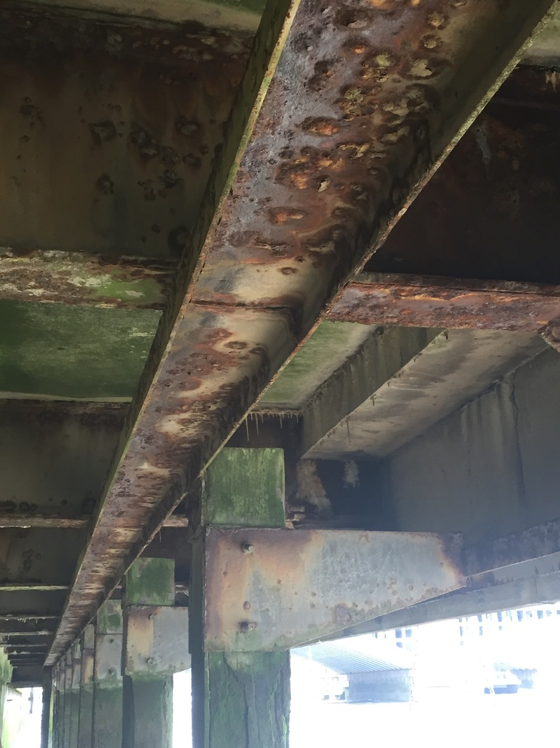
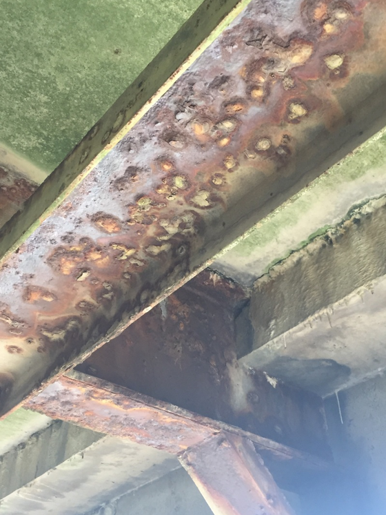
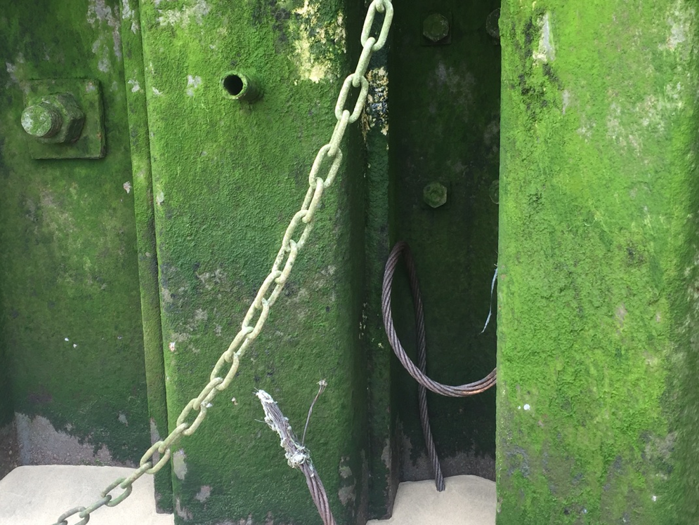
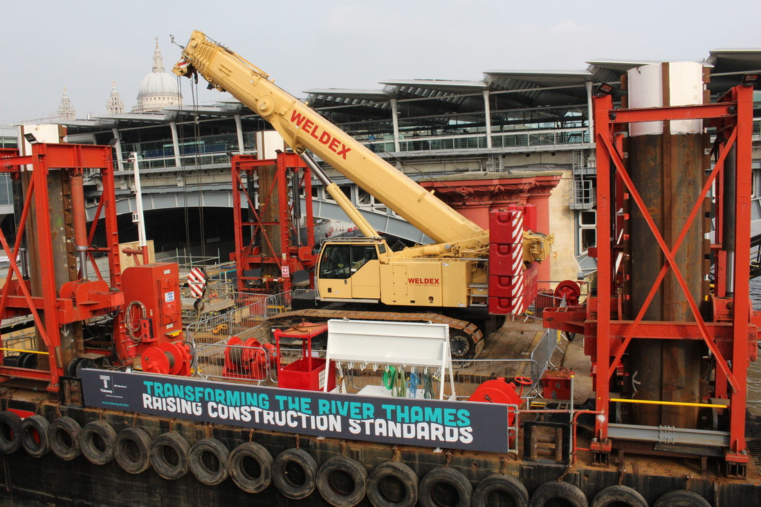
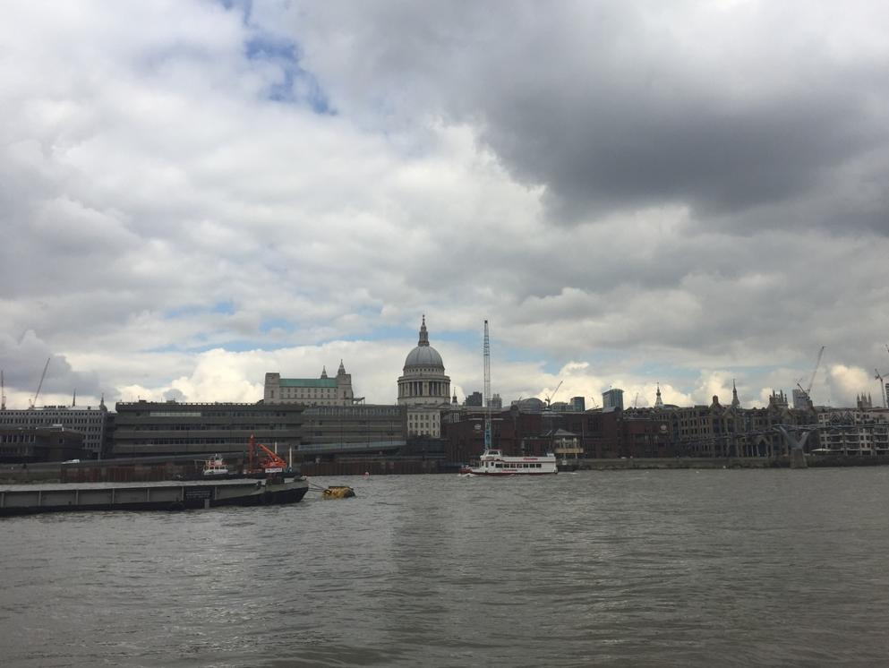
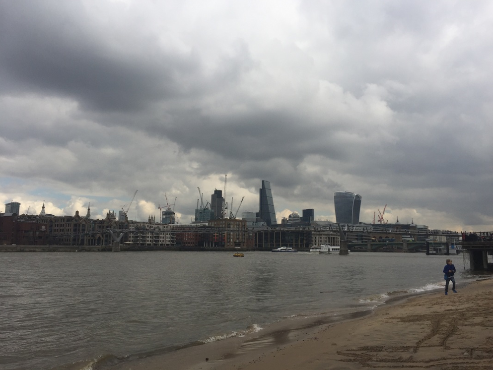
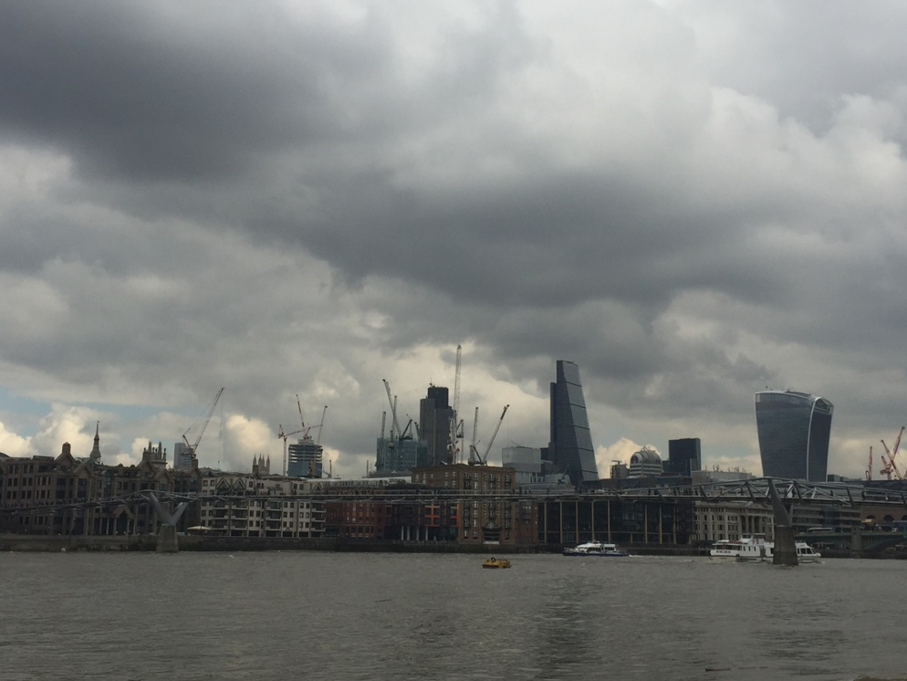
In the photographs below, I walked along South Bank and tried to capture photographs that I though would represent past, present and future well. For my past photographs I captured the decay of architecture around the Thames to show how time has affected the materials around the river. In my future response I took photographs of the several cranes in the sky line of London showing the many buildings that are yet to be built next to the ones that will someday become old. For the present, I tried to capture modern architecture.
Past
Present
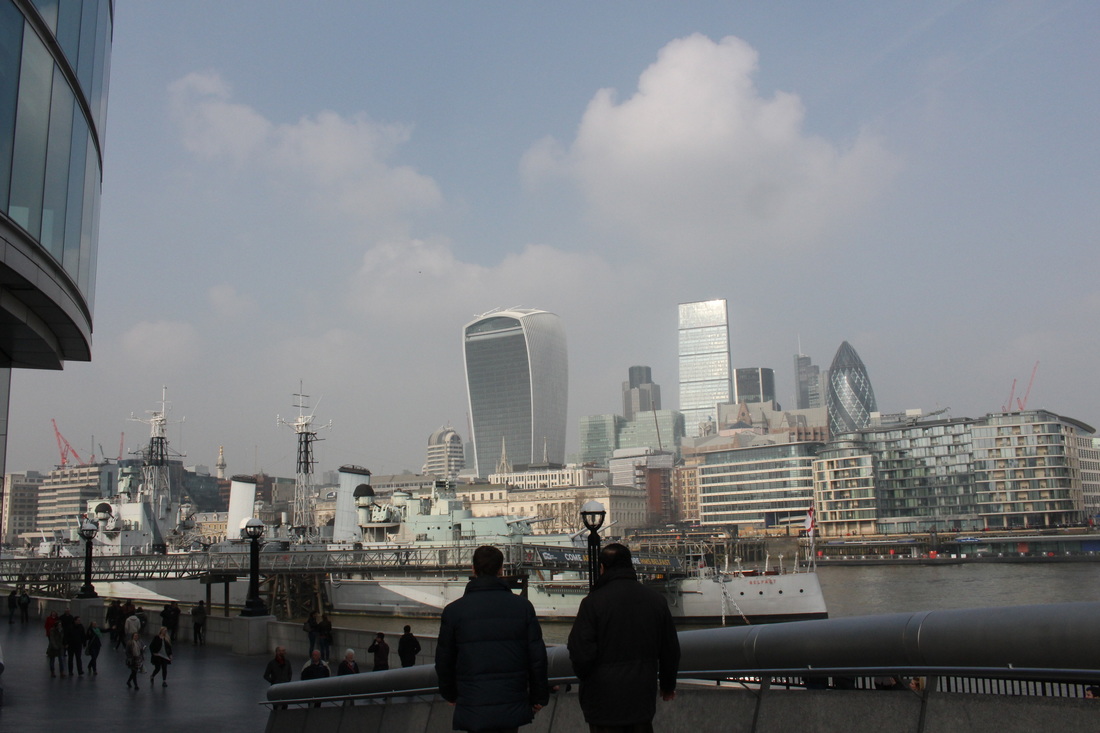
Future
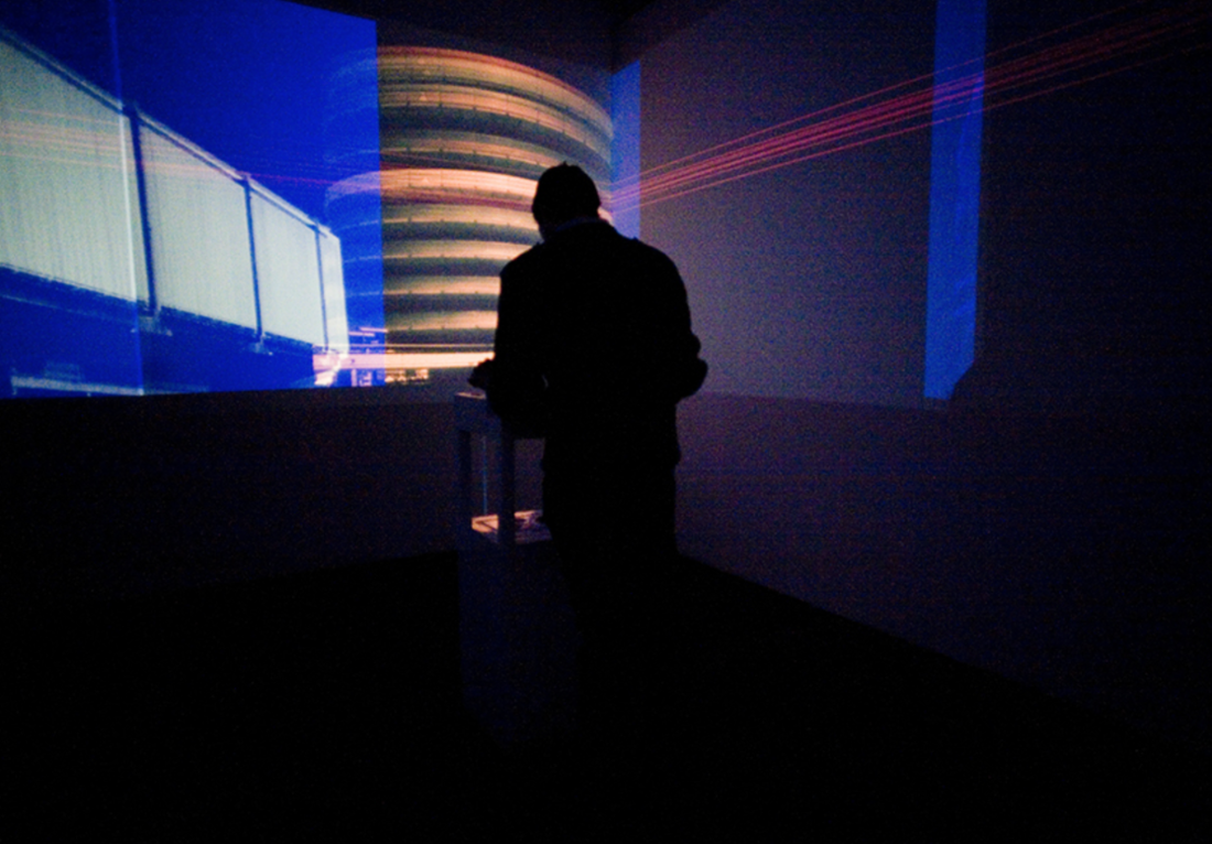
Performing For The Camera: Exhibition Visit
With over 50 seminal photographers on display, the exhibition explores the relationship between photography and performance, engaging with serious, provocative and sensational topics, as well as humour, improvisation and irony. It shows how photographs have captured performances by important artists including Yves Klein and Yayoi Kusama, and ground-breaking collaborations between photographers, performers and dancers. It looks at how artists including Francesca Woodman, Erwin Wurm and others have used photography as a stage on which to perform, and how figures from Cindy Sherman and Hannah Wilke to Marcel Duchamp and Samuel Fosso have used photography to explore identity.
From marketing and self-promotion, to the investigation of gender and identity, to experiments with the self-portrait, Performing for the Camera brings together over 500 images shown in series, including vintage prints, large scale works, marketing posters and artists working with Instagram. It is a wide-ranging exploration of how performance artists use photography and how photography is in itself a performance.
"It’s better to pose myself and be the main character in my work. There is an irony and vulnerability – it is awkward to look at that" - Romain Mader
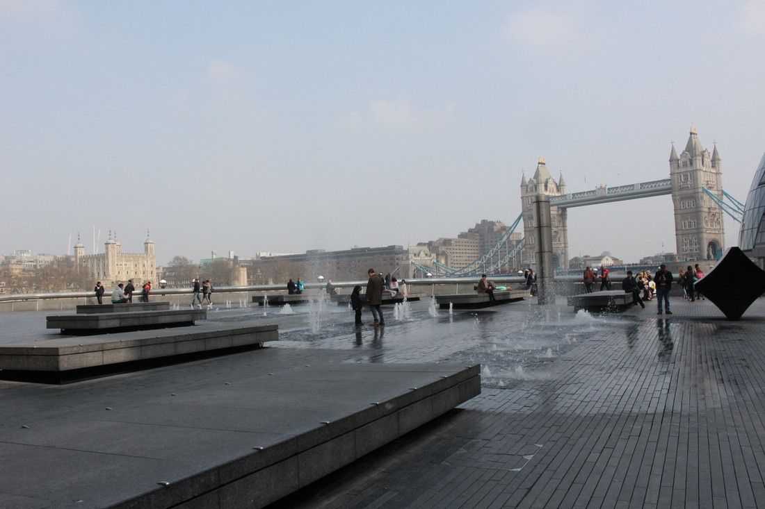
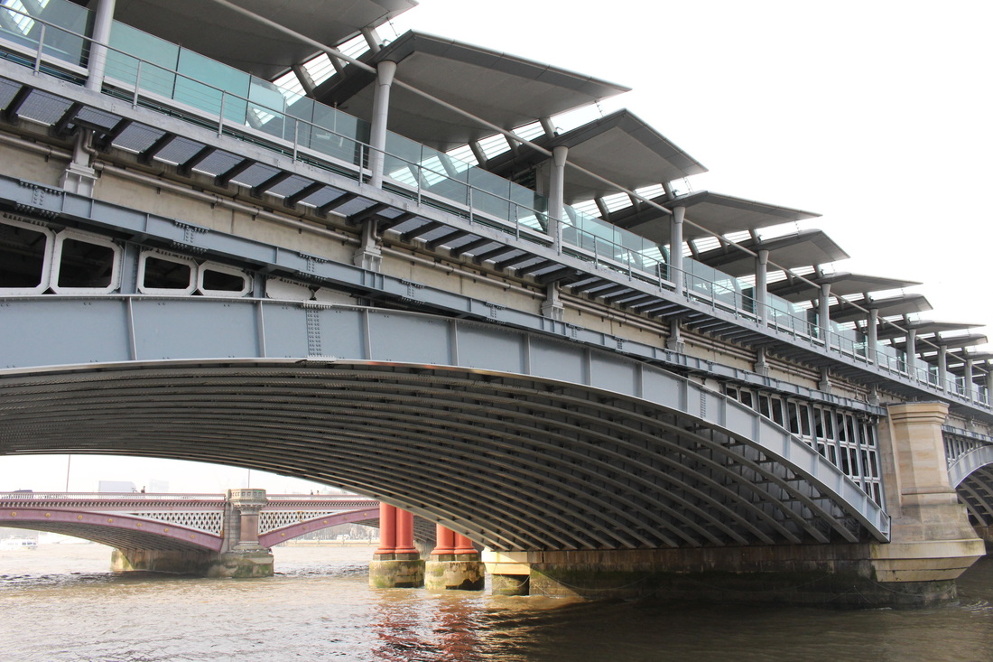
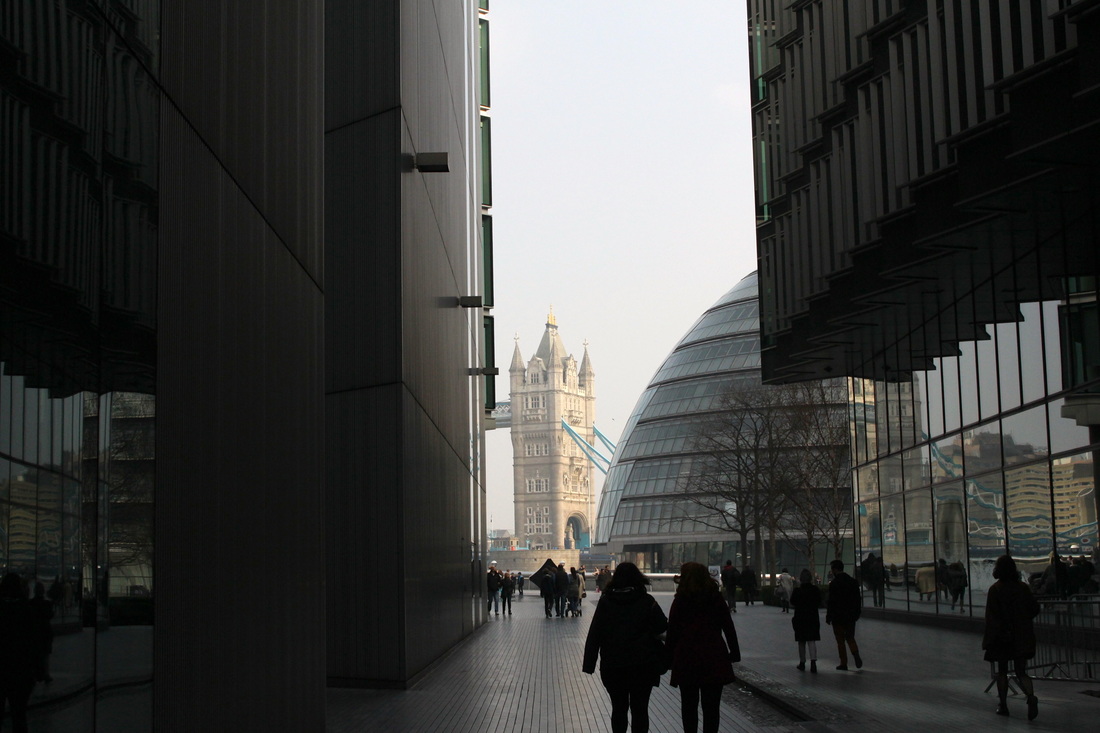
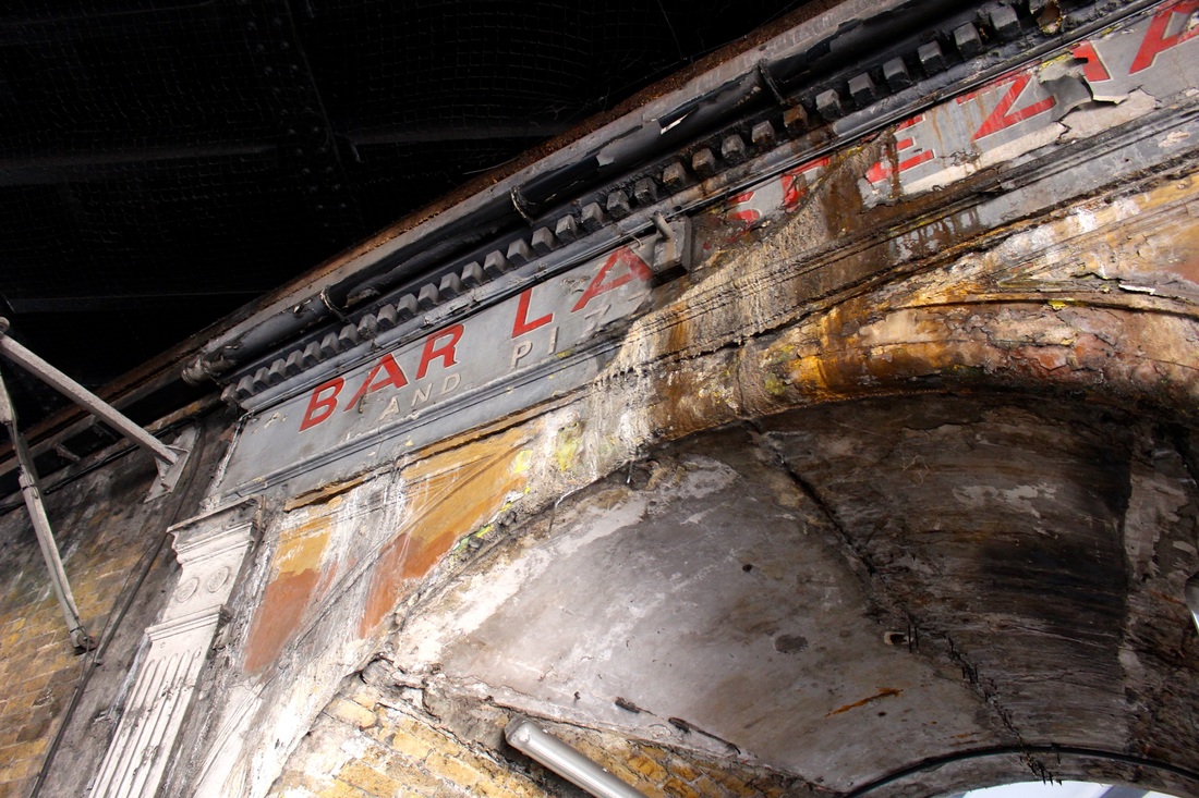
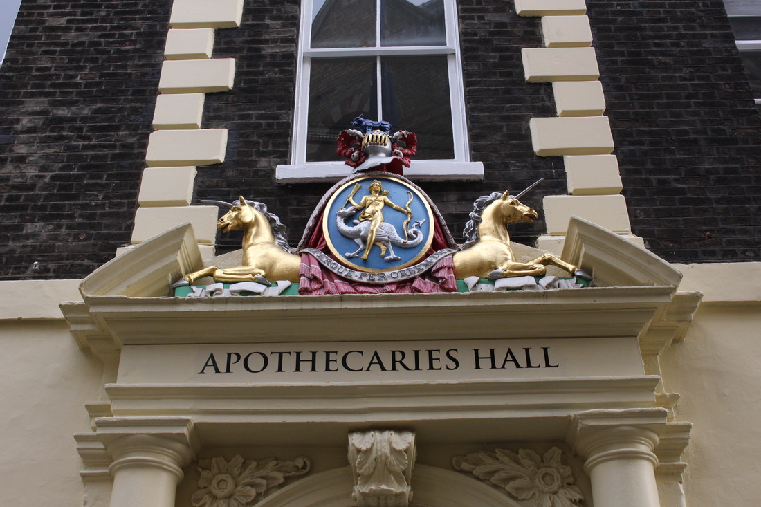
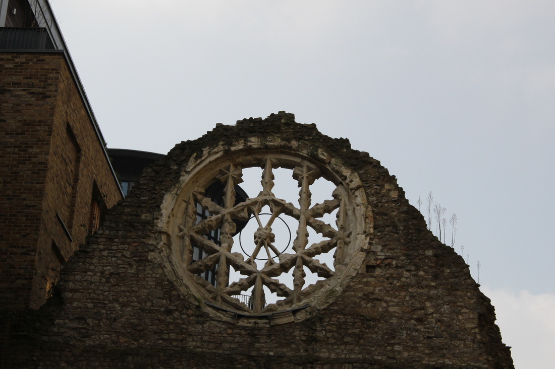
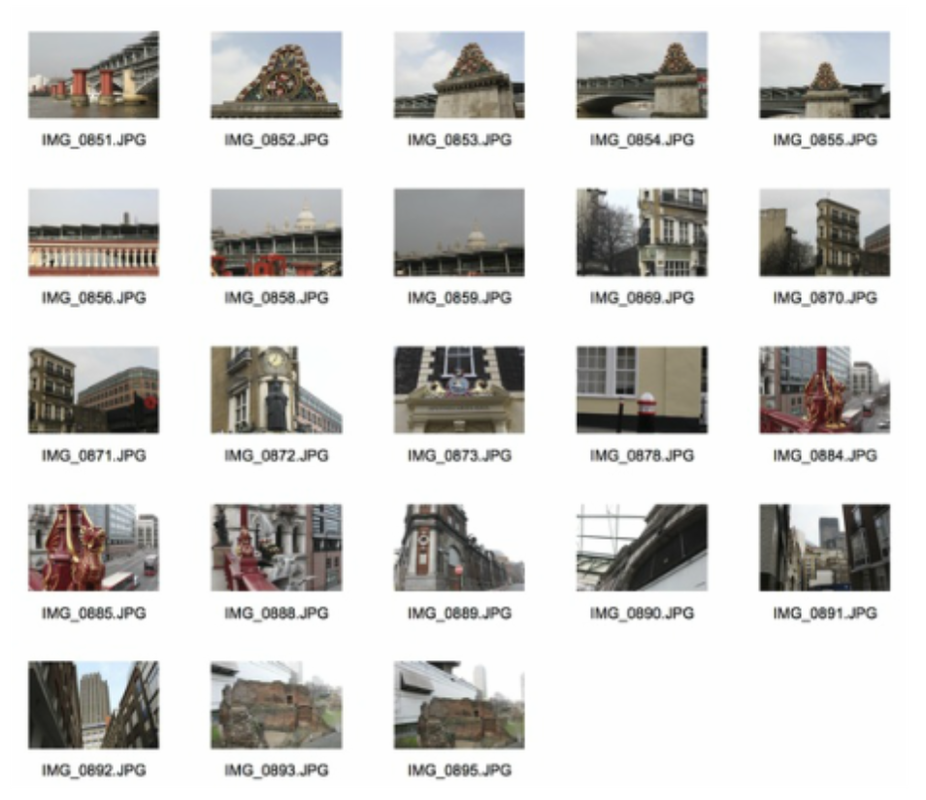
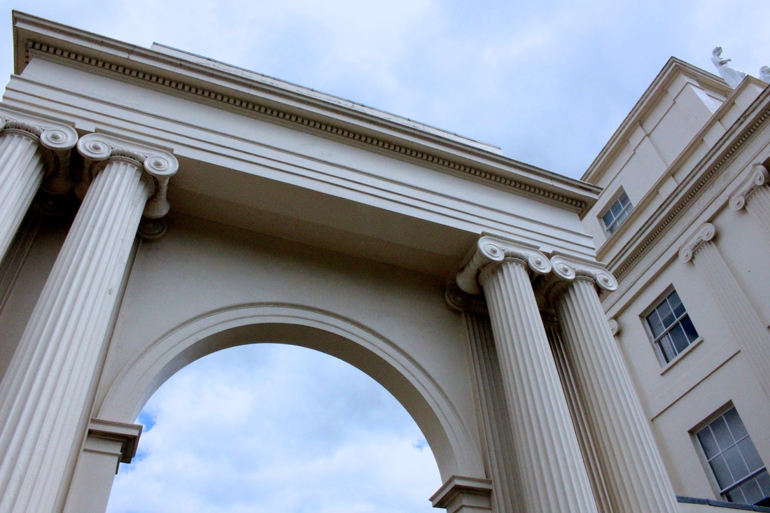
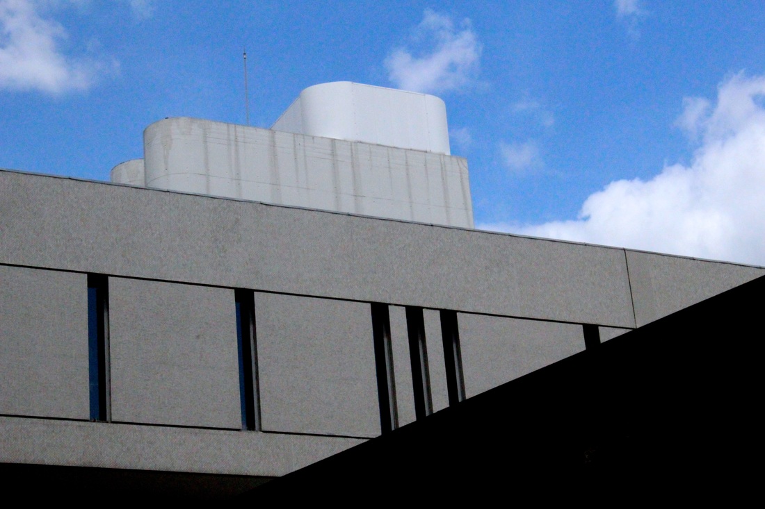
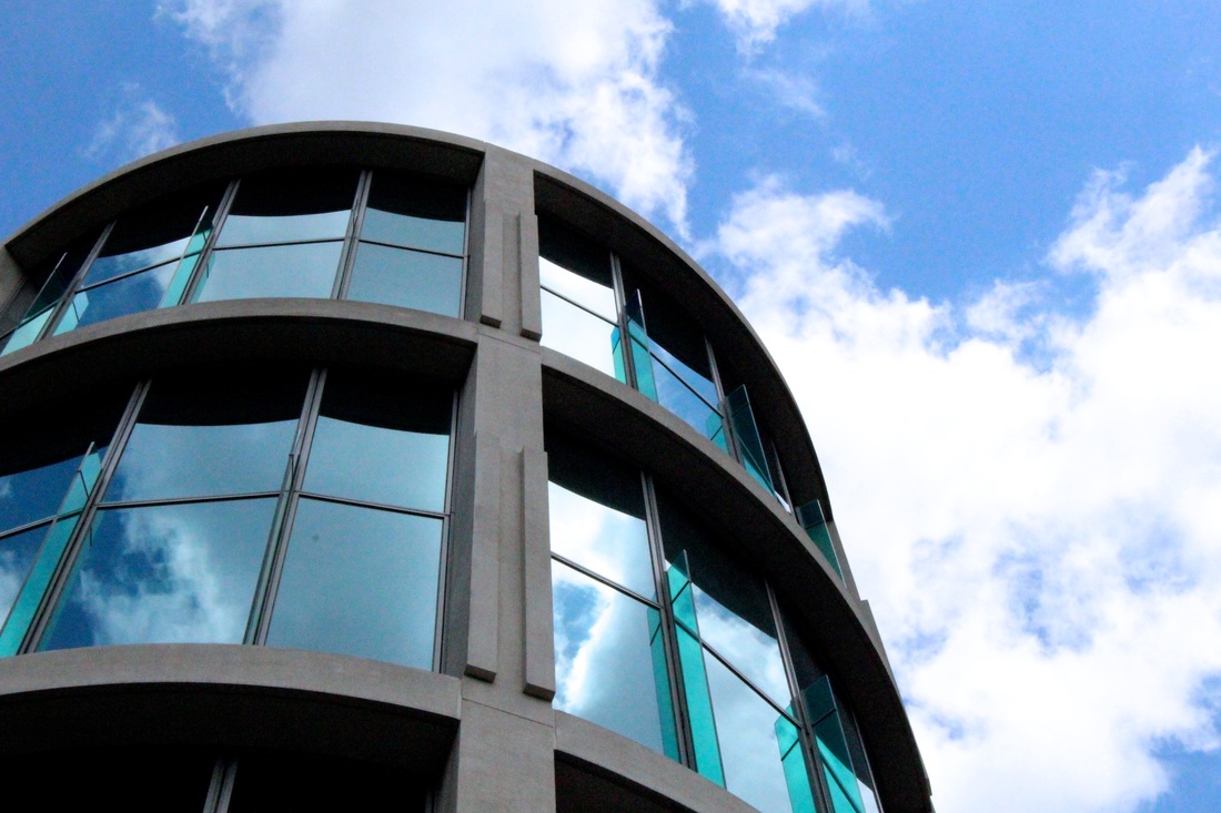
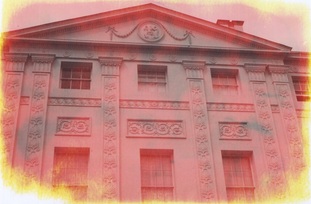
First Strand Response: Old & New Architecture
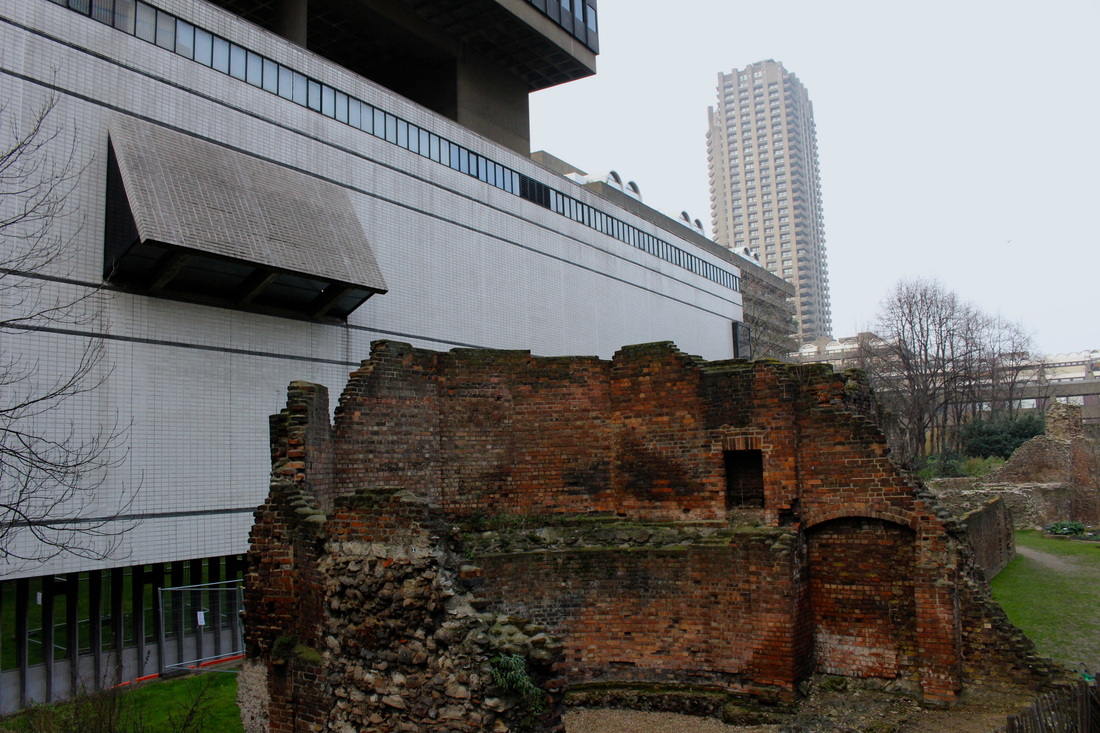
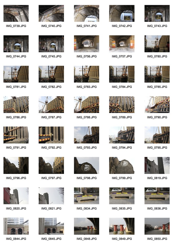
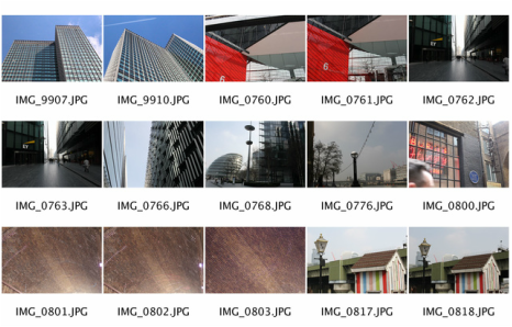
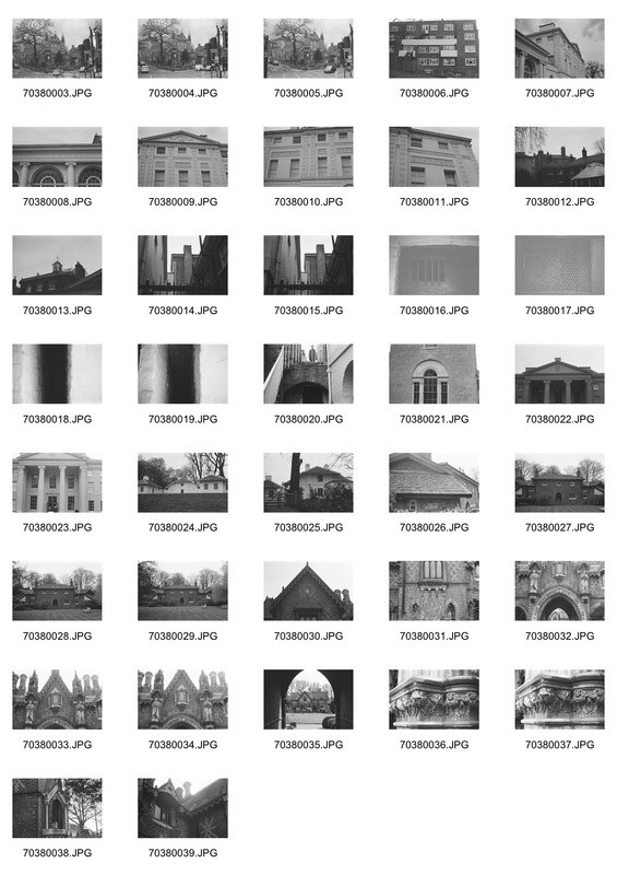
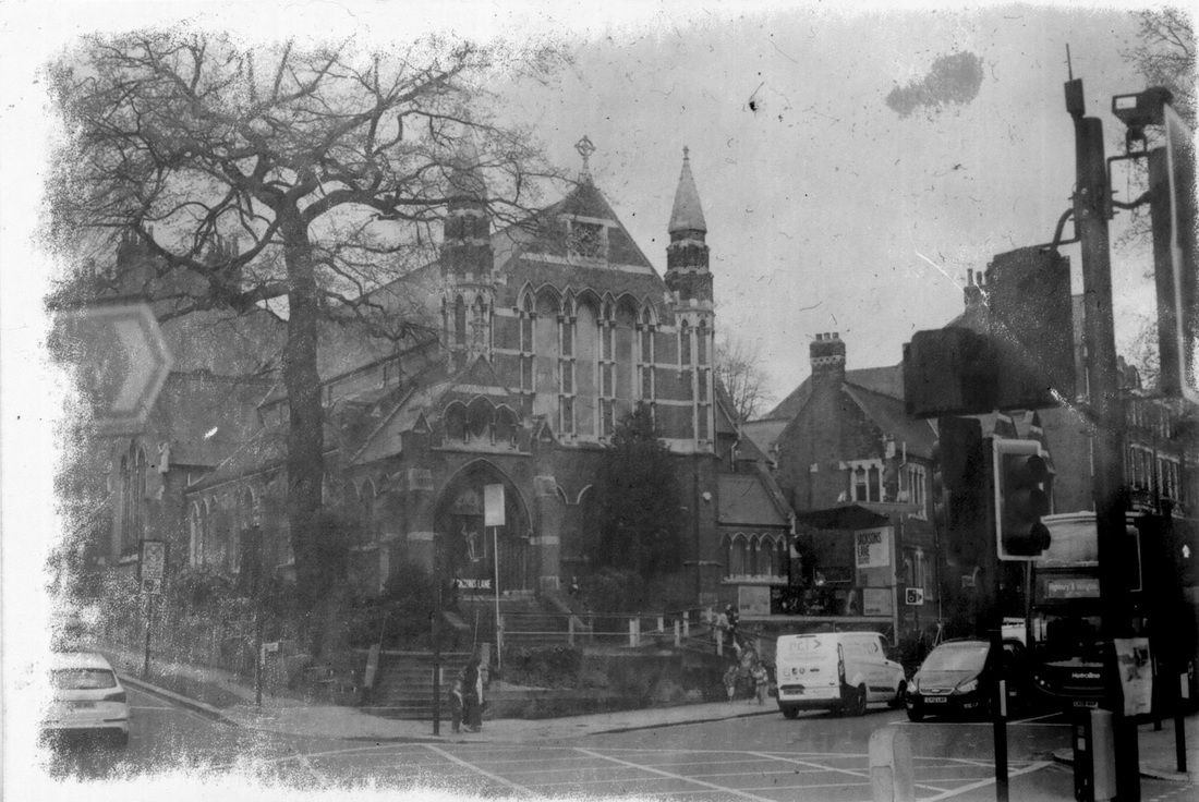
For my first strand response I chose to represent past, present & future through the different types of new and old architecture around London. Below are my first set of images for my architecture response in which I tried to capture both old and new architecture side by side in one photograph. I created contact sheets of all the images I took around central London and then chose my three strongest photographs to enlarge.
|
|

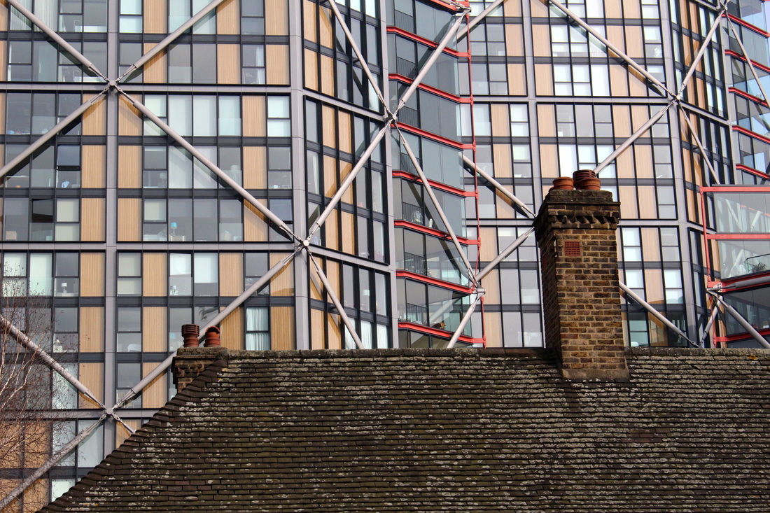
Old Architecture
In my development for my first strand response I first focused more on just old architecture, exploring the aspect of the way the past is shown through architecture in the form of decay, neglect and even old buildings that have been taken care of and kept clean. Below are all the images I took of old architecture around central London in a contact sheet, then my three strongest images enlarged.
|
|

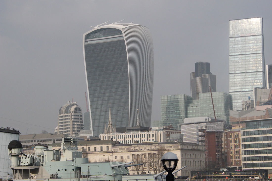
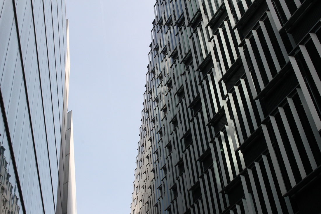
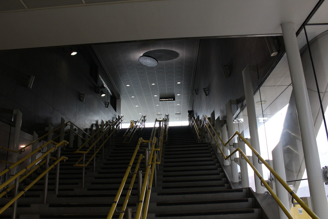
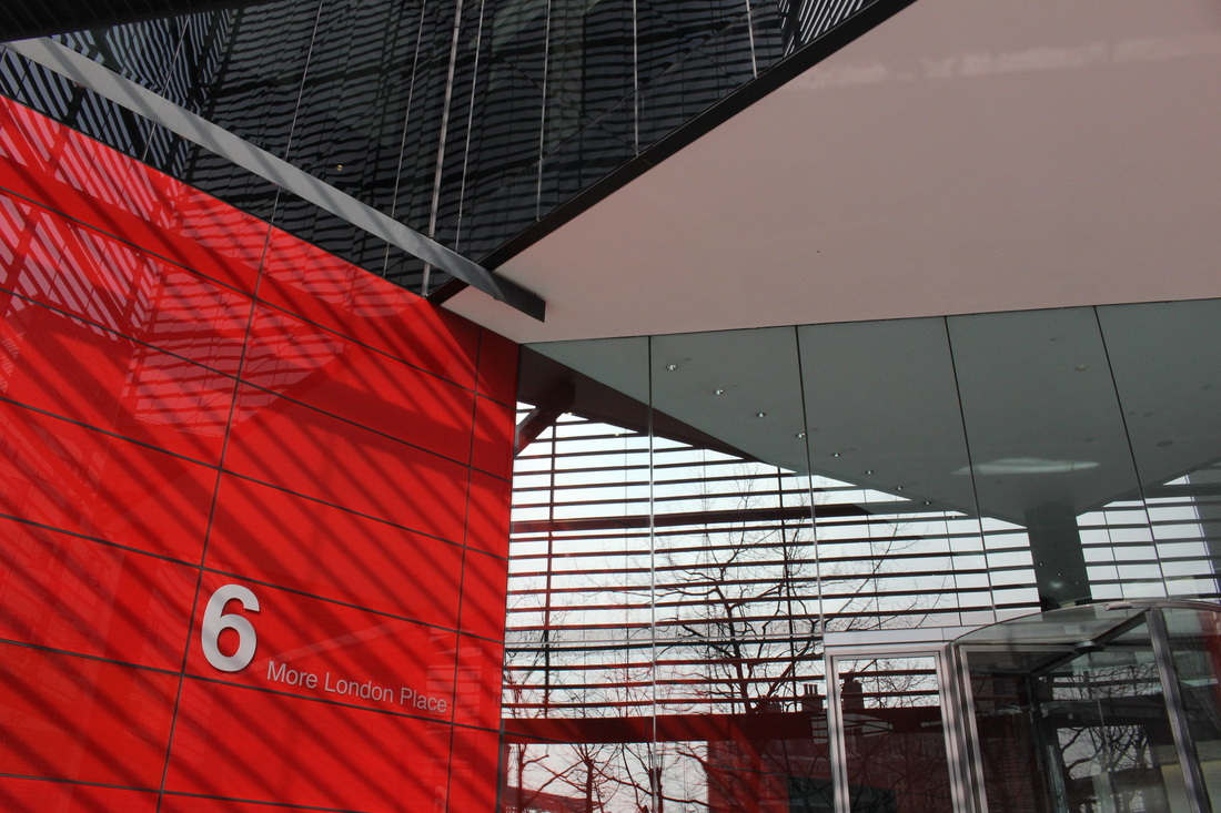
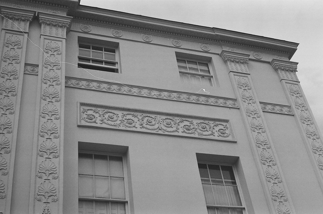
New Architecture
I then looked, in further detail, at the concept of new architecture in central London through modern buildings, reflective and sleek looking architecture and refurbished tube stations. Below are all the images I took for this response on a contact sheet and then my three strongest photographs enlarged.
|
|
Mauren Brodbeck
Born in Geneva in 1974, Mauren Brodbeck has, since her youngest years, been delivering an eclectic and multicolored body of work that calls into question ideas around "being" vs "appearing to be", working in a realm of expressive forms sublimated by color. At the tender age of 12 the artist took her first steps into the fascinating world of photography quickly discovering a passion for all and any of the arts: film, photography, screenplays, design, art directing, singing and composing, dance, writing, magic, fashion... With her heightened curiosity, these forms of expression combine in a magical alchemy that allows Mauren to explore the world and achieve her existential quest to define the place of humans in contemporary society and in relation to each other. At the heart of her work, certain recurring themes come and go, each a different take on the subject of identity: adolescence, self-portraits, architecture and urban landscapes.
|
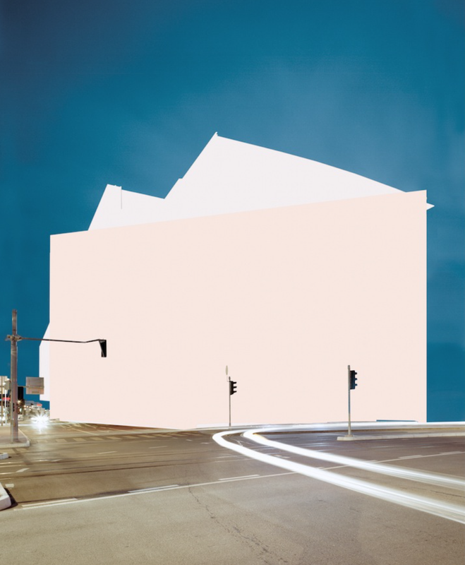
In this first image from Brodbeck that I chose to analyse, she uses an effect that she often portrays through her architecture photography. She has taken a regular image of a building and made it abstract and more modern looking by editing out the building using blocks of colour. I think what is interesting about this specific photograph is the way that she has left the traffic lights in front of the building to emphasise the fact that there is something deliberately missing from the photograph. Because the traffic lights are black and the colour she has used to block out the building is a pale pink/white there is a heavy contrast against the two putting an emphasis on the abstract element of the image. The way that Brodbeck has also used long exposure to get the effect of light trails in the foreground of the image is effective as it corresponds with the colours she has used to cover the building, allowing the light trails to make a sort of pathway for the viewer, leading to the main subject of the image.
|
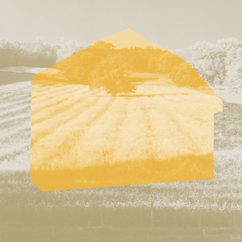
I also thought this photograph of Brodbeck's was interesting as it incorporates the same idea as the first image I analysed, however it is slight more animated and abstract. Not only has she edited a block of the photograph, she has added an effect to the entire image that makes it seem much more surreal and fake. I also think the way that she hasn't actually edited over a structure in the photograph is effective. It shows that her thought process behind these types of images is really quite imaginative and abstract, as she doesn't particularly have to follow the restrictions of what subjects are within the photograph, she can go beyond this by editing in her own structure using colour to make the photograph look exactly how she wants. Finally, I think the way that she has used an effect over the entire image that corresponds with the block colour she has used within the image is effective as it gives the overall photograph a much more flowing feeling as the overall meaning of the photograph is much more attainable.
|
I chose to analyse this final image as I think it shows Brodbeck's style. The way she incorporates abstract with real life and mixes a surreal world with the real one is very obvious in this photograph. I think in doing this in so many of her photographs she emphasises the reality of the real world whilst also emphasising the surreal aspect of the way photographs can be edited so distantly from their original form. In this particular image, however, I think it is especially interesting how Brodbeck has used colour and lighting to portray elements of heavy contrast. I think it is interesting that she has made the subject of the image into a silhouette, whilst the background is still in colour. This adds to the aspect of abstract that she uses so frequently in her photography. I also think that the way she has made the background, colourful part of the image into quite a faded, surreal effect and almost has each element layered over each other, gives the photograph a stronger feeling of surrealism.
|
My response To Mauren Brodbeck
Before
After
How I Achieved This Effect:
|

|

|

|
|
William Eckersley
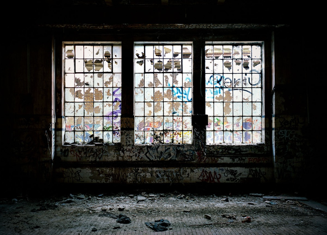
William Eckersley is a London based photographer. Eckersley has one particular series, relevant to the idea of decayed architecture: "Left London". I found this project of his particularly interesting as it features an obvious representation of decay in old buildings. Also, a lot of the images I chose to analyse below use light to emphasise the details of decay.
"My personal practice seek to explore themes of contemporary alienation. Recent projects address this through appropriation, montage and typology, and specifically relate to representation in an age of ubiquitous imagery. Previously I focused on documentary subjects including the form and function (or lack thereof) in urban environments, social justice and travelogues. This work has been featured in various exhibitions, magazines and websites, as well as self-published books." - William Eckersley
"My personal practice seek to explore themes of contemporary alienation. Recent projects address this through appropriation, montage and typology, and specifically relate to representation in an age of ubiquitous imagery. Previously I focused on documentary subjects including the form and function (or lack thereof) in urban environments, social justice and travelogues. This work has been featured in various exhibitions, magazines and websites, as well as self-published books." - William Eckersley
|
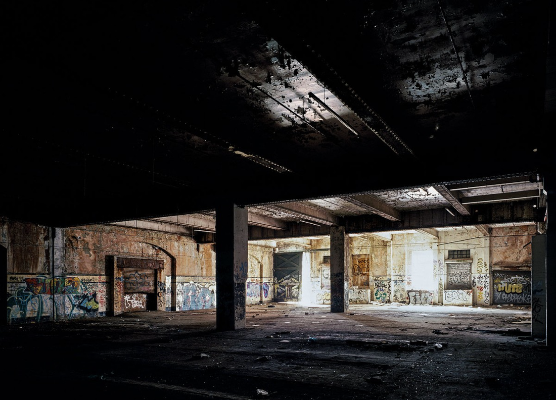
I think this photograph is effective as it features heavy contrast. The bright light coming through the dirty, derelict glass of the window draws attention to the details of the decay inside the room and against the glass of the windows. The contrast against the dark, black walls and the bright light of the window creates a dramatic effect, giving the entire photograph an impressive feeling. Also the element of symmetry in the image gives the photograph an element of cleanliness, contrasting the decay that Eckerlsey is trying to portray in the image. The way that the windows are all perfectly in the centre of the image, even the light on either sides of the windows are symmetrical to each other. This also adds effect to the photograph as it appears much more accessible to the viewer and aesthetically pleasing.
|
Similarly to the last image, this photograph features a lot of heavy contrast. For example, in the foreground of the image, the ceiling is completely black, featuring little detail. This is interesting as it makes it appear quite smooth as the viewer can not see the texture on the ceiling because it's so dark. However, the contrast in this picture is different to the previous as, here, it adds levels to the image, creating an obvious foreground and background. it is also interesting to the viewer that Eckersley has chosen to portray the background of the image as the main focal point. Typically, the foreground would be the main focus, but in this image it is too dark to see the details on the structure in the foreground. This is effective as it adds a large, obvious element of depth to the photograph.
|
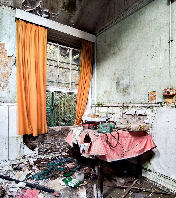
I like this image as I think it's different from the previous two, yet still effective in a very obvious sense. The way the bright colours within the derelict, decayed room contrast against the dirty white, cracked walls makes the image much more interesting. I also think it is interesting to see the way vibrant colour feature in this photograph. For example, the bright orange of the curtains with the bright green rails emphasises the element of nature within the photograph. It seems almost as though the nature from outside the open window is creeping in and decaying the environment inside the room, and also the objects within it. I also think it is interesting how Eckersley has focused all the objects in the room towards the centre of the photograph, making the white walls look almost like a border for the photograph.
|
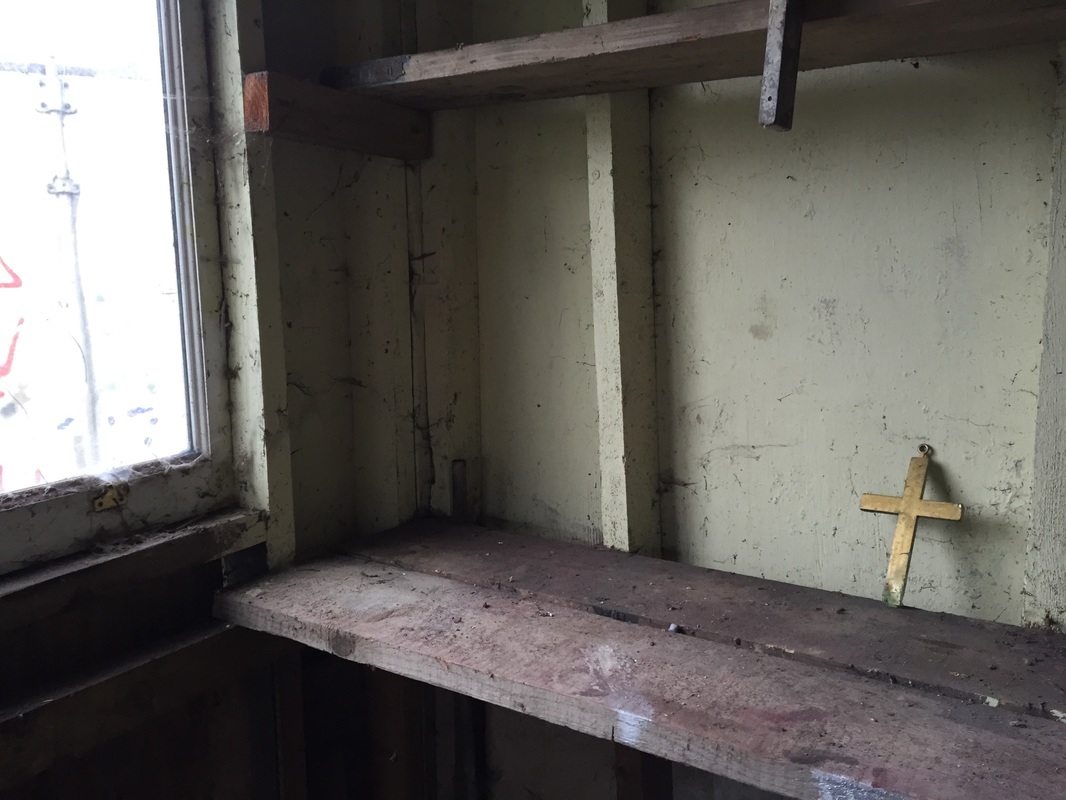
Response to William Eckersley
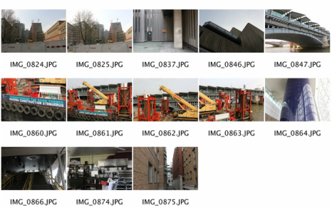
For my further development of my strand response to architecture, I decide to further expand on old architecture. For the images below I took several pictures of an abandoned series of sheds and houses near Alexandra Palace, showing the aspect of past through decay and neglect. I tried to capture light in some of the images as I thought it would emphasise the old architecture as there is natural light as opposed to industrial light. Below, are contact sheets of all the photographs I took there and my three best images enlarged.
|
|
Gilles Coulon
French photographer, Gilles Coulon photographed several photographs themed around the concept of light at night time lighting up little details, allowing the eye to see these details in a much more obvious way then you would see them in the day. The series of photographs her constructed is called "White Night". White Night began in 2000 during a trip to Niger. Obsession, fascination with this universal light. In Shanghai, Paris, Bamako, in Helsinki, New York, in Khabarovsk, in Marseille, in Cairo, Niamey, in Bordeaux, in Beijing and in Bagnolet, these images allow us imagine the personality of each city, each selected place. In a restaurant, in a building lobby, on the street or in a parking garage, each photograph offers to the eye to stop at familiar places.
|
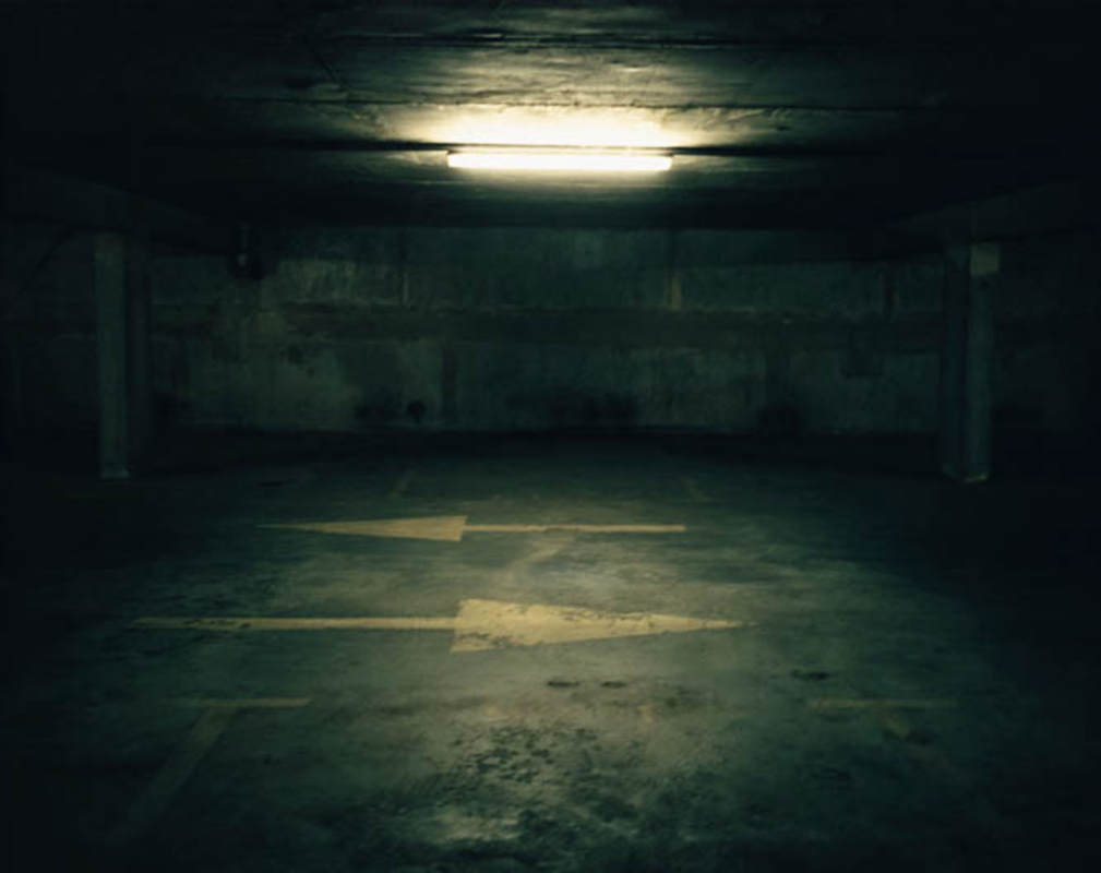
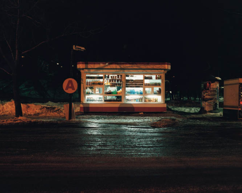
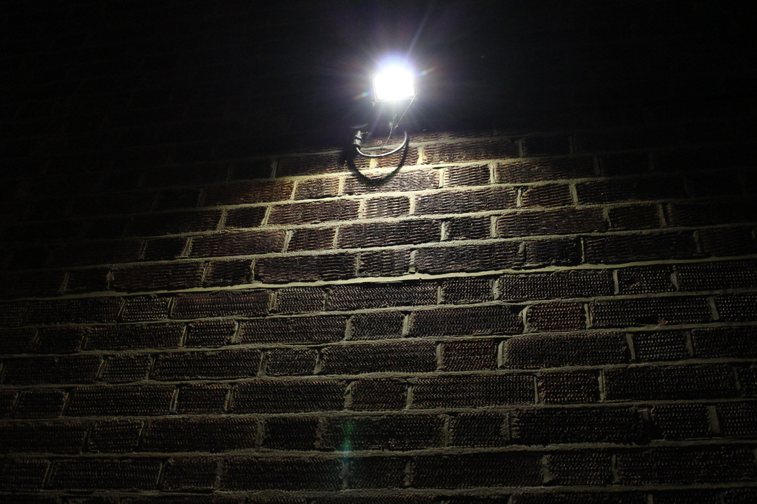
In the series "White Night", Coulon captures several different decaying, or old looking environments at night with single, artificial light sources allowing the viewer to see certain, focused details of the image. I think this technique is interesting as it creates a contrasting effect: it allows the photograph to be very detailed whilst also being quite limited. For example, in the above photograph, you can see the small, intricate details on the ceiling of the parking lot, and some small cracks and bumps on the floor. But, you can only see the details in the centre of the image, not the sides because of the way the atmosphere is lit. I think this gives the photograph a lot of depth, as it seems like the edges of the image are fading out and then centre is just glowing through the things around it. I also think that in this particular photograph there is an element of fear. The way that Coulon has angled the camera to look into the building directly, with the light in the very centre makes the middle of the photograph appear deeper than the rest, like it goes on for longer. Also, the way he has taken it from far away makes the building seem longer and more mysterious.
|
This photograph has quite a different feeling than the last, as the subject of the image isn't interior of a building, it's exterior. I think this is interesting to compare to the last photograph as you can see very obviously the effect that taking the photo from the outside makes on the entire feeling that the image gives off. I think here, there is a lot stronger feeling of contrast as opposed to the previous image, where the edges of the photograph seemed to fade out as you get further from the centre. Here, the feeling is quite opposite as the edges of the photograph are almost pitch black, with some dimly lit objects leading out into the blackness from either side of the structure in the middle. Similarly to the previous image, Coulon has taken the image standing quite far from the subject, emphasising the contrast between the bright light of the store and the pitch black of the night. In doing so, he has captured a sort of pathway that the light escaping from the shop windows create. The two trails of light leading from the store into the road further emphasises the depth of the photograph, making the subject seem further away and smaller.
|
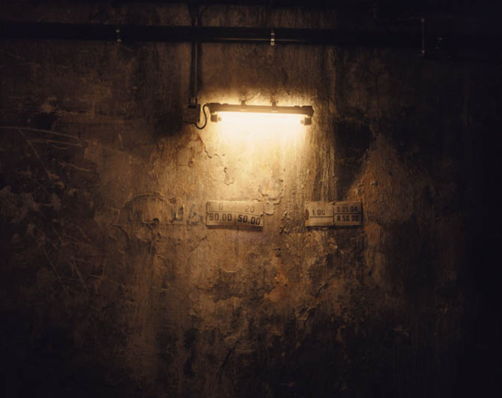
This final photograph is quite different to the previous two images as it doesn't really have much of the same type of depth. However, I think it makes this particular photograph more effective that Coulon has chosen to capture the photograph close up, focusing on the detail of the decay on the wall. If he'd captured this image in the same way he took the previous two, it wouldn't be as effective as the viewer wouldn't see all the small details around the light source. I also think it is interesting how Coulon has taken a small object and focused in closer, to make it appear larger and more significant, whereas in the previous two images he has done the opposite and made bigger subjects look less significant and smaller. This is effective as it shows how the photographer can play with perspective in order to get the exact desired outcome. In all three images that I have analysed I notice that there is a certain extent of symmetry within the image. I think in these types of photographs, this is effective as it allows the viewer to see more of the detail lit up by the light source. If Coulon had angled the images off centre, the details within wouldn't be as obvious.
|
Response to Giles Coulon
For my response to Giles Coulon I tried to capture several different images of lights at night around my area. I tried to capture lights shining on small details, allowing the viewer to see them more clearly. I also tried to to pictures of lights in the darkness from far away to emphasise the element of contrast, however I think some of the pictures turned out too dark as I used too fast a shutter speed.
|
|
Second Strand Response: Vintage photography
For this strand response I thought it would be interesting to look at vintage methods of photography and research into photographs who have used these vintage techniques. I chose this because I think the effect that these older techniques gives off is a lot different to digital photography and that it would be interesting to be able to explore the contrast between digital and vintage.
Horst Exhibition
I thought The Horst Exhibition was an abstract and interesting loo on fashion and time, Horst was a photographer of style and this is consistently shown throughout his exhibitions. He uses light and special camera techniques, that were quite abstract and unheard of at the time, to show different angles and contrast on body structures, especially during his exhibition, The Houte Couture. His work included Houte Couture, Surrealism, patterns in nature and Vogue in Colour.
|
Surrealism
The surrealist art movement changed fashion photography dramatically, it took inspiration from dreams and the unconscious. During the 1930's surrealism became increasingly popular. Horst interpreted surrealism in his own way, using lighting and props to make his images whimsical and dreamy. He had many friends in the fashion industry that he photographed for using their garments to enhance the surrealist feel of his images. One of his most celebrated photographs of the era is Mainbocher corset.
|
Houte Couture
Horst first joined vogue in 1931 when Paris was the World's undisputed centre of high fashion. At this time photography was becoming more and more frequent to graphic illustration in fashion magazines, this led to editors and publishers looking for the highest quality way to reproduce an image. Horst insisted in working with a large format camera to produce richly detailed negatives measuring ten by ten inches. By the mid 1930's Horst took the place of his mentor as Vogue's primary photographer. His images began appearing in worldwide editions of the magazine as he quickly became extremely popular.
|
Sally mann
Sally Mann (born in Lexington, Virginia, 1951) is one of America’s most renowned photographers. A feature film about her work, What Remains, debuted to critical acclaim in 2006. Her memoir, Hold Still (Little, Brown, 2015), received universal critical acclaim, and was named a finalist for both the National Book Award and the Andrew Carnegie Medal for Excellence in Nonfiction. Mann is represented by Gagosian Gallery, New York. She lives in Virginia.
“Few photographers of any time or place have matched Sally Mann’s steadiness of simple eyesight, her serene technical brilliance, and the clearly communicated eloquence she derives from her subjects, human and otherwise – subjects observed with an ardor that is all but indistinguishable from love.”
“Few photographers of any time or place have matched Sally Mann’s steadiness of simple eyesight, her serene technical brilliance, and the clearly communicated eloquence she derives from her subjects, human and otherwise – subjects observed with an ardor that is all but indistinguishable from love.”
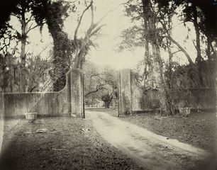
This particular photograph from Sally Mann shows past through both the method of photography she has used, the effect it gives off and the subject of the image. The use of the slight sepia tone of this photograph makes it seem old which is effective against the old landscape she has photographed. I think this image is particularly effective as these two factors make the picture seem much older. I also think the way that she has placed the gate of the ancient looking wall in the centre of the image gives the image a flowing feeling. The way that she has angled the camera so that the pathway is coming from the corner of the photograph, but the gate remains in the middle makes the image very attainable to the viewer and creates a nice path for the eyes. I also think the element of symmetry in this image is interesting as the photographs symmetry is almost disrupted by the placing of the pathway in the photograph. I think if Mann had angled the image so that the path was in the middle the image would have a much different look as it would be almost perfectly symmetrical.
|
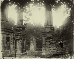
In this next photograph from Mann that I chose to analyse the subject of the image is much more focused and enlarged. This is effective as it is obvious what the main subject of the photograph is. Similarly to the previous image, Mann has played with the aspect of symmetry here. It is obvious that the elements within the photograph have some sense of symmetry against each other, but Mann has chosen to distort this slightly by taking the photograph at a certain angle so that the image doesn't have that perfect symmetry. I think this is effective as it emphasises that the decay of objects is not symmetrical, even though the architecture was built to be symmetrical and perfect. I also think it is interesting the way the sky in the photograph appears to be glowing because of the method of photography she has used. This makes it seem as though Mann purposefully took the photograph looking into the light as opposed to letting natural light shine down on the subject of the photography, giving the entire photograph a slightly abstract feeling.
|
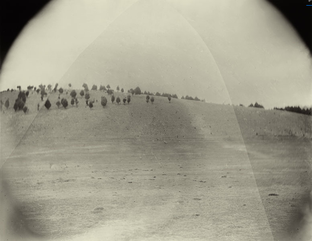
This final image is similar to the previous two as Mann has blackened the top two corners of the image. In the previous two photographs, Mann did not need to use this effect as she angled the images so that the leaves of the trees around the subject would naturally create this effect. I think this is effective in these kinds of photographs as it emphasises the aspect of ageing in the images. The way that the corner aren't as clear as the centre of the image, and that the subject is clearly focused toward the centre of the photographs, makes it seem almost as though the photograph has been burnt out or is so aged that the corners of the image are no longer there. However, this image is different to the previous two as the subject of the image is much less crowded. I think by making the subject of the image so vast and empty gives the photograph a stronger element of solitude and gives off a slightly scary effect. The way that the trees on the the hill are so small emphasises how vast the field is and how far back Mann was standing in order to create this effect.
|
Process: Wet Collodion
In many of Mann's photographs, she uses a vintage method of photography called wet collodion. It is an early photographic technique, developed in 1851 by an Englishman called Frederick Scott Archer. The process involves adding a soluble iodide to a solution of collodion and coating a glass plate with the mixture.
By the end of the 1850s it had almost entirely replaced the first practical photographic process, the daguerreotype.
The "collodion wet plate process" is an intricate process which required the photographic material to be coated, sensitized, exposed and developed within the span of about fifteen minutes, necessitating a portable darkroom. Although collodion was normally used in this wet form, the material could also be used in dry form, but at the cost of greatly increased exposure time, making these forms unsuitable for the usual work of most professional photographers—portraiture. Their use was therefore confined to landscape photography and other special applications where minutes-long exposure times were tolerable.
During the 1880s the collodion process, in turn, was largely replaced by gelatin dry plates—glass plates with a photographic emulsion of silver halides suspended in gelatin. The dry gelatin emulsion was not only more convenient but could be made much more sensitive, greatly reducing exposure times.
One collodion process, the tintype, was still in limited use for casual portraiture by some amusement park photographers as late as the 1930s, and the wet plate collodion process was still in use in the printing industry in the 1960s for line and tone work (mostly printed material involving black type against a white background) as for large work it was much cheaper than gelatin film.
First Response To Sally mann
For my first response to Sally Mann, I decided to shoot the photographs I wanted to capture on a film camera, first using black and white and I will then go onto experiment with colour film. I will also try to experiment with photoshop in order to create an effect similar to the effect that Mann achieves using the wet collodion technique. For my first response I took photographs of landscape around central London and then took some more rural images in a park, however I don't think the location I used was rural enough to be similar to Mann's images.
|
|
Second Response
For my second response to Sally Mann, I wanted to experiment with colour film to see if it would be easier to get the desired wet collodion type look in photoshop if I started with colour photographs. I also tried to take these photographs in a more rural looking atmosphere in order to get a closer result to Sally Mann's photographs. However, I think comparing both colour and black and white film has helped me come to the conclusion that the black and white images look much closer to Mann's method of photography, and also make the subject of the images look much more vintage and old.
|
|
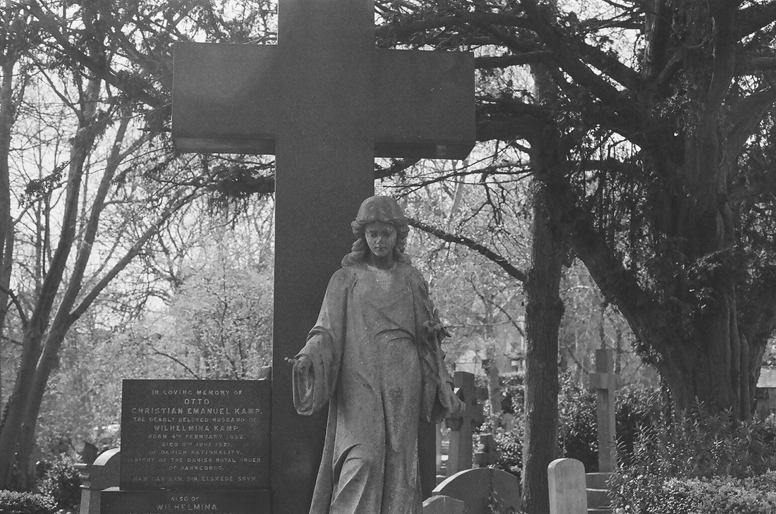
Further Development
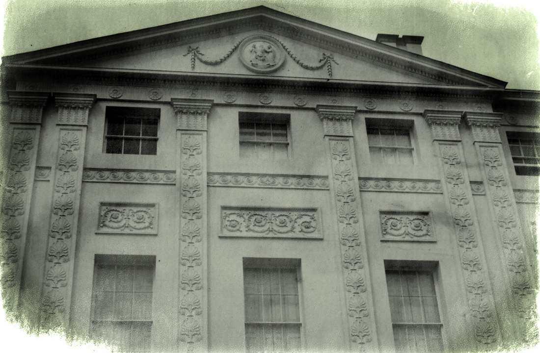
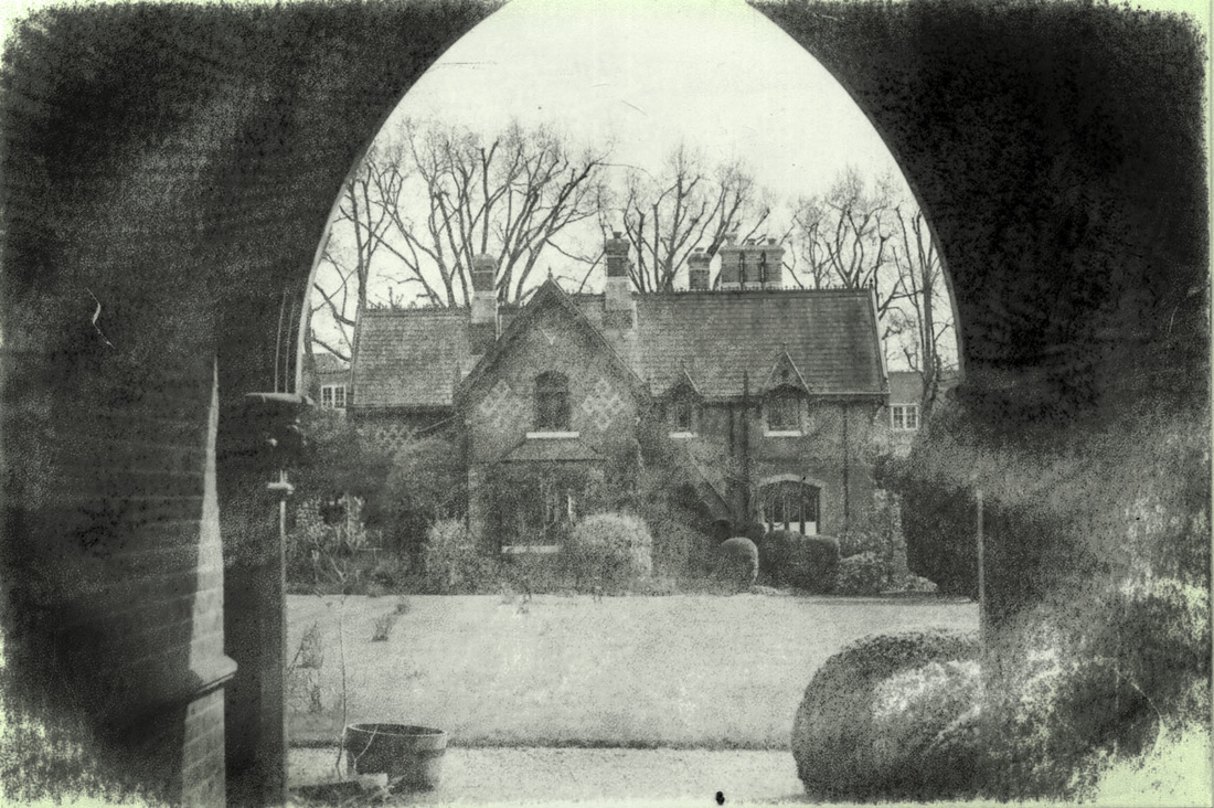
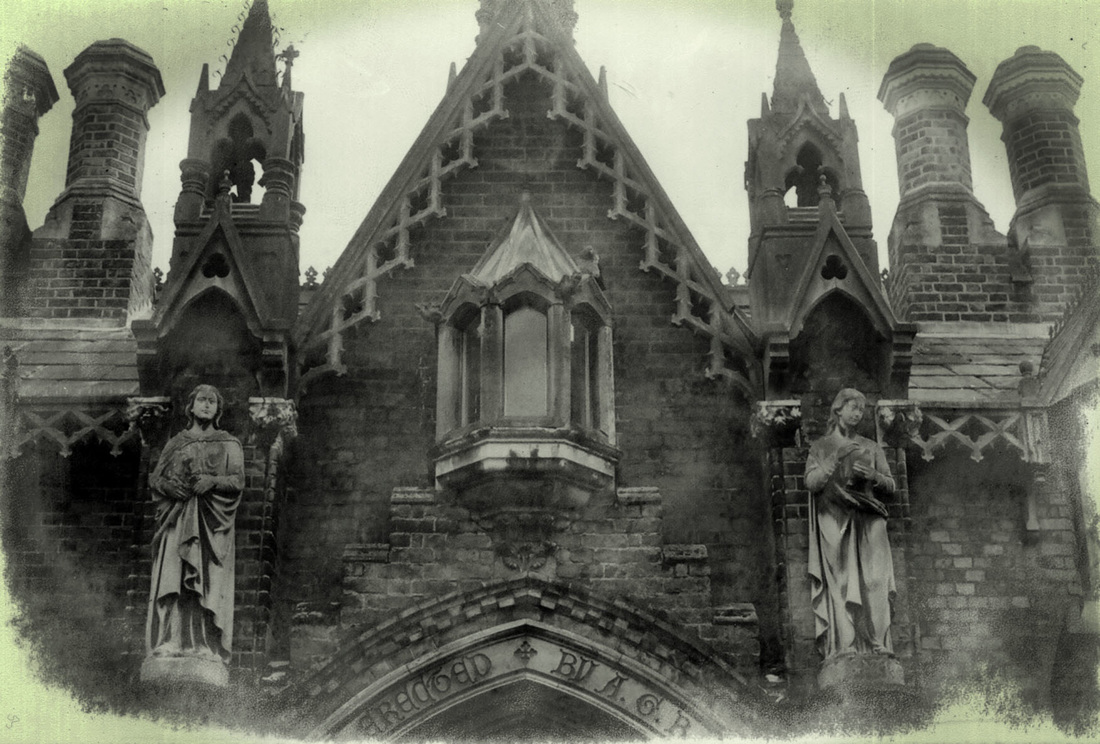
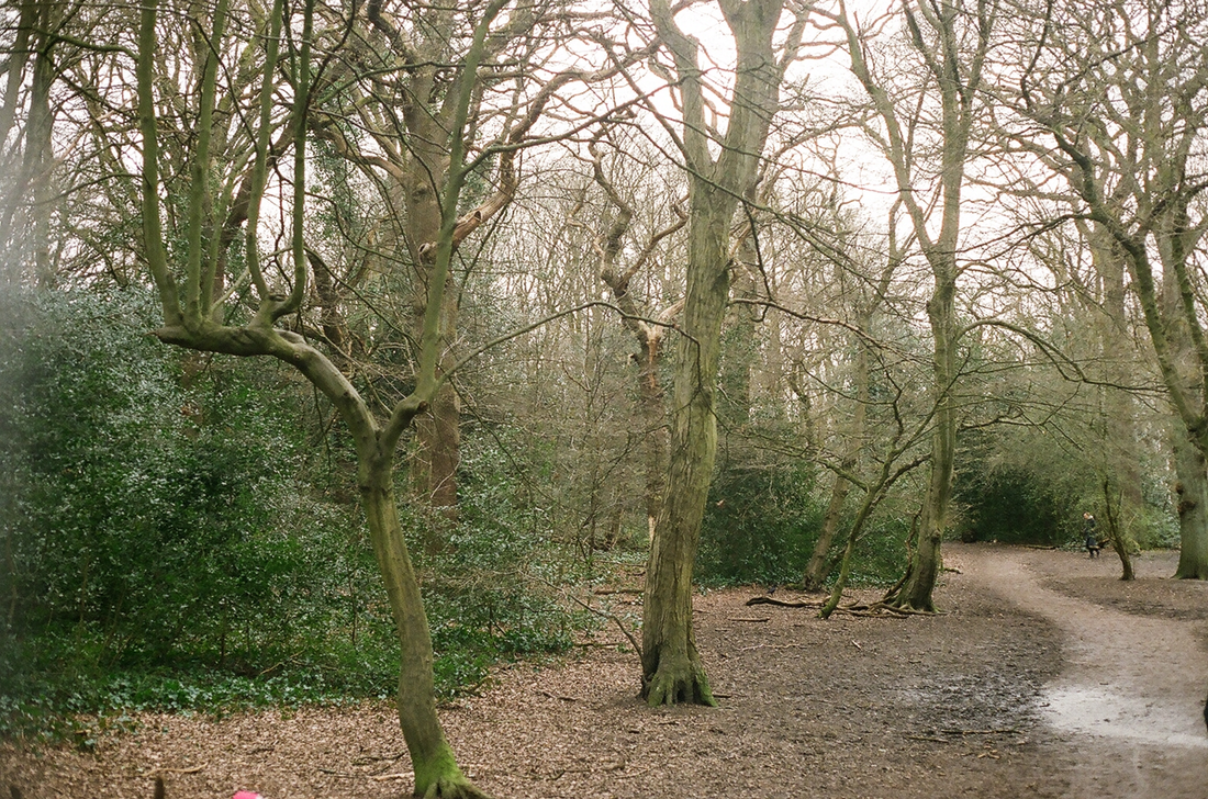
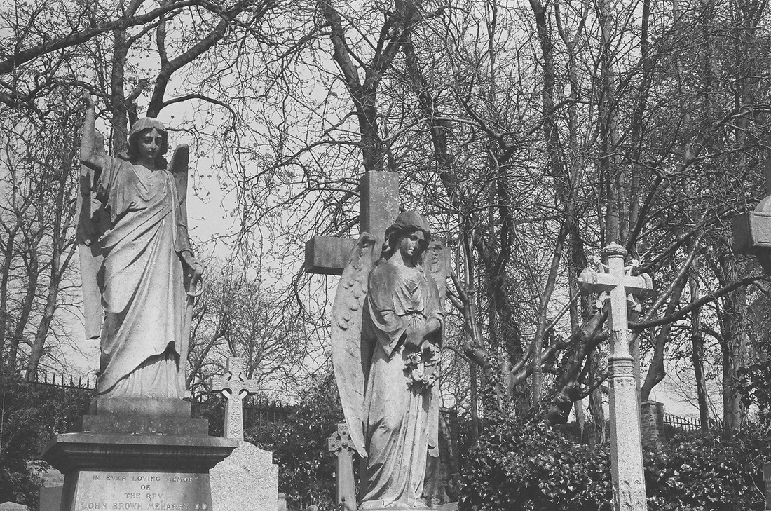
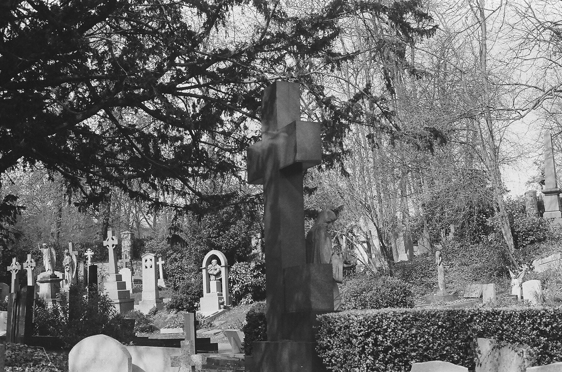
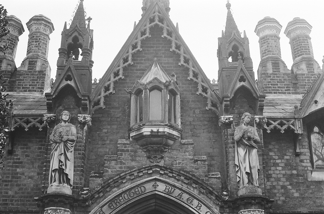
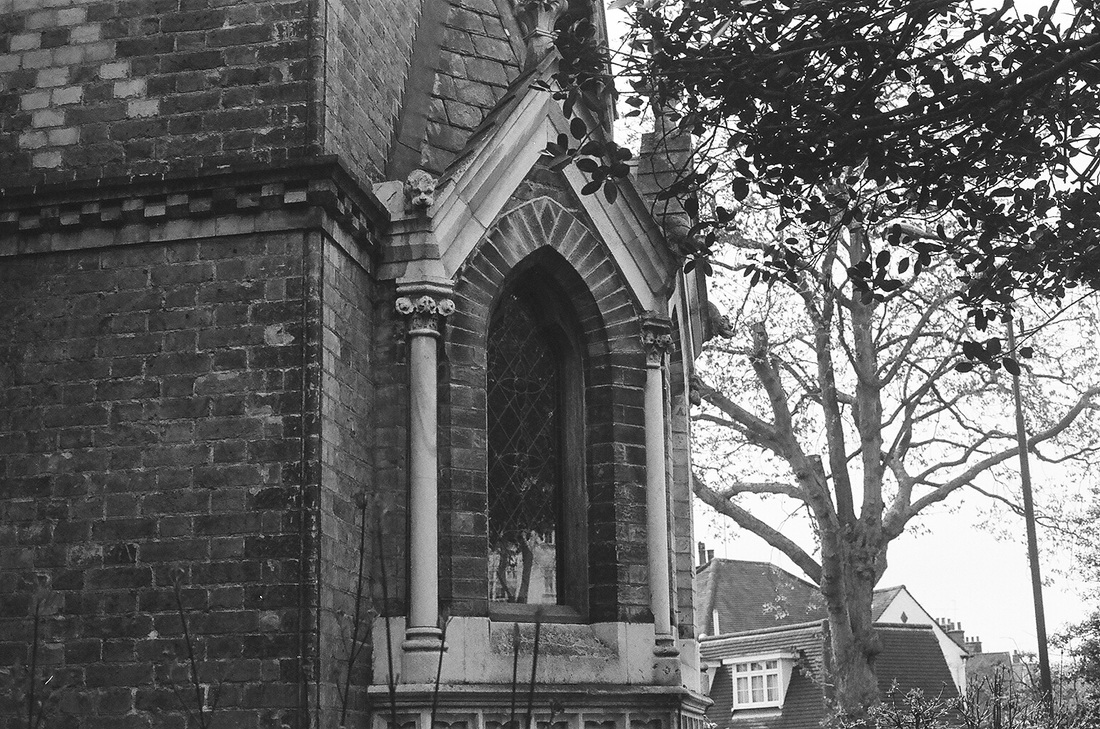
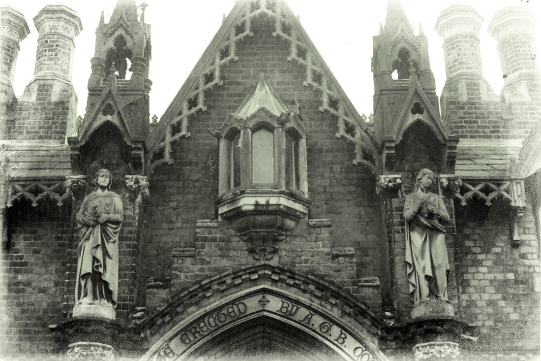
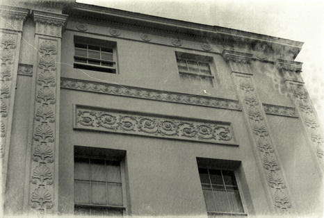
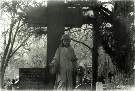
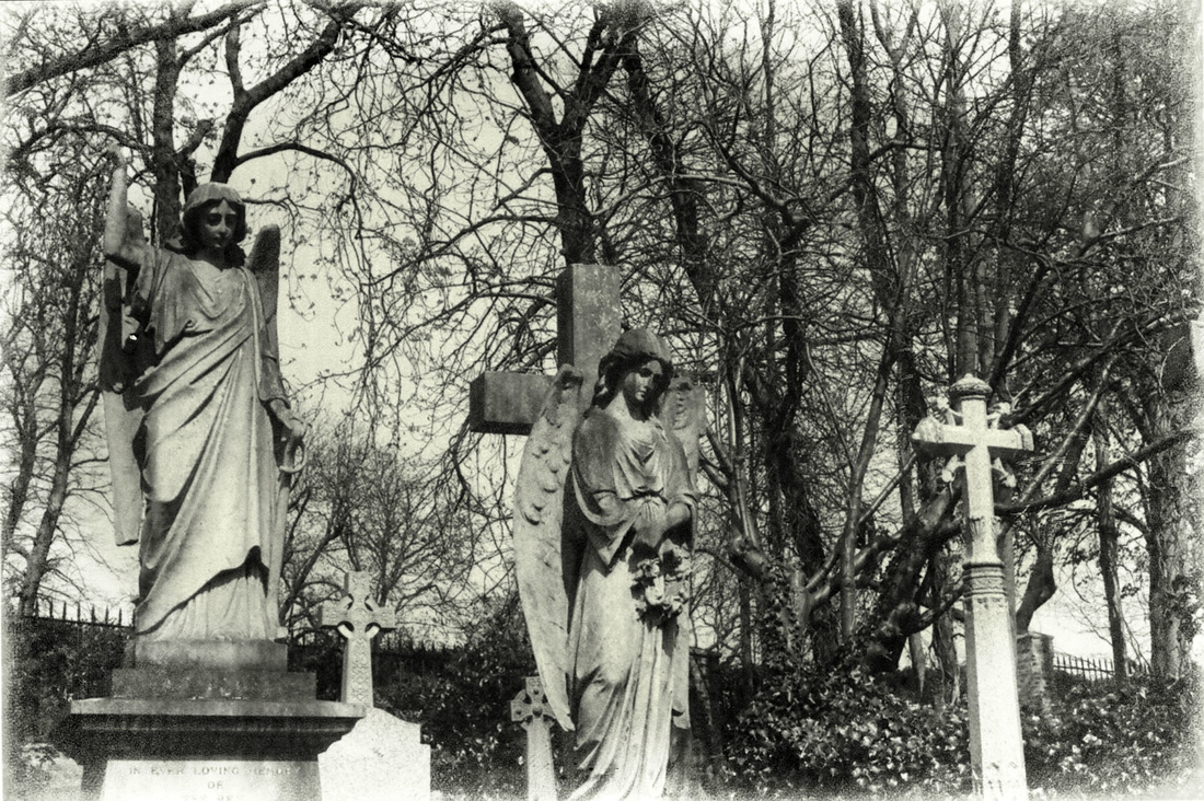
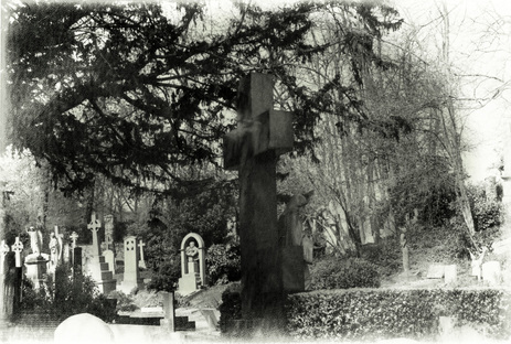
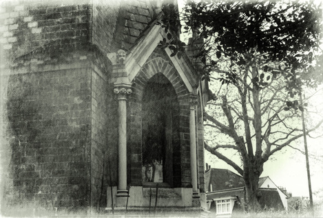
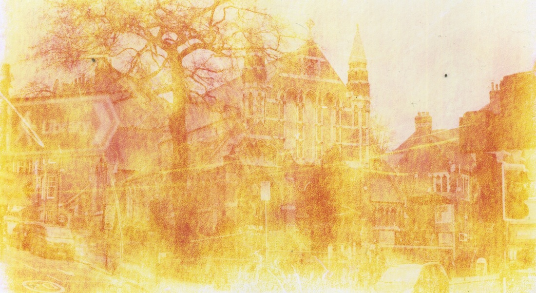
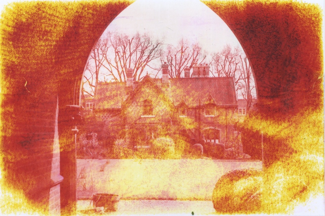
For this section, I went to places with obvious, old architecture and structures. Some photographs were taken in Highgate Cemetery to capture the aspect of past whilst still trying to try and mimic Sally Mann's photography. I think some of these turned out well, however I was hoping they would be more dramatic. For all of the images I used black and white film in order to achieve a more vintage effect to the final photographs.
|
|
|
|
|
Final Piece
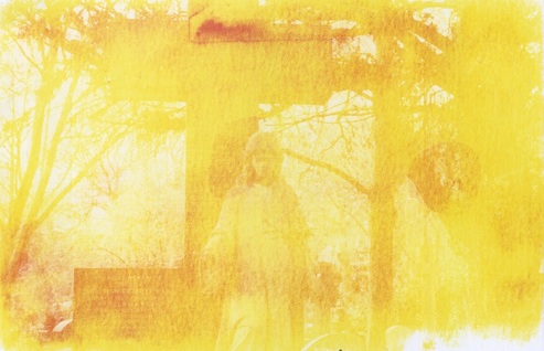
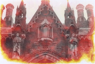
For my final piece I took the images that I shot of old architecture and soaked them in bleach and water to make the photograph look decayed and aged, and slightly more like wet collodion. After bleaching the photograph, I rinsed it with water, allowed it to dry and then scanned it into the computer and edited it in photoshop to make it black and white again. Below is my first attempt at doing this.
Further Expansions:
|
Before:


|
After:
|
Process:
At first, when bleaching my images, I tried leaving them in for a longer time (around 1 minute). This wasn't very effective as it made most of the image yellow, leaving little detail of the original image for me to edit and play around with.
|
|
I then left the images in the chemicals for a little bit shorter (around 30 seconds) and they came out quite affected. After taking the images shown below out of the chemical, I used a brush to further decay the corners and edges of the images to add to the Sally Mann effect.
|
|
|
Final Edits: